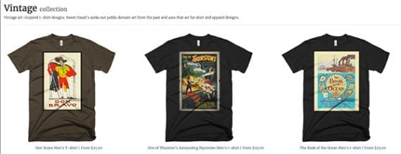
Product category pages play an important role in an online shopper’s journey, acting as a hub for filtering products on the path toward making a purchase.
A well-made product category page contributes to a good shopping experience, encourages purchases, and offers search engines indexable landing pages. What follows are 10 tips to improve product category pages.
Faster Load Times
Fast load times have been linked to improved conversion rates and better search engine optimization. Here are a couple of examples.
Ancestry.com reported a 7-percent increase in site conversions when it took steps to improve page load time and add content to the page more quickly. Separately, at a 2016 Akamai event, Dr. Dongbai Guo, chief technology officer at AliExpress, reported a 10.5-percent increase in orders and a 27-percent increase in new customer conversions when his company improved page load times.
Moreover, page speed is a ranking factor for Google and other search engines and it may be an important ranking factor for mobile search results pages.
Aim for product category pages to load in one second or less.
Consistent Product Photography
Like neatly arranged aisles in a brick-and-mortar store, a product detail page should feature consistent product images that match in quality and style.
For example, one online t-shirt shop might show pictures of shirts isolated on a plain background.

This online retailer has chosen to show the product isolated on a white background.
While another store, selling similar products, may use pictures of models wearing t-shirts.
This t-shirt store uses product images featuring models.
Still another could use lifestyle photography or just the t-shirt design. All of these approaches are effective for a product category page, but, generally, it is best not to mix and match.
Optimize Product Images
The product images on a product category page should be fast loading as well as beautiful.
An online retailer might design the page to use thumbnail-sized images or employ an image content delivery network like Akamai or Imgix to further boost page performance. These services often allow for dynamic image loading so that a product category page gets just the right size image for a particular user’s device, whether that device is a television screen or an iPhone.
Bottom line, work to optimize product photography.
Make Site Search Easy
More than half of online shoppers will use site search to find specific products on their buying journey. So make site search easy to find and use on product category pages.
Place the search field at or near the top of the page and make it relatively large. Shoppers may repeatedly refine their search, adding to the query as they drill down to the specific products they want.
The search field should be obvious on product category pages since shoppers are likely to refine their search.
Use Faceted Navigation
Product category pages should include the option to further filter product results with facets, such as brand name, size, or price.
Faceted navigation offers shoppers a good experience and can boost conversion rates significantly.
Faceted navigation is popular among shoppers, as it allows them to sort products as they search.
Improve SEO
As good as faceted navigation is for shoppers, it can be a challenge for search engine bots. The problem is that faceted navigation, in some implementations, creates many paths to identical content.
A few years ago, Google released an article about SEO for faceted navigation on its Webmaster Central Blog. This post acknowledged faceted navigation’s value and offered some best practices for SEO.
Many modern sites will either configure Search Console to help Google understand what to index or use JavaScript that does not necessarily change the URL.
Write Good Product Titles
Even on a category page with a dozen or more products, each product should have a good title.
Be sure to include a product’s brand and model number if those are terms shoppers are likely to use when they search for the item.
At the very least, the product title should be descriptive.
Notice in these product titles the brand name, Columbia, is shown first since many shoppers will search for a “Columbia shirt,” or similar.
Show Price and Availability
Product category pages should include product prices and availability. As much as possible, an ecommerce site should let shoppers know specifically how much a product will cost and if it is immediately available — before making those shoppers click again.
There are going to be exceptions. Sometimes, to comply with a manufacturer’s online dealer policy or minimum advertised price (MAP) requirements, a store may need to hide the final price until checkout or make a shopper log in to see a price. But those are by no means best practices.
Have a Clear Call to Action
Some online merchants will imply a call to action on product category pages by simply assuming that shoppers know by convention they can click on a product picture or title for more information or an opportunity to add the item to the shopping cart.
While this is acceptable, a store may be able to improve conversions with a clear call to action, such as a simple add-to-cart button.
Include Structured Data
Add structured data to product category pages to help Google and other search engines. If Google is your focus, consider JSON-LD. Specifically, use the JSON-LD itemListElement field. This will allow you to share structured product data for each item on a given category page.