“Want to guarantee engagement? Concerned about your organic reach? Cool. Run ads.”
Given their recent algorithm changes, this is the sort of take-it-or-leave-it message Facebook is sending to brands.
Although it’s not exactly what marketers want to hear, Facebook ads are a proven way to get in front of your specific target audience. And with 93% of social marketers already on board with Facebook ads, we’re facing a sort of “now or never moment” where pay-to-play is becoming an expectation.
The good news? Facebook’s already-intuitive ad platform is probably easier than ever to use. Whether you’ve dabbled with ads or have only played around with Facebook’s Creative Hub, you can dive in ASAP.
But this begs a bigger question: where the heck do you begin with your next campaign, anyway?
Don’t sweat it: we’ve highlighted some of the best Facebook ad examples out there to get you started.
12 Facebook Ad Examples You Can Swipe from Today
The beauty of Facebook ads is how much creative freedom the platform offers. No matter what your product or message might be, you can craft something to suit your needs.
And no, you don’t need to be a creative genius to make it happen. With a much-needed dose of inspiration from the following Facebook ad examples, you can better understand firsthand what makes an ad “work.” This combination of paid ads and promo posts not only shows the diversity of Facebook ads at large, but also that there is no “one-size-fits-all” formula for engagement.
And with that, let’s dive in!
1. AirAsia
Let’s start by smashing the myth that Facebook ads need to be complicated. This static-image promo from AirAsia screams “simplicity,” but ticks all the boxes of an effective ad.
What makes this ad work? Economical with words, this ad’s copy doesn’t pull any punches. The bright imagery is enough to stop scrollers in their tracks, while power words like “FREE” and the limited time offer are both powerful motivators.
2. Sephora
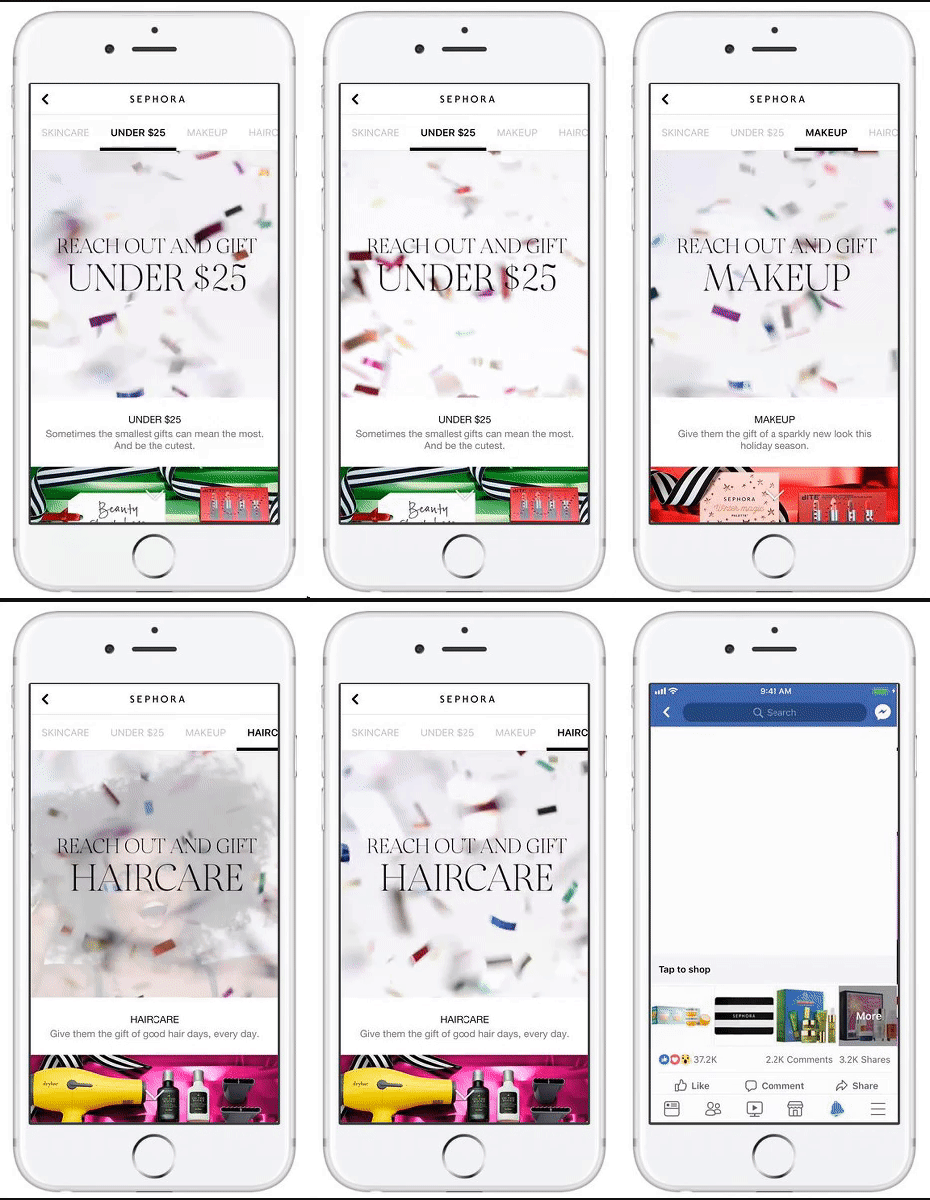
In case you missed it, Facebook explicitly wants brands to produce video content given its high engagement rate. This is exactly why video ads are booming right now, including this Sephora campaign which resulted in a 41% higher click-through rate than their previous ads.

What makes this ad work? There’s a lot going on here visually, which helps the ad succeed in standing out in users’ feeds. The ability to showcase multiple promotions and products via video in a matter of seconds helped the ad reach beauty buyers of all shapes and sizes.
3. Project Repat
Despite popular belief, you don’t need a massive budget for your ad creative. While many of these Facebook ad examples come from bigger brands, Project Repat’s success story proves the marketing firepower of something as simple as a snapshot.

What makes this ad work? Using a customer as a billboard is a brilliant move given how well user-generated content converts. Less-polished ads can actually work in your brand’s favor given the phenomenon of consumers becoming blind to traditional marketing messages in their feeds.
4. P.F. Changs
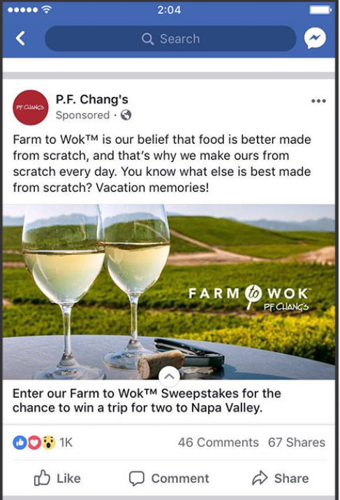
A staple of old-school advertising, sweepstakes still work as proven by P.F. Chang’s 3x engagement rate to win over entrants. This ad highlights the fact that not all ad objectives are created equal, again signaling the sheer diversity of Facebook’s platform.

What makes this ad work? Giveaways and contests via social media are still effective, granted you provide a compelling prize for your entrants. This ad’s simple imagery contrasts with its big-ticket prize, perhaps making it feel like a sort of hidden gem for entrants.
5. Pura Vida
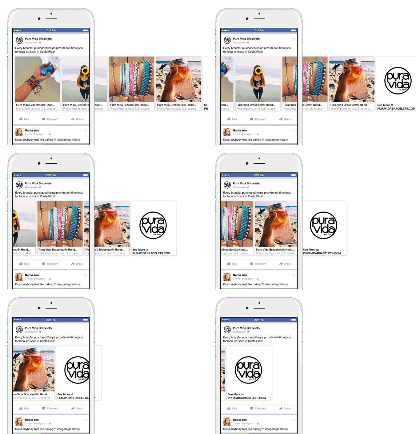
A shining example of carousel ads in action, this ad definitely dispels the notion that Facebook ads have to be boring. The creative, interactive nature of this carousel campaign actually resulted in Pura Vida selling 20x as many unique products.

Why makes this ad work? The combination of eye-popping imagery, user-generated content and a socially conscious message help this ad totally kill it. Each slide essentially represents a separate ad in and of itself, allowing plenty of room for experimentation and more opportunities to convert.
6. Porsche
Just when you think you have Facebook’s platform totally figured out, they throw something new at you. Perhaps the most new wave of our Facebook ad examples, this ad implements a carousel including videos and a messenger bot to boot.
What makes this ad work? Pretty much everything about this ad is interactive. Want to chat it up with the Porsche bot? Want to see the firsthand accounts of drivers having a blast? Users have plenty of places to click and different ways to experience the ad.
7. Loot Crate
The ultimate goal of any ad is to, well, not feel like a sales pitch. Despite the fact that Loot Crate links to their product in just about every single post they make, their promos are never in-your-face.
What makes this ad work? Asking questions is a smart move in the face of Facebook’s algorithm which emphasizes engagement. Just peeking the number of shares this post scored relative to likes and comments, discussion-based ads promos are a proven way to get people talking.
8. Dollar Shave Club
Well-known for the humorous ad campaigns, this rather straightforward promo from Dollar Shave Club performed incredibly well. Resulting in an increase of subscribers by 1.5x, this ad shines due to its simplicity.

What makes this ad work? Pun intended, this ad cuts directly to the point. The curiosity-driven copy and competitor call out was enough to pique users’ interest and likewise drive them to the comments section.
9. TOMS
Unlike many of our Facebook ad examples, this is one of the few that isn’t totally about dollars and cents. TOMS generated a ton of brand awareness as a result of this canvas ad without explicitly highlighting their products.

What makes this ad work? The lack of a concrete promo or CTA makes us ask “What’s this all about?” The striking visuals and memorable tagline also work in TOMS’ favor here.
10. MeUndies
Another testament to the power of video, this fast-paced video ad from MeUndies resulted in a whopping 40% increase in conversion rate.

What makes this ad work? The short, humorous tagline sets the tone for this ad, all the while the rapid-fire video seals the deal. This particular ad is also crafted in a way that it appeals to both his and hers, a nice touch depending on your audience.
11. Nintendo
Not every Facebook ad needs to reinvent the wheel. Straight-up sales messages like this one from Nintendo are still effective as long as they’re relevant to your audience.
What makes this ad work? The contrasting, bright colors make this ad visually striking while the time-sensitive offer encourages conversions. Given that photo content receives relatively high engagement on Facebook, it always helps to couple your offers with some sort of compelling image.
12. HelloFresh
Seeing a pattern here with all of the video ads? This HelloFresh ad again reminds us that not all video ads need to be elaborate productions, though.
What makes this ad work? The dual video approach essentially allows for two ads packed into one. Stop-motion represents an easy way to create a video ad minus major production costs, all the while showing off your product in the wild.
And hey, that concludes our list!
The Anatomy of a Great Facebook Ad
Although the motivation behind each ad is different, they feature many of the same structural elements.

Which key elements deserve your attention? We’re glad you asked!
- Headline: A summary of what you’re offering.
- Post text: Copy that’s placed directly above or below your image. Often the first text a viewer will see.
- Description: Available in only a couple of ad types, this piece of copy allows you to go into more depth about your product or offer.
- Media: This is your image or video. It’s the largest part and encourages viewers to look more closely at your ad.
- Call-to-action: This button appears near the bottom of your ad and instructs viewers on what to do after viewing your ad.
That said, the content of each ad is entirely unique to your business. Below are some principles marketers should try to stick to when crafting a new Facebook ad. While not hard and fast rules by any means, these tips can help guide your ads if you have any doubts.
Keep Text Tight & Concise
The success of your ad lies in its concise wording and delivery. Your headline should immediately capture a viewer’s attention and some rules apply to your descriptions. Tight copy is the name of the game here, otherwise you run the risk of readers tuning out.
Choose Your Words Carefully
Brevity isn’t the be-all, end-all of your ad copy: keep in mind that word choice counts. Given what we know about the psychology behind Facebook Ads, advertisers tend to see better results when these five words are included:
- You
- Free
- Because
- Instantly or now
- New
That said, you should only insert these phrases where it actually makes sense. They’re common enough to be easily worked in organically, so there’s no need to shoehorn them.
Fine-Tune Your Call-To-Action
An excellent way to ensure your audience clearly understands that action you want them to take after viewing your Facebook Ad is by using a call-to-action button. Depending on your ad objective, you can choose from the following CTAs:
- Shop Now
- Book Now
- Learn More
- Sign Up
- Download
“Learn More,” “Shop Now,” and “Sign Up” are used significantly more than any other CTA. In 2014, “Shop Now” was favored by 74% of marketers, while “Learn More” reigned as the top performer.

Send Audiences to a Landing Page
If you’re sending people off of Facebook, as in the case of a Clicks to Website or Website Conversions objective, your best bet is to direct viewers to a landing page. In fact, the majority of Facebook ads link to a dedicated landing page versus a homepage.
Directing your audience to a specific landing page ensures that your viewers are instantly provided with the most relevant information related to your ad. If sent to your home page instead, it’s up to them to correctly navigate your site and find the details related to the product or service advertised.
Not only does this help you calculate your ad performance and ROI, but also ensure people take the actions you want them to take versus bouncing.
Ready to Run Your Next Facebook Ad Campaign?
Hopefully our Facebook ad examples shed some light on the elements of a top-tier ad in 2018. The growing need to run them doesn’t look to slow down any time soon, and we can only imagine what new features Facebook has for brands around the corner.
And with so many options already available, brands have room to get creative and craft a killer ad regardless of their industry or budget.
We want to hear from you, though. Which of our Facebook ad examples were your favorite? Who else do you think is totally killing it right now with Facebook ads? Let us know in the comments below!