Making people click through your ad is just a small part of the whole marketing process, you also need a great landing page to get them to convert
Paid campaigns are considered to be the best choice if you want to drive quick results, as they really do get those results. However, paid ads aren’t all about simply bidding on the right keywords. There are some other things you need to.
Making people click through your ad is just a small part of the whole marketing process. The next thing they face is your landing page – a web page you should create for the purposes of your advertising campaign. The effectiveness of this page will influence whether or not you achieve your business goal.
Quality landing page creation doesn’t require titanic efforts but it does need some research. The approaches you have to use will depend on your target audience and the goals you set. After all, if you launch an SEO webinar, your landing page shouldn’t look like a page promoting gifts for Mother’s Day.
On the other hand, there are basic features common to all the high-converting ads. To make sure you know the crucial aspects of a quality landing page, you should be able to answer all the questions in this post.
1. What’s your aim?
The first question is the most crucial one for your whole campaign. Your aim will impact your next steps. Content, design, CTA – all of these aspects depend on the reason for the creation of your landing page. I circled out the three common goals marketers set when launching paid campaigns:
- Sell a product: This goal may include several CTAs, as your audience needs a different approach at each different stage of the sales process. If your ad shows up in search results, then people clicking through it probably have never heard of your company before. So, to drive prospects to purchase decision, it’s much better to offer the following options:
- A demo.
- A trial version.
- Call-back and more.
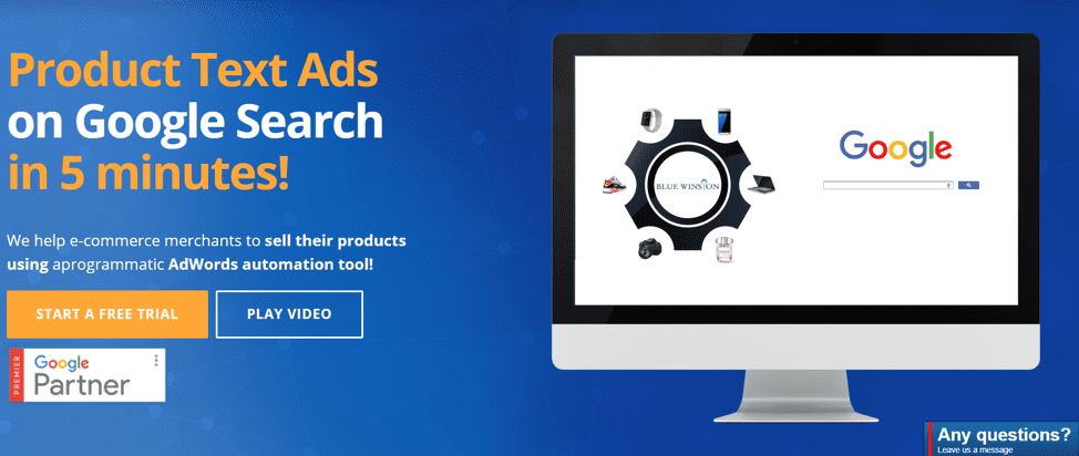
Here’s the example of landing page Blue Winston provides:
- Nurture relationships with your audience: This goal contributes to your brand awareness and credibility. To achieve it, most website owners offer free seminars or webinars. In this case, the landing page contains a short description of the upcoming event, including its benefits, along with a sign-up form.

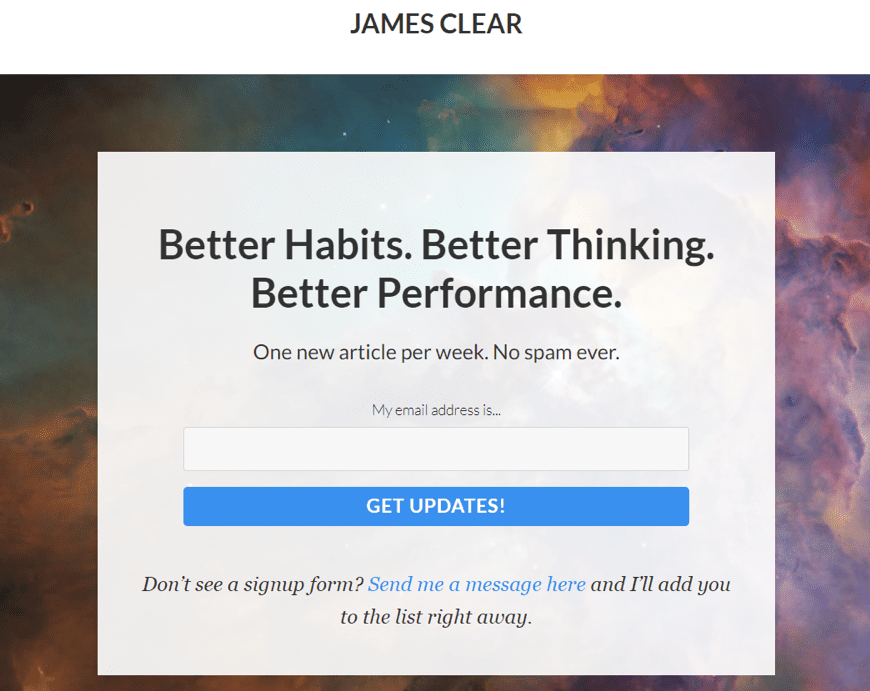
- Gain subscribers: These landing pages look pretty simple and don’t require long explanations. You simply need to make it clear how they can sign up.
2. Are you going to optimize your landing page for the specific goal?
The answer should be yes. One goal = one landing page. Never try to create multiple ads for one page, as this may result in a disconnect between the audience’s expectations and what they face.
Let me illustrate this: I searched for ‘buy AirPods’ on Google, There was a paid result in the first position:

I clicked through the ad and found the landing page to be pretty frustrating:
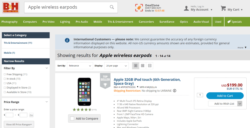
You can see the website owner didn’t bother creating a separate landing page for every product. Many people won’t want to scroll through the list of results to find what was advertised and so they will likely leave the page, increasing the bounce rate and reducing the ROI of your ad.
3. Are you bidding on the right keywords?
The keywords your landing page shows up for have a direct impact on your campaign success. First of all, It’s always a good idea to check what kind of ads are already ranking for your target keywords. It’ll help you understand whether the competition is relevant to you.
Secondly, choosing several main keywords for your paid campaign is nice, but it’s not enough. Never underestimate the power of the proper keyword research. With Wordtracker, you can collect the right keywords for your ads.
![]()
4. Who’s your target audience?
Understanding what kind of people are most likely to come across your ad copy will help you better tailor the contents of your landing page. Your target audience portrait (and their expertise as well) will influence different aspects of your campaign, including:
- What kind of CTA you should use.
- The description you should provide.
- Whether you should add special elements like images or videos.
- Your tone, approach, etc.
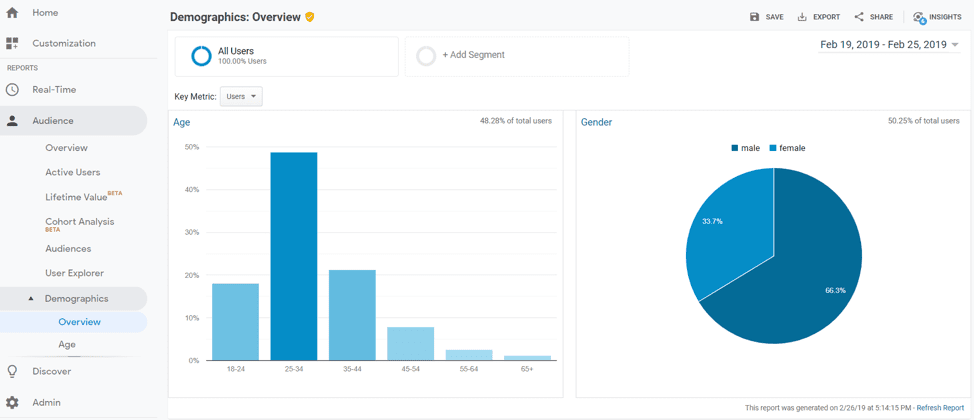
If you haven’t analyzed your target audience yet, you need to do so before creating a landing page for your campaign. First of all, take a look at Google Analytics. Even if you think you know who your buyer persona is, it’s still a good idea to check your website audience.
Go to the Audience > Demographics. There you’ll see the data on your visitors’ age, gender, location, language, etc. which will help inform your landing page.
On top of this, it’s a good idea to contact your sales department and ask them to provide you with your customers’ portrait. You may be surprised by the information they provide you with.
5. What do your competitors promise?
Before launching your own campaign, it’s always a good idea to discover your competitors’ strengths and weaknesses. This step will help you avoid the same mistakes and discover some great ideas you could implement into your strategy.
The easiest and the most efficient way to analyze your competitors’ ads and landing pages is to check them with Serpstat. Simply enter your target keyword into its search field, select your country, and click on Search. From the Overview report go to PPC Research > Ad Research.
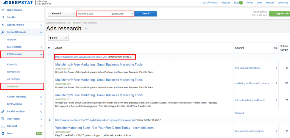
You’ll see the list of ad copies showing up in search results for the queried keyword. If you tap on the link below each ad, you’ll see the landing page it leads to.
6. Is the content relevant to the ad?
Seeing your ad, users form expectations on what they will find on your landing page. People click through your ad copy because it promises them something they were looking for. Ife page content appears to be completely different to what was promised, they’ll get discouraged and return to the search results.
Such a situation may happen when you try to ‘entice’ customers with false promises or simply overdo with your marketing creativity. In most cases, you’ll just attract the wrong audience, who won’t convert.
So, if you want your click-through rate to correspond with your conversions, make sure there’s no disconnect between your ad copy and the landing page.
7. Do titles and headings contain some advantage for the audience?
The title and the following heading are the first things your prospects will pay attention to. They should be short, catchy and relevant to the content. What’s most important is that you should mention the advantage your visitor will get if they choose your brand. Show them you know their pain and that you’re ready to solve their problem.
8. Is it clear what you promote?
Some marketers fail to explain exactly what they offer on their landing pages. Remember that most people who see your ad will be seeing your brand for the first time.
For instance, this landing page shows up for the query ‘marketing automation tools’:
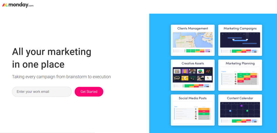
Although the page is designed pretty well, it’s unclear why they need a user’s email and what ‘Get Started’ actually means. What are the benefits and why should a user provide their personal details?
As your landing page has some specific purpose, its content should be perfectly clear. Tell users how they’ll benefit if working with you.
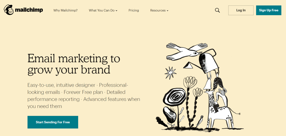
9. Does CTA encourage users to the targeted action?
Remember that your CTA should denote the action you want your prospect to take. If it sounds too obvious, just review one more time the landing page by Monday.com I’ve mentioned above. The words like ‘Get Started,’ ‘Click to benefit,’ and others may seem creative, but they don’t really describe what someone required to do.
Spell it out and highlight a benefit they get if they take the action your require, such as ‘Get Your Free Guide’, ‘Download Now’ etc.
10. Did you add a chat widget?
This aspect isn’t compulsory, but it could help you a lot. It may happen that your prospects have questions concerning your offer. You don’t want them to leave your landing page in order to search for your contact information (and let them change their mind), so it is a good idea provide a chat box on the page.
Even if your chat box uses a chatbot, this could help answer the most frequent questions and encourage users to convert.
11. Does it look trustworthy?
Don’t miss the opportunity to boast a bit with customer testimonials. Reviews always contribute to the brand’s credibility. If someone has never heard of your brand, they’re likely to find benefit in reading about the positive experience of your customers.

Moreover, if you represent a B2B company, listing brands you work with on your landing page is a must. It’ll contribute to your expertise and engage more clients.
12. Is the register form easy-to-use?
If you’re asking people to fill in a contact form, make this process as easy as possible. The fewer questions you ask, the better. Value your customers’ time. If the field isn’t required, then why add it to the registration form?
Keep them on one page and make the sign-up process as simple as possible. It can also be a good idea to offer something in return, especially in the B2C industry, to make signing up even more enticing.
Conclusion
These are the basic things you should consider when creating your landing page. Once you answer all these questions, it’ll be a great kick-start. Knowing the basic aspects of a quality landing page, you can test and develop it for your specific needs.