How many times have you pondered over which images to use in a paragraph, blog post, web page, etc.?
I struggle choosing a visual for my content. Yet, it’s important, as frequently cited research shows that images attract more people to the content and help people retain the content they consume longer.
Knowing images are crucial to the success of the post, I focus on the matter even more. Thankfully, in my career I had to learn how to use Adobe Photoshop, Adobe Illustrator, or even Corel Draw. A long time ago, I was a designer for a small advertising agency. Those days helped me understand the difference between good and bad design, which has been helpful in creating a blog.
Today I present 12 types of visuals you can use in a blog post. You do not have to use all of them. See what inspires you given your content marketing strategy, audience, and formats.
HANDPICKED RELATED CONTENT:
1. Data-driven visuals
To be a well-known leader in your industry, start creating data-driven content. Designed as charts or graphs, it can make it easier for your audience to comprehend your message than with text only.
QuickSprout research reveals that articles with data-driven visuals rank fourth in shareable formats. More noteworthy, the same research shows that blog posts with graphs and charts receive more trackbacks – 258% more than blog posts with other types of images.
For instance, Content Marketing Institute’s annual benchmark research on the industry includes a lot of data-based visuals. Someone who needs statistics to back up an article regarding the importance of content marketing is likely to use CMI’s data-driven visuals. Take for example SEOPressor’s article for beginning B2C content marketers.

Takeaway tip: People love sharing new data and well-researched information that also looks awesome in a visual.
People like to share good research in visual form, says @katairobi. Click To Tweet
2. Quotes
Influencer marketing is a great strategy for extending your content marketing reach in a valuable way. Creating an image with the influencer and his or her quote, you create a memorable image.
In a 2015 article on Bannersnack, we included lessons learned from David Ogilvy, the father of modern advertising, that relate to online marketing. To make it more memorable, powerful, and easier to read and share, a visual was created for each of his quotes included in the article.

You also can incorporate quote visuals from living influencers, particularly within your industry, as that can increase the chances the influencer responds to your content (and shares with his or her audiences).
Takeaway tip: Visualizing quotes in blog posts can help you make statements backed by names well known to your audience.
3. Infographics
I did not know how powerful infographics were until I researched them. I read case studies about companies that used them and got great results. I started using infographics on my blog and the company blog. The infographics continue to contribute to the site’s traffic, backlinks, and social media shares.
An infographic that is aesthetically pleasing with relevant data – that happens to be user-friendly – will undoubtedly help increase awareness of your brand. It also offers potential for several platforms beyond your blog. They can be shared on Pinterest and uploaded to SlideShare. If the infographic has multiple components, crop parts of it to create snackable visual content for Facebook, Twitter, LinkedIn, and even Instagram.
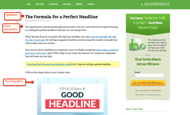
You also do not need to write extensive content for blog posts with infographics. Just write a simple paragraph presenting the information, use keywords that rank, and voilà! – your article is ready. That is how Neil Patel publishes his infographics on QuickSprout.

Takeaway tip: The crux of an infographic is not the design, but the research itself. You need to invest time and energy to get the data and create a useful wireframe to behave like a visual story.
4. Gifographics
Gifographics are like infographics on steroids. Think about them as animated infographics. GIF stands for Graphics Interchange Format, originally a file type for both animated and static images that work well on the web.
You can use GIFs on Facebook, Twitter, and Instagram. On Facebook, you cannot upload them natively. You need to upload them on giphy.com then copy the new URL and paste it in a new Facebook status. Twitter allows for direct uploads, while Instagram lets you create GIFs using its Boomerang app. Buffer conducted a study that concluded that posts with featured animated graphics get more social media shares than the ones with no animated visuals. (See more about GIFs in No. 5.)
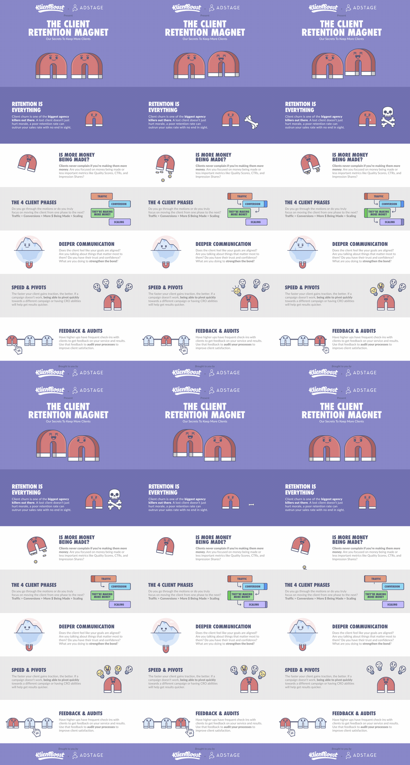
But what about gifographics? They combine the power of an infographic in a format more likely to be shared by the audience. KlientBoost uses a gifographic to show its viewers how to keep client retention high. It also published the gifographic in a more in-depth article on the blog.

Gifographics combine power of infographic in format more likely to be shared, says @katairobi. Click To Tweet
Takeaway tip: If you know how to explain ideas and data through infographics, take them to the next level and add movement. It can increase the interest of your audience, better entice them to share the content, and, ultimately, the increased traffic can boost your SEO (and you’ll stand out in SERP results.)
5. GIFs
Some marketers are afraid of using GIFs in their blog posts. I have to admit I am not a big fan of this type of visual content. But in my research, I came across this discussion on Inbound.org about using GIFs when blogging.
If you are unsure whether to use GIFs or not, let me give you a few reasons to give them a try. GIFs can:
- Give off a professional vibe that indicates your business understands internet trends
- Be easy to consume and share on social media
- Convey emotion
- Show your brand’s human side
If you still aren’t convinced, read this article from Hootsuite in the Ultimate GIF Guide for Social Media Marketers.
Takeaway tip: GIFs can be a way to stand out from your content competition. Start using them and see how your readers interact with them.
GIFs can be a way to stand out from your content competition, says @katairobi. Click To Tweet
6. Memes
If you want to add a light touch to your article, memes can set you apart from your competition. Even if your industry is a bit tedious, your articles shouldn’t be boring. Just craft some funny images and help people relax a little bit.
Here’s an example from The Next Web, which uses a meme and descriptor text to inform visitors it uses cookies.

Memes are snackable visual content – easy to consume. And if your audience finds them relevant to their lives, they are likely to share on social media.
Takeaway tip: Create a standard meme format within your content. For example, use a meme at the beginning or at the end of each article. You can upload that meme on social media to promote your blog post.
7. Videos
The importance of videos in content marketing has been discussed a lot. Well, video is still a big thing. Just look at the biggest social media platforms and you will see why.
Videos are extremely effective for your visual content on blogs. For example, Dental Marketing Guy created this blog post featuring both video- and text-based content from a webinar he conducted.

What I want to highlight is that you do not have to create a ton of videos for a blog post. You just have to be creative about the type of content your community loves to consume.
Takeaway tip: Look for opportunities to use video you already have (or create video of your currently planned activities) to expand video’s role in your content.
8. Screenshots
Screenshots may be the easiest way to create visuals for your blog posts. When I learn something new reading articles, I usually bookmark the ones with screenshots.
Screenshots are an easy way to create visuals for your blog posts, says @katairobi. Click To Tweet
Brian Dean from Backlinko does an awesome job at using screenshots. For example, his article on turning keywords into SEO content is full of helpful screenshots showing actionable tips, step-by-step walk-through, checklists, and other diagrams to help the reader progress through the content.

Takeaway tip: You can create screenshots using one of the many tools available, including Skitch from Evernote or Jing from TechSmith. You also can elaborate on the screenshot by inserting arrows, explanatory text, or basic shapes to better convey your message.
Use tools like @evernote’s Skitch or @techsmith’s Jing to create screenshots, says @katairobi. Click To Tweet
9. SlideShare presentation
Presentations are a great resource for visual content. When you post to SlideShare, you now have the benefits of visuals on a web-based platform (think SEO).
How can you use SlideShare presentations in your articles? Consider this example from Yotpo, a customer-focused marketing software company. It incorporated multiple visuals, including a SlideShare presentation, in an article about how to get more customer reviews. The SlideShare presentation helps users find an answer to their questions. The best thing is that users can download it as a PDF for future reference.

Takeaway tip: SlideShare presentations are a great way to concisely share the thoughts in an article in a visual, downloadable way. You also can use single slides from SlideShare presentations as visuals within your content – similar to screenshots.
10. Photos
Photos are ubiquitous in articles. Whether they’re stock or original images, use them wisely.
For example, Neil Patel chose a photo of a student to promote his online courses for entrepreneurs. The image clearly indicates education – a great way to showcase the topic.

Make sure your image file sizes are optimized for the web as large files negatively affect site loading. A plug-in on your web development platform can help accomplish this.
Make sure image file sizes are optimized for the web so they don’t negatively affect site loading. @katairobi Click To Tweet
Takeaway tip: Use quality images for your content. If you don’t have a budget for a professional photographer, here are a few sites that offer free stock photos.
HANDPICKED RELATED CONTENT:
11. Illustrations
Illustrations can help your blog posts stand out in the ubiquitous world of photos. If you happen to have access to talented designers who also are great illustrators, get them involved.
HelpScout, a software company for support teams, uses illustrations in its blog posts. It even crafted an article about its approach to illustrations and why it is using them.

Takeaway tip: Your illustrations need to look professional in a way that reflects the tone and messaging of your brand. You should work with a professional designer to execute.
12. Flip books
When CMI founder Joe Pulizzi said almost a year ago that the custom print magazine would be a trend in content marketing in 2017, I confess I did not understand. But as the days went by and I read the news and listened to the This Old Marketing podcast, I realized brands already have begun launching custom print magazines.
That’s when it hit me. If you create a print magazine, you can publish it on your blog. I did not see many blogs following this trend, but I stumbled upon this product called Flipsnack, which allows you to upload a PDF to receive an embed code to use on your blog, such as the fashion magazine-like feel in this article.

Takeaway tip: If you create a custom print magazine, upload it on your blog or create a special landing page for the magazine like CMI does with its magazine, Chief Content Officer (CCO).
Conclusion
You first have two options for visuals in your blog post or other content – to use them or not. If you use them, you can pick from one (or more) of these 12 types to make your blog posts more appealing and interesting for your readers.
Now, I am particularly interested in your opinion and feedback. Do you use visuals in your blog posts? And, if yes, what kind and why?
Please note: All tools included in our blog posts are suggested by authors, not the CMI editorial team. No one post can provide all relevant tools in the space. Feel free to include additional tools in the comments (from your company or ones that you have used).
Want visuals delivered to your inbox daily for content marketing inspiration? Subscribe to the CMI blog.
Cover image by Joseph Kalinowski/Content Marketing Institute
