As companies go digital in order to keep up with the changing business environment, the competition between e-commerce stores has gotten incredibly tight.
This has led to refined and carefully thought-out marketing strategies that are dictated by the rapid development of technologies and customers’ demands. All of them are aimed at increasing conversions and boosting sales and can be easily implemented with your marketing strategy.
So there’s no need to reinvent the wheel! Instead, here’s what we can learn from e-commerce marketing strategies.
E-commerce Marketing in a Nutshell
Before getting down to the marketing strategies, let’s take a look at the e-commerce industry and see why it demands a bit of a different approach towards marketing.
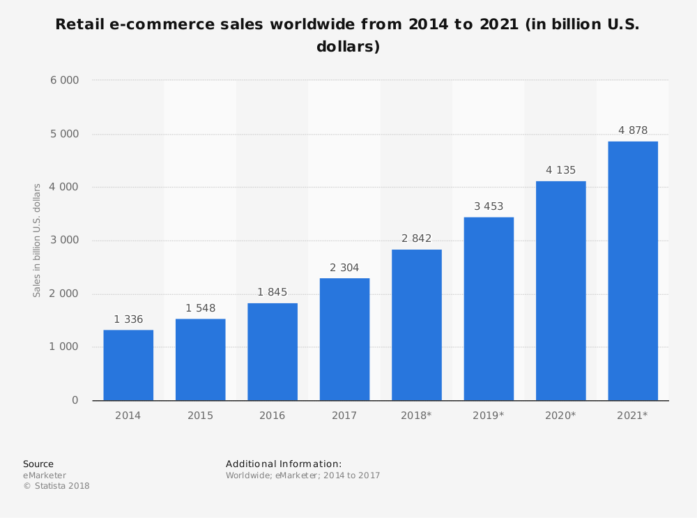
E-commerce is a process of buying products or services online. Though it was first introduced in 1995, the industry only started gaining popularity in the 2000s. In Q1 of 2018, e-commerce sales accounted for just 9.3% of total retail sales, which may not sound like much, but that’s $3.45 billion this year and an estimated $4.9 billion by 2021.
E-commerce enables the customer to buy any product at any time, either from a PC or mobile device. Ease and speed of service together with high personalization are the main reasons behind the rapid industry growth. And since e-commerce is tied to the Internet, it requires a digital approach towards marketing and focuses on transparency, 24/7 communication and support, informative content, and customer-first approach.
E-commerce marketing is a combination of classic techniques and cutting-edge innovations. Companies still compete for traffic, invest in SEO heavily and rely on paid ads. But at the same time, customers’ willingness for two-way communication and immediate service has led to the rise of natural advertising, heavy use of social media platforms, and the popularity of micro-influencers.
So here are 17 actionable marketing strategies we can borrow from the e-commerce world.
1) Sense of Urgency
A sense of urgency is a strong motivator that is widely used by marketers across all industries. You can limit time (X days left), quantity (X items left), or advertise an item in accordance with the situation (shop for Christmas now).
This technique works exceptionally well with e-commerce stores and can be used to promote any products or services. Urgency can be used not only for selling, but for any desirable conversion: newsletter sign-up, event registration, page following.
2) Email Marketing
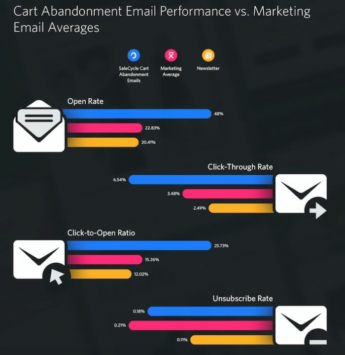
Email marketing remains a powerful tool for marketers in any industry, with some types performing significantly better than others. For example, a top performer is the cart abandonment email that has a higher click-through rate (6.54% vs. 3.48% for general marketing emails) and a higher open rate (48% vs. 22.83% for general marketing emails):
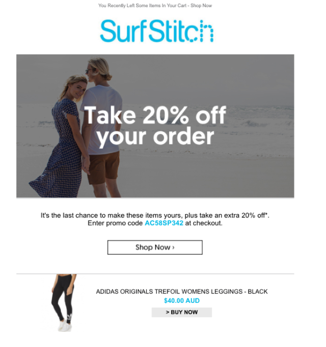
The abandoned cart emails usually serve as reminders that the user has items left in his or her online shopping cart. Such emails can create a sense of urgency, described above (i.e. stating that the item is selling out fast), offer an incentive for coming back (get a discount for the next purchase), or guarantee free shipping upon completing the order.
The numbers say that more than 40% of abandoned cart emails are opened – out of which, 50% eventually lead to a completed purchase.
You can also use emails to:
- Notify about the upcoming events
- Offer incentives
- Inform about the latest news from your company
- Add a touch of personalization
3) Customer Reviews
Users trust other users more than they trust brands – in fact, 85% of online shoppers trust customer reviews as much as they would trust family or friends.
Many e-commerce stores integrate Facebook reviews into the product pages or enable the option to leave a review on the page. The implementation of reviews on the store page contributes to the increase in customer loyalty and can promote sales.
Fun fact: customers tend not to trust 5-star ratings and try to read the negative comments first to see the pros and cons of the product.
Dive Deeper:
4) Descriptive and Unique CTAs
Call-to-action buttons are the ones that are greatly responsible for conversions. They encourage site visitors to “learn more”, “buy now” or “sign-up & get a discount.” CTAs are used by all businesses, but not everyone knows how to create a truly converting CTA.
The following factors affect how a user would react on a CTA button:
- Placement: the higher the better
- Color: ghost buttons are not recommended
- Message: no clichés (Learn More, Click Here, etc.)
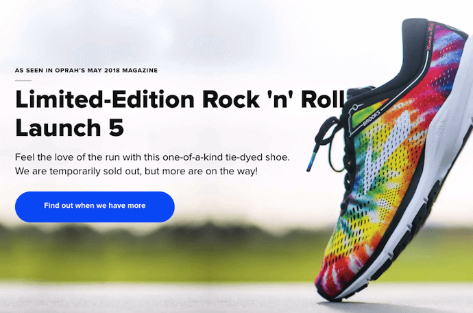
Like any other UX element, the call-to-action button should be personalized for your specific brand and product. If you sell beauty products, you can incorporate a CTA like “Take the quiz” to encourage the user to discover the most suitable product for them. Or if you want someone to browse your eyeglasses catalog, use a CTA that says “See all glasses.” Be specific and let people know what they will get after completing the action.
5) Personalization
Personalization causes an immense response from users. Barilliance reports that 80% of shoppers would be more willing to buy if the company offered personalized products. In fact, the purchase rate of personalized products is 170% higher than of non-personalized ones.
One of the easiest and most effective ways to add personalization to an e-commerce store is adding a “Recommended for You” section to the product page. To do that, you can use a product recommendation engine which would analyze users’ behavior and draw a correlation between the products they’ve already purchased and the other products in the store.
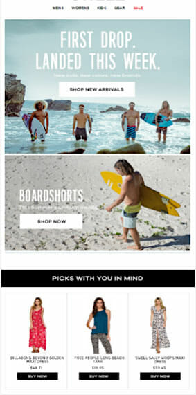
In addition to product recommendation, you can also show a user’s previous searches in the search bar, send personalized emails, or offer loyalty programs.
6) User-friendly UX
Modern users do not have enough patience to perform dozens of actions to complete one simple order. It is therefore critical to optimize your website UX in such a way that the user can find the desired product quickly and effortlessly.
Some UX optimization tips that e-commerce marketers use are:
- Minimize the number of steps for product checkout
- Use automatic credit card recognition
- Use autofill for the user’s form
- Allow the user to type in their full name instead of having separate first and last name boxes
- Eliminate unnecessary filters
Though seemingly minor, these things can impact conversion rates positively as they decrease the time that the user spends on in-site activities.
7) Social Media Presence
Here’s a quick reminder about the role of social media in the development and growth of companies across all industries: 30% of shoppers would be likely to buy from social media platforms like Twitter, Facebook or Instagram, and 23% of shoppers are influenced by social media recommendations.
While Facebook remains the leading platform for businesses to sell and promote their products, Instagram and Pinterest are close seconds. Last year, both platforms introduced new shoppable features that make advertising both natural and engaging.
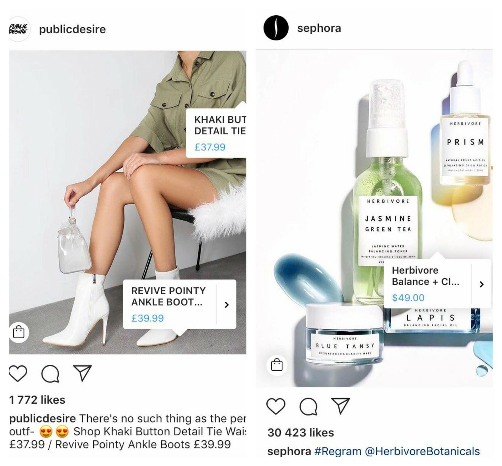
Instagram now offers businesses an option to tag their products either in regular posts or in the Stories. Once the user taps on the product, they will be able to see a short description with a price and follow the link to the more detailed product page with an opportunity to buy an item right away.
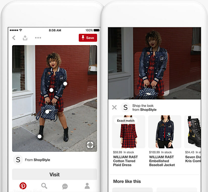
As for Pinterest, it has a somewhat similar feature called “Shop the Look.” The platform now has pins with white tappable dots, placed on the shoppable items. If interested, the user (similar to the process on Instagram) can tap on the dot and see more information on the product and a link to follow.
A social media presence should be unique for every business in accordance with their products and goals. But it’s not enough to be present on social media only – it’s also important to add the social media buttons to your store directly to show users where they can find and follow you.
Dive Deeper:
8) Use Chatbots
Due to the popularity of technological innovations within the e-commerce industry, the majority of online stores now have chatbots – smart virtual assistants that bring many benefits to the companies and the users. These automatic and intelligent helpers give personalized recommendations, save time and can even perform simple tasks like adding orders to a cart or tracking the order.
E-commerce is not the only industry that uses chatbots. In banking, such bots can perform easy financial transactions, in healthcare, chatbots can identify whether the user needs immediate assistance and call a doctor, and in the hospitality industry, brands like Airbnb are using them to help customers book flights or accommodations.
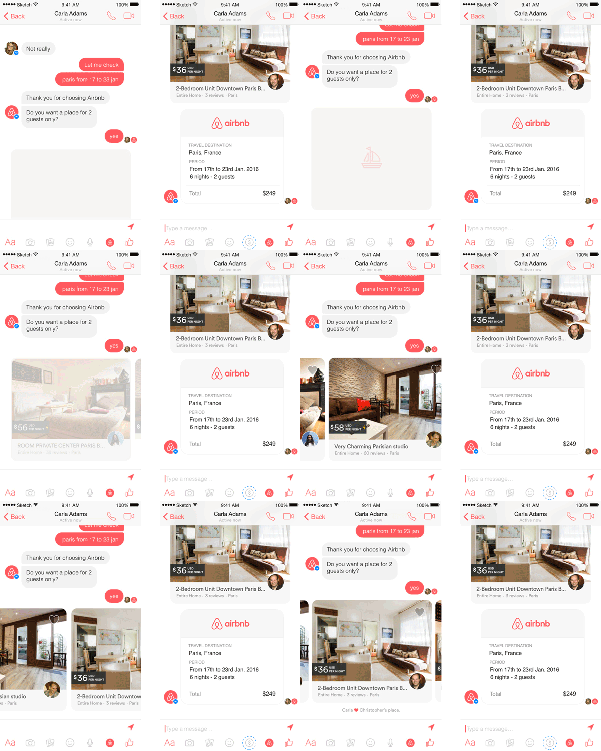
Because of their ability to increase customer loyalty and satisfaction, the implementation of chatbots is a must for any company that wishes to retain the user and provide them with a seamless experience that result in more conversions.
9) Use of Videos
Interestingly enough, the use of video on the homepage can increase conversion rates by 80%. While some marketers may doubt it, numbers don’t lie and numerous tests prove that people react to video much better than they do to simple images or text.
There are some general guidelines to follow before adding a video to your homepage:
- Choose a custom thumbnail. If possible, use one with a smiling person or another similarly attractive image.
- Create a video according to your goals. Do you want to tell your brand’s story, describe your services or simply welcome the user?
- Keep it short. The video should be 1-1.5 minutes long, otherwise, the user may lose interest:

10) Value Proposition
It is a must for any e-commerce store to have a value proposition on every page to remind users about the benefits they will receive after completing a purchase from the store.
A value prop can contain information about free shipping, discounts or special offers. It is anything that you are willing to give away to the users once they complete a conversion. The value prop is normally placed at the top of the page and should be visible (otherwise, it will be useless). You can A/B test how users perceive your value prop and choose the one that works the best for your business.
11) Mobile-Friendly
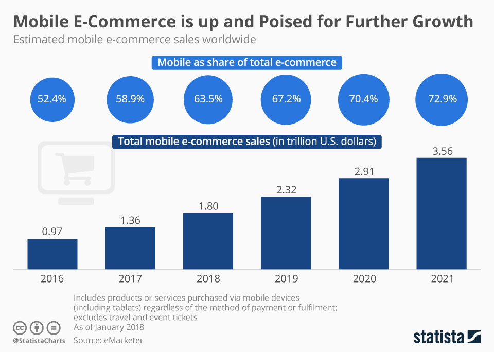
The biggest thing that companies have to keep in mind is the fact that the majority of users browse online stores via their mobile devices. It is, therefore, crucial to make the design and navigation of your site mobile friendly.
Optimization of an e-commerce store for mobile includes many aspects: The user should be able to navigate easily on the small screen, every clickable element must be responsive, and images should remain high quality in both the mobile and desktop versions.
An interesting fact is that mobile is getting higher priority than desktop. Google recently introduced mobile-first indexing, meaning that the crawlers will first inspect and index the mobile version of a store and only then will it proceed to the desktop one. So pay attention to SEO and make sure both mobile and desktop versions perform equally well.
12) Guest Checkout
We already spoke about cart abandonment and the biggest reasons behind it. In addition to process complexity and hidden costs, another major reason that users leave their cart is the lack of a guest checkout.
Obligatory registration requires a certain amount of time and, therefore, not all users are willing to fill out a few forms before buying a single item. Upon offering a guest checkout option, you will see an increase in conversion rates almost instantly.
Some stores set the guest checkout as a default option, but you can provide users with a choice and add value to the proposition of a sign-up (i.e. “Sign up and be the first to hear of new products!”).
Dive Deeper:
13) Pay Attention to the Content
Some marketers tend to ignore the written content and instead pay attention to only the visual elements. However, good copy always sells and is the exact element that contains the message you want to communicate to your customers and prospects.
Here are some tips on creating good (and converting!) copy:
- Keep it short as nobody has time for massively long reads. Users came to your store to buy, not to read.
- Make your content SEO-friendly.
- Keep the tone entertaining, friendly and valuable for the user. Your copy should reflect the nature of your brand.
- Your content should always have value. Do not write a lot in order to fill in the blank spaces – instead, write a few lines but make them outstanding.
- Be creative and descriptive in every element that contains copy: CTAs, product descriptions, value props, page titles, headlines.
14) Offer Incentives
When Joseph Sugarman wrote about psychological selling triggers, he mentioned reciprocity. When a person receives something, either a gift or other small incentive, they will feel as if they have to give something back. That’s what reciprocity is about and it can be successfully used to boost sales and convert users into customers.
You can offer new users a discount or a gift as a way to welcome them or offer a gift to loyal users to thank them for staying with you. Either way, this gesture will show that you care about your customers and do not resort to pushing them to buy. This will create a sense of gratitude and cause positive emotions that inevitably affect buying decisions.
15) Upsell
Upselling is a process of persuading a customer to buy more from you. While it may seem like something negative and over-persistent, this is quite a good technique if done right.
One of the most popular ways to upsell is to include “Customers also buy” or “Goes well with” products on the page of a specific product.
Another way to upsell is to actually offer a customer additional items before you ship their order. I.e. if you send an email confirmation about the order, include additional items and offer to allow the user to add them to the cart before the order is shipped.
16) Natural Advertising
Research by Adobe reveals that 58% of brands consider their paid advertising to be efficient – while only 38% of their customers agree.
As the costs of digital advertising keep growing, natural advertising is becoming more and more popular. Its main idea is keeping the ads “natural,” meaning that they should look native in the user’s feed:
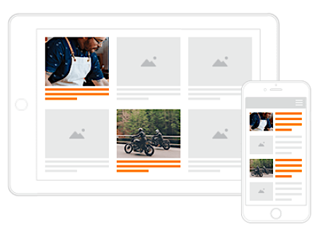
Word-of-mouth marketing, user-generated content, and the use of customer reviews – all these methods help marketers create more user-friendly and engaging content.
Dive Deeper:
17) Visible Search Bar with Automated Suggestions
One small trick that has a big impact is: replace a search icon with a search bar.
Search bars are bigger, more visible and, thus, have a higher chance of engaging the user: 43% of website visitors go straight to the search box or search bar. And companies that switched to a search bar saw higher conversion rates – users are 2-3 times more likely to convert.
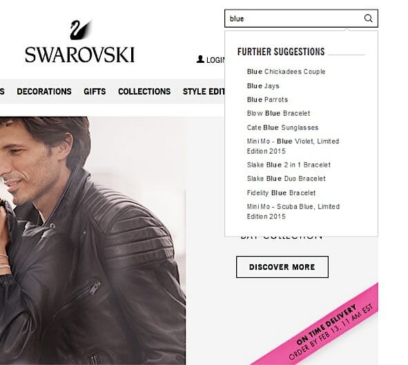
A search bar is a must-have for any e-commerce website but is also helpful if you want the user to quickly find an article or any other information. And it’s a good idea to use auto-suggestions and typo correction to provide accurate results.
What’s Next?
Whether you have an e-commerce store and wish to leverage its performance or you are a digital marketer from another industry and are looking for new methods to try, these techniques should boost your conversions.
A good, converting website is:
- SEO-optimized
- Fast, with high load speed
- UX-friendly
- Feature-rich
However, before implementing any changes, you first have to have a clear understanding of what areas you want to improve. Do you want to sell more, increase traffic, or expand your audience reach? You should then adjust your strategy in accordance with set goals and KPIs and by using some of the described techniques.