A clean, modern design can be effective for an ecommerce store. It prevents shoppers from being overwhelmed with excessive content, confusing menus, and aggressive sales promotions — allowing stores to create sales through a focus on products.
Here is a collection of clean, modern ecommerce sites. There are fashion sites, specialty boutiques, and design-focused brands.
Harry’s
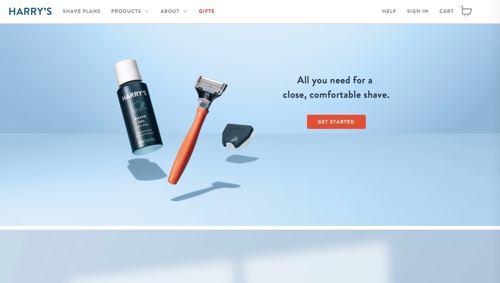
Harry’s mission is to deliver functionally-designed razors and affordable replacement blades. The simple image and bold text on the home page reinforce Harry’s basic product design — it’s all you need.
—
Hardgraft
Hardgraft, a retailer of leather and fashion goods, uses limited text, a bold mission statement, and compelling product images.
—
Eden
Eden sells handcrafted, wooden iPhone cases. It uses textured background images to highlight the elemental design of its product.
—
Saturdays NYC
Saturdays NYC, a clothing and accessories retailer, mixes compelling product imagery with editorial content and video. The placement of a black-and-white video montage loop at the bottom of the menu is a cool, non=traditional conclusion of the experience.
—
Anglo-Italian
Clothing retailer Anglo-Italian has a clean, minimalist layout on the main menu that’s functional for shoppers. Product descriptions are reserved for product pages.
—
Bacca
Bacca is a site for hand-made wooden stands for laptops and instruments. The simple home-page image highlights the design of the product.
—
Oyyo
Oyyo is an independent design studio and producer of unique-textile interior products. The functional menu design shows Oyyo’s carefully constructed collections, the designers, and the shop.
—
Schmeck
Schmeck lets its children’s clothing shine throughout the site, as it’s filled with useful and captivating product images.
—
Not Another Bill
Not Another Bill sells curated gifts from around the world. The home page contains a simple set of dropdowns to select gift types and recipients.
—
Manolo Blahnik
Manolo Blahnik accentuates its minimal design by presenting its luxury shoes in an off-grid layout. The shadow on each shoe reinforces each unique design.
—
FootJoy 1857
FootJoy 1857 sells golf accessories. It uses edge-to-edge video to emphasize the classic elegance of its golf shoe in action.
—
Seedlip
Seedlip produces and sells herb-based cocktails and other drinks. Its site highlights the basic pouring of its spirits as a compelling, full-screen video background to its menu.
—
Kuum
Kuum is a retailer of colorful block puzzles. Its colorful animated menu simulates the experience of playing with each Kuum design.
—
Kvell
Kvell sells modern home furnishings with a mission to make contemporary and functional design attainable to everyone. Its simple and intuitive navigation allows users to select larger collections and images before needing additional text.
—
Bellroy
Bellroy is a wallet and carry-goods company with a mission to help the world carry with greater simplicity and ease. In addition to the clean product layout, the site uses animated video and a simple animated slider to demonstrate the design of its wallet.
—
Othr
Othr sells unique objects with minimal environmental impact. The site’s clean design and beautiful product imagery support that mission.
—
Leen Heyne
Leen Heyne produces and sells fine jewelry. Many of its pieces are crafted from just a single band of metal with twists. The sparse layout with contrasting angles and colors help to display the elegance of each piece.
—
Tinker
Tinker builds high-quality, minimalist watches. The spare menu design focuses on the quality of the watch components and the simplicity of the product.
—
MA&LO
MA&LO is a contemporary Italian shoe company with a handcrafted tradition. The simple deconstructed menu reflects the edgy, contemporary lifestyle feel of the brand, while the product images display quality.
—
Haikure
Haikure is a fashion brand, established by C&S Jeans, that takes its name from the minimalist Japanese poetic composition. Its home page is composed of images and sparse text. Main menu images lead to lookbook images rather than to shopping pages.
