In October, we put out a call for your best emails as part of the Email Excellence Awards.
And DID 👏 YOU 👏 ALL 👏 DELIVER.
A big thank you to everyone who submitted their email for consideration. Judging this year’s submissions was no easy feat. Not just because of the volume (nearly 300 entries), but because of the quality of entries. The work this community puts out is truly top-notch.
All submissions and nominations were judged by a panel of email experts from Litmus and around the email community, including:
- Anne Tomlin, Founder of Emails Y’all and Email Loot
- Jen Capstraw, Co-Founder of Women of Email
- Jaina Mistry, Senior Manager of Email Marketing at Litmus
- Cynthia Price, VP of Marketing at Litmus
- Jess Materna, Director of Product Marketing at Litmus
- Lily Worth, Email Design and Production at Litmus
The winners of the Email Excellence Awards were announced last week—and now we’re sharing them with you here. In addition to the winners of each category, we’re highlighting the honorable mentions. Meet the seven award winners!
Best Email Design
Submission from: Shannon Gray, Creative Director at Rejoiner
Rejoiner did an incredible job creating an email for H.V.M.N that’s both captivating and conversion-oriented. They leveraged research showing people are more likely to act on information they learn from comics than text alone. To do so, they created playful animation that compares the sugar levels in H.V.M.N. Keto Food Bars versus other “healthy” bars.
At least two members of our panel clicked through to their site while judging. This first-hand experience proves why they took home the award for best design.
Plus, check out that fun GIF showing the different Keto Food Bar flavors—makes you want to try one, right?
Best Use of Personalization in Email
Submission from: Madeline Buhr – Data Driven Marketing Lead at Foodstuffs NZ

This was by far the toughest category for the team to judge—but Foodstuffs NZ’s campaign for the New World Beer & Cider Awards took the cake.
The level of thought and detail that went into this campaign was extraordinary. Their team prepared different emails and journeys based on past purchases. Customers who had bought more than three bottles of beer or cider in the last 13 weeks went into one segment, and customers who had not purchased any beer or cider went into another.
Beer lovers received an email highlighting the award-winning beers and ciders. Foodstuffs was aware this audience knew their beer, so they focused on getting customers to vote for their favorite beer in the “Battle of the Beers.”
Customers who were not engaged with beer and cider—but who had purchased from Foodstuffs recently—received recipe inspiration and pairing recommendations. The introduction of beverages to these “Foodies” was more subtle than in the beer-related email.
The results speak for themselves: 15% of customers who received the email purchased an award-winning beer or cider from New World. Foodies targeted spent 22% more than the control group.
Best B2B Email
Submission from: Brandon Lawson, Email Marketing Strategist, Development at Ferguson

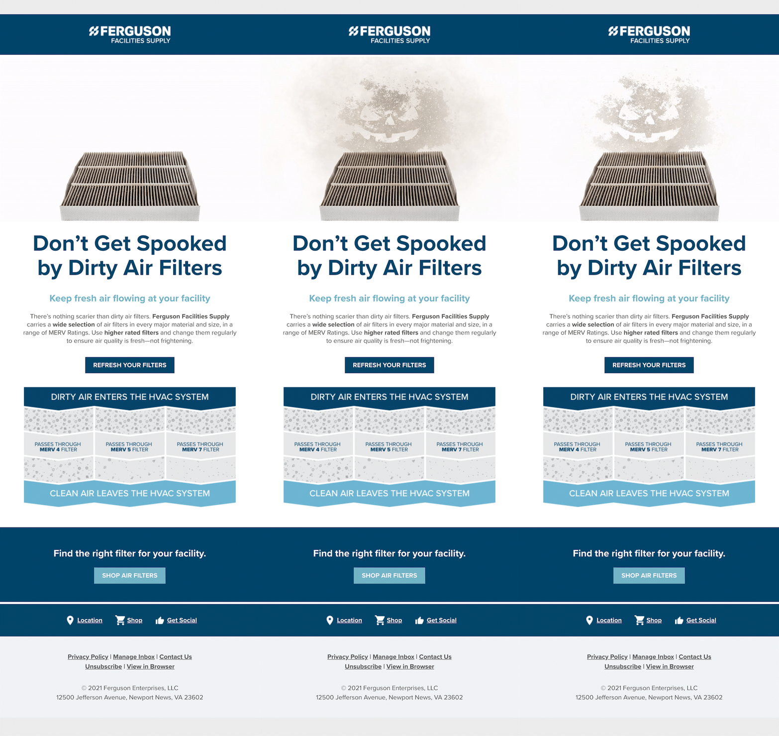
Ferguson Enterprises surprised us all by taking something uninteresting (HVAC filters) and making it fun. Judge Jaina shared, “In B2B, it’s hard to get exciting and fun. Ferguson did it in a good way—and they tied in Halloween without making it too gimmicky.” Judge Lily chimed in about how this email was Dark Mode optimized. And Judge Jen summed up all of our thoughts when she said: “I love this email. It’s delightful.”
From a design perspective, the inverted pyramid layout, encapsulated CTA, and CTA at the bottom stood out as a clear example of a well-designed email. Well done, Ferguson!
Best B2C Email
Submission from: Marc Verity, Email Marketing Specialist at Alterra Mountain Company

This email from Alterra Mountain Company was one of a five-part series that asked prospects to provide information in exchange for a ski pass discount code. We love that Alterra used segmentation to send a longer, more thoughtful email campaign. For instance, after the initial introduction, Alterra targeted communications based on past engagement with emails and prospect activity.
And the results weren’t too shabby either. Alterra’s team surpassed nearly every KPI they set for the campaign, including a form completion rate that was 144% higher than expected.
Best Agency Email
Submission from: Mike Zimin, Art Director at DAU Relationship Marketing

DAU Relationship Marketing really impressed us with their creativity. It’s hard to get more than a few seconds of someone’s attention and their email makes you want to read the whole way through—a common theme in their submissions. Being able to capture a reader’s attention that long is a superhuman effort.
Not for nothing, the trolling of Black Friday marketing also had us LOL’ing. And DAU’s sales team saw an uptick in upsell opportunities as a result of this communication. We admire your creativity, team!
Best Multi-Channel Campaign
Submission from: Joy Weddle, Email Marketing Strategist and Anna Carris, Email Marketing Specialist at Clayton Homes

TikTok and email to promote modular homes? It’s a creative mashup of social and email marketing that has plenty of likes from our team.
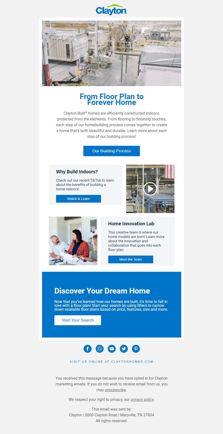
Clayton Homes created a TikTok video showcasing how their homes are built—then embedded the content in an email that showcases their building process and encourages readers to start designing their dream home.
What we thought was cool about this email was that the TikTok video was seamlessly embedded in the content. When running a multi-channel campaign, you want to repurpose content, but not just copy and paste across platforms. Clayton Homes designed a video that worked for each channel to appeal to users across platforms and throughout the consumer journey.
Overall Best Email Winner
Submission from: Nicholas Harvey, Senior CRM Marketing Manager at Vitality
Of all the emails we reviewed (did we mention there were 300?), this one stood out for all of our judges. It’s not one you can easily forget which is why it took the top spot!

Vitality launched a new car insurance product—and Nicholas Harvey knew parallax was the way to go, which you don’t see used too often. It’s when an object on your screen moves at a different pace than the surrounding objects.. In this case, you see a car “driving” down the email in the background.
This email was not only engaging, but also super thoughtful. The scenery along the “road” ties into Vitality’s core purpose of incentivizing people to make healthier choices. Judge Lily noted that the fallback works gracefully.
Judge Anne remarked, “This made me scroll all the way to the bottom. I wanted to see the entire thing.” Judge Jen loved the engagement this email got, saying: “For a new product, this level of engagement is solid.”
Honorable Mentions
There were too many good entries to not give a nod to the following folks:
Congratulations to our winners and we look forward to seeing what kind of creative ideas you submit in 2022!
