One website, many audiences. It’s a common challenge for every marketer who must define primary demographics, prioritize content, and extend messaging. Convince & Convert knows that practitioners of all experience levels require underlying principles, as well as specific examples, to be successful.
We decided to follow up from our first look at Social Media Lessons from the Best American Hospitals and extend our research to identify digital best practices that can be used across industries. How better to educate ourselves and others, then by examining the top universities in America?
How We Identified the Best University Websites
For this report, Convince & Convert reviewed the top 50 universities in the United States, based on undergraduate enrollment size, in order to see how the largest schools represented themselves through their primary online presence. We established a 100-point scoring system and analyzed each university’s website against both quantitative and qualitative criteria.
Quantitative Score: Using tools from Google, BuzzSumo, and Pingdom, we tested for four parameters—Mobile Site Friendliness, Number of Backlinks, Number of Social Shares of Website Content, and Homepage Load Time—and assigned each college a maximum of 40 points.
Qualitative Score: From the Quantitative results, Convince & Convert narrowed down the list of schools from 50 to 25. We then evaluated those institutes’ websites on an additional five criteria—Clarity of Brand/Identity, Ease of Use for Students, Ease of Use for Parents, Ease of Use for Alumni and Donors, and Ease of Use for Faculty and Staff—for a maximum of 60 points.
Universities Leading the Way
Total scores across the top 25 schools ranged from a high of 90 points down to a low of 38; considering these were the largest schools in the country by enrollment size, we found it intriguing to see this rather wide variance in digital performance.
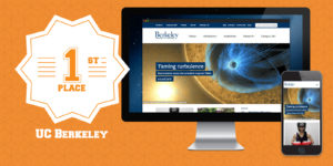
University of California Berkeley received the highest score, with University of Illinois Urbana-Champaign and University of Michigan each trailing by a difference of less than 4 points.


Top 5 Factors for University Website Success
By looking at both the desktop and mobile versions of the top 25 university websites, Convince & Convert identified five best website practices.
1. Site Navigation
Each college had their own way of designing and displaying website navigation, but the ones that were most successful kept it simple. Menu items were labeled concisely, in common terms that would be understood by the broadest audience. In addition, limiting the number of top- and sub-level navigation choices made it easier for website visitors to follow their own specific path toward content they are most interested in.
#ProTip: Look at your site #analytics in terms of visitor behavior to identify successful paths toward high-demand content as well as potential dead-ends or blockages. #UX Click To Tweet
2. Mobile Experience
While all of the college websites we reviewed were viewable on mobile devices, many of them were clearly migrated over from their original desktop versions with little consideration for on-the-go users. We found the best mobile experiences came from universities who designed for small-screen readability, minimized bandwidth-heavy imagery, and prioritized which content to display.
Just because your website is viewable on mobile doesn’t mean it’s functional on mobile. Test your site on handheld devices in real-world situations to maximize usability. #mobileux Click To Tweet
3. Relationship Building
Convince & Convert was surprised to see how many universities treat their website homepage like a news portal rather than an institute of higher learning. It’s certainly understandable to want to highlight current updates, but this approach illuminates a potentially damaging attitude. A university earns its students, faculty, and donors through long-term relationship building, but if the first impression a potential student receives is not “how may we help you develop your future?” but “hey, look how awesome we are so you should come here,” it’s easy to turn a first visit into a last visit.
Consider your website homepage from a first-date point of view. Are you talking only about yourself, or are you genuinely showing you’re interested in your visitor? Long-lasting relationships are not built on selfishness. Click To Tweet
4. Branding
It’s essential for any business, including one in higher education, to definitively show a USP (unique selling point). However, Convince & Convert’s research concludes that—beyond a few notable exceptions—most university websites simply don’t do well at differentiating what’s unique about their school. Branding needs to stand out, intrigue, and inspire your audience in order to win customers.
Learn to live and breathe your value proposition. If your business can’t clearly communicate what makes you unique, why should your potential customers care? Click To Tweet
5. Calls to Action
A university beneficially contributes to the education and development of numerous individuals, but it is still a business at its core. As such, it’s critical to maximize the inflow of monetary streams and provide as seamless a process as possible for potential and existing clients. The most successful schools in our report made their audience calls to action very clear. “Students, Alumni, and Donors” sections were prominently labeled, with easy paths to transactional closure.
To maximize results, a business must focus on the most profitable actions. Follow the #ParetoPrinciple (aka 80/20 Rule). Click To Tweet
Put Best Practices To Work
The best website practices Convince & Convert discovered are important because the learnings we share in this paper go beyond the higher education vertical. Any large organization responsible for communicating with diverse, sizeable audiences can learn from our results and apply them for improved audience reach. Do you have some best website practices from your specific industry? We’d love for you to share them with us.
Download The Best Websites Among America’s Top Universities for more insights.