It’s that time of year again — time to release our rankings for the top 25 best university websites in the United States.
In the inaugural version of our report report (2018), we expected to rank top American university websites and find a clear winner. Instead, we discovered five primary themes around which the most successful schools focused their website marketing efforts. In the new version of the report we did for 2019, we continued with our same methodology and found many of the schools made huge improvements to their websites. Congrats!
These themes are important because the learnings we share in this research go beyond the higher-education vertical. Any large organization responsible for communicating with diverse, sizable audiences can learn from our results and apply them for improved audience reach.
Best University Websites for 2019: How We Identified Them
For this report, we reviewed the top 50 universities in the United States, based on undergraduate enrollment size, in order to see how the largest schools represented themselves through their primary online presence. We continued on our established 100-point scoring system and analyzed each school’s website to explore the effects of both quantitative and qualitative factors.
Quantitative Score: Using tools from Google, SEMRush, BuzzSumo, and Pingdom, we tested for four parameters—Mobile Site Friendliness, Number of Backlinks, Number of Social Shares of Website Content, and Homepage Load Time—and assigned each college a maximum of 40 points.
Qualitative Score: Once the universities were reranked based on these quantitative scores, we next chose the top schools and evaluated each based on five qualitative features: Clarity of Brand/Identify, Ease of Use for Parents, Ease of Use for Alumni and Donors, Ease of Use for Students, and Ease of Use for Faculty and Staff. Each measurement was assigned a value of 0, 6 or 12 points, for a 60-point maximum.
Best University Webites: The Top 3
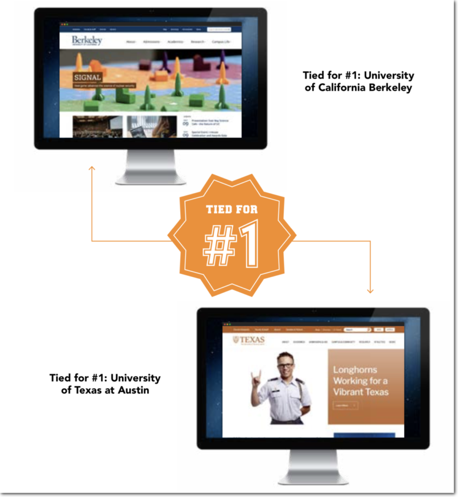
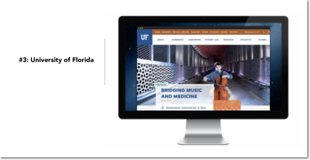
For 2019, top honors are shared in a tie between University of California Berkeley (last year’s #1 ranked) and University of Texas at Austin, each receiving the highest total grade of 95 out a possible 100 points. University of Florida ranks third with 88 points.

Download the full report
Top 5 Factors for University Website Success
Our initial goal for this report was to share a list of top U.S. university websites based on typical web KPIs (key performance indicators). However, as often happens during the course of research, conclusions are apparent that were broader
in scope than black and white numbers.
Below are the five primary themes we discovered around successful university website marketing.
1. Navigate Without Mystery
Visitors should never have to guess at what a navigation label means. The universities who did the best job used very clear and simple terms in their navigation, such as “Admissions & Aid,” “Academics,” “Research,” “Alumni” and “Athletics.” These standard phrases have consistent meaning and enable users to identify quickly the preferred starting point into the site.
#ProTip: Visitors should never have to guess at what a navigation label means. #UX Click To Tweet
2. Maximize the Mobile Experience
Today, website visitors are digital natives expecting information wherever they go. This paradigm shift necessitates a mobile-first approach to design. While all university websites we evaluated for this report were viewable on mobile devices, many had design or content issues that downgraded performance and general usability.
Mobile website users need information fast, without extraneous fluff or unnecessary levels of complication. This means that you must evaluate existing website content and decide what is most important to their roving audience.
Mobile website users need information fast, without extraneous fluff or unnecessary levels of complication. #mobileux Click To Tweet
3. Establish a Relationship
During our research, we noticed an interesting trend: a number of colleges focus much of their website homepages on latest news and upcoming events. This is not necessarily a bad content choice. It’s understandable that a university wants to showcase exciting updates.
Our primary concern with this approach is that new visitors are presented with content that largely caters to individuals—such as current students and faculty—that are already vested in campus activities. In addition, even on-location users might not find news and events of particular value, given their broader opportunities to locally learn about these without visiting their college’s website.
The solution is to think of your website visitors as an ongoing relationship, not a one-time date.
4. Define Your Unique Selling Proposition
There’s no denying that enrolling in higher education is one of the biggest—and most daunting—investments an individual or family will make in a lifetime. Numerous considerations go into selecting a university. For some students, attending a certain college means carrying on a parental legacy. Other students are drawn to specific schools for their unique opportunities in specialized fields of study. And for many individuals, the decision is primarily based on fiscal drivers in the form of residency, scholarships, or tuition assistance.
Our research concludes that most higher educational institutes don’t do well at differentiating what’s unique about their school. Design layout, imagery, and content tends that are fairly bland don’t help the school standout against the competition.
5. Enable the Action
Higher education institutions are a business that, like every company, makes money from obtaining and retaining customers. Universities may call their them “students,” “alumni,” and “donors,” but the end goal is the same: revenue.
Most marketers are aware of the Pareto principle, more commonly referred to as the 80/20 rule. Roughly speaking, this credo predicts that 80% of results come from 20% of activity. Therefore, to maximize results, a business should focus on their most profitable actions.
To maximize results, a business must focus on the most profitable actions. Follow the #ParetoPrinciple (aka 80/20 Rule). Click To Tweet
Put Best Practices To Work
The best website practices we discovered are important because the learnings we share in this paper go beyond the higher education vertical. Any large organization responsible for communicating with diverse, sizeable audiences can learn from our results and apply them for improved audience reach.
