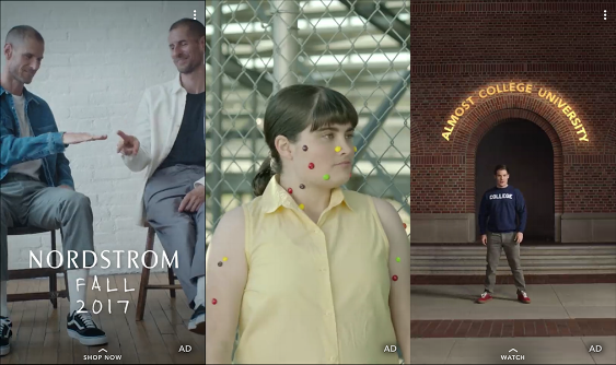
From Instagram Stories to Snapchat Discover, vertical video is proving itself a robust new medium that is defining the aesthetic practices of native content for phone screens.
We’ve previously covered the vertical video basics regarding location selection and composition. For the final article in this series, we’ll take a step back and explore the possibilities, new traditions, and considerations to make when planning content for the full screen phone.
Here are three key elements to consider.
1. Modular Editing and Design

It’s time to stop thinking of vertical video as only video.
With audio increasingly ignored in the consumption of social and mobile video, copy and design elements are now the principal means of storytelling. Video is starting to look like Harry Potter-esque magazines, where multiple images, videos, text, and design elements all animate together and work in tandem.
The layout and design of your vertical content is critical to capturing attention and maximizing resonance.
2. Playing with the Medium

Thinking outside the box and surprising audience’s expectations is always refreshing in all mediums, and mobile video is no exception.
Emulating the phone’s screen, tinkering with the “taking over your phone” effect, or creating your own interface are all good examples of how you can take advantage of the broadcast platform – the smartphone – to make video content that stands out.
3. Framing Subjects

While vertical video allows for many new ways of conveying a message, framing human subjects has proven to be difficult, and picking the right shots is more important than ever.
Close-ups and two shots are especially tough to pull off, and the vertical frame can isolate individual subjects. Repurposing conventional live-action video for phones can be a design disaster, so always keep in mind how the frame will look when cropped in the storyboarding process.
Now that you got the basics down, the most important next step to making vertical video work for your brand is to start shooting. Take the time to try things out, and you’ll be well on your way to creating some forward-thinking mobile videos that will definitely stop thumbs in the feed.
This article was originally published on Likeable Media’s Blog
