Your website is a big deal. And even if it’s only a few months old, the odds are high that it’s already somewhat outdated.
Keep in mind that your website doesn’t just increase your visibility on the Internet. It’s also usually a consumer’s first interaction with your business. More than 65% of your target market is going to check out your website before they ever set foot in your store.
For a lot of people, your website may be the only way they’ll ever interact with you. Given that 51% of U.S. consumers prefer to shop online, you may never have a chance to impress them with your natural charm and awesome personal service – unless your website manages to convey those things for you.
When you refresh and modernize your website’s look, add new content, and refine your services regularly, that tells consumers that you care about their experience and stay current with trends.
Panicked? Unsure where to start? Don’t be. Follow the tips outlined below to update your outdated website.
Tackle the Cosmetic Aspects First
Don’t undervalue the importance of cosmetic updates.
Think of your website as your SMB’s homebase. If you walk into a house with avocado-colored kitchen appliances or pink-and-green floral wallpaper, it doesn’t matter how well-kept it seems. You automatically start wondering what else hasn’t been kept up to date.
To keep consumers from bouncing, this is what they need to see:
1) Simple Pages
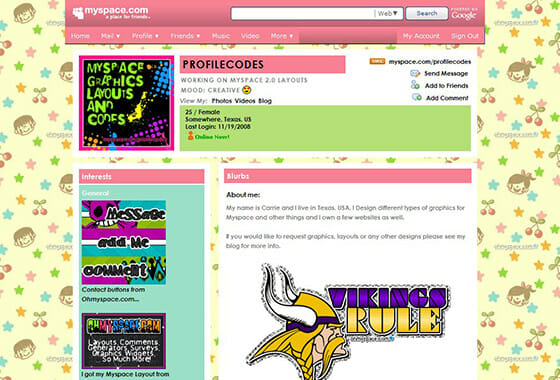
Anybody who remembers the plethora of MySpace pages with sparkly fonts, blinking graphics, and backgrounds that came in an infinite and eye-bewildering variety of patterns can understand why simple is better when it comes to a website.
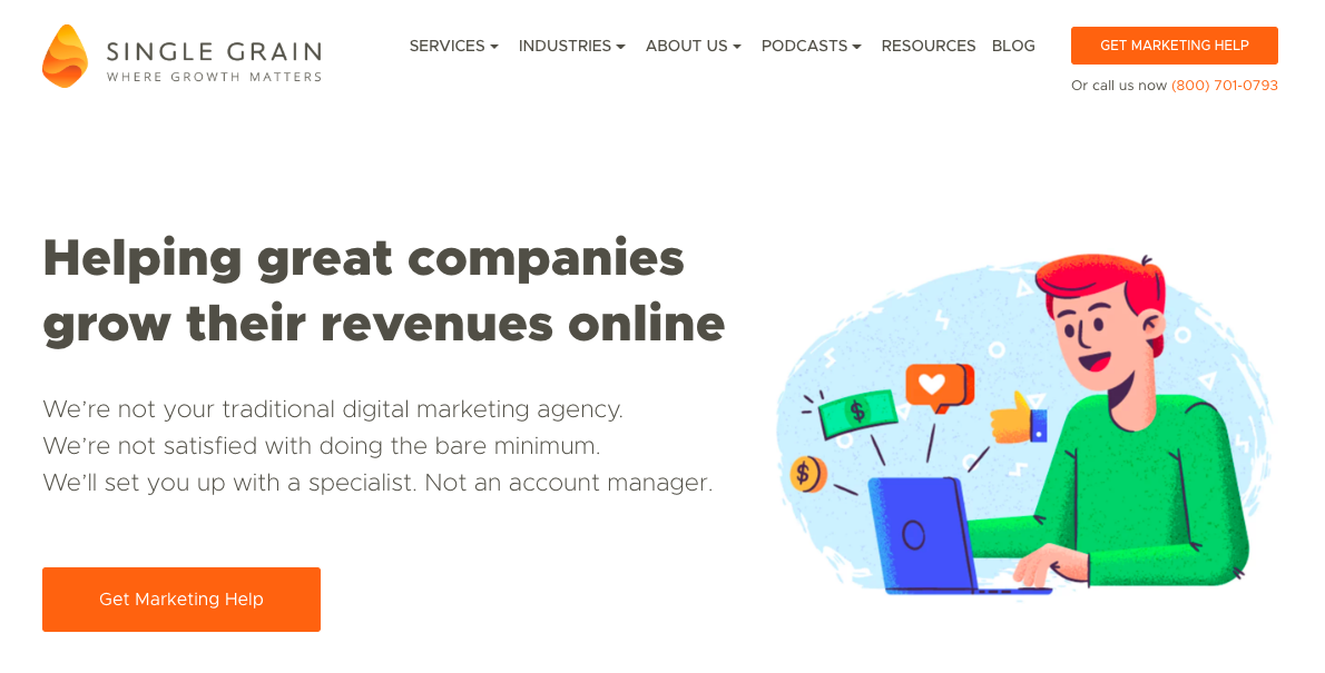
Simple doesn’t mean “empty.” You can give users the tools and features that they need without overloading them, like the homepage of Single Grain:
2) Fewer Images
Images add visual noise and make sites slower to load, which is a big drawback in an era where the smartphone has rapidly turned into the world’s favorite way to access the Internet and a page load time of more than 1.5 seconds will turn site visitors off.
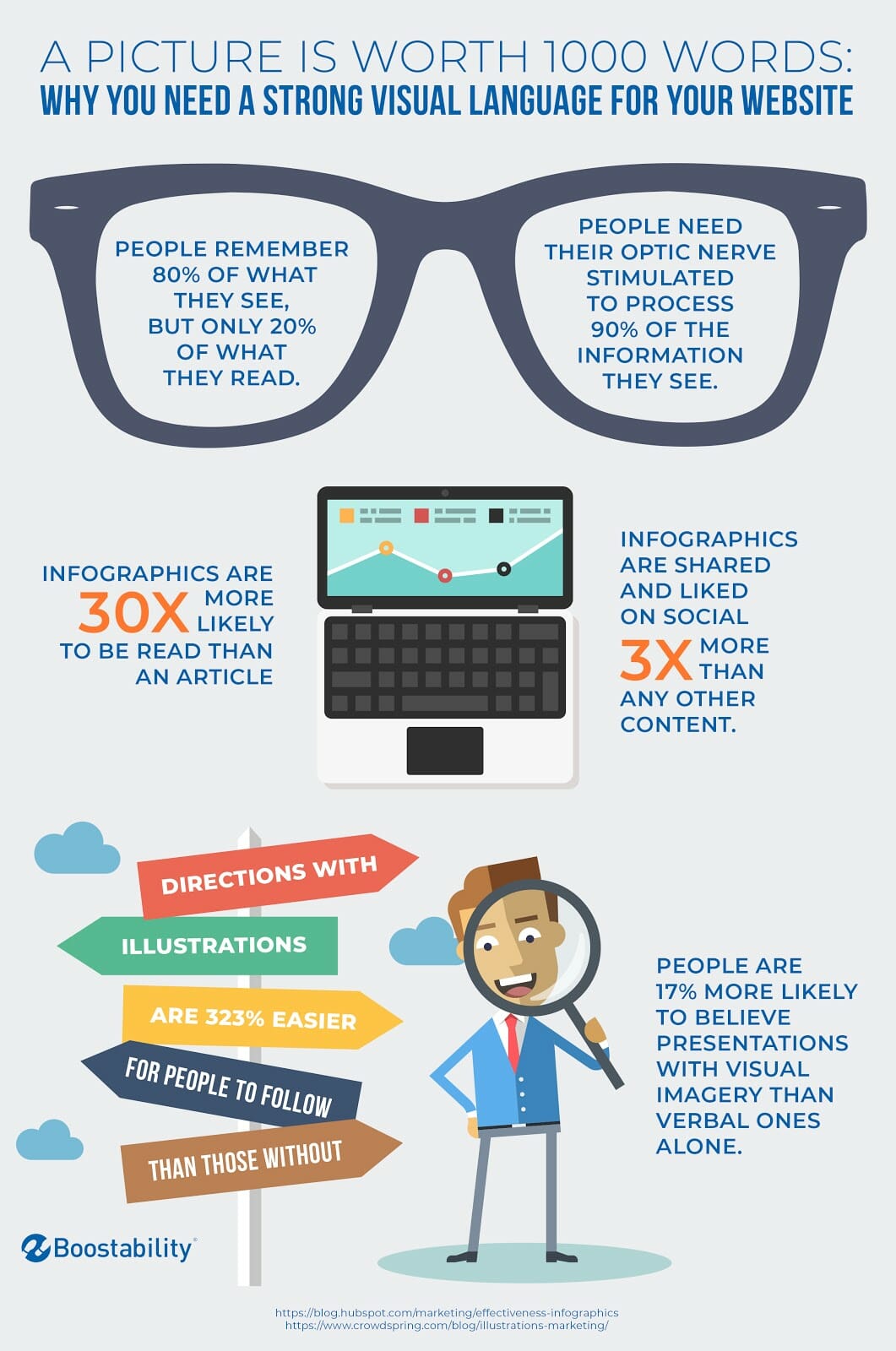
That doesn’t mean you need to ditch all the images on your site. You want some images on your site because hey’re basically brain-friendly. People absorb a lot of information from images, including things like, “Who is this?” and “What can I do here?”
You want images that clearly resonate with your target audience and say something to the viewer about your business or goals.
Source
3) Relevant Infographics
Images (aside from relevant screenshots or graphs) clutter up a page without adding much value. Infographics, however, add facts and feed the information junkies inside your consumers.
Unfortunately, consumers face a constant barrage of things clamoring for their attention. There’s about 5 times as much information presented to the average person today compared to the amount received in 1986. You need to find ways to cut through all that noise, and infographics can help you do it.
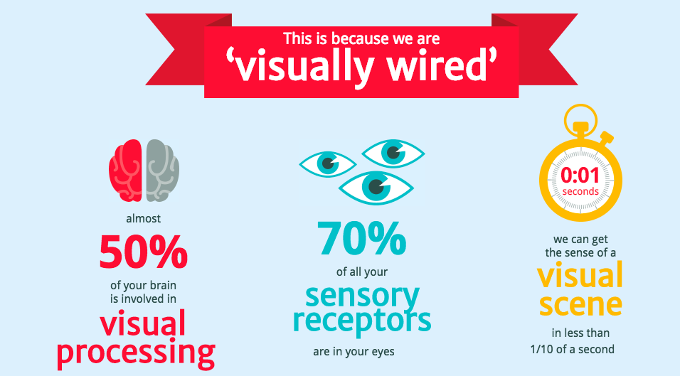
The human brain is uniquely wired to love infographics – they’re fun, engaging, easy to share, and actually make people 35% more inclined to believe what they’re reading.
Further Reading:
4) Readable Fonts
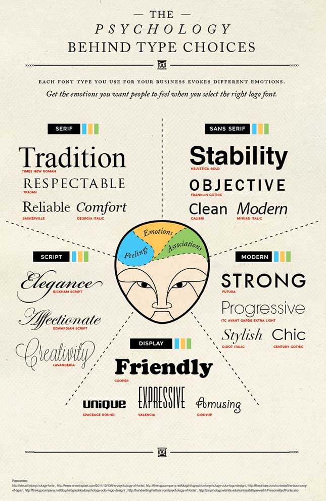
A quirky font can let consumers know you’re a playful company, while a conventional font conveys a more traditional, business-like approach. Font styles can convey subconscious messages to consumers like, “trustworthiness,” “strength,” and “authenticity.”
For example, think of the lettering you might see on a website for a restaurant that specializes in Indian food. Look at a font that conveys a sense of Indian authenticity and flair:

Now compare it with the sort of font you might see advertising a Western adventure on a ranch:

While these might be fairly extreme examples, you can use them as a base reference when you’re trying to decide what font is right for your brand’s unspoken message.
Here’s a quick reference sheet of The Psychology Behind Type Choices:
5) Consistent Color Palette
This is particularly important if you’ve chosen a certain palette as part of your brand. Some brands are so heavily associated with certain colors that it would be odd to see their website using something else.
Take Coke’s website, for example:

The iconic red and white logo takes center stage, but the muted images in the background subtly reinforce the brand’s palette in the consumer’s mind.
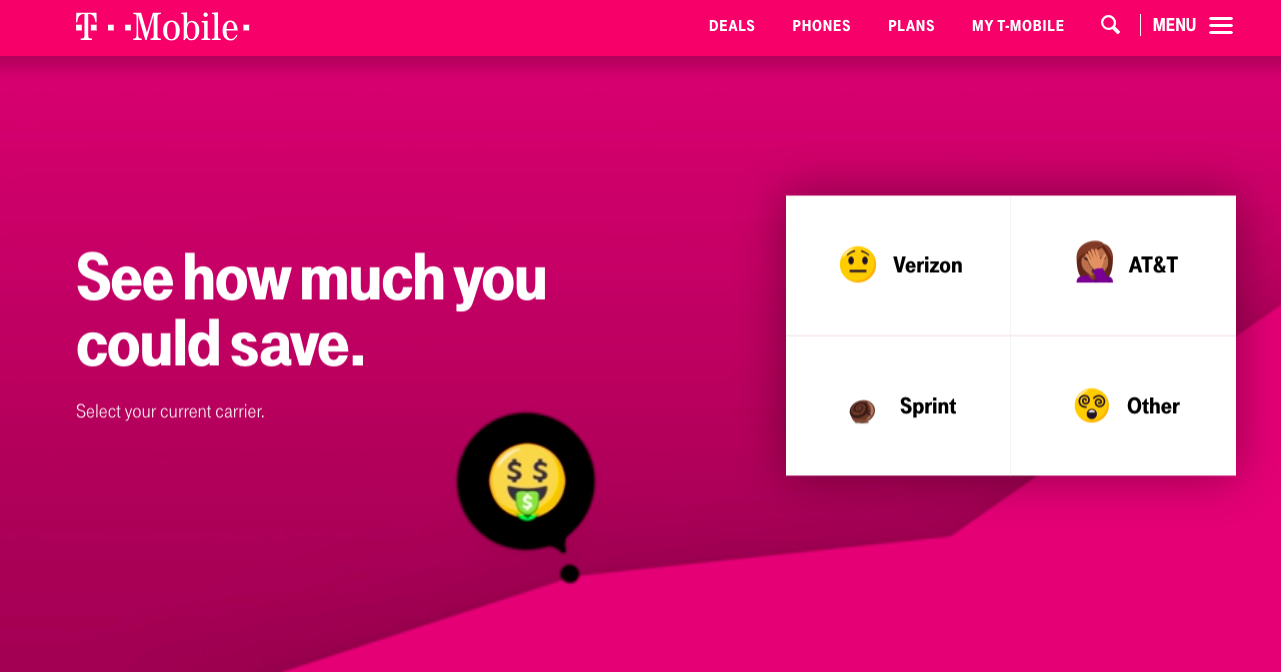
When you think of T-Mobile, on the other hand, you automatically think pink:
6) Strong Accent Color
Save the vivid accent color for the most important headlines and the eye-catching buttons that help drive prospects down the pipeline toward the conversion point where they become buyers.
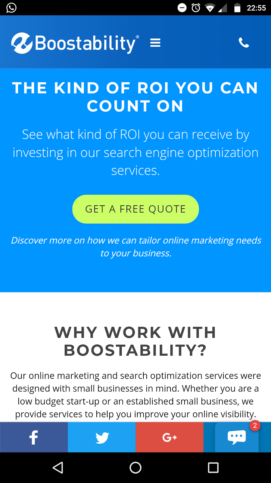
As Millennials become the majority of your consumer base, the trend toward using mobile devices to shop is only going to increase. For an optimal mobile web design, minimalism is key.
In other words, you want to think more like this:
And a lot less like this old Penny Juice site:

The understated tones from the Boostability site are easy to look at and the site is clean and minimal, while still giving viewers plenty of buttons to click and choices to pick. The accent colors help draw the eye down the page and to important parts of the page.
The old Penny Juice site is eye-blindingly colorful – and impossible to read.
Make Personal Connections Early
Use your website to make personal connections. Think it isn’t possible? Think again.
People used to divide the world into “Internet” and “real life” much more heavily than they do these days. Now, there’s only one reality, and it encompasses both the local bakery and your favorite Etsy store, or your Facebook “friends” and the friends you see in person.
Online or off, we connect with other people by sharing information. Different tactics will appeal to different people, so your website should include diverse approaches:
1) An “About” Page
Start with your mission statement – which should be crystal clear (if people have to hunt through your site or Google you to figure out what you do, you’ve already lost).
More importantly, tell them why you do what you do. What differentiates your brand from other brands offering the same product or service? You know you’re special – this is where you get a chance to tell everyone why!
2) A “Meet the Team” Page
Give potential customers the names and faces behind your company. A few light-hearted facts – like your design team’s pizza addiction or your customer service manager’s favorite book – can make you much more “real” and increase your credibility with prospective customers.
If you want a great example of a team page that has a lot of charm, check out the “Meet the ICO Team” section of friendz.io:

While it’s a little more animated than most, you can add personal color and authentic touches just through your choice of the information you share.
Further Reading:
3) Videos Showcasing Your Product
People love to know more about how a product is sourced, made, worn or used, and videos make it easy to share that kind of information and showcase your product all at the same time. Not only that, but video is a favorite source of content consumption: one-third of online activity is spent watching video.
BUFF Headwear is one of the best – and simplest – product demo videos:
If you sell a service, video infographics can help consumers both absorb more information and better understand what you do. Aim for informational or instructional pieces that show how cool your product really is.
For more examples of good corporate videos, take a look at the ones on Man Crates. What do they have in common? They’re short. They’re entertaining. They tell a story. They convey something interesting about the company or its product and customer service.
4) A Company Blog
A blog is one of the most important things you can use these days to connect to your customers. It’s a place where you can produce all kinds of helpful content for your site visitors, prospects who want to learn more and even writers who are looking for well-written content to cite. When you share your expertise, you gain credibility. When you share your positive personal experiences, you become more interesting.
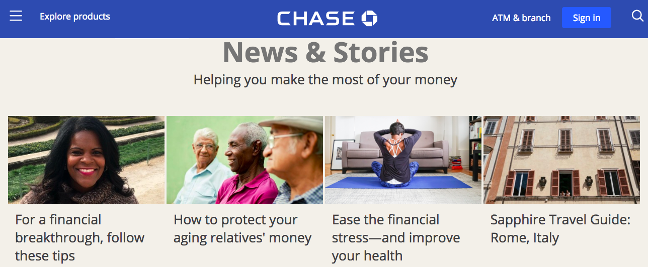
Chase is a good example of a company with a great blog. It engages its users and provides value through posts like “How to Protect Your Aging Relatives’ Money” and “Ease the Financial Stress – and Improve Your Health.”
5) Offer Verification Badges
Potential customers, in particular, need to be reassured about your credibility, so if you have it, flaunt it! A “Verified & Secured” badge from third parties like the BBB or GoDaddy can make a nervous prospect a comfortable customer.
Verification (or trust) badges are symbols like the ones pictured below that let your site visitors know that your website is secure. From Bluehost: “as many as 61 percent of participants said they had decided not to purchase a product because it was missing a trust seal.”

6) Social Share Buttons
Buttons that make sharing a post or a page to social media easy are an absolute must!

The one thing that consumers like doing more than finding or learning something cool is sharing it with their friends and followers. If you don’t make it easy for them, you’re limiting your ability to become more of a social presence.
Make sure that consumers can link your blog articles, videos, product pictures or the company homepage to Facebook, Twitter, and LinkedIn and/or photo-sharing sites like Pinterest and Instagram.
Ultimately, these personal connections and content that provides value is how you get consumers to come back to your website. Keep the content rolling – it’s okay to remix and reuse your pieces as long as they provide quality information and you keep them updated. Remember that you’re building credibility, value, and trust at the same time you’re building your website’s natural links and climbing the SEO ladder.
Further Reading:
Improve the Consumer’s Experience
Finally, you want to turn your attention toward improving the consumer’s experience. Here’s how:
- NAP: If you have a brick-and-mortar location for your store, make sure that your name, address, and phone number (NAP) are easily found on each page. You can’t afford to make your prospective customers hunt you down – they’ll just turn to the competition instead.
- Browsers: Check your site on different browsers. It’s amazing, but many people forget that there are other browsers in use besides the one they use! Make certain that fonts, colors, images, and links all show up properly in Chrome, Safari, Firefox, Microsoft Edge, and Opera.
- Seamless experiences: Aim for a seamless conversion from the regular web to mobile and back again. 90% of consumers say that it’s important to have access to content however they want it, while 83% say a seamless experience is absolutely necessary. Keep in mind that as of May 2018, Google will rank mobile-friendly sites higher and can drop a non-mobile friendly site out of mobile search results altogether.
- Email list: Collect emails from first-time viewers and get a subscriber’s list. Offer a hefty coupon for a first purchase in exchange for that email – you won’t regret it! That not only gives value for the trade, but entices prospects to convert more easily. If you offer an additional coupon for referring friends, you may even see your pages shared more often!
- Filters: Add filters to your search systems if you own a retail store with a lot of products. There’s nothing more frustrating to consumers than having to look through a 100 pairs of boots that don’t come in their size, especially when a simple filter can solve that problem.
- Voice search: Consider adding voice search – or make your website compatible with Siri, Cortana, and Alexa at least. Voice search is becoming increasingly important and integrating it now shows a forward-thinking company.
- SMS & Messenger: When a customer makes a purchase, offer tracking updates through text, Messenger or email. This is a relatively new trend, but it inspires trust on your customer’s part. In addition, add a chatbot to your site as an instant, 24/7 customer service channel for site visitors with questions.
- Verification: Follow up with a verification service. A simple text or email saying “We show the package was delivered. Did you receive it?” can do wonders for the consumer’s sense that you actually care about their purchase and experience.
- Retention: Offer suggestions for future purchases based on prior purchases or search history as Amazon does. That can encourage customers to look around your website a little more.
The goal is to reduce your bounce rate, increase the amount of time users spend on your page, and increase the number of pages they view. You’ll do that by making the experience feel personal – even if you’re hundreds of miles and two time zones away.
The Takeaway
To prevent your website from becoming stale and outdated, concentrate on three main areas: its cosmetic aspects, ways to increase the customer’s sense of a personal connection with you or your company, and adding those small touches that improve the customer’s overall experience on your site.
Keep your website clean, make it easy to search and to share, offer free information that has value and the voice of authority and you’ll entice new prospects into becoming customers and keep old customers coming back for more.