When it comes to online checkout, trust is everything. After a shopper adds items to the cart, security is crucial to close the sale. The typical shopper isn’t so focused on the technical process of capturing and storing information. For him, security is relative to trust — both in how his information is handled and whether he’ll get what he’s promised after paying for it.
Here are four ways to instill trust throughout the checkout process, to reduce cart abandonment.
4 Trust-building Checkout Elements
1. Install the “green bar” SSL. There are different types of SSL certificates. Each has its own level of trustworthiness. The most common is “domain validated,” which is the quickest and cheapest to get. It installs in minutes and is useful for blogs and informational sites.
“Organization validated” certificates verify the identity of the business, but otherwise are pretty basic.
Both of these SSL certificates provide adequate encryption when transmitting data, so they are suitable for ecommerce operations. However, neither catches the eye of the shopper.
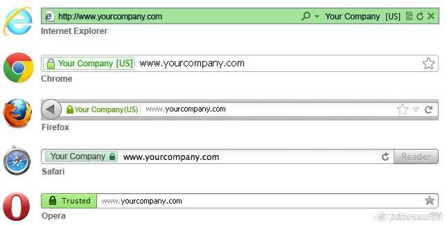
“Extended Validation” SSL certificates instill more trust because they include the green bar in the browser’s address bar. This makes security immediately prominent. An EV SSL costs more, and any website using it passed a vetting process that proved the business is legally registered and currently operating. It also ensures the company is located at its listed address and phone number, and that it owns the domain name.

EV SSL certificates instill trust by going green in the address bar.
EV SSL certificates are available through many vendors and at different prices. GoDaddy’s “Premium (EV) SSL,” for example, runs $149.99 for the first year and $199.99 for the second.
2. Show off trust seals. Shoppers want to feel safe. And trust seals provide the security confirmation that shoppers need to enter personal information and click submit. Thus it makes sense to display multiple relevant trust seals during the checkout process.
- SSL certificate seals. Most SSL certificate providers allow security badges to be embedded on the website. Some upcharge for serving the seal, but several studies have shown that displaying these badges can increase conversions from 10 to 40 percent.
- Verified payment icons. These include simple credit card logos and embedded icons for alternative methods such as PayPal and Amazon Payments. “Verified by…” services add yet another layer by guaranteeing a secure transaction and payment protection.
- Rating-and-review site badges. These range from free tools, such as Google Reviews, to paid memberships, such as the Better Business Bureau. Ratings from customers and third parties are key to instilling trust with first-time shoppers.
- Antivirus seals. These indicate the website itself is constantly monitored on various levels. While they’re among the most expensive to use in the scope of conveying security, antivirus seals are also the most recognized due to prominent brands such as Norton and McAfee.
- Partnership and business-customer logos. If you sell to businesses with recognized brands, show them off (as appropriate).
3. Place icons in lines of sight. Conversions depend on psychology. This includes the emotions specific colors evoke and, yes, the level of trust a shopper has during the checkout process. The placement of various elements plays a big role in checkout conversion rates.
For example, a Baymard Institute study revealed that 18 percent of people who abandoned carts did so because they didn’t trust the website with their credit card info. Thus it’s not enough to embed a security seal on the page. It needs to be in line with the credit card fields to make the most impact.
Most shoppers don’t even think about security until they’ve reached the point of sharing payment information. Calling attention to the most sensitive fields by using an alternate color or field border also helps.
Even though the entire page is secure, the average shopper doesn’t have concerns until it’s time to enter payment data. Source: Baymard Institute.
4. Reinforce guarantees and return policies. Knowing they can get support if something goes wrong is the last step shoppers need to tap that “submit order” button. Use simple icons that convey the promise of standing by what you sell.
Don’t Inundate
While it’s important to communicate trust throughout the checkout process, be careful about inundating customers with too much information. Be sure to choose the most relevant and recognizable elements and display them in ideal locations. As always, use analytics to annotate and analyze all changes so you can see if they are working in your favor.