Perception matters when it comes to pricing. By applying a few principles of human perception to price presentation, you can craft your copywriting to maximize the perceived value in your prospect’s mind
Lee Atwater is attributed as saying, ‘perception is reality.’ This is never truer that in the world of marketing in general, and Offer pages in particular.
By applying a few principles of human perception to price presentation, you can craft your copywriting to maximize the perceived value in your prospect’s mind. The better you can do this, the higher your Average Order Value (AOV) will be – and higher AOVs translate into a higher revenue per visitor (RPV). Best of all, doing this requires only a bit of extra time and cost.
Pricing in the awareness and consideration stages
If you’ve been doing digital marketing for some time, you know the buying stages by heart: Awareness, Consideration, Decision, Action. While your prospects don’t always move through these stages in a linear fashion, they represent the type of thinking they’re doing – whether it’s seeking a solution or ‘the best value’.
So let’s dive into the pricing presentation techniques you should implement – or at least split test – on pages early and midway down your conversion funnel.
Delay showing your prices
An interesting thing happened during a 2007 study done at Stanford University. When participants were shown a box of chocolates, the ‘reward system’ of their brain lit up, as if to say, ‘I want to have this.’
But when the price was then shown to the participants, an entirely different part of the brain was activated, namely the insula. This is the area of the brain associated with experiencing pain, for example when we cut our finger or get excluded from a social group. In other words, our brains perceive price as pain.
A good salesperson knows this, either intuitively or through training. They don’t want to discuss pricing with the prospect early on. The more they do, the less likely they’ll get the sale. So, what to do?
Don’t get into pricing specifics on consideration-stage pages. But do give a rough indication of pricing. This serves to:
- Qualify your prospect – are they too cheap or low-budget for your offering?
- Disqualify prospects who aren’t worth your effort – from whom you’d earn a small profit relative to the marketing effort you would put in.
- Tell your target prospects that they’re in the right solution ‘sandbox’ – they’re not wasting their time on your website or marketing channel.
Example: SAAS subscription pricing
Let’s say that you sell a software-as-a-service (SAAS) CRM solution with this pricing:
- $599/year for small/medium-sized businesses
- $1199/year for enterprise-sized businesses
Instead of only showing the yearly subscription price, you could instead say:
“Plans starting at $49/month”
(for our 12-month plan)
That’s a cost most small business owners can afford but if they can’t, they’ll disqualify themselves early in the process.
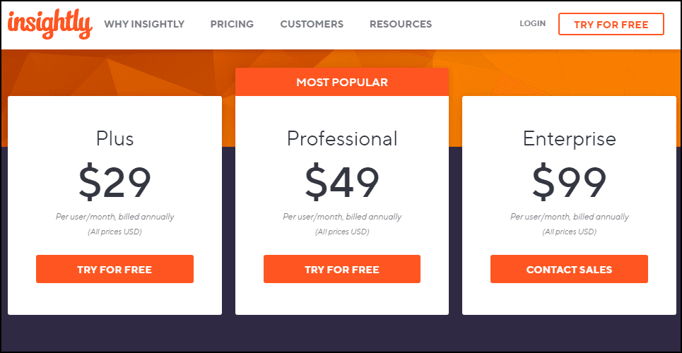
You can show this directly on your pricing page (as CRM seller Insightly.com does – see below), or at the bottom of your services, solutions or landing pages.
It’s always best to build value before mentioning pricing, which brings me to my next tip.
Build your offering’s value with great copy
Most rational people, even more brand-loyal, less price-sensitive ones, are seeking value: the best quality, social image, etc. for the money spent. That’s the mental ‘value calculation.
You build this value with your copy. Whether you’re scripting a TV commercial, marketing video or website sales page, it’s compelling copy that will grab your prospect’s eyeballs and keep them reading.
Here’s an example from the auto industry. The current tagline for Mercedes Benz is ‘The Best or Nothing’. This pretty well sums up what their brand represents. That’s why they see people driving C240s – lower-end, 4-cylinder, Mercedes sedan- because they would rather, for example, be seen in a low-end Benz than in a high-end Mazda.
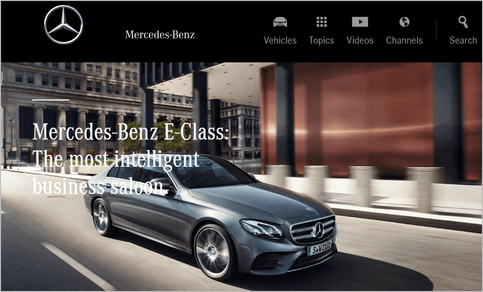
Here’s Mercedes’ E-Series landing page. Their headline (H1) says, ‘The most intelligent business saloon’. It’s clear that they’re selling a ‘smart car’ to smart, upscale people.
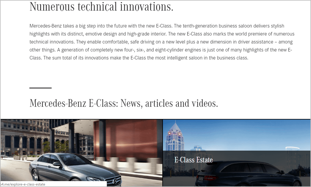
Just one scroll down the page they emphasize the vehicle’s innovative, future-forward design and the emotions it evokes. They mention cutting-edge technologies like driver assistance and new engines, just enough new tech – along with sexy imagery – to entice their visitor to click into the body style they like the most.
In this way, their copy positions the brand and makes their target prospect say, ‘That’s me’ (or ‘That’s who I want to be’). Higher pricing, of course, is implied for this brand. For lesser-known brands, you should show a high-level (‘Starting at…’) indication of pricing on your equivalent of the ‘model selection’ page.
Pricing in the decision stage
Let’s now move into the decision phase, where pricing – how it’s presented and, most importantly, perceived – are crucially important. It’s at this point that context, not just content, is king.
Change the context of your offer
Most of us humans are pretty clueless about how our brains perceive value. While this naivety makes your prospects prone to manipulation, it presents a great opportunity for you as a marketer.
William Poundstone, author of ‘Priceless: The Myth of Fair Value,’ shares a pricing study done with beers.
In the first test, only two options were offered: a regular beer and a premium beer:
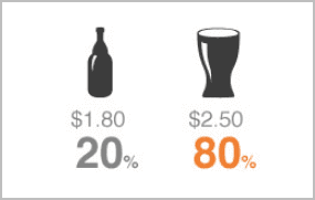
Out of 100 customers, 20 chose the first option and 80 chose the second. The revenues earned: US $236.
In the second test, the researchers added a lower-priced (US $1.60) beer to the mix. Here’s the resulting sales breakdown:
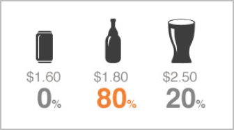
Revenues earned (per 100 purchasers): $255.50. This offer mix thus generated the highest revenues. Obviously, over more months, and thousands more unit sales, the revenue difference would really add up.
These examples show how important it is for you to present both different offer mixes and different pricing levels.
Experiment with price anchoring
As the old saying goes, the best way to sell a $2,000 watch is to put it right next to a $10,000 watch. Why? The principle at work here is a cognitive bias called anchoring. Anchoring refers to the tendency to more heavily consider, or ‘weigh,’ the first piece of information offered when making decisions. For prospects in Western cultures, the first item considered is the one on the left.
In the same book, Poundstone describes another study run by MIT scientists for a mail order business. In the first mailing, one of the women’s clothing items tested was priced at $39. The second mailer offered the item at $34; the third at $44. The outcome: the $39 price point generated higher sales. Specifically, 23% more people bought the dress at $39 than at $34. There was no significant difference in sales at the $34 and $44 price points.
This company also frequently put items on sale and marked them in their catalogs in this way: ‘Regular Price: $X; SALE: $Y’. As you might expect, they saw higher unit sales when the sale prices were highlighted. That is, buyers didn’t know that $Y was a good price unless it was ‘anchored against’ the higher regular price.
Consumers were also more likely to buy an item for $40 if a regular (anchoring) price of $48 was also shown, than if the same item was priced at $39, but with no price anchor. In other words, the anchoring and context of your offer matter more than your price points. So you should definitely test all of these variables within your specific marketing and product mix.
Hide extra costs in bundles
Let’s talk about the selling of accessories, commonly called ‘upsells’. If you’re like most people, you don’t want to pay much extra for these add-ons, even if they provide a better overall solution (10% appears to be the upper end of the ‘just noticeable difference’ cost threshold most people are willing to pay, according to Weber’s Law).
One way to ‘hide’ the extra cost of such upsells is to bundle them with your ‘base’ product (the main product you’re selling). McDonald’s was perhaps the first brand to do this when they asked, ‘Do you want fries with that?’ For example, a burger and drink purchased separately cost US $6.59, while the ‘combo’ was priced at US $6.99. That’s only 40 cents, or about 6%, more for the fries. McDonald’s has sold billions of combos over the years, so this approach clearly works.
The same principle applies when you’re marketing your offering. If you can keep your base-plus-accessories bundle price within 10% (or even 15%) of the price of your base product, you should offer the bundle on your product or other sales page.
UK-based bicycle seller Halfords.com does a great job of this, as you can see below.
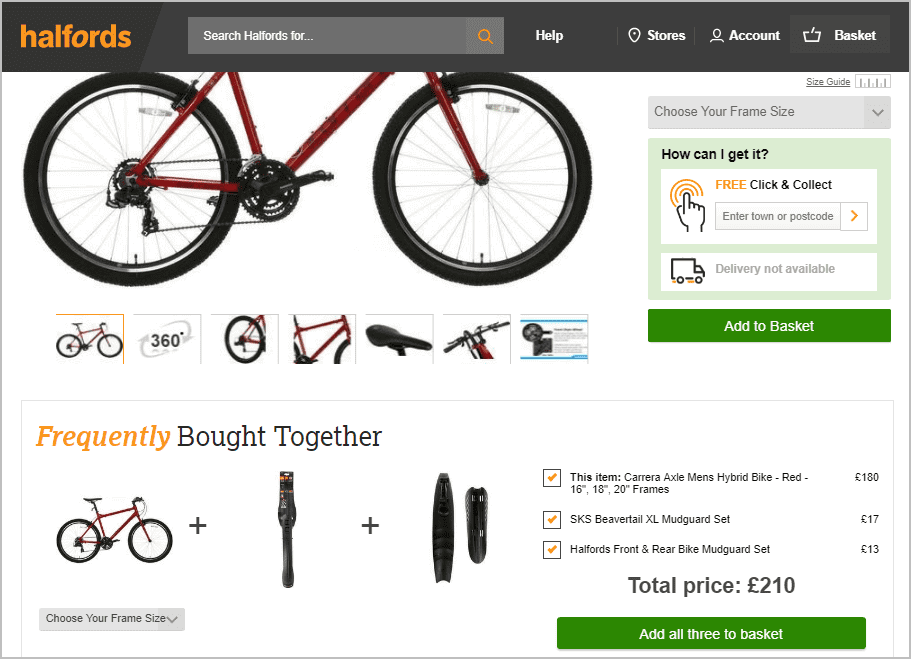
Here’s another benefit of bundling: you can offer the accessories that generate the highest margins. Amazon.com famously does this with their generic “AmazonBasics’ products and related accessories. It’s your choice whether you want to maximize revenues or profits based on these price manipulations.
For more insights on this approach, read the SmartInsights guide, ‘How to optimize your e-commerce merchandising’.
Wrapping Up
Some say pricing tricks smack of manipulation. I disagree. I say it’s just presenting your products and pricing in the best context and in a way that best meets your business goals. Ultimately, your prospects and customers control their own decision making.
So I invite you to try out some, or all, of these proven pricing techniques. Better yet, test them in a systematic manner using your Web optimization platform. You have nothing to lose, yet higher AOVs and revenues to gain. Plus, doing this only takes a little more design time.
