Website landing pages are important. They are a sales opportunity. Think of them as windows for conversion—your chance to influence a website visitor to become a customer. That’s why landing pages should not be taken lightly or treated as an afterthought. There is an art (and a science) to creating landing pages that work. Try these five tips. Boost the success rate of your WordPress website landing pages and watch your sales soar.
Visual Simplicity
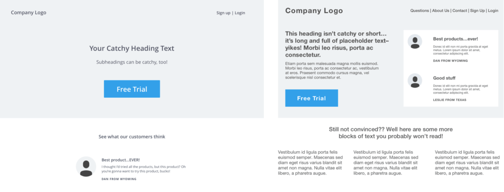
Landing pages should be as clean and minimalistic as possible. Think Swiss design. The use of minimalism and white space allows us to focus 90% of the visual attention on the call to action (CTA), which is the lifeblood of the landing page!
When you are creating landing pages, remember that your calls to action should be very bold and strong. An overall simplicity can create natural contrast by helping CTAs stand out from the content and sales material. Take a look at these examples, and it’s pretty clear that a more minimalistic approach helps you focus on the messaging and CTA and promotes action more effectively.
Eye-catching and Pithy Content
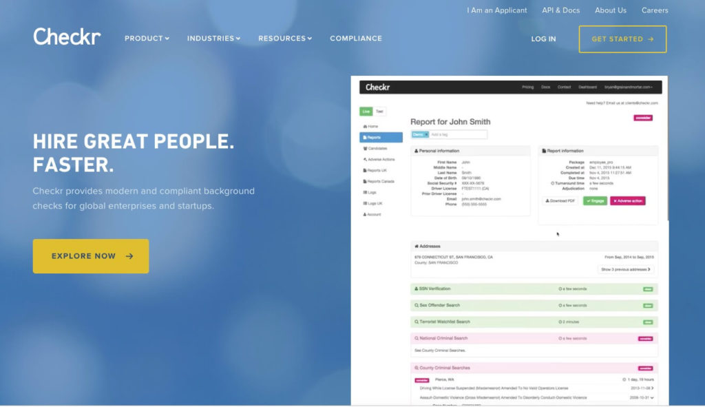
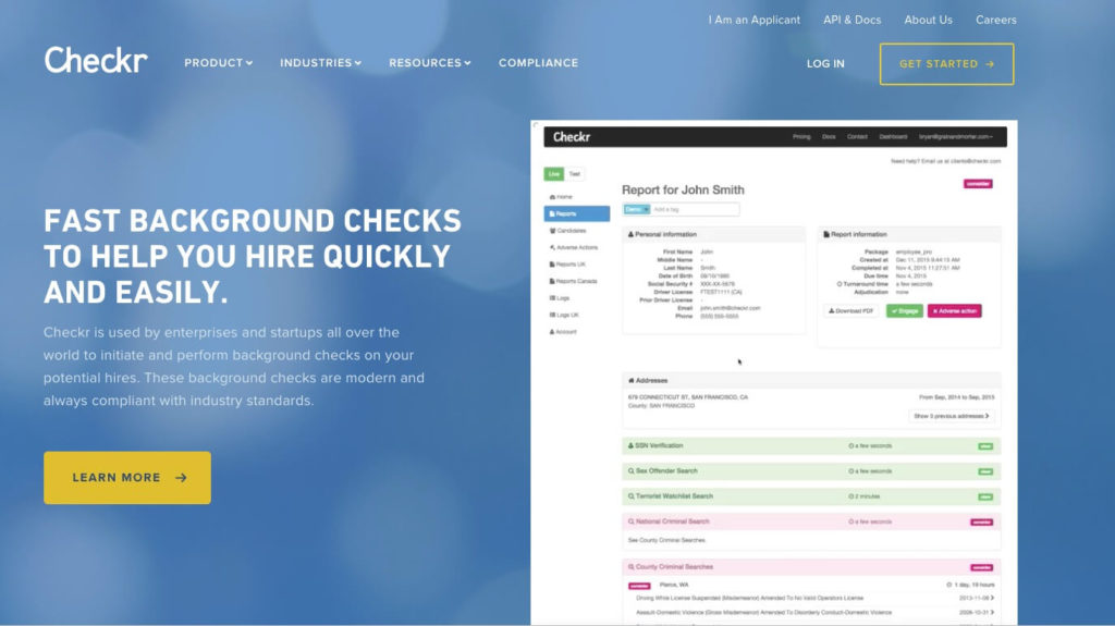
Landing pages are not the appropriate setting for a blog-style amount of content. You’ll lose the users attention quickly if you don’t engage them. Content should be short and to the point, with headlines that are catchy and draw attention to the main CTAs. For example, look at the difference between these two examples; which catches your attention more?
Call to Action Text
The actual call to action link or button text should have just as much thought as the heading copy. For example, you may be able to significantly increase your conversion numbers simply by changing your CTA copy from “Sign Up” to Sign Up Free.” As you go through the process of creating landing pages, consider the words you’re using. If your button has drab copy such as “Learn More,” you’re almost certainly missing out on conversions. Opt for something more persuasive that also indicates a small amount of urgency. It should encourage action from the visitor by using words like “Get Started Now” and “Start Exploring.”
Sharp, Beautiful Media
Just like successful songs need a catchy hook to get stuck in your head, your landing page should have some type of graphic to help hook the user visually. This can be a beautiful photo (custom photography is a million times more effective over stock photos, by the way), a well-executed product shot, or a custom graphic or illustration.
It’s important to determine which is appropriate for your brand and the goals of the landing page. For example, if your target audience is hip 24-year-olds in New York City, a cool abstract illustration or graphic will work much better than a landing page targeted to 45-year-old blue collar workers, who would probably benefit more from a clean product shot or photo.
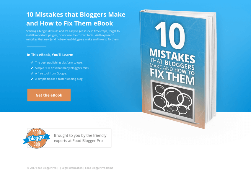
Even if you don’t have a physical product, you can always hire a designer to mock your product up into a more real-world design to help connect with users. For example, this product shot is for an eBook, but because it’s mocked-up in the form of a physical book, it builds trust that it’s a legit product and helps catch the visitor’s eye.
Use Testimonials and Real People
Even if you only have one or two, featuring real words from real people can help create a more personal connection with your users. It’s been proven time and time again that showing real people on product and landing pages helps to increase conversion numbers. Highrise decluttered their landing page, and by adding prominent testimonials and pictures of real users, they saw their conversion rates skyrocket.
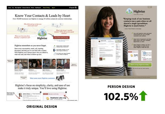
Many, many websites overlook the essential elements of landing pages. Just by following my recommendations, you can easily stay ahead of the competition, appeal to your visitors, and increase your conversion rates. Your website exists to make your business a success. Guarantee that goal by creating landing pages that work.
Also published on Medium.
