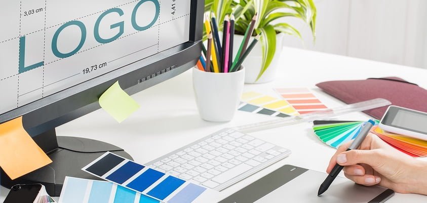
It’s important when designing your company logo that it represents your brand. There are a few things which matter trying to put together the right design like colors, slogan, image, and uniqueness. By making sure you have the right combination of these, you’ll create a logo which is unforgettable and represents your brand to the fullest.
I did some research so I can put together my top 5 tips when designing your company logo. Let’s get started.

Unique
When designing your company logo, it’s important to be unique because this will help you stand out compared to your competition. When you look at other logos right now like Apple, Coca Cola, or even McDonalds, you know right away what type of company because you’ve visited their store or tried their products before. Study the logos of your competitors, and come up with a unique design one which customers will remember because it stands out.
However, when creating a unique design, you want to make sure that all the other factors discussed below are also incorporated.
Colors
The company colors you choose will usually be based around your logo. For example, whenever I design’s websites, I’ll come up with a logo first then base the website colors around my logo. However, sometimes it will work the other way around, and you’ll use colors within your logo which currently represent your companies culture. This can be the color of your products, the building design, and/or colors which represent the purpose of your business. You’ll notice how environmental companies will always have the color green within their logo representing tree’s, grass, and again the environment.
When choosing colors, you’ll want to study color psychology, and how the human mind responds to color. The benefits of coloring infographic will show you how different colors can stimulate different parts of the human mind.
Easy and Flexible
You want your logo to be very easy to understand, and the person should not have to sit and stare to know what it represents. The longer it takes for the person to understand what company it represents, the faster they’ll forget about your company brand. The main idea is to design a logo which is flexible also so can look good on any device it’s viewed on like a tablet, mobile phone, or even on a television set.
Keep in mind that it should take a maximum 2-3 seconds for the person to understand what the logo stands for and to remember it too.
Text or Not
This is something for you to decide however is very important when designing a logo. You need to ask yourself can I design a logo as just a symbol and it will represent my brand to the fullest? Many designers make the mistake of not adding any text when they should, and this makes it harder for people to understand what the company does. For example, IBM has done a great job adding text to illustrate what they do as it represents International Business Machines.
Different Variations
When first designing a logo, it’s important you create different variations because its hard to get it right the first time. Some designs will resonate with people better than others so always test different things. You want to test with or without text, shifting around colors, and even changing the symbol around. As a matter of fact, testing is probably the most important part of designing a logo because it helps with the creative process by knowing what works and what doesn’t. This will force you to think outside of the box coming up with cool things to add to your next design.
Final Thoughts on Brand and Logo Design
You can find a lot more resources on logo design by doing a quick search on Google or reading through this logo design case study. These tips will help streamline your design process and even give you some logo design ideas. If you have a budget to spend on design, then hire a company to come up some ideas for you.
