Architecting an effective website can be an arduous task. It begs the question, where should one start?
This can also be asked of simply improving an existing site to provide better content pathways, usher conversions or portray content importance to crawling search engines.
The answer: your main navigation.
Website main navigations are like snowflakes. You will never see two that are the same.
They serve many of the most important roles of a website, that of the navigator.
They often connect the user from landing page to conversion, from information-seeker to resourceful content or a highway for crawling search engines.
Regardless of the role, crafting your main navigation with usability and SEO in mind will prove fruitful in the future.
What follows are a few tasks and considerations that you should employ in your main navigation construction or reconstruction.
Throughout this process, you need to ask yourself this key question:
Do we really need to link to this page from the main navigation or should we add this page?
The steps below will help reaffirm your linked page interests.
1. Google Analytics User Flow
Before we appease the search engines, we have to take a look at how main navigation is being used on the site.
This will help us to understand how we can combine SEO considerations with main navigation without getting in the way of usability.
Within your Google Analytics profile, navigate to Users Flow within the Audience segment. Initially, we want to see what the common user-pathways are on the site.
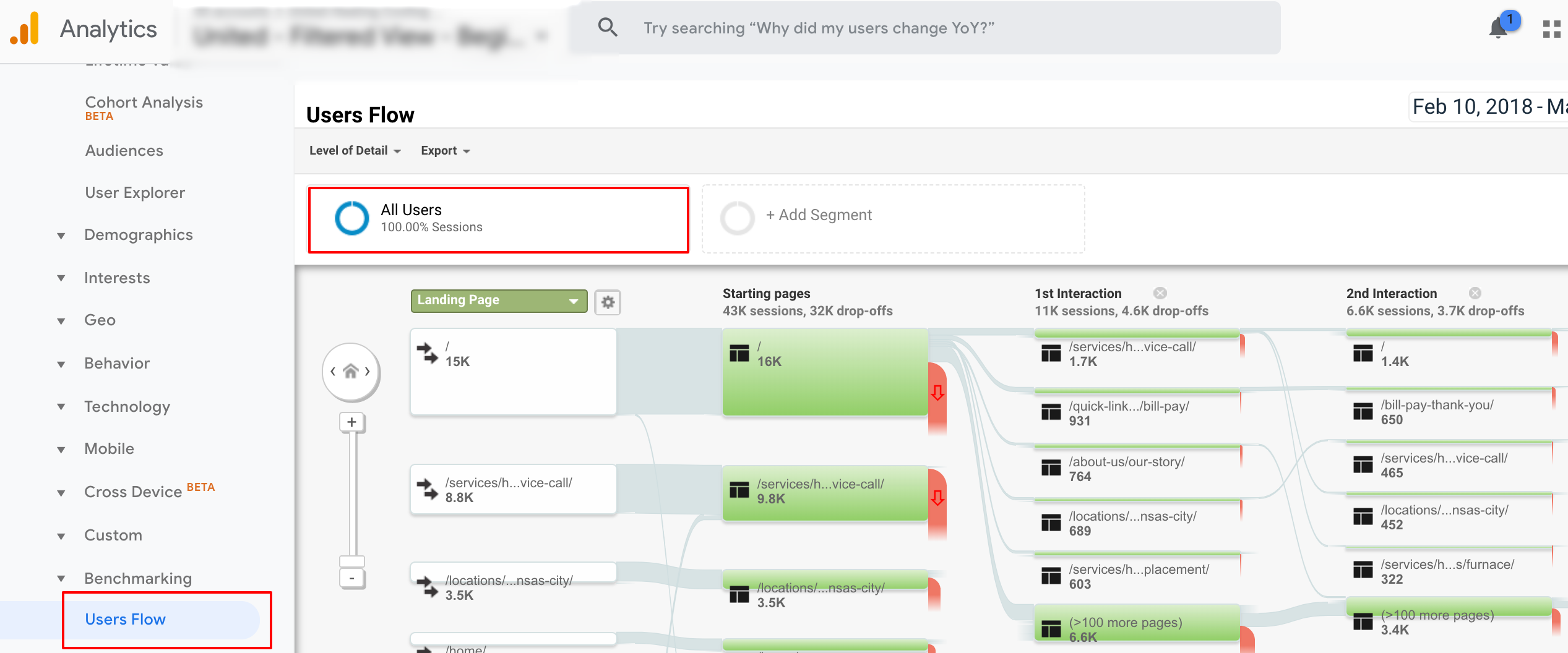
Do you see defined movement behavior?
Next, create an advanced segment to view those visits that resulted in a conversion or transaction.
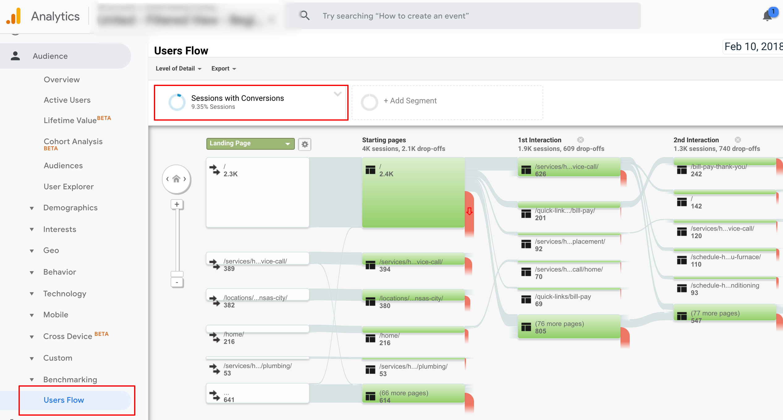
Again, do you see defined movement behavior or similar to the common user?
Last, just as we had set an advanced segment to monitor converters, now create a segment to view how non-converters. This will require the creation of a new advanced segment to only view visits with zero goal completions.
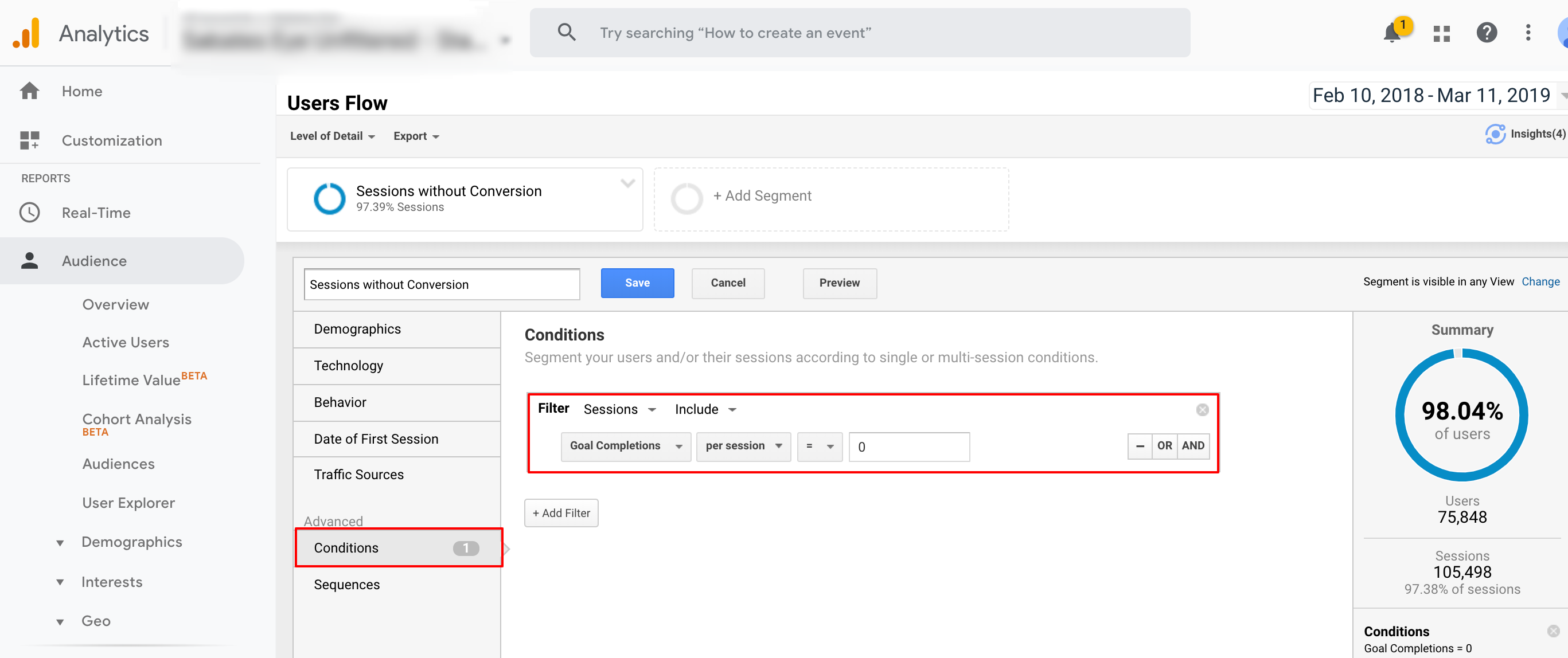
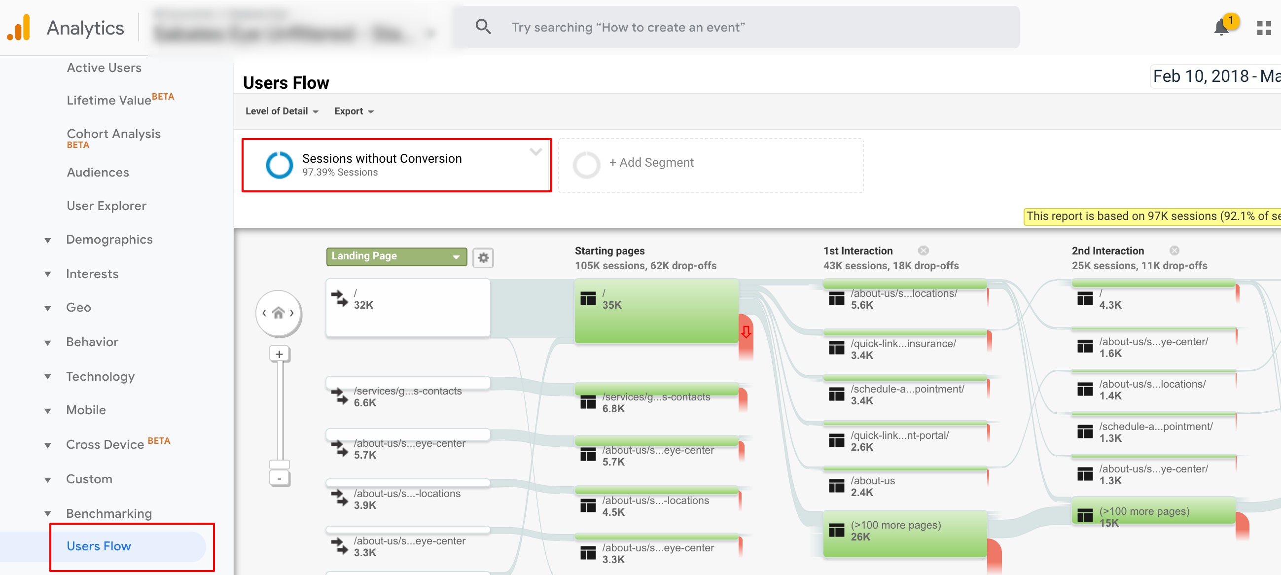
Here, there is likely a noticeable difference between converters and non-converters.
If not, your conversion concerns likely lie somewhere between site speed, on-page layout or messaging.
2. Heatmap
What we did in the last exercise was to gain analytical insight into common user journey behaviors.
Take this to the next level through utilizing heatmap data (I prefer Lucky Orange) to understand visually where clicks are taking place from desktop and mobile users as well as where mouse activity/attention is being paid.

You’ve done your due diligence in understanding user behavior. This is beginning to show important insight on what links or main navigational elements we must keep.
3. Anchor Text
In a perfect world, everyone would know about your new service offering with its catchy innovative name.
The truth is, your prospect arriving at the website first time will likely not know this. It is advised that you call your services and products with a descriptive nature in main navigation link anchor text.
For example, it will help search engines as well as website users to know that the “Whiz Bang XL Suite” is actually an accounting software product family that you offer.
Understanding what you should call your product and/or service pages will fall back on keyword research.
Another good practice in this area is to listen to your customer base and understand what they call your product/service family or how they commonly refer to them.
4. Top Linked Pages
To this point, we have been focused upon user-specific data but let’s now put our attention on SEO.
In Google Search Console, within the Links section, specifically Internal Links, you will see Google’s report on the frequency of how you link to your internal site pages.
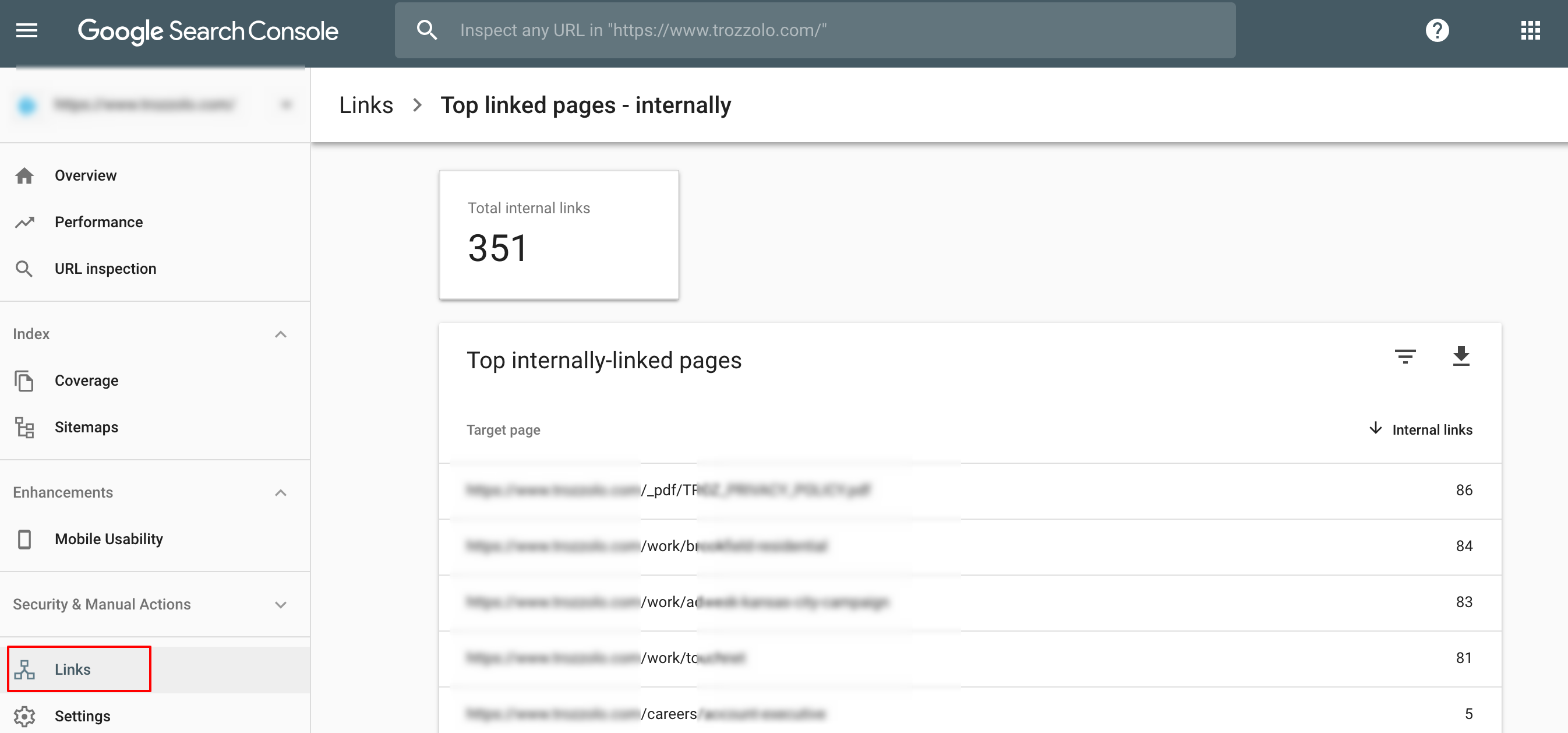
You obliviously can see what internal pages you are linking to in your main navigation but this report gives you a feel for instances when you may already be linking heavily in other supporting navigation instances.
If you see an abundance of internal links for pages that you deem less important, now you can to see that these should not be placed in the main navigation but may remain in the footer or internal secondary navigation.
5. Minding SEO Basics
While anchor text does cover the on-page keyword relevancy needs of SEO, primary main navigation SEO must-haves are rooted in technical considerations.
Think of this as the factors that surround “efficiency of the crawl”.
Google and Bing have made great strides over the years in crawling and indexing JavaScript but I still would steer clear of this style of navigation.
If you are accidentally robots.txt-excluding JavaScript on-site or not using preferred deployment such as Progressive Enhancement, you run the risk of possessing a main navigation that is difficult for a crawling search engine.
The best practice is to ensure that your main navigation is constructed in an HTML format or what is commonly referred to as “a href” referenced links.

In considering the efficiency of site crawling as it relates to main navigation, there is a mistake that is made far too often.
Over the course of the life of a website, URLs are redirected. What is often forgotten is that main navigation is not updated to link to current page URLs and redirection is taking place.
Forcing a crawling search engine to endure a redirect will slow down crawl speed and give a less than efficient crawl for search engines.
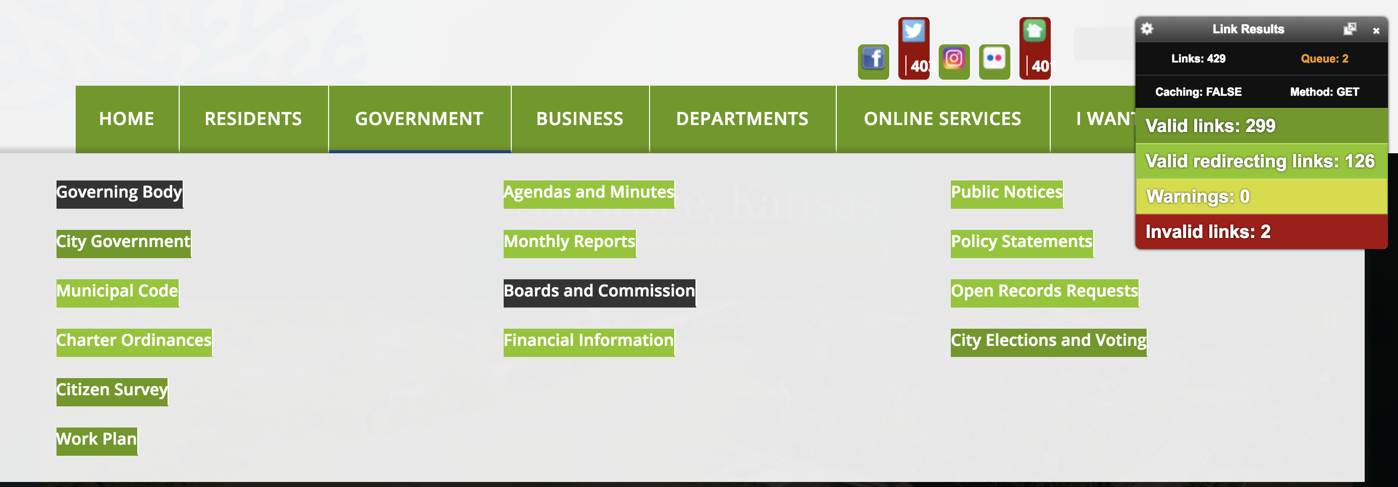
To assess this potential issue in your main navigation’s current state, use the Chrome extension Check My Links. This tool will highlight any redirecting (and broken) links that may exist in your main navigation.
6. What’s Ranking, What’s Not
We’ve already discussed that the more you link to site content, the better you portray site hierarchy and page/section importance to a search engine.
By reviewing all of your top organic search rankings, you can get a feel to where you likely have sectional or hierarchical gaps.
Linking more so to these internal sections can convey importance to a search engine.
Example:
You may find that your homepage ranks well as well as product sub-category pages, but not the product parent category pages.
This can be caused by drop-down navigation which does a good job of linking to deeper site content but the parent category is not linked to at all.
This causes a massive disproportion in the amount of linking and perceived importance at deeper site levels vs. parent level category pages.
To Link or Not to Link
Hopefully, this article has piqued your interest in a potential main navigation audit. Those who do not do this may be losing out on a lot of SEO and UX efficiency opportunity.
Those who shortcut this process adopt “mega-menus” or main navigations that point importance to all site areas. In some cases, there are sites that need this.
For most, you are confusing your traffic as well as importance perceived by crawling search engines.
More Resources:
Image Credits
Featured Image: Created by author, March 2019
All screenshots taken by author, March 2019