User Interface (UI) and User Experience (UX) may seem interchangeable, but these features can make or break your company’s website. You need excellent UX and UI to achieve your design goals, increase web traffic, and retain customers on your page.
However, many businesses are unintentionally making irreparable mistakes when it comes to these design features – and their sales are suffering as a result.
Here are 7 common mistakes you may be making that are most certainly costing your business some highly coveted engagement.
What Is User Interface?
UI design refers to how users engage with a website and how easily they can navigate from page to page.
A UI designer makes your company website intuitive, responsive and easy to use for your site visitors. If your website is difficult to navigate, your customers will leave and find a site with a better interface. Usually, UI designers work on areas of the website where your customers will visit and look at your products.
Some of a UI designer’s job functions include:
- Customer analysis
- Brand personality development
- Prototyping and testing
- Screen resolution analysis and adaptation
- Interactivity and animation
- Design research
- Implementation and developer consultation
- Meetings with UX designers

What Is User Experience?
UX design refers to the features of a website that attract and retain visitors and potential customers. Unlike the name may imply, a UX designer’s job is not to create design elements of a web page. They do not handle colors, graphics or images. People involved in UX make sure that a website is seamless, functional and easy to use for people visiting your website.
UX designers determine who the target clients are and implement web design strategies to make your website as easy and enjoyable to use for that demographic as possible. UX designers value functionality, adaptability and usability.
Some of a UX designer’s job functions include:
- Web development planning
- Coordination with developers and UI designers
- Analysis of web traffic and iteration of certain features
- Prototyping new features
- Competitor and customer analysis
- Content development
- Goal tracking and testing
- Product structure and strategy

It is very easy to make mistakes with UX and UI. Hiring a professional who is skilled in these areas can help your company target these issues and remedy them for the best possible customer experience.
Mistake #1: Too Few (or Nonexistent) CTAs
Your Calls-to-Action (CTAs) are arguably one of the most important parts of your website. You basically throw all your potential sales conversion power behind one message that tells your visitors to “Click Here” or “Buy Now.”
CTAs are crucial to obtaining new leads and sales, and should contain the following elements:
- An effective, simple button design
- A bright color that contrasts with the rest of the web page
- A moderate size: not so small that customers don’t notice it and not so big that it seems intimidating
- A clickable shape, usually rectangular and not surrounded by text or images
- Active, compelling language that conveys a sense of urgency; uses active words, a time-related word, and first-person point-of-view
- An intuitive location after the initial proposal convincing the customer to convert, logically urging the user to “Sign Up” or “Learn More”
- A short message, ideally fewer than 60 characters

Dive Deeper: How To Create CTAs that Actually Cause Action
Mistake #2: Too Many Pop-Ups
Pop-up windows are popular among marketers for a number of reasons. They help push conversion rates and encourage consumers to sign up for a newsletter or check out a new offer. However, pop-ups could land you in hot water in the search engine rankings. Google announced in August 2016 that they would penalize websites with pop-ups that appeared immediately or that covered the main content:
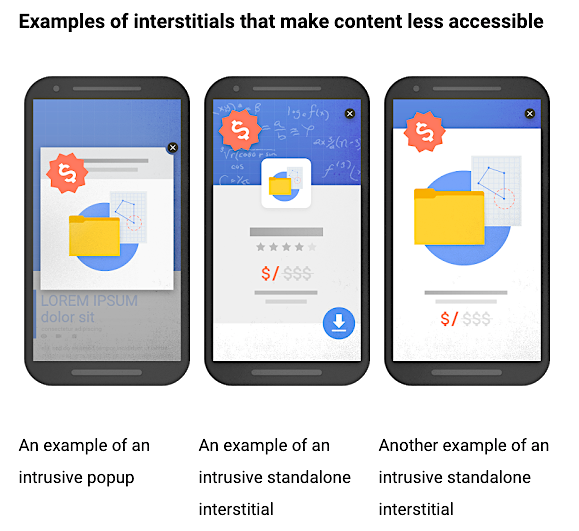
Pop-ups can annoy customers and make your content less accessible, so use them responsibly. Google will not penalize pop-ups that contain cookie agreements, age verification, or only use a small portion of the screen. Make sure your pop-ups are necessary and are not too large.
Dive Deeper: How Correctly Used Pop-Ups Can Help Increase Leads
Mistake #3: Little to No Social Presence
In search engine rankings, your company’s social presence is becoming increasingly important. Including customer feedback, testimonials, and links to your social media feed can boost your search engine optimization and lead to higher conversion rates among your website visitors.
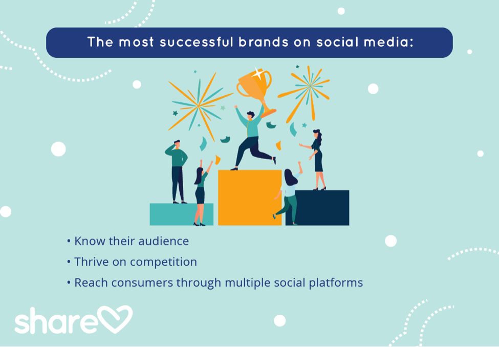
Without a social presence, your company loses credibility. Your consumers want to see what other people are saying about your products to make a purchasing decision. Without this information, customers are more inclined to purchase from a competitor with a more active presence. Add links to your social profiles, user-generated content, testimonials, and other social information to increase your presence.
Dive Deeper:
Mistake #4: Your Design Is Not Mobile-Responsive
Nearly everyone has a smartphone with Internet capabilities nowadays. As a result, more people than ever search for products and services on their phones rather than their laptops. In fact, 3.7 billion people across the world use mobile devices for online surfing – which amounts to about 52% of all web traffic:
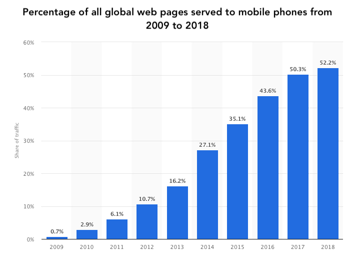
If your website does not work for mobile devices, these potential customers will leave your site and visit a mobile-friendly competitor.
In addition, Google ranks websites based on user behavior and mobile-friendliness. If many users leave your page after opening it, the search engine will rank you lower in the results. To avoid losing crucial mobile users, make sure your website is responsive to both mobile devices and traditional desktop computer screens. A UI designer can help you adapt your website to various screen sizes for the benefit of your business.
Dive Deeper: 12 Quick Fixes to Make Your Mobile Traffic Convert
Mistake #5: You Use Long-Form Copy
Website users want information that is quick to read and easy to skim, gaining necessary information without having to read through massive blocks of text. Long-form copy may be necessary for some businesses, such as insurance companies or law firms, but for other companies it can hurt you.
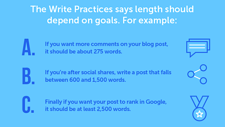
Unless you need to write an in-depth post, stick to short-form copy. If you do choose to write longer posts, you can make it much easier to read by breaking up large blocks of text with bold, descriptive headers and subheaders, turning long lists into bullet points, and sectioning your post with relevant images that enhance or explain the text. At the end of the day, it generally comes down to your goals:
Mistake #6: Hard-to-Read Fonts and Poor Color Contrast
This is a common and completely avoidable issue on websites. If users cannot read your website easily, they will leave and find a better, more legible competitor. Make sure that you do not use thin fonts that are difficult to read, such as script fonts or fonts with a lot of flair. Stick to crisp, clear fonts such as Calibri, Arial, Times New Roman, Helvetica, etc.
Consider the below images: the image on the top is an example of a poor font to use, while the image on the bottom is an example of a clear, crisp font:


For color contrast, make sure you place dark text on light backgrounds – placing light text on a light background, for example, will make your website extremely difficult to navigate. In addition, placing white text on a black background can also be difficult to read for many users. For best results, stick to a light background/dark text contrast (like this!).
Mistake #7: Poor Images and Graphics
Customers expect a certain quality of website nowadays. If you use cheesy, staged stock photos or poor-quality images, you can turn customers off to your web page. Make sure you use photos in effective ways that enhance the content.
Choose images that are high resolution and have low pixelation. Images that are pixelated or out of focus are big mistakes. Make sure your images are crisp, clear and appropriate for your web page. For example, look at the quality between these two identical pictures:

The apple image on the left has a lower resolution of 200px, and compared to the apple on the right, the difference in quality is obvious. The apple on the right has a high resolution of 2,000px, and has a crisp, clean image with low pixilation. The colors look brighter and the lines are sharper with the high-resolution apple, and in contrast, the low-resolution apple looks dull and unprofessional. Which image would you rather have on your website?
Poor UX design can drive customers away from your website and decrease lead generation. By following these tips, you can keep your site away from these common mistakes and get the edge on your competitors.
In Conclusion
The User Interface (UI) and User Experience (UX) of your website can make or break your company’s site. Make sure you spend the time and resources to provide excellent UX and UI to ensure that you retain customers on your page.
Remember, UI design refers to how users engage with a website and how easily they can navigate from page to page. UX design refers to the features of a website that attract and retain visitors and potential customers.
Fix these 7 common mistakes you may be making and watch your engagement increase!