There are many reasons for high exit rates and abandoned carts. Most are logical: non-competitive prices, substandard security, poor checkout processes, expensive shipping, and restrictive return and exchange policies. Other issues, though, aren’t so apparent.
Seemingly minor snafus in website design, wording, and navigation can drive shoppers away. Sometimes shoppers can’t tell you why they left, only that they weren’t comfortable buying. The good news is that most of the snafus are quickly and easily fixable.
So take the new year to address problems that may be decreasing sales conversions.
Here are seven often-overlooked sales killers.
7 Ecommerce Sales Killers
Typos and poor grammar. Misspelled and misused words act as a “stop” when it comes to reading comprehension. It’s easy to overlook these mistakes in personal text messages, but they can seriously damage marketing materials.
To fix, run a spell check on every piece of textual content and use grammar checking to find words that are used incorrectly — such as “their” instead of “there.” Grammarly, for example, offers a free version that will catch many usage errors. Nothing beats a professional, experienced editor, however.
Run-on sentences. When we read, we pause for commas, semicolons, and periods. Long sentences are frequently cumbersome to follow. Today’s average online shopper tends to rush through content. Thus everything we say must be easily digestible.
Use shorter sentences that focus on simple details.
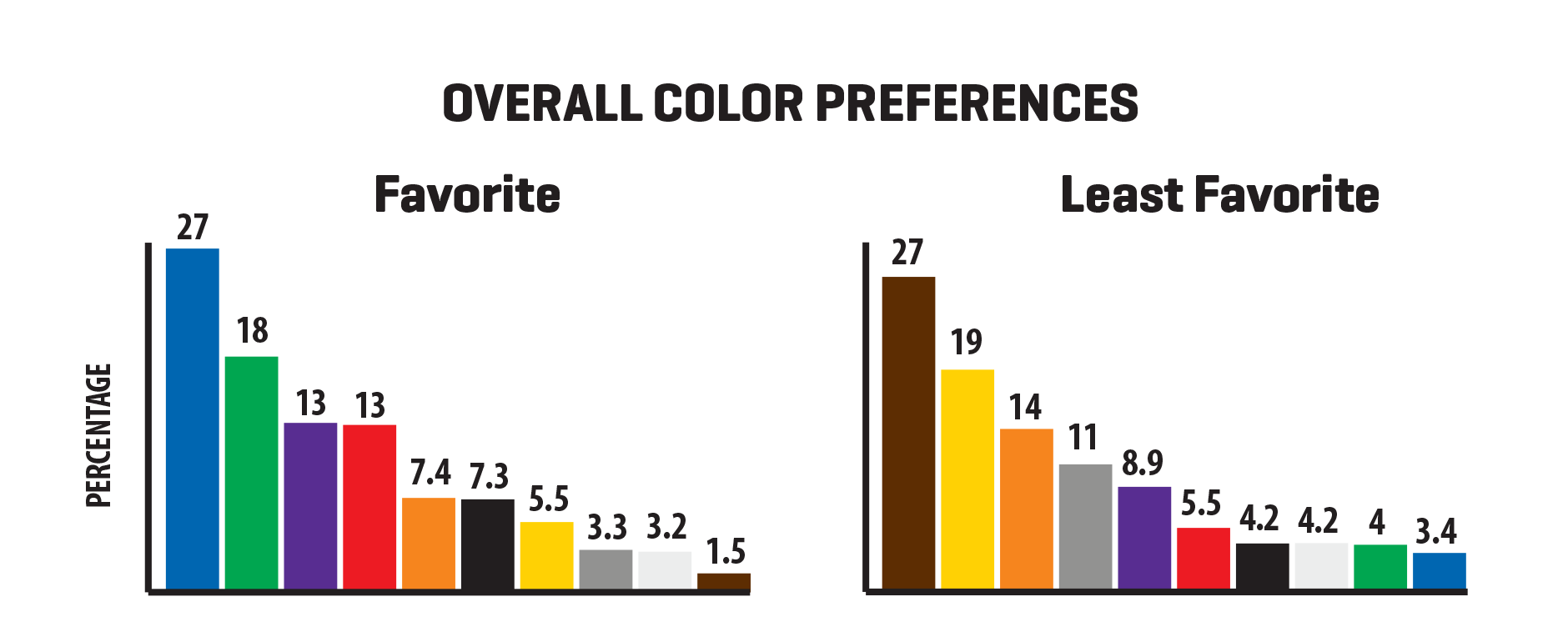
Bad color combinations. If your site experiences high bounce rates, the problem could be its color scheme. Most visitors can’t explain what threw them off. It could be the overall color design, the company’s primary color, or the complementary color in calls-to-action or navigation icons.

The most popular colors are blue and green. Brown and yellow are among the least favorites. Source: Scott Design.
To fix, test colors that work for your audience. Hopefully, your site uses CSS, which makes changing colors easy.
Relying on manufacturer descriptions. Manufacturers focus on products. But their descriptions for those products often read like sales pitches, which can be a turn-off. Plus, many are poorly written and do little to help shoppers understand the item.
Write your own product descriptions. Then test variations of them to improve conversions.
Poor photos and videos. Photos and videos should be appealing and easy to understand. Grainy videos and small, fuzzy photos do little to sell a product. This is why Amazon requires the longest side of a product image to be at least 1,001 pixels and prefers a width of 2,560 pixels.
Quality images that can be zoomed accommodate all shoppers, regardless of their device. This example from Amazon shows the detail of dog waste bags.
Always use images and video that truly represent the product. Even if your site has a zoom feature, accommodate mobile and tablet users who pinch to zoom for a closer look.
Not testing across devices and browsers. Ideally, your online store should look the same on a Mac as a PC, as well as when loaded via Chrome, Firefox, Internet Explorer, Microsoft Edge, and Safari. The mobile version should look and function the same on an Android device as it does on an iPhone or iPad.
Ensure the site follows modern HTML and CSS standards. Try to accommodate shoppers using dated hardware and software — at least two prior versions.
Not querying shoppers. Finding the culprits of high bounce and exit rates isn’t always easy. User-testing platforms can provide video of actual shopping sessions, to help identify conversion problems — even if users can’t tell you. Watch for pauses in scrolling and hesitation when clicking buttons or filling out information.
And don’t be afraid to survey your customers to request candid feedback. They are often thrilled to participate. Consider offering a gift for their time, such as a coupon or a free product.