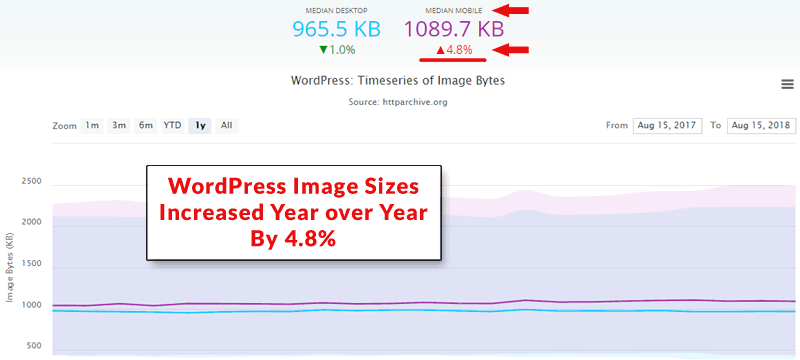
Using lightweight images strategically is important for mobile websites. Yet astonishingly, WordPress sites are using 4.8% more images by kilobytes in 2018 than in 2017. Here are seven ways to improve your SEO by reducing image size and using those images in a meaningful way that may help your search rankings.
Download Speed and Semantic Meaning
One of the top concerns for mobile websites is speeding up the download speeds. An easy win is optimizing images. Another easy win is using images to communicate what the meaning of your content is about.
Images are content, not decorations. Treat them with the same care and regard as you do your textual content and you will likely begin ranking better, including in position zero.
Images are useful for breaking up the text and making the content easier to scan. That’s a user experience feature. You can still achieve a better user experience and boost your SEO strategy with images.
So rather than just use images to make a web page easier to read, it’s possible to improve the SEO of a page and provide a quality user experience by treating the images as content.
Meaningful integration of images so that they complement the textual content and download quickly is the goal.
Meaningful integration is about using images to illustrate a concept or provide a step by step instruction that clarifies the text that precedes or follows the image.
These tips will decrease download speed and help the search engines better understand what your content is about.
These are seven ways to boost your rankings with images:
- Simplify images
- Avoid mixing photographic images with fonts and graphic elements
- Save images in the correct formats
- Avoid the use of too many colors
- Compress images
- Make images support the content
- Give images meaningful context
WordPress Image Size Trends
The year over year trend in WordPress image size shows that images are on average 4.8% higher in 2018 over 2017, according to httparchive.org.
 WordPress image sizes have increased by 4.8% year over year from 2017 to 2018.
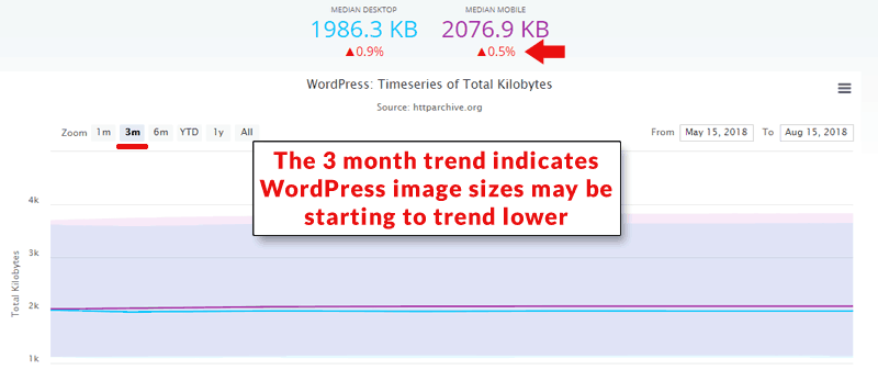
Statistics for the three month average ending August 15, 2018 show an increase of just .5%. This might be an indication that publishers are starting to shrink image sizes for mobile devices. Will your site be a part of this trend?
 Three month statistical trend indicates that WordPress image sizes may be starting to become smaller.
Simplify Images
Images that feature a lot of patterns, gradients, and small details tend to create larger files. For example, an image that has a spider web with dew on it or a person wearing a herringbone jacket will create a larger file than a simpler image. Images with gradients or tiny details also tend to create larger file sizes.
Half the battle of using images with small file sizes can be won by simply choose simpler images.
Avoid Mixing Image Types for Smaller File Size
Images that are photographic and those that consist of illustrations (or letters) create larger files sizes when mixed together.
For example, if you have a JPEG photographic image of a landscape and then superimpose lettering announcing an event, the resulting image will generally be larger than a PNG illustration of a landscape with the same wording on top of it.
The reason is because the JPEG format needs to be saved at a higher resolution to reduce pixelation and fuzziness in the words.
In the below example, notice the distortion and fuzziness between the letters.
Example of a photo with wording:
 This image is 42 kilobytes. Note how there is fuzziness around the letters and pixelation. That is an artifact of saving mixed photo/illustration image in JPEG format. The cat image itself looks fine.
The same image without the letters, saved at exactly the same amount of compression, weighs only 36 kilobytes. With letters it weighs 42 kilobytes. The photo looks great at this resolution. But the lettering does not look so good at this resolution.
The image with words is passable but there are still artifacts between the letters. The size of the image decreases to 36 kilobytes without the letters and looks fine.
To make the lettering look less fuzzy, I need to increase the resolution.
Resolution had to be increased to 182 kilobytes to make wording less fuzzy:
 The resolution of this image had be increased to 182 kilobytes (from 42 kilobytes) in order to attractively display the words superimposed over the photographic image. The same image without letters saves attractively at 35 kilobytes.
Here is the same image saved at 36 kilobytes, without lettering:
 Image without letters saves attractively at only 36 kilobytes.
Smaller image file sizes will improve a web page’s download speed.
Download speed is important because speed is a Google ranking factor as of July 2018.
- Images that are a mix of illustrations (not photographs) and fonts (letters/words) work well together.
- Fonts (wording) superimposed over photographic images tend to result in larger image sizes.
If you must use a photograph for your featured image or within the body of the content, try not to use fonts/letters in the photograph so that you can publish the image in the smallest file possible.
Drop shadows and gradients make .png files larger. Try to avoid their use in .png illustration type images.
If you must use a drop shadow, try not to make it a major feature of the image. I use drop shadows in .png files but by making them a minor feature they don’t substantially increase image file sizes.
Save Images in Correct Format
This is one of the most common mistakes. Save image files as jpg. Save illustration type files as .png files. You can also save them as .gif files but some sites classify .gif files as animation and will sometimes superimpose a “play” button on top of your image.
Avoid the Use of Too Many Colors
This tip applies to illustration type files and photographs. The more colors are in an image the larger the file size. Most people won’t notice if you desaturate the image.
For illustration type images, you can save file size by combining similar colors. Most times there is no need for eight shades of red in a single image. Using one shade of red is often enough.
For photographic images try to desaturate the image just a little bit. Or you can try choosing images that don’t feature too many colors.
Compress Images
This is the most important tip for saving image size. Do not use HTML or CSS to shrink a 1200 pixel image to 400 pixels. While the image may render as 400 pixels it will still carry the weight of a 1200 pixel size image. There is no weight saving.
It is a common mistake to use a large image size for a small image. Additionally, if an image is 900 pixels wide, would it look any worse if you shrunk it to 800 or 600 pixels?
Make Images Support the Content
What’s important is not the size of the image but what that image adds to how the user understands the content, whether it’s a product image or a step by step illustration. What matters is the content. Never use an image to simply make the page pretty. Always make that image support the content.
Accessibility
An important consideration is accessibility. When using the alt image attributes, make an effort to describe what the image is. Don’t use it as a dumping ground for keywords you’d most like to rank for.
The use of colors that contrast well helps users who are color blind. This benefits a web publisher because it makes it easy for site visitors to see call to actions and buttons you want users to click.
Another consideration that was brought to my attention via Twitter was to consider limiting emojis and animated gifs to improve the user experience for those who are visually challenged.
Give Images Meaningful Context
Consider adding alt text to your images to explain what the image is to blind visitors to your site. This might also help your SEO. Additionally, consider adding captions to your image to explain how that image relates to your content.
Images Are Important to SEO
Images can be used strategically for ranking. Properly considered, images can rank in position zero. Images can also rank in image search and lead to more visitors. Images can also help search engines understand what your content is about.
Don’t treat images as an afterthought. Images are content. All content should be carefully considered as part of an SEO strategy.
More Resources
Images by Shutterstock, Modified by Author
Screenshots by Author