Even for an ordinary, inexpensive item, it’s astounding how many uncertainties can come up from online shoppers. For instance, a listing for men’s socks on Amazon has 50 questions from would-be buyers! Such questions provide a window on the many issues that can lead someone to select an item while rejecting others.
In the case of the socks, concerns include:
- “Is the elastic at the top stretchy?”
- “Does ‘6-pack’ mean 6 pairs or 6 individual socks?”
- “Do the heels hold up over time?”
- “Will they cover my feet in lint?”
- “Will they cause blisters if I run in them?”
- “Does the seam at the top of the toes ever annoy your toes?”
If you tried to address every single worry or question in a product description, it would quickly become bloated and unmanageable. Instead, refer shoppers to secondary content, such as the following seven options.
7 Ways to Answer Questions
Q&A. Amazon leads the way here, with hundreds of thousands of items displaying questions from shoppers. Answers are posted mostly by purchasers rather than the manufacturer or Amazon itself.

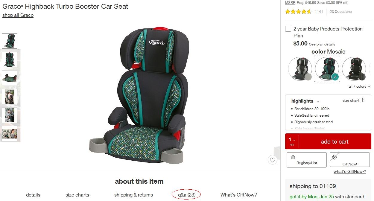
Target’s listings show how many Q&As an item has — 23 in this example.
User reviews. Very often, user reviews address the kinds of concerns that show up in shoppers’ posted questions. But in the review format, it’s time-consuming for prospective buyers to find answers. Still, merchants can help by suggesting that reviewers write a headline that helps address what other people may be wondering. Even better is setting up a search function for the reviews that enables shoppers to click those that mention a word or phrase.
Ability to ask and get answers. If your online store includes live chat or phone support with knowledgeable reps, shoppers can get answers to their questions while still looking at and considering an item. Next best is if shoppers can email their question and get a prompt, informed answer. Then you cross your fingers that they’ll go back and buy. In some form or other, have a method for shoppers to ask questions and receive prompt answers.
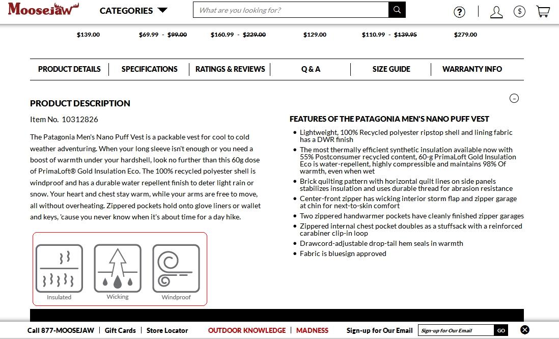
Icons. When a concern often comes up among your shoppers, consider implementing icons that show at a glance whether, say, a brand promises “no animal testing” or that its chemical formula is “pet safe.” Raphael Paulin-Daigle, head of the conversion agency SplitBase, calls such icons “objection badges” for their role in addressing shoppers’ worries.

Moosejaw, an outerwear retailer, displays icons (at lower left — “Insulated,” “Wicking,” “Windproof”) representing key features shoppers may be particularly concerned about.
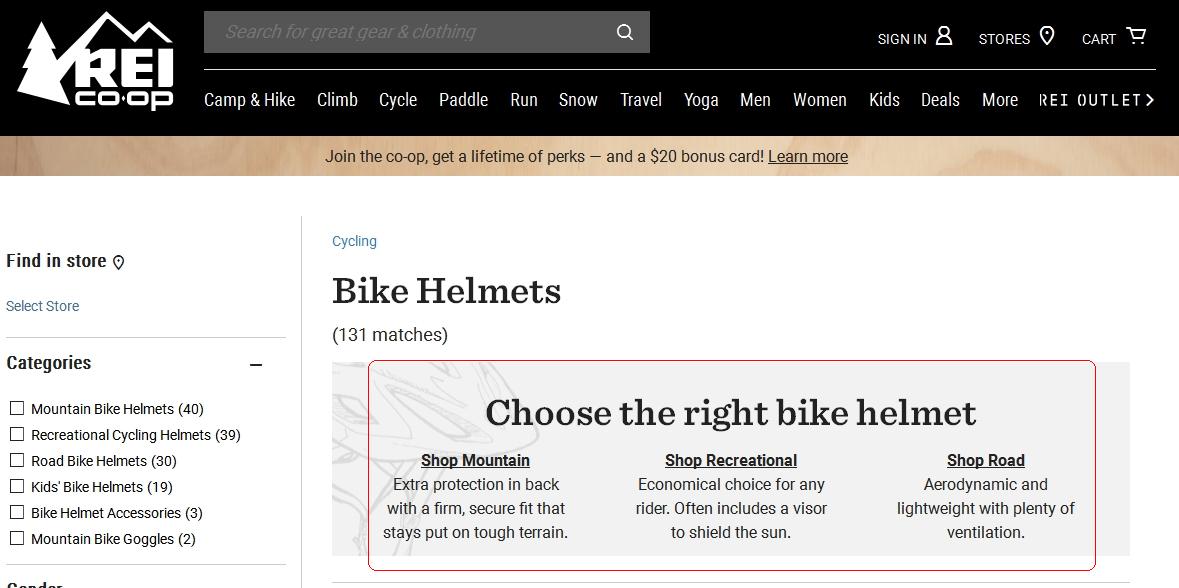
Search results. Displaying site-search results according to a product’s intended use helps shoppers quickly narrow their options to items that are, for instance, suitable for a certain age range of children or for camping outdoors.

When searching on REI.com for “Bike Helmets,” the results separate helmets by the intended use, such as mountain biking, recreational biking, or road biking.
Videos. A video can demonstrate that a product is easy to assemble, simple to use, or suitable for a certain purpose. Videos on product listings need not be clever, funny, complicated, accompanied by music, or shot with high-end equipment. Aim for simple presentations without visual distractions or auditory fuzz.
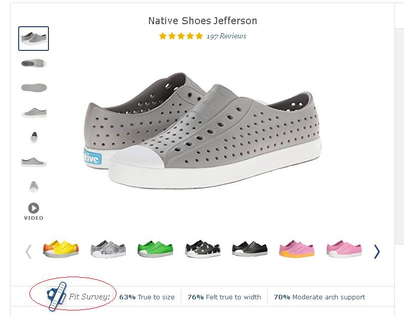
Survey customers. Many online merchants survey customers about common shopper questions and then post the results on the product pages. For example, online clothing retailers often post buyers’ responses on whether an item runs small, large, or as expected. Nest, which sells home thermostats, addressed a major worry of potential buyers by posting that three out of four customers installed their Nest thermostat in 30 minutes or less. Responses from customers have more credibility than a merchant merely stating “it’s easy” or “the shoes will fit you.”

Zappos’ shoe listings include figures from its “fit survey” on how buyers felt the shoes fit.
Implementation
Begin by brainstorming or researching the kinds of issues that shoppers have about what you sell.
- Ingredients: What is something made of? And what does that mean?
- Safety: Kid safe? Flammable?
- Quality, freshness, and expected longevity.
- Suitability for a given set of users, or for unique circumstances.
- Packaging and assembly.
- Ethical or social concerns: Animal testing, child labor, environmental impact.
The solutions you implement depend mostly on what you sell. What you don’t want is consumers leaving your website to research elsewhere.