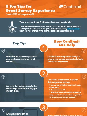
8 top tips from Confirmit for great survey experience (and LOTS of responses!). This infographic explains how responsive design contributes to a better survey experience. There are currently over 5 billion mobile phone users globally and the established preference for mobile continues with more website visits coming from mobile than desktop. Studies reveal nearly 80% of people reach for their phones in the morning before doing anything else!
Download
Here’s a preview of some of the tops tips:
- Mobile is Key, so your survey content must work seamlessly across all devices. Confirmit uses responsive design to ensure your survey automatically looks its best on any device.
- Use tools that help you create the best surveys possible. Our clients choose how to create their responsive surveys: a) Use our out-of-the-box templates for easy set-up. b) Create from scratch. c) Build your own totally custom experience using our API, full documentation is provided for clients that want to get-technical!
- Survey designing can be complicated & time-consuming. Pick software that makes survey creation quick so you can spend time focusing on what matters (the results!). With Confirmit you only have to create your survey ONCE regardless of mode or channel, saving you valuable time & eliminating unnecessary cost.
- Your surveys should feel consistent & always look their best. Our out-of-the-box templates are designed to fit your brand. Easily customize them to create a consistent look & feel.
- Make your web intercept surveys powerful & unobtrusive across multiple channels. Our Digital Feedback product is fully responsive, ensuring your pop-outs are always optimized to drive up response rates. Responsive design contributes to creating quick, fun, engaging surveys that work on any device and reduce mid-survey respondent fatigue.
For more top tips check out the full infographic.
