If you’ve invested the time in making your website’s mobile version more shopper-friendly, you should start seeing better returns. Mobile users have long exceeded visitors on desktops and tablets in respect to catalog browsing. But, finally, the number of mobile purchasers is increasing.
A recent study by Wolfgang Digital, an Ireland-based research firm, reported that year-over-year mobile sales grew by 23 percent during the 12 months ended June 30, 2018, in, mainly, the U.S. and Europe. Moreover, the study confirmed that smartphone traffic outranks visits from desktops and tablets combined. Thus it’s essential to continue focusing on ways to turn mobile shoppers into customers.
There are plenty of ways to encourage mobile sales conversions. In this post, I’ll address eight of them.
Increasing Conversions from Mobile
Decrease load times. Website speed is a big issue. Last year Google reported it takes, on average, roughly 15 seconds to fully load a mobile web page. That’s not good. By some accounts, half of the visitors will leave if a page takes more than three seconds to display on their screen.
Focus more on what matters: simple, easy-to-digest content rather than flashy graphics and load-bearing scripts. Consider eliminating everything that isn’t necessary for first-time conversions, especially on the home page and landing pages.
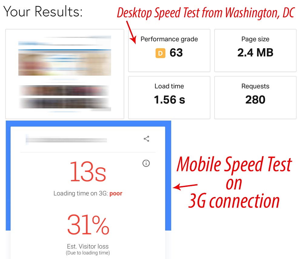
Run mobile speed tests regularly. Don’t rely on desktop tests as they nearly always return faster results. According to Google, nearly 70 percent of the mobile users worldwide will use 3G connections through 2020 — much slower than typical broadband.

Don’t rely on desktop tests as they nearly always return faster results. The difference in load time between desktop and mobile can be drastic. Sources: Pingdom and Google.
Tweak the site’s design. The more appealing the design, the better the chance people will stay and shop. Keep in mind that simple can be both beautiful and engaging. If you’ve been procrastinating about fixing design elements or color schemes, now is the time to take action. An attractive, inviting site will nearly always convert better than one that isn’t.
Simplify navigation. The average shopper has little patience when it comes to figuring out where to go. Successful mobile sites have obvious ways to get to everything — the catalog, customer service, shopping cart, and checkout, as examples.
Eliminate jargon. Describe products using simple words and graphics. Include all the key information without stuffing content. Be descriptive without wasting your visitors’ time.
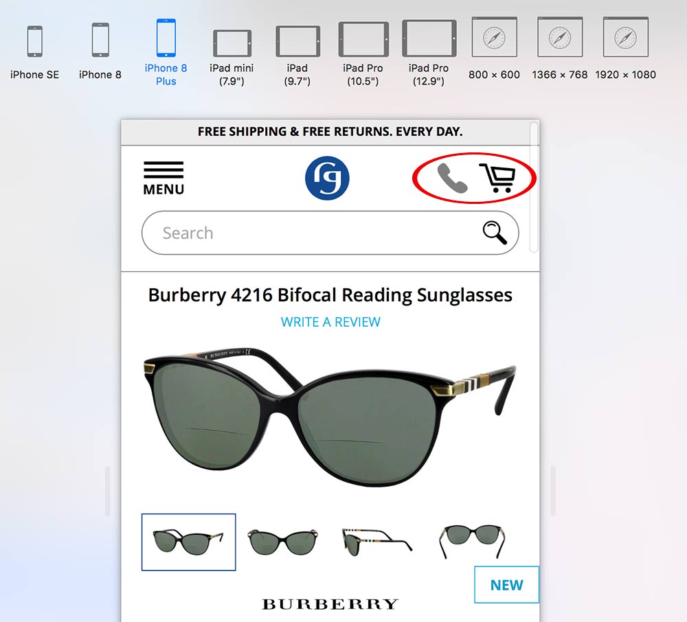
Use clear calls to action. Add to cart, signup, and other key conversion buttons should be apparent. Ideally, “buy” buttons should load above the scroll line, or immediately after if using full-screen product images. Cart and checkout buttons should be visible no matter where the shopper is on the site.
Simplify checkout. Make sure shoppers can reach checkout in a single tap. Eliminate any extra steps. Remove unnecessary form fields, which increase the chances of abandonment. Request only what you need to complete the sale.

Make sure the cart and checkout buttons stand out. An icon to tap for mobile calling is also helpful. Image: Burberry.
Encourage return visits. Focus on the number of sessions per user in a given period. Many studies show that the more one visits an online store, the more likely he will ultimately make a purchase. If you can’t convert visitors on the first visit, at least make a good impression. This goes beyond special offers and sales. Trust is a key reason people return to a site.
Instill trust. Display trust symbols — SSL logos, affiliations, payment icons — on every page. Incorporate testimonials and reviews, as well as return and exchange policies. These all help newcomers trust you and your products.

Instill trust by displaying icons and affiliations and providing direct links to customer service. Image: RetroPlanet.com.