A primary call to action is essential on product and landing pages. It’s easy for add-to-cart buttons to get overshadowed by other necessary options, such as adding an item to a wish list or sharing it on social media. When this happens, conversion rates suffer.
For in-stock products, “add to cart” is always the primary CTA. It needs to stand out without detracting from the most important details about the item, such as the product name, images, price, and other key features.
A single CTA is most logical way to convert. Sometimes keeping it simple is best. Image: Fuel So Good Coffee.
Calling attention to the primary action you want the shopper to take, though, is about more than large buttons with ample space. The store’s design and color scheme play a big role, as do the target shoppers and their buying habits.
Here are eight considerations for presenting the ultimate call to action on a product page.
8 Ways to Supercharge Calls to Action
Standard, simple text works best. Stick to terms like “add to cart” or “purchase” (for stores where typically only a single item is bought). Recognizable instruction works best.
Text-based buttons on a solid background work better than fancy graphics. The idea is to prompt the shopper to take action, not to distract that plea with a busy design.
Poo-Pourri’s landing page CTA is crystal clear: Visitors should order now.
The color should follow the site’s design without blending in. Contrasting colors can work, too, so long as they don’t stand out so much they detract from everything else.
The add-to-cart button should be grouped with available options. If the shopper needs to select a size, color, or other attribute, the CTA should appear immediately below the selection.
Be sure to group necessary elements, such as product options, with the CTA. Image: Everything Kitchens.
Also, leave options open for selection. In the example above, the 8-inch option is selected by default, making it easy for the shopper to add the item to the cart without realizing the size he’s ordering.
On desktop computers, the CTA should always appear above the fold. If shoppers need to scroll to add an item to the cart, conversions drop.
Don’t place the CTA before everything else. Etailer Crate & Barrel does this on the site’s desktop version, but it’s not ideal. Not only does it separate the add-to-cart text from the delivery options, it begs for a purchase before the shopper has even reviewed the product. CTAs define the action to take once the shopper has gained interest. It’s difficult to sell products sight unseen, and this kind of placement can leave shoppers hunting for the button when they’re ready to purchase.
Placing the add-to-cart button above options and in a non-standard location confuses shoppers. Source: Crate & Barrel.
Avoid fancy styles, like excessive emboss and drop shadow. Not only do these filters distract, they often make stores look like they haven’t been updated since the early 2000s. Shoppers might not be able to pinpoint exactly why a button made them question a purchase — only that it isn’t appealing.
Don’t sway from the standards on mobile. With mobile accounting for more than half of Internet traffic, it makes sense to carry the standards over to those devices. While shoppers typically have to scroll (just once, ideally) to reach the CTA, the requested action needs to be just as clear.
It’s common for the CTA to appear on the second scroll for mobile. Be sure not to bury important info, like pricing, in this area.
Use secondary calls to action. While the primary CTA is essential, secondary CTAs are needed as well. These can be links or buttons that prompt alternative actions, such as taking shoppers to other products or sections. Without these, non-buying shoppers have little choice than to leave the store.
Secondary CTAs include:
- Add to registry or wish list, or save for later.
- Share on social media or email to a friend.
- Shop related sections or items.
- Buy add-ons or accessories.
- Links to “did you mean?” areas.
Secondary CTAs can be buttons, graphics, or links, yet should never take attention away from the primary CTA.
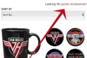
Never underestimate the power of anchor text. Anchor text is linked text that prompts visitors to take an action. Anchor text is commonly used for search engine optimization, but it can also be used to prompt for clicks on landing pages, category pages, and supporting content (such as how-to articles and the store’s blog posts). On product pages, it can be used to direct shoppers to alternative products without taking away from the primary CTA. According to HubSpot, anchor text can increase conversions by more than 120 percent.
Use anchor text to direct shoppers to other options. In this case, a link to guitar accessories helps shoppers who aren’t looking for other accessories — coffee mugs in this example.
Implement, annotate, and review. It is imperative to review results of all CTAs in the store. In Google Analytics, create annotations to track which changes increased conversions. To do this, visit Conversions > Ecommerce > Overview. At the bottom of the chart, click the expandable down arrow, and then click “+Create New Annotation.” Be descriptive about the change to help identify reasons for the results.
Annotating changes to CTAs helps determine which changes helped boost conversions.

