If you put a great deal of focus on social media, organic search, and online advertising for incoming traffic, there’s a good chance you’re not putting enough effort into a key gateway to products: the category page.
While ecommerce continues to grow and evolve, let’s not miss the mark by serving up cookie-cutter pages of products. There is much to be done on the category page. Here are nine features that can help boost conversions by using the shopper’s time efficiently.
9 Key Category Features
Educate with headers. Lately, the norm is simple is best. But that doesn’t mean ditching category descriptors altogether, especially for products that don’t necessarily speak for themselves.

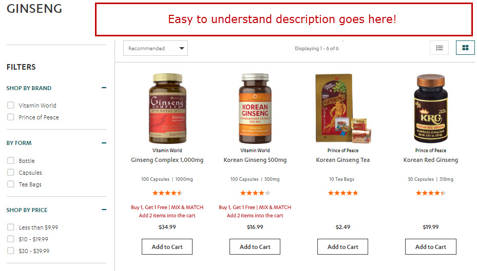
What exactly are the benefits of ginseng? Vitamin World could convert more if it used category headers to educate its target audiences.
You can also use category headers to quickly display subcategories and related sections.
Use headers to tell stories, assist with search engine optimization, and display subcategories, such as in this example from Missguided.com, a women’s clothing retailer.
—
Show featured subcategories. By featured, I’m referring to groups of products based on the most sought-after types, brands, uses, and price range. This is different than automatically displaying all nested categories, which may clutter the page or, sometimes, miss targeting your intended audience.
Show featured subcategories, such as brands, that are relevant to your target audience. Source: J.C. Penney.
—
Let them shop by color. Color is a primary factor in the purchase of many types of products. Displaying color filters on search and category pages helps customers find what they want more quickly. Take it a step further by using colored blocks to select the right range of colors. Since devices and monitors display colors differently, include the color or color range name beneath the block. This is useful for those with vision impairments, too.
Missguided.com uses colored blocks — with the color name beneath — to simplify filtering.
—
Let them choose the price range. There are two main problems with pre-determined price ranges. First, they assume shoppers fit into budget “boxes.” You may wind up losing sales from those who want to spend more, or less.
Second, the gaps tend to be too large. For example, offering a filter for a huge collection of dresses priced between $50 and $100 doesn’t much help a shopper who only has $65 to spend.
Instead, use input boxes for shoppers to enter price ranges. It’s good practice to pre-populate the fields with average low-high prices.
Also, reserve “under” and “over” named filters for the lowest and highest priced groups. This allows shoppers wanting to shop in a specific range from having lower-priced items clutter the results. (This is good practice for categorized gift guides, too.)
Give them a way to shop by intent or purpose. Some shoppers are brand loyal, and others want to find products based on specific occasions, goals, or interests. Guide visitors to groups of products that fit the bill and you’ll likely sell more. A store that sells vitamins and supplements would provide ways to shop by one’s goal — such as weight loss, weight gain, or flexibility training — while a gift shop may subcategorize anniversary gifts by milestones.
Promote volume pricing and “buy one, get one” offers. This helps bargain hunters navigate more quickly. If you offer mix and match deals, it lets them see exactly what qualifies and what doesn’t.
Vitamin World makes it easy to find products to mix and match for BOGOs.
—
Show available colors for products. Have you ever shopped for furniture in a physical store and hunted for a sales clerk, to ask for different colors or finishes? It wastes time. The same goes for having to click through to a product page.
Show them what colors are available right on the category page. Source: Bon-Ton.
—
Show what ships free. If you offer free shipping based on order threshold, you can convert more if you promote free shipping on individual products. Be sure to label other products that ship free regardless of price.
Don’t assume that shoppers are aware of free shipping thresholds. Label qualifying products throughout categories. Source: Van Halen Store.
Consider eliminating the bestseller filter. For huge etailers, focusing on best selling products helps shoppers make what they think are the best decisions — and, for Amazon, it often is. This isn’t ideal for smaller stores, due to a few factors.
- Shoppers who focus primarily on best selling products rarely see other items that currently sell less, but are better in price, quality, and rating.
- Calling too much attention to best sellers can keep them more prominent, which makes moving other stock more difficult.
- Best sellers, by default, aren’t necessarily the best rated. Displaying these first could be costing you sales.
Instead of pushing what sells the most, focus on quality, features, price, and overall customer rating.
Testing Is Paramount
Use heat maps (primarily for desktops) and analytics to determine what works. Some of these features take up real estate. So make sure the space taken is worth it. Remember, not every feature is for every type of store. It’s up to you to understand your shoppers and what makes them tick.