Median conversion rates hover between 3-6%, according to the Conversion Benchmark Report. But the best?
Anywhere between 12-27%. That’s two to five times the median.
If you’re reading this, chances are that you’re stuck somewhere in the depressingly-low single digits. Most are.
You’ve got the right keywords, your Ad Groups are on point, and your landing pages nail the essentials. So why are conversions and costs not budging?
The problem is that while ‘best practices’ can be helpful, they’re not enough. You need to rethink how those PPC landing pages are organized, who they’re targeting, and what customers need from them at different points in time.
Here are three places to get you started moving up into that double-digit club where you belong.
1. Funnel Segmentation
PPC landing pages arguably have the biggest impact on campaign ROI—just not for the reasons you think. It isn’t just the cheesy, tool-generated headlines that are stopping you from converting. It’s the lack of funnel segmentation in your campaigns.
In a perfect world, your PPC campaigns look like this:
Multiple stages of your funnel
+ Multiple offers for each stage of the funnel
+ Multiple keyword variations + ads for each offer
= Dozens and dozens of landing pages
And yet, you probably don’t have dozens and dozens of landing pages. You’re probably rocking one landing page. Potentially five. Rarely, ten.
Because: work. I get it.
But you don’t need another lecture about TOFU, MOFU, and BOFU. You need to start differentiating campaign offers with pages for each one.
Check out Jon Loomer’s 15 Facebook ad campaigns, for instance. He’s got awareness-based content campaigns at the top, lead gen nurturing ones in the middle, and revenue-producing sales offers at the bottom. Each with a different offer and associated landing page:
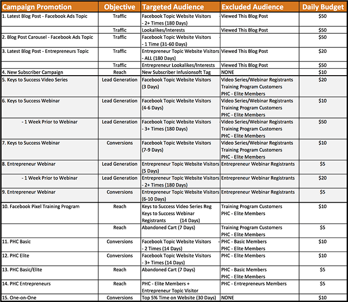
He’s even got different offers for different segments in the same funnel stage. Beginners get one page, while power users get another. This is an excellent example of how it should work, but where do you start?
How Directive Consulting built a funnel
Here’s a common way this plays out. Brady Cramm, Director of PPC at Directive Consulting, had trouble driving results from LinkedIn display ads at first. That’s because up until recently, LinkedIn’s advertising options were a nightmare.
Targeting was a significant part of this problem. LinkedIn tempts advertisers to laser-target an audience based on job title or role. But the audience sizes often weren’t large enough based on the poor click-through rates. As a result, it used to be brain surgery to manifest a few clicks a day. And your chances at turning those into any meaningful lead count was minuscule.
Thankfully, there’s been significant improvements since then.
Brady now uses LinkedIn ads to drive eBook downloads and views. But they’re beginning to move away from gated content in favor of tracking pixels on different pages.
For example, you can drop the LinkedIn Insights Pixel on your site. You don’t even have to be running ads to use it:

The Pixel can be targeted towards specific pages, like your guide, eBook landing page, or ad offer. Once you get over 300 visitors to that page, you can tap into their matched audiences.
As Brady points out, “you can see what job titles, industries, and functions are on each page. You can see that you’re getting VPs of marketing and then create a tailored campaign specifically for them.”
And that’s the killer targeting he now looks for:
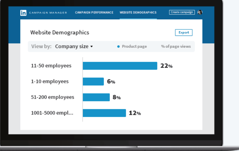
Here’s an example of how it all comes together. Brady’s company, Directive, has a popular post about B2B marketing ideas. They rank high on the popular search query. And as a result, they net a ton of traffic.
The LinkedIn Insight Pixel here helps them figure out exactly who’s visiting (and why).
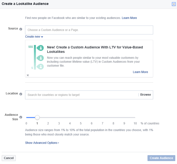
Then they can turn around and create a Facebook lookalike audience based on the people who’ve visited that page from search:
It doesn’t stop there. Once someone becomes a lead or provides their information, custom audiences can be spun up on both on LinkedIn with Matched Audiences…
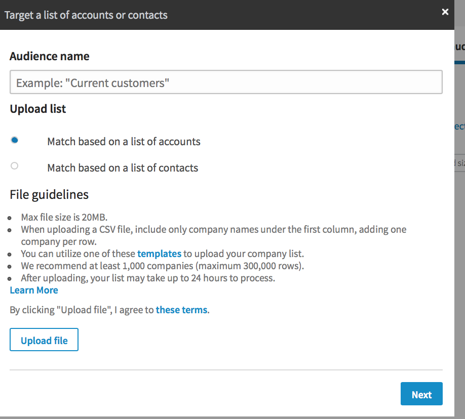
… or Facebook with Custom Audiences:
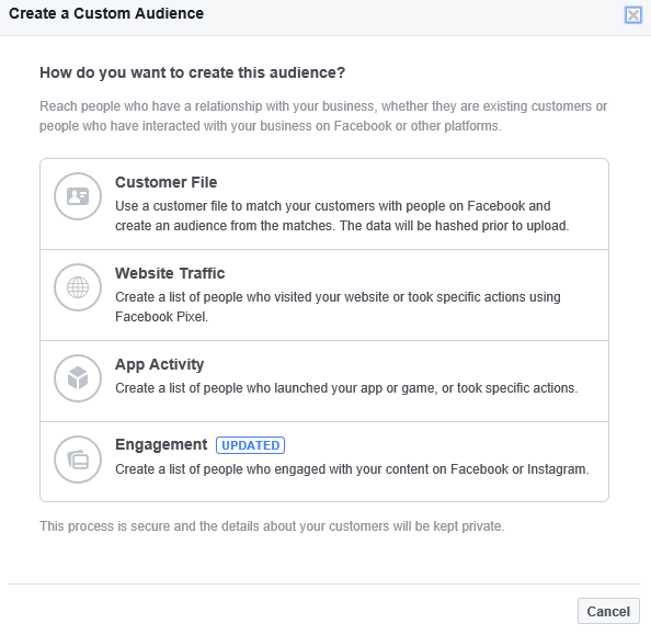
But Brady’s strategy doesn’t stop there. “There are a lot of PPC opportunities outside Google Ads,” he says.
For instance, Directive also uses Quora ads to promote an opt-in eBook. The book’s topic dealt with “B2B marketing demand gen,” so he targeted “B2B demand gen” topics in Quora. Makes sense. (And the Quora listing is written like content, so it blends in and gets a better response rate.)
Third-party directories are also huge for B2B.
Think about the typical customer journey for a second. The very first step is for someone to realize they have a problem. When that happens, they start looking for information around that particular issue. After gathering enough research and evidence, the next step is to begin transitioning into potential solutions.
Most competitive markets have different affiliate-based sites that aggregate, rank, and suggest possible solutions. Local businesses have Yelp. Travel has TripAdvisor.
And B2B has Capterra.
Capterra lists companies within specific verticals, like “construction marketing software.” Options are then ranked based on a number of criteria, like the number or quality of reviews.
But you can also pay to be listed at the top too. It’s a PPC bidding war. Potential customers look up related software alternatives, and you pay to be listed in the top five to get the most interest:
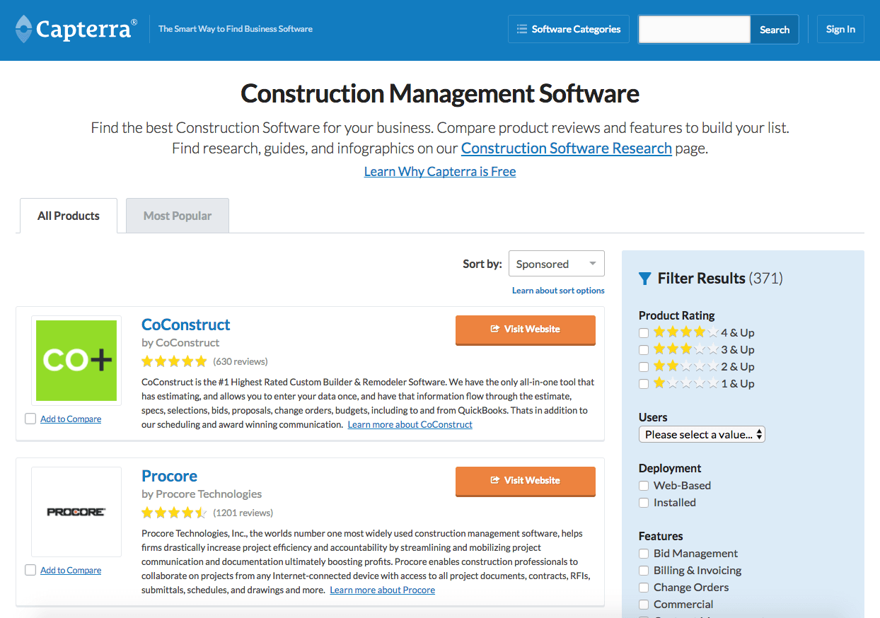
Brady elaborates on the benefits of using Capterra:
“I see those as highest Sales Qualified Leads (SQLs) at lowest costs. In consumer’s eyes, they see our client ranking as top three [blank] software company. And then from there, you can audit the competition’s landing pages, improving the messaging and CTAs to outperform them.”
Managing ad spend across campaigns
Beyond this basic setup, Directive uses Shape.io to manage budget and ad spend across many different concurrent campaigns in places like Google, LinkedIn, Facebook, or Capterra: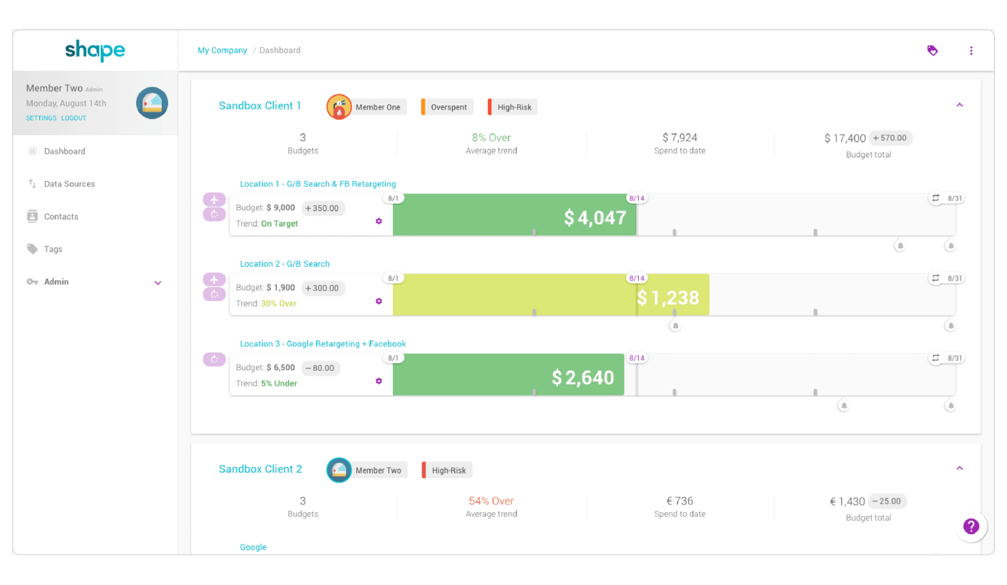 They work with a lot of large accounts that frequently start and stop campaigns based on iterative performance. That can be a managerial nightmare. It’s incredibly time-consuming to babysit campaign performance to the required level of granularity. And the risk of missing something and overspending is high.
Shape lets Directive set up predefined targets with caps for multiple campaigns under each client that make it tailor-made for scaling agency accounts. Brady agrees:
They offer a cool, all-in-one visualization of all channels. It includes budget trend, predicted spend based on real-time performance, how increases or decreases will affect performance, and also an autopilot feature to catch trend lines to not overspend.
2. Message Match
Now, if you’re following Jon Loomer or Directive Consulting’s example, you’ve got funnel segmentation. You’re treating landing pages like content mapping, aligning unique pages with each different offer, segment, or audience, within each stage. You have SKAGS or other tightly-controlled ad groups.
The next step is to align messaging for each page to (1) who’s visiting, (2) why they’re visiting, or (3) where they’re visiting from. Why?
Better message match
=
better Quality/Relevance Scores
=
lower Cost Per Leads
That’s where Dynamic Text Replacement comes into play, a handy little off-the-shelf feature in the Unbounce Builder to help you personalize PPC landing page content. It’d be challenging to do this hundreds or even thousands of times, but dynamic text replacement solves this (almost) overnight.
Dynamic Text Replacement (DTR)
Inside the Unbounce Builder, you can highlight a content section, like the headline. Head over to the “Properties” tab, and click on “Dynamic Text Replacement.”
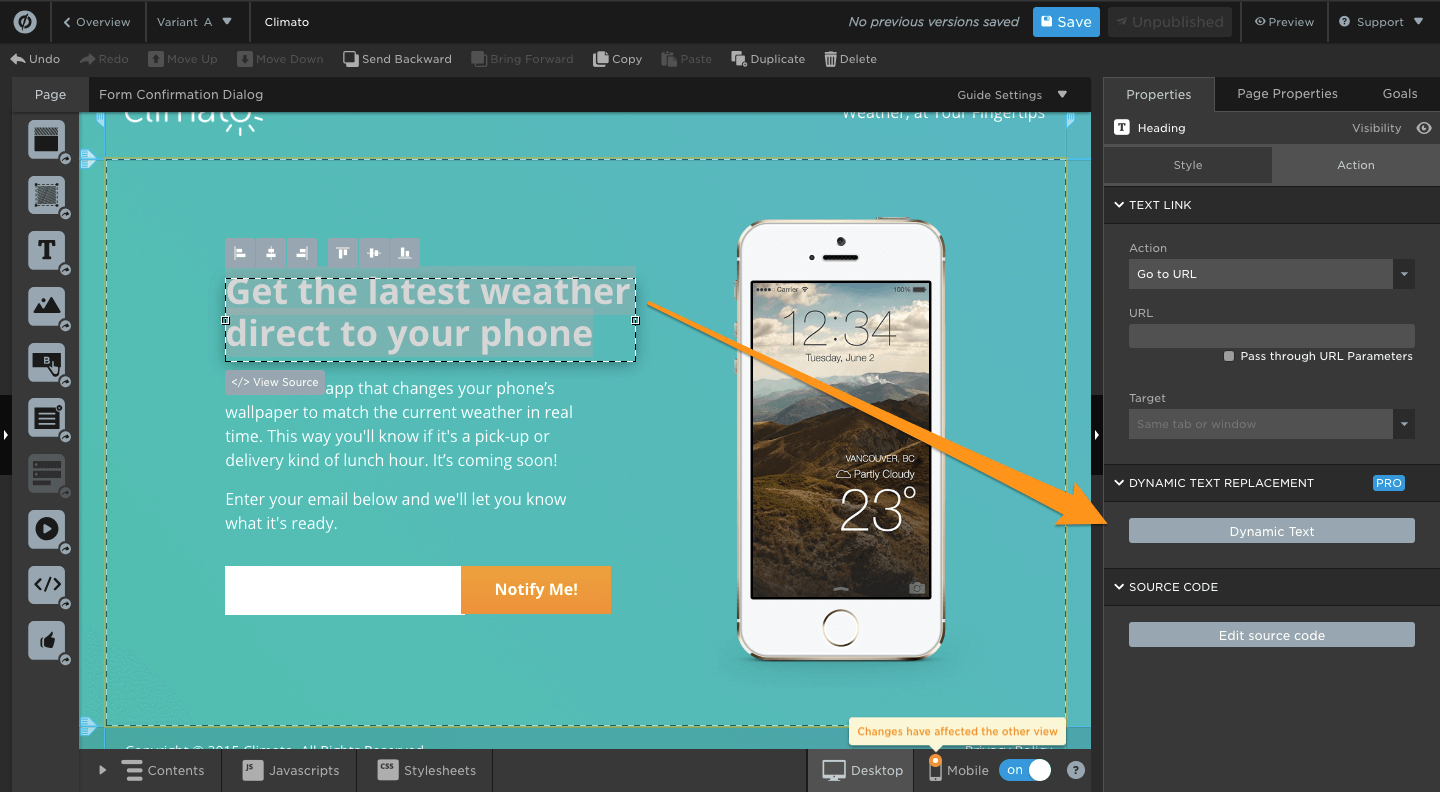
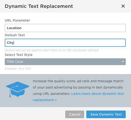
Next, you can set the parameter and default text to show visitors as a backup plan. It’s all pretty straightforward.
And we’re still just scratching the surface here.
ShipBob is making a killing by optimizing message match across all campaigns. Chief Marketing Officer, Casey Armstrong, reported that they’ve been able to scale their ad spend over 60% quarter-over-quarter while keeping ROI the same:
At ShipBob, we hyper-focus on customization from ad to landing page to on-boarding experience. We’re launching some exciting new on-boarding elements shortly, so today we can focus on the ad-to-landing page experience. We use Unbounce and run a script to create dynamic header and copy changes throughout the page. We mirror our ad campaigns and ad groups to each landing page, as we run over 1,000 campaigns and over 100,000 groups.
So, for example, you Google “Shopify Order Fulfillment” and see this exact-match ad:

You click it, and then land on a page that exclusively focuses on “Shopify order fulfillment”:

Google Ads IF Functions
Google Ads IF functions are another game changer for message match because now you can pair it with DTR to customize ad and page, automatically.
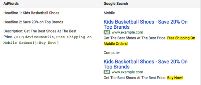
For example, you can use RLSA audiences or even device type to customize ad text on the fly, even going so far as to change the offer for each. Take this example from Samantha Drane of CPC Strategy:
The way we use our mobile device is different than the way we search on desktop. Mobile is more ‘in the moment’–maybe you’re going somewhere or looking for something near you, but desktop is considered more of a research tool.
Here’s how it works out:
Targeted Templates
You can create page templates for each segment, too. So that in addition to copy, other page elements can be customized, like an attorney-looking dude that pops up when you search for “attorneys”:

While a doctor-looking dude comes up for “doctors”:

(Note: These examples are both dudes because the targeting was primarily dude-specific.)
In fact, laser-targeting each landing page like this to every single keyword you’re bidding on might be the lowest-of-low-hanging-PPC fruit. Obsessive message match in this last example decreased cost per converted click from $482.41 to $147.65 while increasing the conversion rate from 4.08% to 12.76%.
Before:
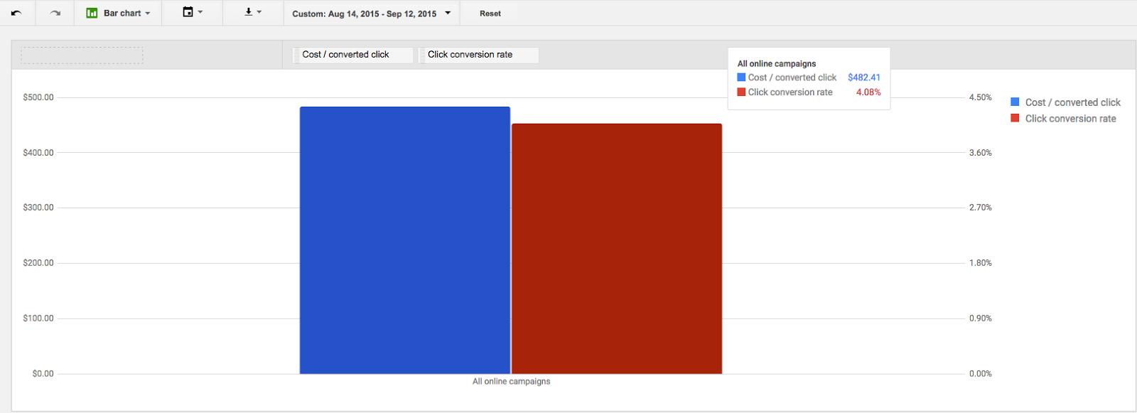
After:
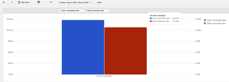
Multiply those cost changes against a $30,000/month budget (which this was), and you’re talking about hundreds of more leads for tens of thousands less.
3. Offer Messaging
Google Ads can trick you.
Nowhere else can you get sales-ready leads with such precision and accuracy. No other platform—online or off—delivers people to your door with wallet in hand.
That’s why the same old boring “Free Quote” landing page works OK on Google Ads but absolutely bombs on pretty much every other channel out there. Don’t fall for that trap.
The final ingredient separating double-digit landing pages from sub 1-2% is amplifying the offers you’re using to draw people near (three billion in ad spend analyzed can’t be wrong.)
It’s about moving away from a direct hard sale:
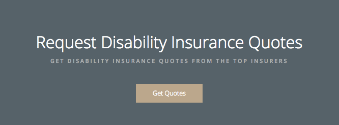
To one that focuses on the end result that your customers receive:

Except, how do you balance message match (who they are, where they’re coming from, etc.) with more persuasive copy that gets them to convert?
Luckily, Joanna Wiebe’s got the trick to balancing the two with her 10/90 messaging hierarchy layout:
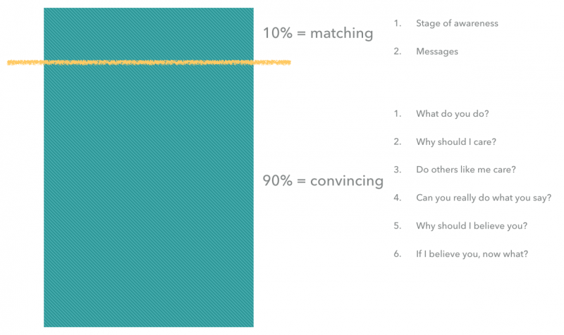
Customize the top ten percent for message match, and the bottom 90 percent for persuasion.
Trimming your word count
When you’re trying to be persuasive, it’s easy to forget that you still need to be as concise as possible. The Conversion Benchmark Report states that pages with fewer words (less than 100) convert 50% better.
So how can you possibly persuade, while ruthlessly cutting word count?
Wistia recommends split testing with video placements: “Put your video to the test by making two different versions of the page and seeing which one drives more conversions, the one with or without the video,” according to Venngage’s guide on lead gen. Then you can even split test different types of videos or demos.
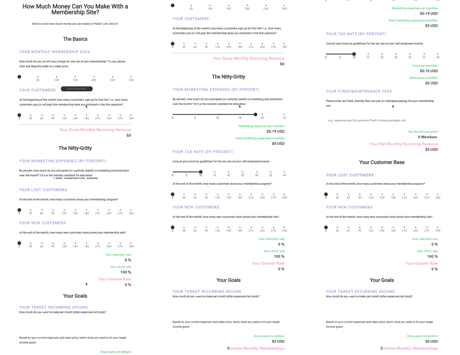
Split testing pages, not necessarily A/B testing, is a recurring theme. For instance, you can split test different types of offers for the same campaign. No matter if it’s a quote request, free assessment, webinar, or interactive calculator, like the one we created for Podia:
For Directive Consulting, on the other hand, software demo videos work really. They’ll often do on-demand or evergreen ones (as opposed to scheduled ones), so prospects can view the video at their own convenience. Here’s a perfect example:
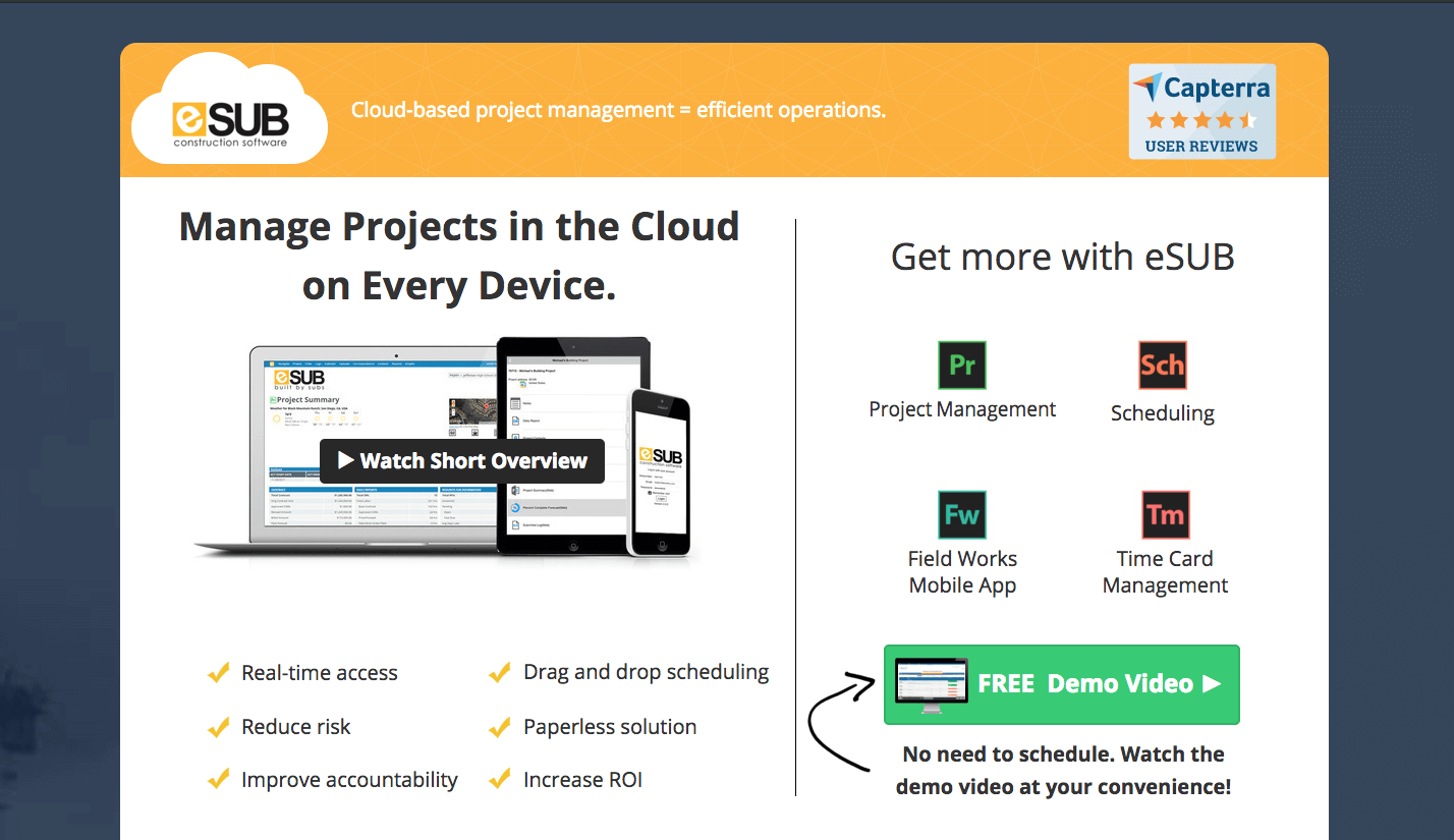
Extras like this help a lot in a competitive environment, like Google Ads or Capterra, where the same person might click on the first ten companies to compare them all within a few minutes.
“Convenience can provide a big lift,” says Brady.
Brady focuses next on ad copy, but not just for message match in this case. Page elements, like teaser bullets, quickly summarize the main outcomes and benefits (not features) a prospect might get.
This is also one of the most common mistakes he sees on most B2B landing pages.
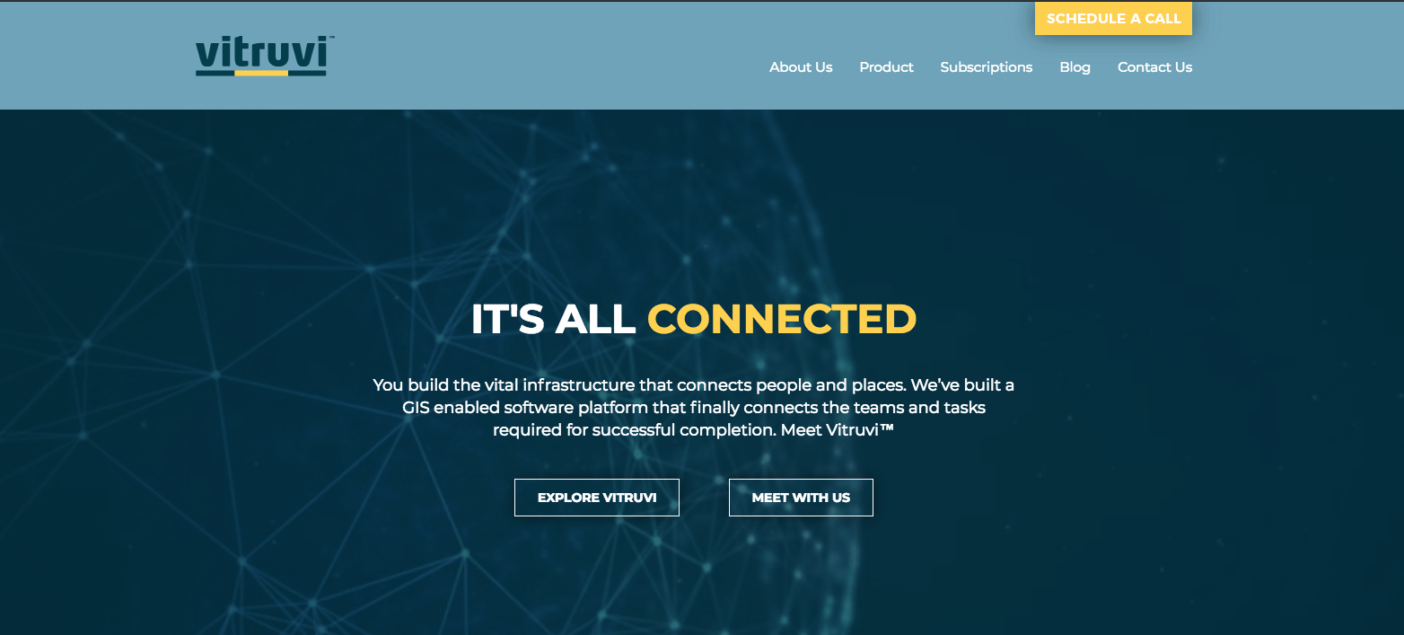
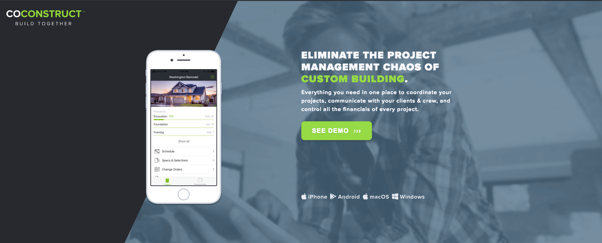
It’s so important to get that outside perspective. There’s a poison in many B2B companies, where everyone uses their own language around the office. They all understand it. But nobody (outside of the company) knows what they’re saying when they bring it to the web.
So not this:
🤔
But that:
🤗
Device targeting
Last but not least, device targeting can make or break your campaign’s offer messaging.
Landing pages need to be treated differently if they’re on mobile versus desktop. One time, a Directive client had their form below the fold on mobile devices. The page was responsive, but the mobile layout wasn’t ideal, forcing the form out of sight and out of mind:
The solution was obvious: “We swapped [the form] to the top and conversions went through the roof.”
And Brady also decided to segment paid campaigns only for mobile or desktop. Not both: “Mobile traffic was sharing and clicking, which is good. But they weren’t staying very long, consuming it, or opting-in.”
Users exhibit different behavior on mobile versus desktop. Brand awareness campaigns or content promotion might work well on social, but lead gen campaigns are often better reserved for desktop. We’ve confirmed this across several promoted content tests on Facebook.
My company spent $984.69 on one content campaign and found that the three primarily-mobile placements (Audience Network, Messenger, and Instagram) significantly outperformed desktop and right column placements for top-of-the-funnel traffic.
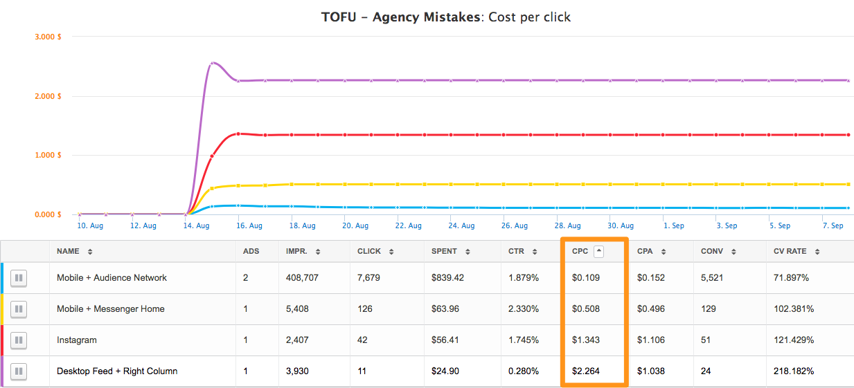
In this case, it makes no sense to continue spending anything on desktop placements. You might as well drive as many cheap clicks as possible, so you can later retarget them with better offers on desktop when there’s a better chance they’ll convert.
Here’s how the math breaks down after shifting more ad budget to the mobile-based placements:

That’s nearly 2,000% more clicks for the same spend. And we were able to repeat this trend again and again and again.
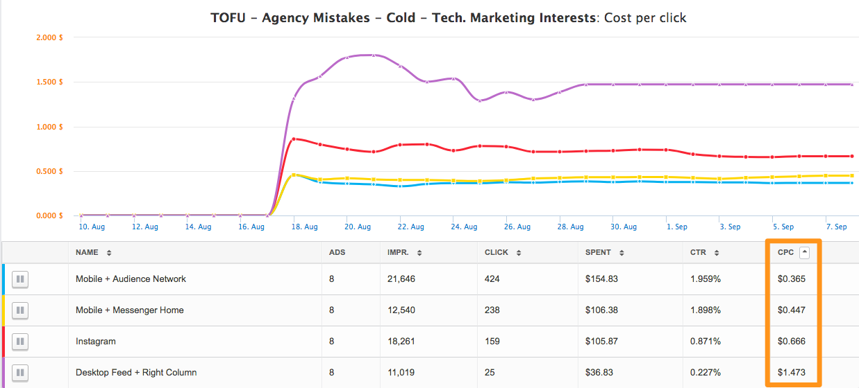
So the campaign success wasn’t just indicative of a single headline or button or any other variable on your PPC landing pages.
Rather, we learned that campaign success more often comes from aligning everything from the funnel segmentation, with message match, and offer messaging across each placement.
Conclusion
Button color has basically zero impact on your PPC campaign performance. Yes, landing pages should have certain elements. Yes, they should be convincing and professional.
But what separates a >10%+ converting landing pages from a <2% one isn’t just what’s on the page.
- It has to do with your funnel segmentation and how you’re delivering offers to people on different platforms and different times.
- It has to do with message match at scale so that each combination of ad and landing page aligns perfectly.
- And it has to do with how you’re testing page offers to better match what people want.
So while ‘best practices’ are a good starting place, true landing page success doesn’t come down to any single variable but how all of these puzzle pieces fit together in the end.
