Airbnb is a master of branding and tempting UX. We thought we’d round up some examples, from campaigns to webpages and even little bits of what one might call ‘micro UX’.
It should be noted that not all of Airbnb’s creative efforts have gone smoothly (have a look at Floating World and Shell, the once-evicted super host).
However, there’s plenty worth shouting about within Airbnb’s community-led approach, so we hope you enjoy reading through this list and find some inspiration.
Right, off we go…
1. ‘We Accept’
In 2017, Airbnb responded to accusations that some of its hosts were discriminating against guests on the basis of race and gender by introducing a nondiscrimination policy on their site. Their ‘We Accept’ campaign was launched to underpin Airbnb’s long-held values of community-led and culturally diverse travel.
Combining simple photography and melancholic background music, the ad encourages viewers to reflect on the core message outlined by the bold typography in the centre of the frame. The result is powerful and moving.
In similar vein, Airbnb’s 2018 ‘Keep Travelling Forward‘ campaign (which is also worth a watch) reinforced this idea of global community by directly rebutting the imposed travel ban in the US.
2. Experiences
Airbnb recently intensified its focus on experiences, offering more opportunities than ever to prospective travellers looking for authenticity in their destinations.
The online marketplace introduced thousands of new ‘Passion Categories’, such as food and drink, concerts and sports, across thousands of new locations by the end of 2018.
To increase awareness of this added functionality, Airbnb collaborated with brands Vice and Pantone to produce immersive experiences, often gamifying them to increase desirability and hype around the campaign.
Vice
Media brand and broadcaster Vice, known for covering often controversial and NSFW topics, curated a number of experiences for Airbnb inspired by some of its most successful content. One hundred competition entrants were chosen to participate in these ‘once in a lifetime’ experiences in locations such as New York and Tokyo.
Pantone
Inspired by the 2017 Pantone colour of the year, the ‘Outside In‘ project was launched in association with Airbnb.
For a limited time, guests could book to visit a building in Clerkenwell, London which had been transformed into a green paradise. They could also book activities, such as gin making, a wallpaper painting workshop and tea picking to enhance their experience.
Incredibly immersive and very ‘grammable, this listing provided a great escape from the grey city streets, but it didn’t stick around for long (only three days, in fact).
Thank you to those who visited our @Pantone Outside In house last week, may it inspire a year of lush Greenery in your homes ???? ???? #LiveThere pic.twitter.com/2F1kbRr6i2
— Airbnb UK (@Airbnb_uk) February 1, 2017
3. Marnie the Dog
To celebrate National Dog Week in the US, Airbnb teamed up with the very adorable Marnie the Dog, doggy influencer-extraordinaire, to boost awareness of its pet-friendly listings.
In this short, produced by DKC Productions, Marnie gets treated like a VIP in a Beverly Hills mansion. Its addictive feel-good vibe and charming humour forces us to play it on repeat.
4. ‘Live There’ campaign
In 2016, Airbnb further developed its brand proposition, rooted in travel, communities, people and experiences.
The Live There campaign summed this up brilliantly, contrasting the Airbnb experience with more traditional, more inauthentic travel.
As Jonathan Mildenhall told Marketing Week, Airbnb is “moving towards [an] end-to-end experience proposition where the core of the Airbnb brand value proposition transcends accommodation.”
5. App design
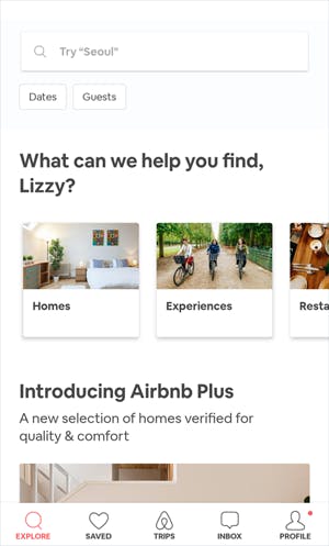
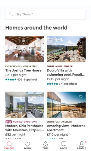
The app was redesigned for the Live There campaign launch. Airbnb improved its matching algorithms to present users with the most appropriate information and listings.
But it’s the simplicity of the design that strikes us most.
The main page of the app is a long scrolling experience including a sticky search bar, a whole bunch of recommendations and extensive content such as guidebooks.
There’s no faffing about in a menu, discovery is baked into the homepage of the app.
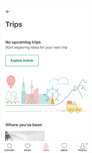
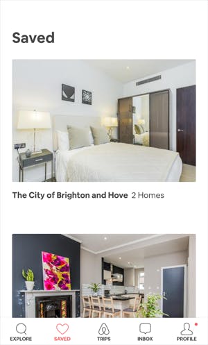
The four other tabs on the footer menu give access to more practical areas of the app – search functionality, messages from hosts, your booked trips and your profile.
It’s one of the easiest apps to navigate that we have experienced, with the white space and chunky headers making it a joy to use.
The Airbnb app homepage.


The Airbnb app


6. The Belo logo
There was a small amount consternation on social media when Airbnb’s current branding launched in 2014, as the Belo logo looks not unlike the previously existing logo for Automation Anywhere.
But the rebranding process was a huge success (read more here) and, as Airbnb CMO Jonathan Mildenhall told FastCo, was “when [Airbnb] went from a property listings company, which is what we were – a very successful property listings company – to a culturally-driven brand.”
The Belong Anywhere campaign and the Belo logo launched Airbnb as a super brand.
7. Neighbourhood guides
There are lots of neighbourhood guides curated by Airbnb for 23 of its most popular cities. Each is extensive.
There is much to love about these guides, with Airbnb’s indomitable tone of voice ringing throughout.
Here’s a list of what makes the neighbourhood guides great:
Neighbourhood guides are heavy on photography…
…essential for marketing of place.
Using local photographers means authenticity and unusual aspects that don’t look like regular travel agent fare.
Each long page is a mesmerising joy to scroll, and at the bottom there’s even details of each photographer and their websites.
Digested information
See the summary of Tokyo below. Listing what locals love and hate paints a picture of the city in the way that mere listings of attractions cannot.
The guides also include well-labelled maps and plenty of transport advice.
Summary of Tokyo.
Integration with hosts
As one would expect with Airbnb, this content marketing of sorts is a whole lot more.
These guides are integrated into the Airbnb platform and therefore offer genuine value to users.
What that means is links through to places to stay, quotes from hosts, community tags (crowdsourced lists of attractions), and the ability to save neighbourhoods to look at them again later.
8. Guidebooks
I have already extolled the merits of Airbnb’s Guidebooks in another post – 10 examples of great travel marketing campaigns.
They are similar to the neighbourhood guides discussed earlier, but are different in one crucial aspect – they are crowdsourced from hosts, each of whom is invited to add their recommendations to the platform. That makes them more personal, more authentic.
There are aggregated city guidebooks, too, which tot up all the host votes and present a list of top ‘things to do’.
The Guidebooks do cross over slightly with neighbourhood guides, but are much more about planning activities, rather than deciding where to stay.
What’s to like about the design of the guidebooks? Well, they are a great example of user-generated content, laid out a bit like TripAdvisor, only with a cleaner design.
Host comments are included, there’s a handy map with all attractions marked, filters for different types of place, and external links to useful websites.
User-generated content is exactly what Airbnb is about – letting travellers experience the authentic side of their destination. Ultimately these guidebooks should become a platform in their own right.
A host guidebook.
9. Airbnb Stories
These host stories are simple but effective – honest portraits of some of Airbnb’s best hosts.
A few years old now, these stories are nevertheless an important part of Airbnb’s marketing.
Though not everyone will come across this content or need it to be convinced to book, without community-led content, Airbnb would be failing to publicise its USP.
10. The floating house
A bit of experiential PR now, with the Airbnb house that was floated down the Thames in May 2015 (a bit of a PR cliché, we know).
The stunt celebrated the Deregulation Act, confirming Londoners could let their house out for 90 days (effectively the legalisation of Airbnb, which had been a grey area).
In terms of PR, the competition (win a stay in the floating house) delivered 73,500 people to the Airbnb site, 28,000 of whom were new to Airbnb.
Reach of 19m on social media was impressive and you need only Google ‘airbnb floating house’ to see how effective the campaign was.
In conclusion…
Perhaps the best note to finish on is one from James McClure, Airbnb’s general manager for UK & Ireland.
He told Marketing Week about Airbnb’s community-led marketing strategy, saying: “Our selling point is that we don’t view marketing with a capital M like most companies do; everything we do starts with the community first.”
“If you look closely at other iconic brands and their moment of brand truth, it’s when you open that iPhone box or try on those Nike trainers for the first time. We are succeeding in making that first moment a traveller knocks on a door and meets their host our defining truth.”
James’ eloquent assertion is evidenced in the creative and content above. Airbnb is doing a great job.