The third part of our step-by-step guide will take you through the last five parts to building your website, making it easy for all the non-techies out there
This is the third part of this step-by-step guide taking you through how to build and launch your website. Let me quickly remind you of those things that we learned in part one and part two.
In part one we looked at choosing a domain name and what you should consider when doing so. We also went through buying that domain name and how it could be beneficial to keeping the hosting and domain name separate. This part of the guide also went through some of the most popular CMS options.
Part two emphasized the importance of choosing a reliable website host. It also explored the differences between shared hosting, VPS hosting, and managed hosting. On top of this, the blog looked at marketplaces offering ready-made website templates, including TemplateMonster, ElegantThemes, and ThemeForest.
Now, we’ll go through the final five steps that you need to follow in order to create your company website.
6. Choose your theme
Once you get through all the steps in the previous blogs, it’s time to look for your website template. These are sets of ready-made pages that are pre-designed and incredibly easy in use. Obviously, no coding experience, extra skills, or special knowledge is needed to make the most of your templates, so they are a great option no matter what your skill level.
Your pack can include a variety of ready-made pages, including:
- Contacts
- Blog
- Maps
- Gallery
- Our projects
- Shop
- Contact us
- Our team
- Feedback
Besides these, there will be lots of UI components, web design trends, modern features, and more.
So, how do you choose the right theme for your site? To begin with, you should know all about the features you definitely need. To help you create a list of must-have features for your site, here are some you really need to make sure your templates include:
Navigation

Needless to say, navigation is the first thing you should work on, as customers will make use of your navigation system it as soon as they open your website. After all, even the best website design won’t impress people if they can’t navigate around your site easily.
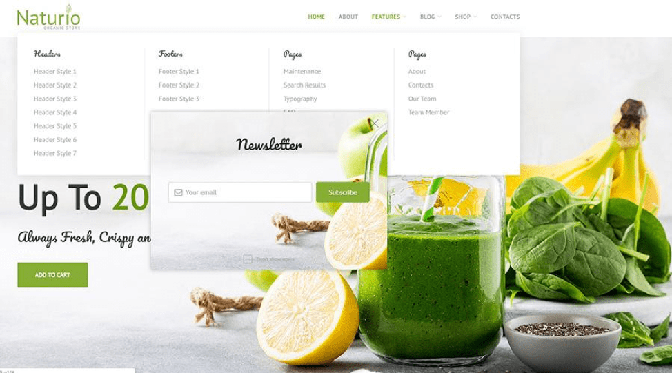
Choosing an easy-to-use navigation option – such as that seen with the Naturio WooCommerce theme above – will ensure that everyone can find what they’re looking for.
Here are some other features to look out for when choosing your theme or template:
MegaMenu
This is a top-notch plugin that allows you to build menus of varying complexity. You can enrich the menu with pictures, icons, vectors, animations, and other visuals to make it more engaging.
With this plugin on board, you will be able to sort all your items, products, services, and pages. There will be many categories and subcategories, so the web design won’t look overloaded. Plus, this plugin can help improve your SEO results.
Hamburger Menu
Another cool feature to look for when managing a site is a Hamburger Menu. This small option will hide lots of information, keeping your site looking neat and tidy. If you want to showcase a lot of details and keep the website minimalist, a Hamburger Menu is definitely your must-use.
Stick-to-top or sticky menu
To put it simply, this menu stays at the top of the site all the time, no matter which page someone clicks through to. It also won’t disappear when a customer scrolls the gallery down. As a result, your website visitors won’t need to scroll all the pages back up in order to open another section, helping to improve the user experience.
Back-to-top button
This small web design element helps to make website navigation more comfortable. As the name suggests, this button will take your visitor back to the top of the page. Rather than having to scroll upwards, people will be able to get back to the top of the site with a single click.
Responsive design
In the modern age of web design, responsive design is something you really need. Visiting your website, customers already expect that it is fully responsive, so they can enter it via any device.
It means that your site will fit any gadget and any screen size. All the elements (including media, texts, and videos) will be rendered to the required size automatically. This improves the mobile experience, which accounts for a large proportion of browsing.
Mobile-first design
As an alternative, you can use a mobile-first design. This feature starts building your website with its mobile version. It will be available for customers even when the desktop site is still under construction, allowing people to visit your site and learn about your company.
Cross-browser compatibility
Needless to say, your website should also be cross-browser compatible. This means it is built so customers can visit it and get the same experience across all browsers.
Accelerated Mobile Pages (AMPs)
Finally, you should know what AMPs are. Accelerated Mobile Pages are another way to build a fast and mobile-friendly website. There are many advantages, including faster load speed on mobile devices, but the main one is that they will make your mobile site really lightweight.
Intuitive search
I also recommend that you add intuitive search to your web design. This type of search shows suggested results when a user is typing their request. It will help the visitor to quickly find exactly what they are looking for.
Easy contact
The final feature you should make use of is a way for users to contact you. It is important to ensure people are able to contact you with questions or complaints quickly and easily, especially as it could reduce social media complaints. Use features like a quick contact form and live chat. There are a number of great live chat plugins available for WordPress.
On top of these features, your site should:
- Be simple so people don’t get confused.
- Include the logo of your company or any other image that will make your brand easy to remember.
- Use call to action (CTA) buttons.
- Be SEO-friendly.
- Be translation-ready.
Additional Options

Now you know about the main must-haves any website requires, let’s move onto the additional features you may want to use. Below, I’ve selected the functions that will help you to promote some products or services, so you may want to consider introducing these to your site.
Featured products
Top-Rated Products or Featured Products can be a great way to show people what products others have bought, highlight any offers you have or promote products when you have an excess of stock. Different themes have different names for this option but they all allow you to select the most popular products and showcase them on your main page.
Counters
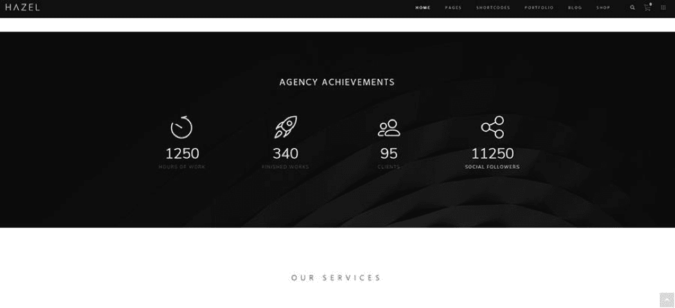
Secondly, take a look at modern counters. They make a nice way to attract visitors and engage them in any offers. For example, one option is a Countdown Timer, which shows how much time a user has until the end or the beginning of something, such as a discount. Without a doubt, it a winning way to promote new items, inform people about a sale and much more.
Social login
Make sure that your website is linked to all popular social media platforms. Use a Social Login option to let people visit your website or add their details via their social media accounts. This will help them to skip a long registration process – which can have a high abandonment rate – and can bring more social traffic to your site.
Insta Gallery
If you have a good presence on Instagram, it could be a good idea to add an Insta Gallery to your homepage. This will allow you to showcase user-generated content and provide social proof around your products. You can set it up to show images from users who have used a specific hashtag associated with your brand.
Blog
A blog is important for SEO, as it enables you to develop a content marketing strategy based on keyword research, which can help you improve in search rankings. It also provides your audience with informing, engaging and relevant content. Just be sure to keep it active.
Web design trends
When you are done with the technical part of the website, you’ll probably want to get a couple of trendy features. Here are the web design trends popular in 2019 that you might want to consider:
- 3D illustration
- Outlined type
- More diverse, iconoclastic illustration styles
- Vintage type
- Inclusive design
- Bold typography
- Broken grid and asymmetrical layouts
- Fluid/organic design and elements
- Nostalgic design aesthetic
- More enhanced/elevated image treatments
- Monochromatic and absence of colour
- Overlapping design elements
- Reimagined hero/header areas
- Large and experimental navigations
- Serifs on screen
- Diversity
- Thumb-friendly navigation
- Glitch art
- Natural, organic shapes
- Micro-interactions, etc.
Don’t forget that you will need only a few of these features, otherwise, your website is likely to become overly complicated.
7. Install your theme
When you are sure that you found the right theme for your brand, it’s time to install it. As always, this process depends on the CMS you choose but the installation is the same for almost every product. As an example, I’ll show you how to install a WordPress-based website theme. To do it, you should:
- Download the theme
- Install it
- Choose one or several templates from the pack
- Combine the needed details
- Pick a colour scheme
- Customize all the details (icons, buttons, sections, etc.)
- Find unique pictures
- Upload new content
- Check the way it looks
- That’s all!
It’s worth remembering that not all the WordPress themes require the latest version of WP but it is recommended that you always use the most recent version of your CMS as it will make your site work faster, lower the security risks and fix any bugs present in the previous version. An update is free, so you can simply download WordPress from their official website.
How to download WordPress
In case you decided to update WP or just have never downloaded it at all, the only thing you need to do is download WordPress from the official site. As soon as you have done this, unpack the files with any file archiver. This process is very simple but, if needed, you can find lots of videos and other tutorials online.
Your next step will be uploading WordPress to the hosting server. The only thing you need to do is upload the platform files into:
- The PUBLIC_HTML
- Or WWW directory.
And that’s it! Now, you can create a database.
8. Design your site
Finally, it’s time to enrich your website. You already know which features you definitely need, so, hopefully, you’ve chosen a theme that includes them. What you need to work out now is what style you want to use for your site. Currently, the most popular web designs are:
- Minimalist design
- Flat design
- Material design
- Neutral design
- Urban design
- Corporate
These are popular because everything about these designs is simple. They are clean, neat, readable, and eye-friendly. Plus, it’s always easier to promote your chosen information with a minimalist design, as users won’t be confused by over-the-top design. Still, no matter which web design you are about to use, keep in mind that all the aspects of your site should harmonize with each other.
9. Fill your website with content
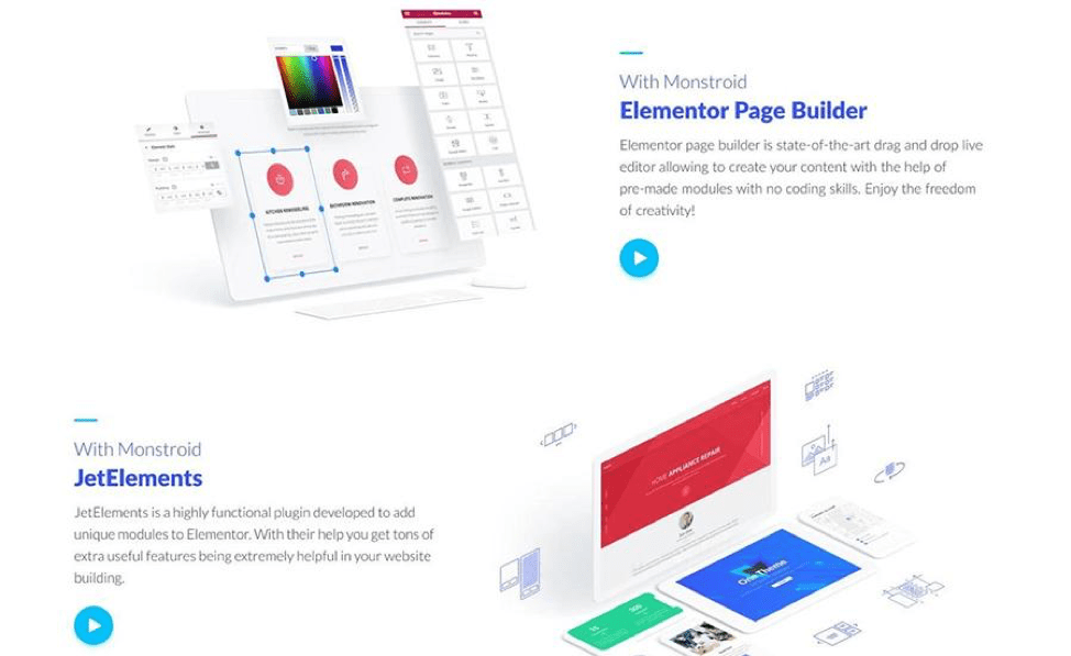
This will be the fastest and easiest step because, nowadays, all premium themes are creator-friendly and code-free. When it comes to WordPress, you can upload your content and organize your pages with Elementor without a hitch.

However, it’s worth bearing in mind the keywords that you want to rank for and SEO best practices when writing your content. You want to ensure the content on your site informs any visitors, but you also want it to help you rank better.
If you’re using WordPress, there are a few steps you should take to ensure your site is SEO optimized.
10. Keep it up-to-date
Although you may think that all the work is done, website creation is only the first step. To keep the audience engaged, your website should have regular updates. Here are some easy ways to make your site look fresh:
- Change your CTA buttons.
- Upload fresh banners, grids, and other promos.
- Create a newsletter pop-up and use it to inform customers about discounts and offers.
- Run a blog and update it regularly. You can showcase your most popular and newest posts on the main page.
- Integrate your social media accounts with your website to show new content.
Final thoughts
As you can see, website building is not a big deal at all and you don’t need loads of technical skills to create a functioning website. Thanks to all these handy features and user-oriented products, you can run an outstanding site without trouble.
Just remember that to attract visitors, improve conversion and create a good user experience, the website should:
- B visitor-friendly
- Be mobile-friendly
- Use flexible settings (for you and for visitors)
- Include search engine optimized content and design features
- Have easy-in-use navigation for starters
