 When I say, “website design,” what comes to mind? Graphic design? Interface design? User experience design?
How about analytics design? That’s what Andy Crestodina thinks of. Andy – who has provided web strategy and advice to more than a thousand businesses, and written the book Content Chemistry: The Illustrated Handbook for Content Marketing – encourages all companies to consider analytics when designing or redesigning a website.
The bad news: If you fail to make analytics-friendly design decisions, your website will work against your analytics, preventing you from getting insights that could benefit you.
If you fail to make analytics-friendly design decisions, your site will work against you, says @crestodina. Click To Tweet
The good news: It’s easy to make analytics-friendly design decisions.
This article summarizes some of the advice Andy gave at Content Marketing World in his talk Web Design vs. Analytics Setup, including:
- Put your blog in its own directory.
- Make a page for each product, service, and topic.
- Post PDFs sparingly.
- Put thank-you messages on their own pages.
- Post contact forms, not email links.
Put your blog in its own directory
To set up a blog to get the most out of analytics, choose a URL structure with care. Your URL is your site’s backbone. Andy says, “The structure of the URL has everything to do with how well you can do analysis. It also has a big impact on search-engine friendliness.”
The worst place to put your blog – for SEO and analytics – is at a separate website, a separate domain. In fact, Andy says, never launch any website on a separate domain. When people link to a separate domain, the domain authority of your main site is diluted.

The worst place to put your blog for #SEO & analytics is on a separate domain, says @crestodina. #CMWorld Click To Tweet
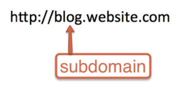
An OK place to publish a blog is a subdomain: blog dot website dot com. It’s easy to set up a subdomain; a lot of companies choose this URL structure for their blogs. A subdomain doesn’t have to be hosted on the same server as everything else on the website.
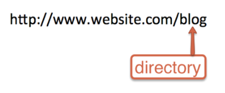
A better place to put your blog is at slash blog. Everything after the slash is in a directory (folder) off the root of that website. Only when blog posts are in their own directory can you easily get data about the performance of individual posts.
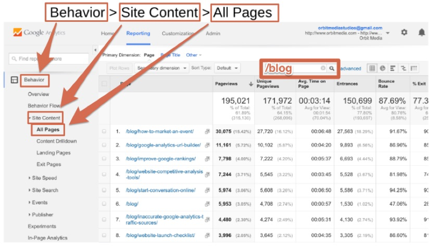
Andy gives this example of how easy it is in Google Analytics to review the performance of individual posts when those posts are all located in a directory. Go to Behavior > Site Content > All Pages, and enter “/blog” in the filter field. Then, “Kaboom, there are all your blog posts,” Andy says.
Click to enlarge
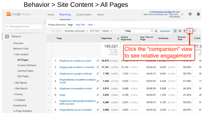
Next, Andy clicks the comparison button:
Click to enlarge
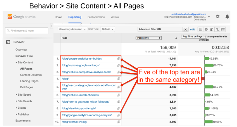
In this case, five of the top 10 blog posts are in the same category. (The categories don’t show up in this screenshot.)
Click to enlarge
When he saw this report, Andy says, the insight was obvious: “We should publish more in that category.”
In short, put your blog in a subdirectory of your website so you can get analytics for individual blog posts. Then you can adjust your content strategy accordingly, for example, publishing more content on the most popular topics and doing more to promote your high-value, low-traffic posts.
Make a page for each product, service, topic
Just as your blog’s URL structure determines how much value you can get from your analytics, so, too, does the way you structure your web pages. Andy notes that web pages, unlike blog posts, are typically about a company’s products and services. People searching for the content about your products and services are more likely than blog readers to consider a purchase.
“Marketers need to understand the difference and set up product and service pages for analytics accordingly,” Andy says.
He starts by showing what not to do and cites a long page about a company’s services – all of its services. The page title is Services. The problem with lumping all the services onto one page is that Google doesn’t rank websites; it ranks web pages.
“Every page has a chance to be relevant for a topic. Every page has the chance to rank for a phrase,” Andy says.
Make a page for every one of your services, and give each page a title based on what people call that service. As Andy says:
A page called Services might work for people searching on the term ‘services,’ but who’s going to search for that? We have built a thousand websites, and never once have we built a page called Services or Solutions. I’ve done thousands of hours of keyword research, and, trust me, no one is searching on ‘solutions.’
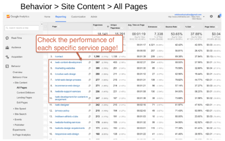
In fact, create a page for every service, every product, and every topic. This approach helps not only with SEO but also with analytics. In Google Analytics, go to Behavior > Site Content > All Pages, to see the performance of each service or product or topic – as long as each has its own page.
Create a separate page for each product, service, & topic for more helpful analytics @crestodina. #SEO Click To Tweet
Click to enlarge
When you set up your pages this way, your analytics can help you identify pages performing well or poorly. You can see where your content is weak, where it’s strong, when people bounce, and what’s ranking. You get none of these insights if you lump all your products into a product page or all your services onto a service page.
Post PDFs sparingly
Yes, PDFs are easy to post. Resist the temptation unless you also post the content as a web page. With the exception of gated content (files people can download in exchange for their email addresses), PDF files, according to Andy, are “a terrible thing to put on your website – the rust of the internet.”
Here’s why:
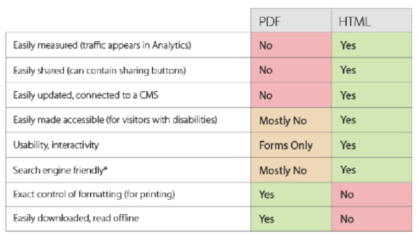
- People can’t easily share content that’s locked in a PDF.
- Search engines can’t rank PDF content.
- Analytics can’t measure the performance of PDF content.
- PDFs aren’t accessible for visitors with disabilities.
- PDFs aren’t interactive.
Resist the temptation to post a PDF unless you also post the content as a web page, says @crestodina. #CMWorld Click To Tweet
This chart conveys the pros and cons of PDFs vs. HTML pages:
How much PDF rust is on your website? Search for “site:WEBSITEURL/ .PDF” (as shown in the example below). You’ll see the approximate number of PDF files on your website. Go look at each of those. “Make sure you have an HTML version for every one of those pieces of content,” Andy says.
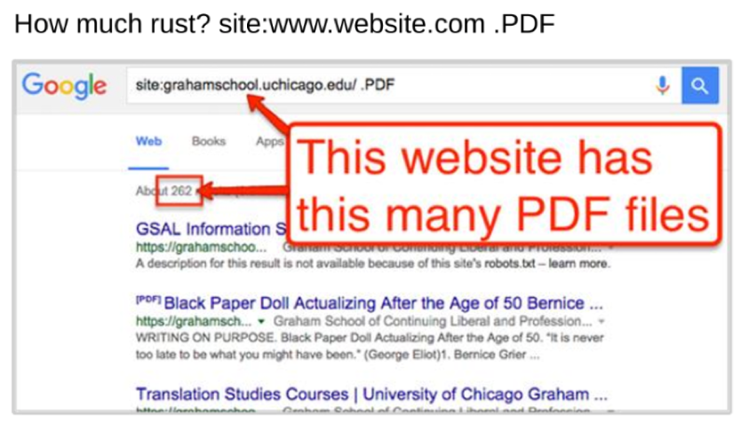
Andy’s advice boils down to this: Make PDF the secondary format and post PDFs only for documents likely to be printed or shared with a particular layout.
Put thank-you messages on their own pages
From the viewer’s point of view, a thank-you message is a thank-you message. From a content marketer’s perspective, you get more useful analytics when you put thank-you messages on their own pages, separate from your sign-up forms.
Here’s an example of a page that includes both the sign-up form and the thank-you message. As soon as someone fills in the fields to request a demo (thereby becoming a lead), the thank-you message appears below the form – on the same URL as the form. “There is no JavaScript trigger. There is no destination goal,” Andy says.
Click to enlarge
A thank-you page has its own URL, enabling you to get reports on conversions specific to that page.
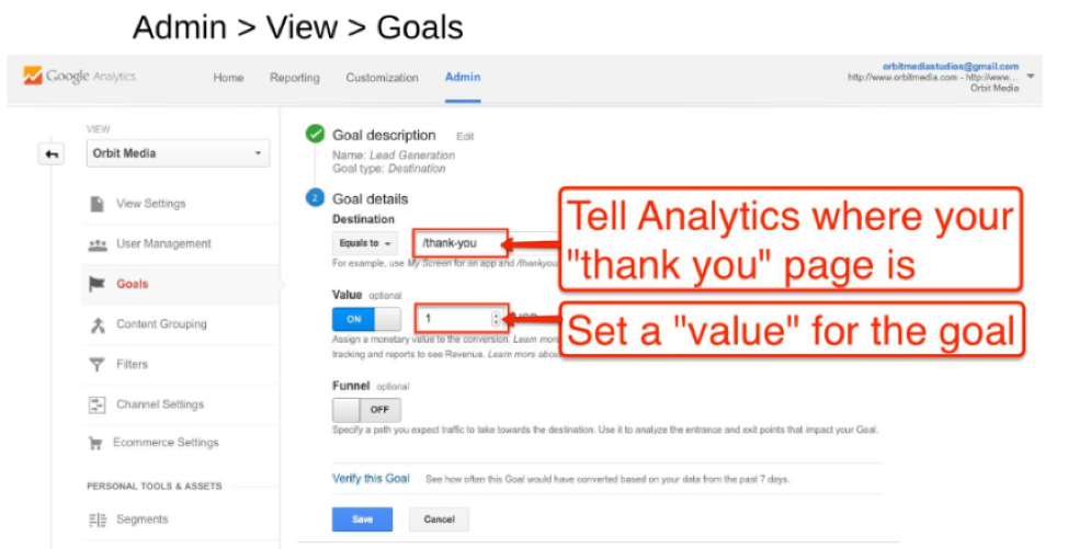
Here’s how to set up goals for a given thank-you page:
- Go to Admin > View > Goals.
- Under “Destination,” enter the thank-you page’s location.
- Under “Value,” select a number. Don’t leave that box empty. Fill in an arbitrary number rather than nothing at all.
Click to enlarge
- Set “Funnel” to ON.
- Under “Screen/Page,” fill in the address of the previous step (the page that precedes the thank-you page).
- Set “Required?” to YES.
Click to enlarge
Andy recommends making separate thank-you pages for each type of conversion for several reasons because you can:
- Set a unique goal for each page.
- Customize the message on each page. (For example, you thank a job candidate differently than you thank a newsletter subscriber.)
- Invite people to take a unique subsequent call to action. (Andy says to give a call to action at the bottom of every page on your website, including each thank-you page. Example: “Get our latest advice every two weeks. Subscribe.” Last year, Andy’s company got 377 newsletter subscribers from the thank-you page after the contact form. “No cost. Free. Super fans.”)
- Offer people more content – maybe a piece of advice. (Take every opportunity to talk to people separately based on who they are. Andy says, “Conversions are a big opportunity. They’re your first chance to talk to people based on their new status.”)
And there’s no downside to having multiple thank-you pages. Additional pages don’t cost more. They don’t make analysis more difficult. In fact, some people believe small sites have a ranking disadvantage since they lack “mass” and “gravity.” Andy suggests building sites with many pages. “I can’t think of a benefit to having fewer pages,” he says.
HANDPICKED RELATED CONTENT:
Post contact forms, not email links
What’s worse than a thank-you message on the same page as the contact form? Email links instead of a contact form.
The page on the left gives email links as the way for site visitors to contact the company:
Click to enlarge
Email links have drawbacks. They:
- Don’t lead to a thank-you page, so you can neither track those interactions in analytics nor automatically deliver additional content or subsequent calls to action
- Can’t be stored in a back-up database
- May not get through
- Don’t send an autoresponse email unless one is set up for that email address
- Don’t route themselves based on what the sender says
- Attract spam (Spammers write robots that scrape the internet for live email addresses and then spam those addresses.)
This chart conveys the pros and cons of contact forms vs. email links:
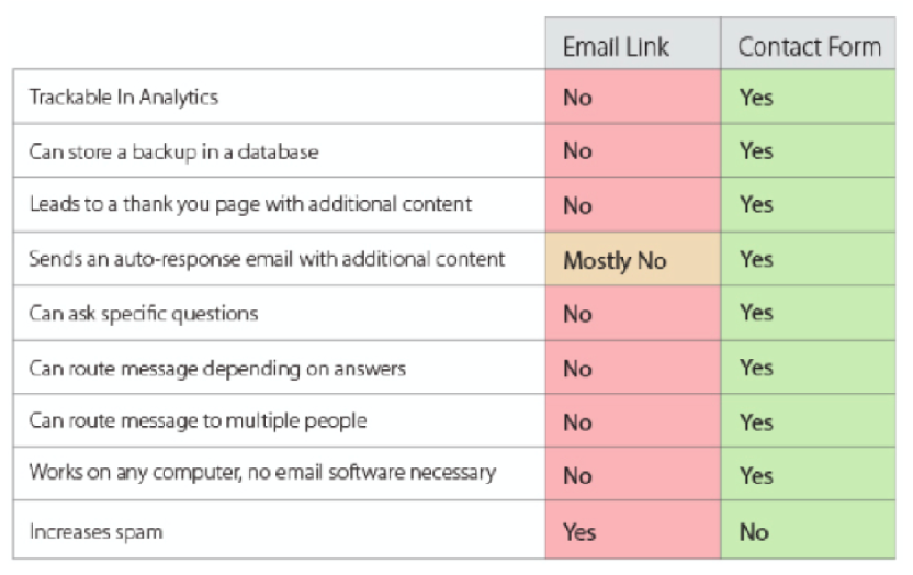
In general, avoid posting email addresses on websites. Use contact forms instead.
Avoid posting email addresses on websites. Instead use contact forms, says @crestodina. #CMWorld Click To Tweet
Conclusion
Your company’s website needs more than graphic design, interface design, or user-experience design. It needs analytics design. Consider Andy’s suggestions:
- Put your blog in its own directory.
- Make a page for each product, service, and topic.
- Post PDFs sparingly.
- Put thank-you messages on their own pages.
- Post contact forms, not email links.
What else does your team do to set up your website for analytics?
Want more from Andy Crestodina? He’ll be speaking at Content Marketing World Sept. 5-8 in Cleveland, Ohio.
Sign up for our weekly Content Strategy for Marketers e-newsletter, which features exclusive stories and insights from CMI Chief Content Adviser Robert Rose. If you’re like many other marketers we meet, you’ll come to look forward to reading his thoughts every Saturday.
Cover image by Joseph Kalinowski/Content Marketing Institute

