Conversion rate optimization is one of the most complicated tasks in marketing, and there are many reasons for that. For one, there are no magic bullets for optimization that would work for every page. Furthermore, it’s extremely hard to track how users are actually interacting within a web page. One tool that makes it much easier to see what people are doing on a web page is a heatmap.
In this post, I explain how to use heatmaps to increase conversions. Let’s go.
What Are Heatmaps?
A heatmap is a graphical representation of how web users are interacting with digital content and page elements.
Heatmaps were originally used to display real-time financial market data to assist traders in making decisions. In CRO and web design heatmaps are used for tracking, quantifying, and displaying users’ clicks and mouse movements.
Heatmaps are used to visualize visitors’ interactions with graphic elements and information displayed on web pages, thereby providing insight into how user experience design and layout impacts users’ actions and conversions.
How Can Heatmaps Help You Increase Conversions?
A heatmap provides a wealth of information regarding visitors’ web-browsing actions.
- They show whether or not clear friction points exist. For example, site elements that seem to be clickable but are actually static.
- Heatmaps show how visitors interact with calls to action.
- They show which areas visitors interact with the most, as well as which page elements prevent them from following the conversion path.
Moreover, thanks to color coding, all of this insight is quite easy to grasp.
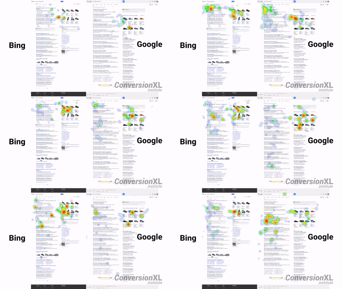
I love this example of a heatmap visualizing user interactions with Google and Bing SERPs from Conversionxl.

Example of a heatmap visualizing user interactions with Google and Bing SERPs. Source: Conversionxl
A heatmap is also handy in gathering data from large numbers of users, without having to leave the comfort of your office (or investing in focus groups).
Heatmap data is very accurate and represents a big set of users that are likely to be your ideal customers and clients that interact with the web page naturally.
Types of Heatmaps
A heatmap is a general term used for different heatmapping tools: move maps, click maps, and scroll maps.
It is useful to know the difference, as different types will help you investigate different aspects of the website performance:
Move maps
Move maps keep track of where desktop users move and pause the mouse while navigating a page. The hotspots in move maps show where the mouse paused.
Research shows a correlation between where a user’s mouse is and where they’re actually looking. This means the move map will give you an idea of where people may be looking while they are using your page.
Click maps
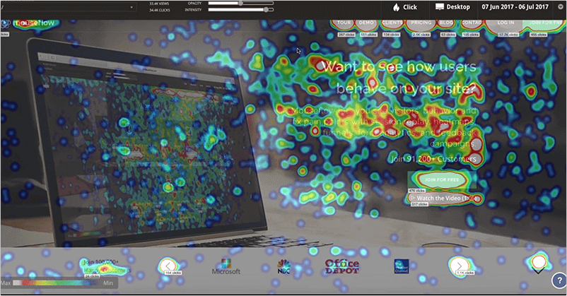
A click map shows where visitors click the mouse on desktop computers or tap on mobile devices. Click maps for mobile devices are called touch heatmaps.
The maps are color coded to show which elements or areas have been tapped or clicked the most (from least to most clicked the colors are green, yellow, orange and red).

Image Source: digitaleagles.com.au
Scroll maps
Scroll maps show how many visitors scroll down to a specific point on the page. The higher the number of visitors that saw an area, the redder the area becomes.
Once you have obtained heatmap data, you will be able to determine if visitors are actually using the website as you intended. This will help you make any required changes to optimize conversion rates.
There are multiple platforms that have all kinds of heatmap features, as well as several WordPress plugins that integrate heatmaps into your A/B testing service.
Here are three ways you can use heatmaps to increase conversion rates.
1. Reducing Cart Abandonment
If your checkout page is not converting visitors as expected, data from heatmaps can help identify where they’re actually clicking. They may be moving the mouse all over the page because it’s not apparent where the checkout button is.
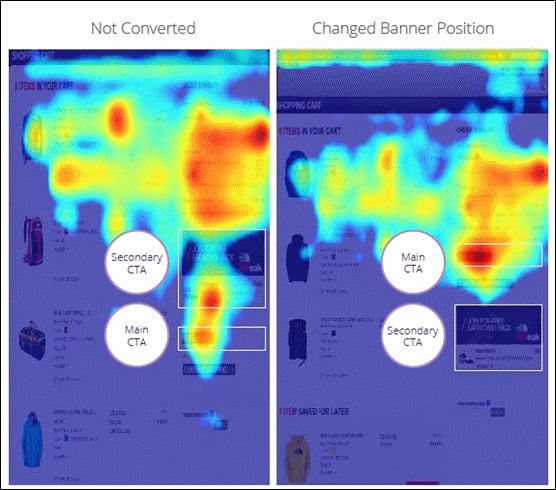
In this example below The North Face website team used heatmaps to discover that visitors were being distracted by a promotional banner on the checkout page.
 Image source: UXmag.com.
Visitors were focusing so much on a promotional banner above the checkout button, which invited them to become a rewards member, that they didn’t pay attention to the checkout button on the shopping cart page. Fortunately, this type of problem is easy to fix once it has been identified.
2. Optimizing Calls To Action
Heatmaps show exactly where visitors click on the webpage. This translates into knowing whether or not visitors actually follow a CTA’s directive.
A heatmap also tracks eye movements. This is useful for determining which areas attract attention. Once you have this information, it becomes possible to streamline the page design by placing the CTA in the area where the visitors’ eyes gravitate.
3. Identifying Dead Elements
If there are any elements that visitors often overlook or ignore, a heatmap will identify this.
This will assist you in making informed decisions about relocating, deleting, or keeping an element.
Heatmaps are only one of many conversion optimization tools, but they’re also one of the most efficient and inexpensive tools at our disposal. Are you using heatmaps to create better-converting landing pages? Let’s discuss!