Every day your customers are bombarded with brands. With the Internet in virtually everyone’s pockets, it’s easier than ever before to reach customers and raise awareness for your business brand, but this poses a problem for you: how can you get your brand to stand out in the crowd? How can you ensure that people will engage with your brand within the sea of logos, memes, social media pages, websites, infographics, and the like?
The answer is simple – implementing branding trends – but it requires some work.
As long as brands have been around, there have been branding trends, so it takes a delicate balance of new and fresh and tried and true to find the sweet spot for your particular business. Luckily for you, when it comes to increasing brand awareness in 2019, BrandBucket has the information and resources you need to make the most significant impact.
One important thing to remember about your brand is that it is basically who you are as a business. What are your goals? What matters to you? How do you want to make a difference in the world? When you know who and what your business is, you can market it better and gain more awareness.
The following 16 branding trends are gaining traction in 2019, and you’re going to want to try one (or all!) of them for yourself.
16 Branding Trends to Increase Awareness in 2019 and Beyond
1) Go Vintage
Vintage is nothing new (pun intended), but it has been one of the most popular and enduring style trends of the 2010s. Despite its popularity, vintage branding is still an excellent way to stand out, especially when it comes to your logo and packaging design.
How do you “go vintage”? There are a few rules to follow when creating a vintage design:
- Stick to a Single (Hand-Drawn) Image: This image should be something that uniquely represents your brand. If your company sells boating accessories, consider a hand-drawn picture of a canoe or sailboat. Have this image encased in an emblem or frame that also features the name of your business.

- Add an “Established” Date: Most vintage logos are spotted by the tell-tale “Est. 1848” (or whatever year the business was launched). Even if this is your business’ first year of life or you’re very new, an established year harkens back to “olde timey” business logos where the established year was always a significant part of the design.
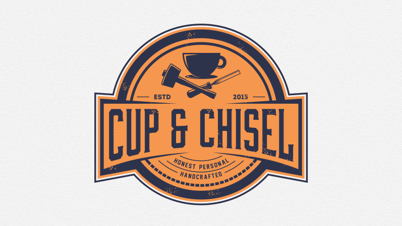
- Use a Weathered Look: The main allure of vintage design is that it looks, well, vintage. With this in mind, ensure that you provide a weathered effect to your image and lettering that makes the logo look old.
Learn More: 10-Step Checklist to Digital Branding for SMBs
2) Make It Visual
Many people find visual content more engaging than content that is text-heavy, so including graphics and images with your blogs, articles, social media posts, and even your logo are all a step in the right direction. Content that contains one or more images has an engagement level that is 2.3x higher than content without visuals, so use this trend to your brand’s advantage, too:

Dive Deeper: Overlooked SEO: Optimizing Images and Video For Search
3) Try Shapeshifting Logos
When you think about a company’s logo, you usually don’t think of change. Logos are meant to be the anchor of a brand – the one recognizable piece amidst any change that your business might go through. Remember when Slack changed their logo and Twitter got upset?
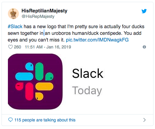
This might make you think that leaving your logo alone is the best course of action, but Slack was ahead of the game. Changing your logo actually keeps your brand fresh and exciting, and more and more companies are creating several versions of their logo instead of the traditional one.
Your different logos can be for various applications: one for your website, one for your app, one for your social media, and even different ones for different customer demographics (kids vs. adults, singles vs. families):

In short, you can change your logo depending on your needs. While you can technically have as many logos as you like, I advise having between three and four for best results.
Related Content:[Growth Study] Slack: The Fastest Business App Growth in History
4) Get Futuristic with Abstract Shapes
If vintage is not your thing, why not get a little futuristic with abstract and geometric shapes? There’s something very modern about abstract shapes, grids and straight lines, and they can each give your brand a refreshing new look. Pair your shapes and lines with a color scheme that represents your brand well:

5) Try a Mix of Old and New with Pixel Art
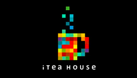
So maybe neither vintage nor futuristic is your thing. Luckily, the options are endless. One branding trend that encompasses both the charm of vintage and the modernity of the future is pixel art. Pixel art is seen as exciting and retro and is a consistently popular branding trend. Also known as 8-bit art, pixel art is all about using monochrome squares (i.e., pixels) to create an image that represents your brand. Alternatively, you can have your brand name written in pixels, making your logo the art:
6) Don’t Skimp on the Details
For some brands, simplicity is charming. For others, intricate details work best. Highly detailed brand logos are usually inspired by art deco and baroque styles and can be executed with hand-drawn illustrations that include techniques that bring more depth and drama to an image. This poster for The Merry Widow is a perfect example:
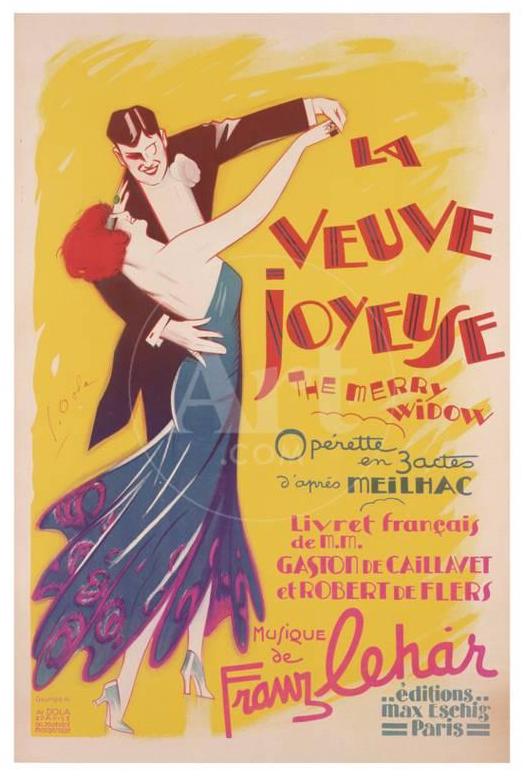
Lots of flourishes, embellishment, small details like feathers, leaves, flowers, eyelashes and hair, parallel lines, patterns, and interlocking shakes, crosshatching and line shading are all great details to add to make your brand stand out:

Dive Deeper: 7 Mistakes in UI and UX That Are Costing You Engagement
7) Be Bold
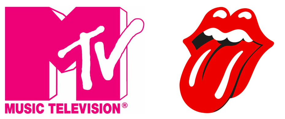
A bold brand is a memorable brand, so don’t be afraid to take chances with your image. This can be executed using dramatic photographs, dramatic drawings or artwork that uses bold colors, lines and patterns. These two very recognizable logos (MTV and The Rolling Stones) are not afraid to go bold:
Learn More: The Complete Guide to Brand Building (Must-Read for Digital Marketers)
8) Use Ghost Letters
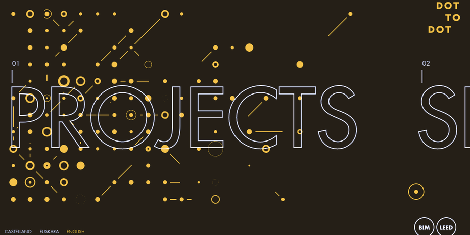
Ghost letters, or typography where the outline of a letter has transparent insides, that allow the viewer to see beyond the letters to the background image is a trend that is growing in popularity. Ghost letters can be a great branding trend for businesses with unique names and brand images:
9) Less Is More with Neo Minimalism
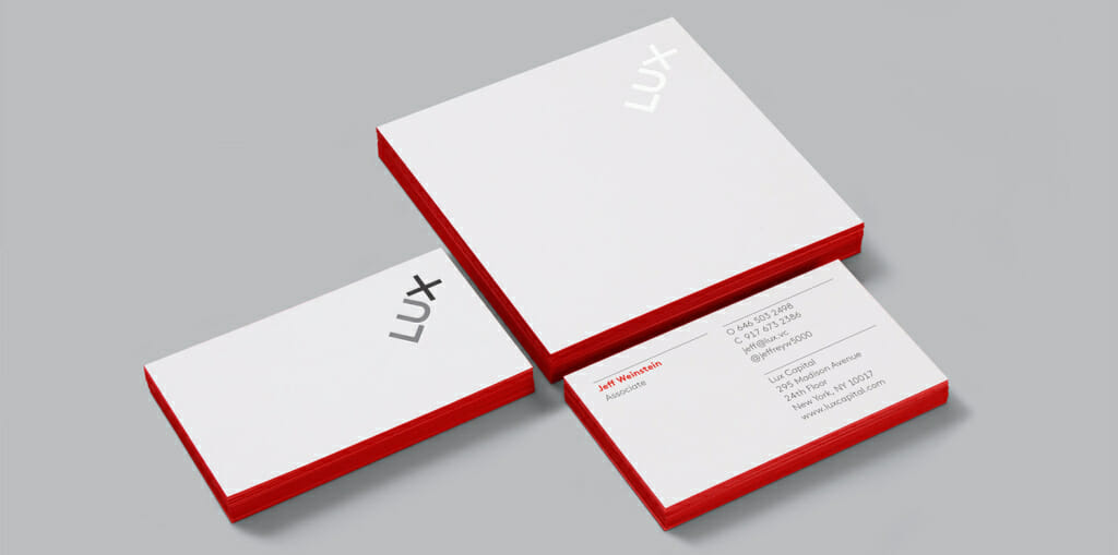
There’s a certain simplicity in the minimalist look that can make a brand’s logo more memorable. Neo-minimalism is minimalism scaled back even further: There are fewer details, plenty more negative space, and images and lettering are used sparingly. This look denotes a decluttered vibe that is simple and compelling, as with this logo from Lux Capital:
10) Stand Out with 3D
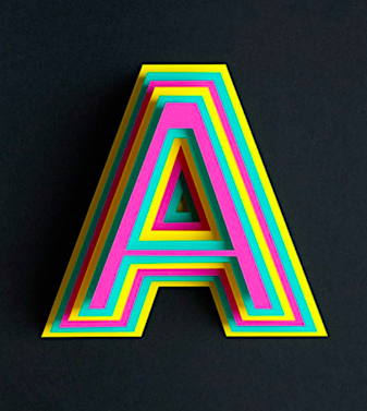
In this modern and technological age, you really can’t go wrong with 3D because it can be executed in a number of ways. You can animate your 3D logo and brand art to make it more exciting, you can hand draw a 3D image and logo for a feel that is both modern and vintage, you can create visuals around 3D imagery, and you can bring a breath of “real life” to your brand thanks to the possibility of photorealistic art.
Using 3D imagery is a great way to stand out because it is an eye-catching art form that wows viewers and gives an air of the dramatic:
11) Use Negative Space
In 2019, using negative space seems to be gaining more and more popularity amongst brands when it comes to their logos. From Digital Synopsis:
“In art and design, negative space is the background space around and between the subject of an image. For example, in a picture of a palm tree against the sky, the shape of the tree is the positive space. The sky and the space between the branches and leaves is the negative space.”
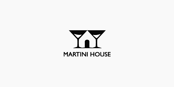
Martini House shows off a brilliant use of negative space in their logo:
12) Create a Catchy Hashtag
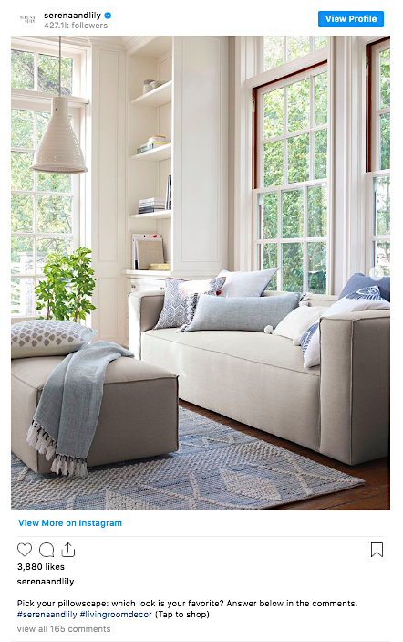
You really can’t do business in 2019 without a hashtag. Hashtags are a great branding strategy because they make all your business’ posts easy to find and navigate with the help of a single catchy phrase or idea. All sorts of brands are using hashtags now to keep their content connected even when it’s spread across the Internet, like these examples from Serena & Lily:
Dive Deeper: Making Data-Driven Decisions for Better Website UX
13) Place Your Brand on Fun Freebies
Everyone loves free stuff, which is a great way to get your brand out there. If you have fun freebies with your logo emblazoned on them to give away to loyal or potential customers, make the most of it. Free stuff can be anything from hats and t-shirts to keychains and lanyards, but the more unique and the more relevant to your brand, the better – like these creative mint tins with AAA’s phone number on them:

Dive Deeper: How to Market Your Startup When No One Knows Who You Are
14) Build Up Your Storytelling Chops
Part of selling your brand is marketing your brand’s story. Invest some time in learning to become a better storyteller by reading more, researching how competitors tell stories, looking at old storytelling trends in the media and marketing world, and just paying attention to commercials and other ads that tell a compelling story in a short amount of time.
This Budweiser commercial is an excellent example of storytelling with just images and a song:
These tips on telling a good story can help you, too.
Dive Deeper: 13 Best Super Bowl Ads of all Time: What Your Business Can Learn from Them
15) Show Off a Little Personality!
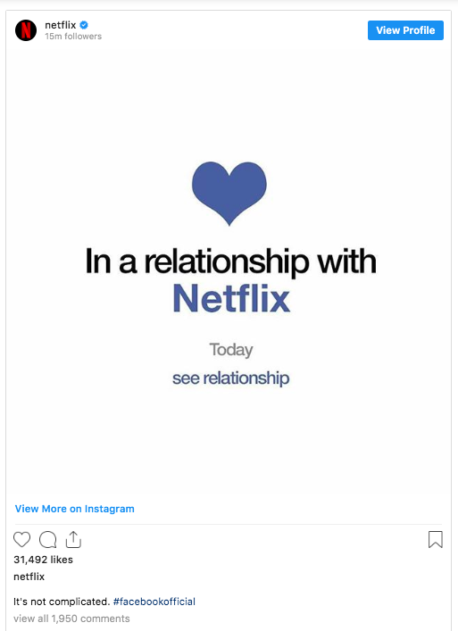
Though social media was meant to connect people across the glob, it can also make it easy to hide behind your corporate mask. But being real and showing who you really are garners trust and relationships between business and customers, so building up a unique voice that feels like a real human can make a huge difference.
Take some pointers from Netflix’s Instagram page:
And Wendy’s Twitter page:

Bottom line: people prefer interacting with people, even online.
16) Team Up With an Off-Beat Influencer
Popularity is fine, but you might want to branch out from the Instagram model with thousands of followers for your particular brand. The best influencer is someone who fits with your brand. If you sell ice cream, you probably don’t want a fitness influencer to team up with you because it can send mixed messages. Look for the quirky, somewhat off-beat influencers who have a unique following that is better-suited to your brand.
Dive Deeper:
Final Thoughts
Developing a tone, both via your brand image and voice, that reflects who you are as a business and the humans behind the business helps you stand out from the myriad of brands that simply dot their Is and cross their Ts.
Play around with these 16 branding trends to increase awareness of your business in 2019. Use them all or pick a select few that are right for you and watch your business grow!
