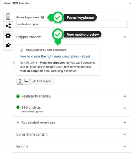
With its latest update, the Yoast SEO WordPress plugin has revamped its mobile snippet preview. It now generates a preview of what your content will look like as a listing in Google’s mobile search results.

More on the update. This is not a new feature; however, the update does replicate a Google mobile search snippet more accurately, even including bolded keywords and a default favicon. Yoast says a site’s actual favicon will be integrated into the preview in a future release. And, you can still switch between mobile and desktop previews.
In earlier releases, both the snippet preview and focus keyphrase features were located towards the bottom of the WordPress editor, meaning you had to scroll away from your content to access it. You can still find them in that location, but Yoast has also made these features more accessible by adding them to the top of the sidebar.
Not as much schema this time. Unlike Yoast’s last four updates, there is less of an emphasis on structured data. This time, the only schema implementation change Yoast has made is taking out the primary image for a page of the WebPage piece and moving it into its own graph. Yoast says that this makes it “easier for search engines to discover the relation between the image, the page and the entities.”
Why we should care. Knowing how your content appears within search results is a window into your customers’ journeys. And, since the majority of searches happen on mobile, having an accurate representation of your mobile snippet is even more important. Yoast’s latest update helps marketers get a better idea of what their customers might see before they click through, which can enable us to optimize our snippets to encourage the click.
