When it comes to launching a new product or business, my mantra is to “fall in love with the problem, not the solution.” In other words: even if you think you’ve come up with the next big thing, you should always treat it like a hypothesis. And as with any hypothesis, that means testing it.
If your original concept takes off without a hitch? Great! But if it doesn’t, you should continue testing (and retesting, and retesting) until you find the best solution to your potential customers’ problem. Testing might sound like it requires a large investment of time, money, and other resources, but I’ve found the perfect low-effort, high-return workaround: building a landing page.
Why landing pages?
Using landing pages to test a new product or service idea allows you to collect valuable customer feedback while remaining agile, and can shed light on the overall viability of your proposed solution. But the best part is that landing pages don’t require a large amount of custom design and development work.
By using templates, you can focus on identifying your value proposition and validating your idea before bringing it to market. And there are more than a few ways to do so:
Split test the big stuff early on
Virtually every landing page feature (headlines and body copy, images, colors, etc.) can be A/B tested to optimize performance—and companies should be using that to their advantage.
That said, you shouldn’t split test everything just because you can. Before trying to determine how layout and header images might impact user action, use landing page A/B testing capability to find out what consumers really want. I generally start with the same layout and experiment by talking about the business concept in two different ways.
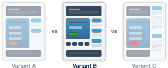
A/B tests are often described in terms of small changes to layout, but they can be very effective for testing different value props.
For example, if I wanted to launch a new ride-sharing app, I could test the following value propositions to see what speaks to people most:
- Convenience: Someone will pick you up and take you where you want to go
- Affordability: You no longer need to own a car or take on the associated costs of gas, insurance, parking, etc.
Testing like this allows you to gather more conclusive data about what resonates most with your audience—knowledge you can use to inform the development of your business or product moving forward.
Distill copy to your main value proposition (no marketing speak!)
Without a doubt, copy is one of the most important elements on a website—it can make or break the visitor experience. Before you even start designing a landing page, think about what you need to say about your product or business idea.
Once you’ve decided your core value proposition (in the previous step), it’s time to describe it in a way that will resonate with prospective customers. Writing things out in a plain Google Doc (instead of directly into a website template) can really help to flesh this out.
When it comes to writing landing page copy, I recommend that you:
- Address the problem, and propose a solution
- Use strong, positive headlines
- Emphasize benefits over features
- Keep it concise; landing pages should be scannable
- Include a clear call to action
Successful copywriting is rooted in a solid understanding of who the customer is: how they think, feel, and act; what drives them to make purchasing decisions. The language you use should also reflect that of your target audience.
Let’s look at a before-and-after example for the same business idea mentioned above:
- Before: Revolutionary ride-sharing technology
- After: We’ll pick you up, wherever you are
The first headline is vague and buzzwordy—it doesn’t tell visitors about the product, or why they should care about it—while the second headline speaks directly to the convenience value proposition in clear and straightforward language.
PRO TIP. If you haven’t had time to develop formal personas, a great way to learn about your customers is to examine how they communicate and interact on social media. Interviewing a few potential users to get a sense of their pain points and preferences can help too.
Incorporate visuals and 3D renders of your future product (if it doesn’t already exist)
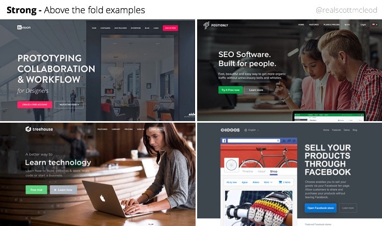
If you’re testing a new product or idea, you’ll need to incorporate compelling imagery on your landing page. Strong visual elements help to communicate the value and desirability of your products. The more you can use renders and videos to show people, “hey, here’s what the future state of this product will be,” the better since it gives you a chance to gauge interest before putting something into production.
In addition to showcasing your product with visuals and 3D renders, design your landing page with simplicity and consistency in mind. Leverage the icons and imagery provided with your landing page template to communicate your values visually (above the fold, where possible) and remember to use a similar aesthetic on your social channels to create a cohesive brand experience for customers.

Focus on top-of-funnel KPIs first, then move down the funnel
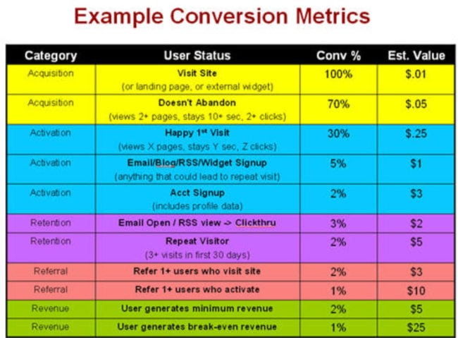
Knowing which metrics and KPIs to pay attention to during the pre-launch phase is crucial. Generally speaking, you’ll want to focus on top-of-funnel metrics first. I look at click-through rates to get a holistic picture of customer interest and engagement. How many people are getting from the first page to the second page? What percentage of people are clicking on the sign-up button?
At the end of the day, it’s great to get money—transactions are the ultimate KPI—but frankly, that’s the hardest thing to accomplish early on. If you start by measuring click-through rates, you can say, “Cool, 22% of people clicked the sign-up button, which took them to another page.” And now you have the chance to get them to fill in some more details, or direct them to a “Welcome” or “Coming Soon” landing page, and ease that customer down the funnel.
Send the right traffic to your landing page
As a benchmark, I try to obtain a 25% conversion rate from a landing page’s first CTA. If you can’t do this, it might be an indication that your product doesn’t adequately solve your customers’ problems—or at least that your value proposition isn’t resonating with them. But remember: there are a lot of things that might affect your conversion rates.
Consider where people are coming to your landing page from. Conversions from paid search are a good sign that people are interested in what you have to offer; you want to capture attention and leads from the people are actively searching for the solution you’re offering. You might also want to think about investing in paid social. I’ve found success with Twitter and Facebook—it’s really about meeting your customers where they are.
Provide value to visitors to increase conversions
To maximize conversions, you need to provide something of significant value to your landing page visitors. For SaaS companies, this can be something as simple as a beta sign-up or free tool download; since there are no physical products involved, SaaS companies have a fair amount of flexibility in their offerings. E-commerce brands, however, need to be a bit more creative.
Kickstarter is one way new companies are gauging interest—if people pledge money or make pre-orders it’s a good indicator of appetite for your solution. Think about the types of incentives you can offer to increase conversions (e.g., discounts, free swag). Or, instead of aiming for an order, perhaps you can ask visitors to submit their email to receive notifications about the product’s launch.
Falling in love with the problem
Each of the above techniques can be used to assess the viability of your product or service before going all in, which could save you tremendous amounts of time and money. It’s important to note that each approach requires constant testing and iteration.
The results of your landing page experiments should be seen as a guiding force that can move you in the right direction—if your original concept doesn’t pan out, don’t be afraid of making modifications.
This brings us back to my mantra:
Fall in love with the problem, not the solution.
Being flexible means you can adapt your product or service to better address the problem you want to solve, which ultimately leads to a more successful business—and a more satisfied customer.
