Your sign up form is the first step to gaining new email subscribers, and it can make or break a visitor’s decision to receive your emails.
So it’s important that the copy and design of your form is effective and converts.
But often, it’s challenging to know what to write on your form and how to design it for conversion.
To give you direction, we’ve collected some of our favorite sign up forms in this post and explained what makes them work. Take inspiration for your own form from these nine examples and tips.
1. Visually represent your incentive
A sign up form with a visual representation of your incentive, like this one from Spoon Graphics, is an effective way to entice visitors to subscribe.
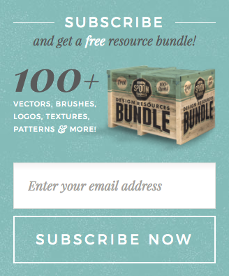
Being able to envision the tangible benefits of signing up to your email list can often be that extra push over the edge in a person’s decision to subscribe. Not to mention that sign up forms with images receive 94 percent more views than those without images.
The sign up form alone can make or break a visitor’s decision to receive your emails. Click To Tweet
2. Present an unfavorable alternative
This sign up form from Boast gives subscribers a discount just for signing up, like many retailers do. What makes this copy different is the alternative Boast gives to those who choose not to sign up.
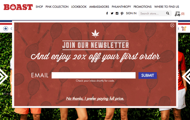
If visitors don’t want to sign up, they can click “No thanks, I prefer paying full price.” at the bottom of the form.
Who wants to pay full price? Not many people would like that alternative.
By positioning opting out as an unfavorable alternative, Boast gets visitors to think about the negative consequences of not subscribing and gives visitors a compelling reason to join their list. This copy can increase opt-in rates, because it positions subscribing as the better option.
3. Display a percentage complete tracker
The top of this sign up form from Amy Schmittauer shows visitors how close they are to completing the sign up process.
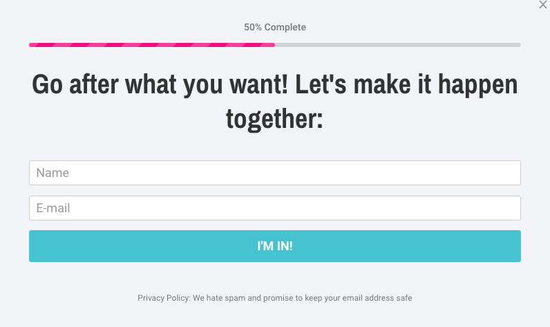
With this strategy, visitors may be more likely to complete your form, because they can visualize how close they are to being finished.
Plus, it demonstrates that they’ve already done half the work, which will make them more inclined to finish the form.
4. Use one form field
Privy uses a sign up form that’s quick and simple with a single form field to make the subscription process easy for visitors.
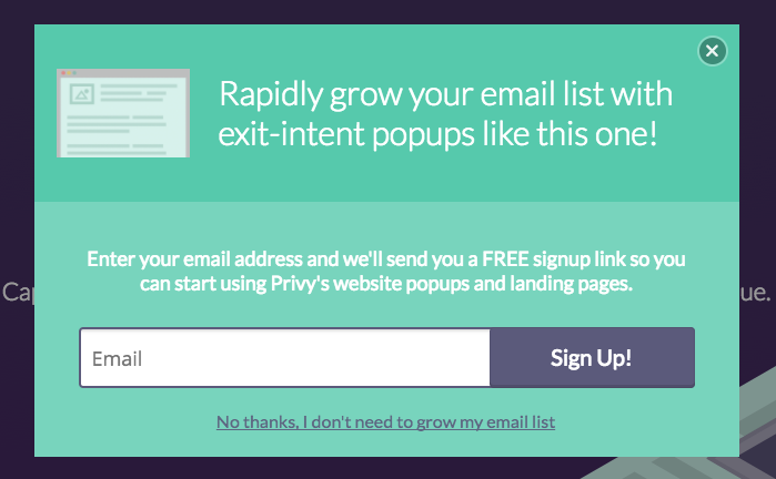
This works because forms with less fields are more likely to increase your conversion rates since visitors spend less time signing up.
One thing to keep in mind is that without asking for the subscriber’s name you can’t personalize your emails. Think about your business’s needs and goals to determine how many form fields are right for you.
5. Let subscribers choose their preferences
Wistia’s sign up form lets subscribers choose their newsletter preferences, which can give them a more personalized email experience.
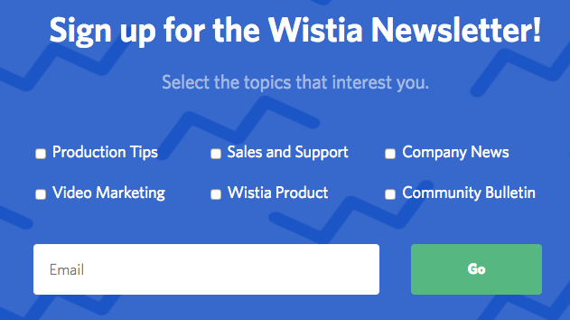
This can also help with form conversion rates as it allows subscribers to choose what kind of content they want in their inbox. When subscribers are able to personalize their experience, they’ll get more value and engage more.
6. Create color contrast
BizChix uses a simple sign up form relying on the brand reputation as the incentive for joining the community while the color contrast attracts the attention of visitors.
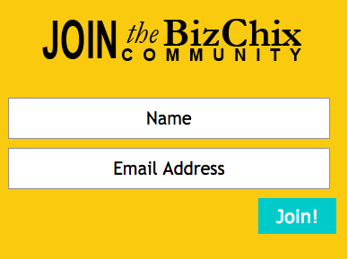
The contrasting colors of this form stands out on the website. Using a bright color, like yellow, on a black and white website draws attention to the sign up form, which can increase the number of people who complete it.
7. Write conversational copy
When you use conversational copy in your sign up form like Kate Spade, it grabs the visitor’s attention and feels more personal.
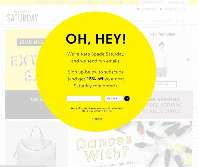
Visitors don’t expect to see phrases like “Oh hey!” or “Hey you!” This copy attracts their attention, which you can use to hook them in and tell them what value they’ll get from being subscribed to your email list.
8. Be creative and witty
Justuno uses creative and witty copy on their sign up form to delight visitors.

Instead of using buttons that just say “yes” and “no,” this sign up form makes a joke with a personalized comparison. The visitor will imagine themselves as a sponge, which implies that they can soak up a ton of knowledge.
Who wouldn’t want to be a sponge that soaks up a ton of knowledge, especially when it comes to getting more conversions?
9. Use social proof
Social proof is a strategy where you leverage herd mentality to convince people to take an action. Because if someone sees that everyone else is doing something, they’ll be more likely to do it themselves.

Jane Mukami’s sign up form lets new visitors know that over 4,000 people are subscribed to her email list. Besides leveraging social proof, this also works because it builds trust. If visitors know that other people have signed up for her list, they’re more likely to believe that she publishes trustworthy and valuable content.
Implement these ideas for your next sign up form
Pin these sign up form ideas on Pinterest to save as inspiration for later!
With these nine ideas for a creative, new sign up form, you can bring a breath of fresh air to your website and email list.
If you’re looking for more strategies and resources for creating a sign up form and lead magnet, enroll in this short video course: Email List Growth Blueprint. It’ll help you build the perfect tools for growing your email list.

