So you’re ready to launch your iPhone app. Or maybe you already have and are looking to boost your download rates. What can you do?
Of course, like any product or service, the options are nearly endless. You can use an e-mail list, pour your heart into content marketing, pay for ads on Facebook or Instagram, or try to optimize for organic discovery – to name just a few.
Plenty has been written about various digital marketing channels and much of it holds as true for apps as it does for any other product. However, there are some strategies you can use specifically for apps that aren’t relevant elsewhere.
App Store Optimization
App Store Optimization, or ASO, is the process of developing successful apps and landing pages to promote discovery and qualified leads inside the App Store. While the emphasis is often on increasing organic downloads, everything you do for ASO will be critical for your conversion rates on traffic across the board.
You don’t have as much control over the customer journey with apps because Apple controls most of the experience and data. That’s why it’s crucial to pay attention to what you can control.
When working on ASO, it’s important to keep in mind the two different types of users:
- Quick Adopters – These are users that make their decisions quickly after landing on your page. They don’t scroll through images or read your description. They decide based solely on their initial impression of your app.
- Investigators – These users take more time. They scroll through your screenshots and descriptions before deciding to download. While these people may be fewer in number, they tend to be more informed and engaged, and are definitely worth paying attention to.
So, back to our question… what can you do to optimize your App Store experience and boost those download numbers?
Learn More: How to Optimize Your Content Strategy with the Buyer’s Journey
First Impressions
Think of the App Store as your landing page and the download button as your call to action (CTA). Everything should be focused on conveying value, building excitement, and encouraging action.
Name
The name of your app is probably the most important element. Technically, Apple allows up to 255 characters for your app name, but that won’t make an effective title for your landing page. In their analysis of the most successful apps, Appbot found that the best titles averaged 36 characters and 5.5 words.
The vast majority of them followed a simple formula:
{name} – {keywords}
Start with a unique and recognizable name for your app, add a hyphen, and then use 2-6 strong keywords.
Examples:
- Waze – GPS, Maps, Traffic Alerts & Live Navigation
- Mint: Budget, Bills, Finance
- Wish – Shopping Made Fun
Photos
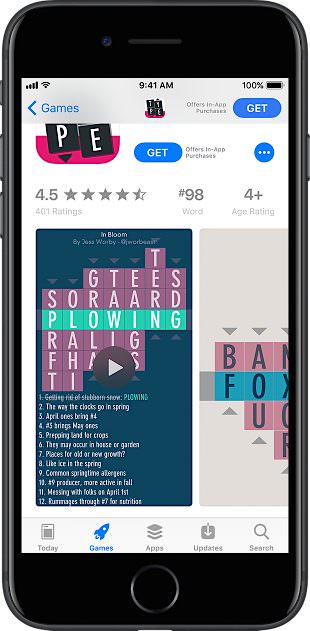
You’re also able to add up to five screenshots or photos to help explain your app. Use them wisely. Depending on your app’s main selling points, you may want to take the lifestyle photo approach, showing happy customers enjoying the benefits of your app.
Alternatively, you can choose to promote certain features or UI elements that help you stand out from competitors. For example, in the crowded calorie-counting space, show how clean and simple your app is to use compared to others.
Either way, the key is to focus on emphasizing the key benefits that your users will get. To help with this, you should include short captions explaining what they are looking at to remove any ambiguity.
One other feature that is often overlooked is the ability to upload different screenshots for different devices. While there may not be a huge difference in your app for the iPhone 7 and 8, there probably is for the iPad or iWatch version. If those are big markets for your app, you should take the time to upload separate photos for them.
App Preview
In the same section as screenshots, you have the option to upload a short video. While it may seem obvious that video can help your marketing, it does present some drawbacks.
The App Preview allows you to create a short commercial to show off actual app usage in order to help potential customers know what they are getting. This can be especially key for gaming apps or apps with dynamic interfaces.
However, it does replace the slot of your first screenshot on the App Store, so in some cases it may not be worth it. One way to offset that problem is by carefully selecting your Poster Frame, which is the thumbnail image that is displayed before the video is played.
If you do choose to include an App Preview, you should keep it short and punchy to convey value and build excitement for the app.
Layout
You can also choose to display your screenshots horizontally or vertically. While this may be dictated by the layout of your app, there are more important considerations that people often overlook. Changing the orientation of your screenshots changes the very layout of the page.
If you choose to display images horizontally (landscape view), you’ll find that the first few lines of your description display above the fold, increasing the chances they will be read by quick adopters who don’t take the time to scroll through your page. Alternately, it may increase the CTR of your whole description, as seeing the first few lines may pique curiosity.
On the other hand, a vertical (portrait) view will not show any part of the description above the fold, which means that visitors must scroll down before seeing any of the text. The trade-off is that users will get a sneak peak of your second screenshot, encouraging them to scroll through and view more.
Description
The description serves a few important roles. First, it is a source of keywords for the App Store to index and thus helps customers find your app organically in the store. Make sure to include any important phrases or search terms that potential customers might use.
It also helps convert customers once they arrive at your app. Like any good blog post meta description, make it catchy, concise and clear. In addition to mentioning one or two of your app’s strongest features, tell the user how your app will benefit them by stating the pain points that it will solve.
Examples:
- Lyft – “Need a lift? Try Lyft for a friendly, affordable ride whenever you need one. Request a ride with the tap of a button, and get picked up by a nearby community driver who’ll take you to your destination within minutes. Yep, it’s that easy.”
- iTranslate Translator – “iTranslate is the leading translation and dictionary app. Easily translate text, websites, or start voice-to-voice conversations in over 100 languages. Our new Offline Mode allows you to use iTranslate abroad without having to pay expensive roaming charges.”
- Acorns – “Investing was for the wealthy. Now it’s for everyone! Acorns helps you save and invest small amounts regularly into your own diversified portfolio. Start with just your spare change and join over 1 million who have taken steps to improve their future. It only takes minutes!”
You can include up to 4,000 characters but it’s worth noting that only 2% of visitors click through and read past the first five lines that Apple displays by default.
Learn More: 3 Advanced Ways to Write Content that Converts
Reviews Are Critical
So far everything we’ve discussed is 100% under your control. But there is one critical element that is a little more delicate… user reviews.
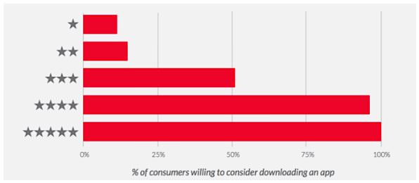
These days, online reviews are critical across all industries and the App Store is no exception. Not surprisingly, Apptentive found that almost all of the most successful apps have an average rating of 4.0 or more and that 60% of people “usually or always check ratings before downloading an app.”
Of course, the first step is to build a killer app that people actually want. If your app isn’t making customers’ lives easier or better, there is no need for it. But even the best intentions don’t always go as planned, so you want to make sure that any early hiccups don’t tank your rating forever.
The key is to route good reviews – 4 or 5 stars – to the app store directly while sending negative reviews to your support team so they can be resolved privately.
The first way to ensure that this happens is to make it easy for people to contact you for support. Make sure to have a dedicated support or contact section inside the app. Include contact information in the App Store description itself and your website if you have one (hint: you should). And don’t forget to respond to messages quickly or this will backfire big time.
A more sophisticated way of handling this is by prompting users to give you their opinion inside the app and then routing them to the desired destination based on their response.
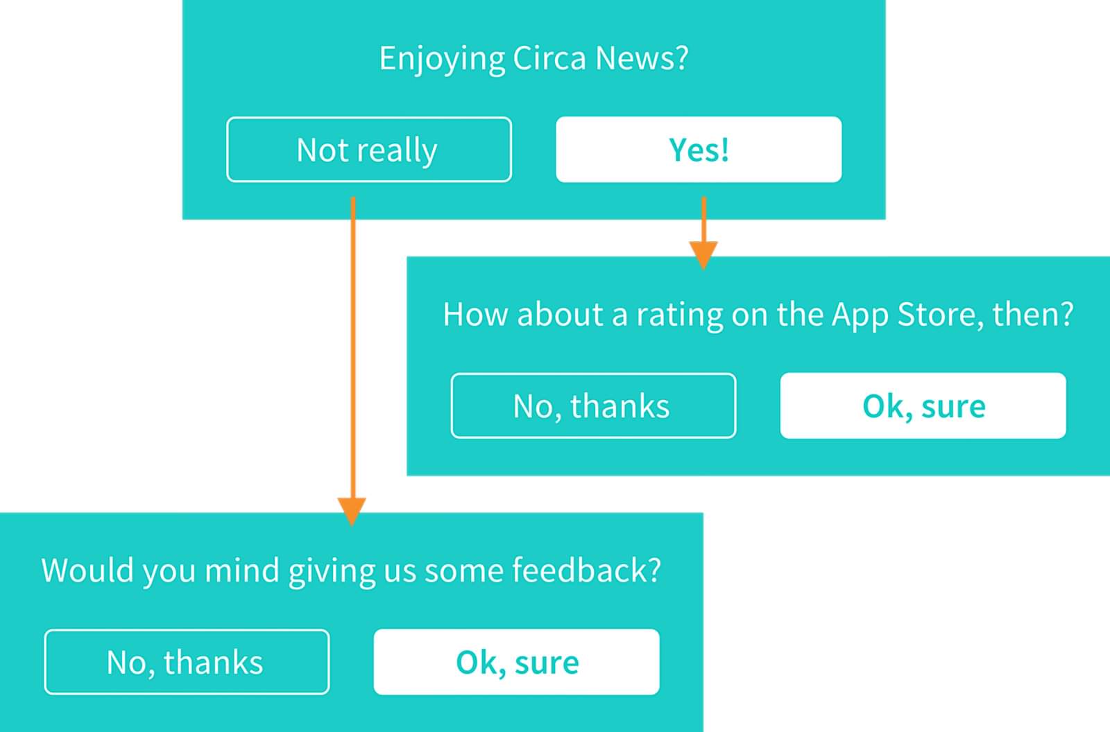
Don’t do this with annoying popups and definitely don’t send them straight to the app store. Instead, employ an integrated method like Circa did. Include the question in the normal flow of the app and follow their three simple rules:
- Don’t interrupt someone’s experience or annoy users.
- Don’t ask for an app rating after your app has crashed. That’s just stupid.
- Do delay asking for a rating until there’s a likely moment of constructive feedback or a positive rating (use multi-step requests).
Their flow looks like this:
This simple flow helped them generate over a thousand reviews, 90% of which were 5-star reviews.
Setting this up doesn’t have to be difficult. If you don’t want to build it yourself, you can use in-app feedback tools like Apptentive.
Learn More: The Kick-Ass Guide to Increase Customer Reviews for Your Online Store
Localization
Any marketer worth their salt knows that they should use segmenting in their efforts. While the App Store doesn’t let you differentiate users by source or other demographic data, you can display content in the store based on geographic location.
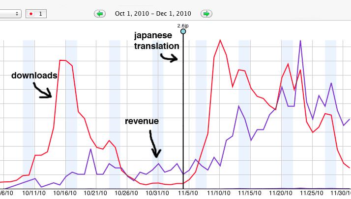
Usually when people “localize” their apps and websites, they simply translate them into the local language. But you can go beyond that by adapting your marketing efforts to local culture and trends. Even though both demographics speak English, customers in the UK may have different needs than those in the U.S.. And both are vastly different from customers in Japan or Korea.
This might sound like a lot of effort, but if you are interested in penetrating international markets, it can be very worth it.
Testing
As I mentioned in the beginning, there is no single winning strategy. Some apps will perform better with video content, and others should stick to screenshots; some may want to use a horizontal layout and others might be better off with a vertical design.
The key is deliberate testing.
The App Store doesn’t have a way to A/B test natively like web landing pages. But fortunately we live in a world full of creative and ingenious problem solvers who have built tools to help us.
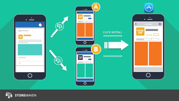
Instead of sending traffic directly to the App Store, platforms like StoreMaven send your traffic to an identical-looking webpage, splitting the traffic between different variations to see which performs best.
A few quick tips when running your tests:
- Have a clear hypothesis. Don’t test aimlessly. Before you spend time and money creating a video for your landing page, ask yourself “why would a video help customers make an informed decision?” and “how can we best achieve that?”
- Don’t waste time testing tiny things. Sure a blue icon may convert 3% better than a red icon, but that’s rarely worth the time and headache it costs to set up and run tests. Think ROI.
- Don’t test too many things at once. If you add a video and switch to horizontal view at the same time, it can be hard to determine which is causing a shift in your results.
- Run your tests for at least a week. The longer the better, but once you feel like you have a clear winner, you can stop. No sense in sending leads to a page you know is converting less effectively.
- Test with traffic that mimics organic and paid sources. Since you can’t actually test in the App Store and Apple doesn’t share all your conversion data, there is no way to see how exactly organic traffic will behave. To battle this, StoreMaven suggests testing with Facebook ads because they most closely mirror the behavior of organic discovery.
Of course, you don’t have to use a sophisticated paid tool to test your App Store page. You could change the content after one or two weeks and see if there’s a change in the number of your downloads.
The biggest problem with this is that it won’t account for changes in other marketing efforts, such as successful press coverage or higher organic rankings due to other reasons. You’ll also receive less trackable conversion data. That being said, it’s better than no testing at all.
Related Content: 5 Important Landing Page Elements You Should Be A/B Testing
Deep Linking
While I said in the beginning that most inbound marketing efforts are similar to other products and services, apps do provide a unique funnel opportunity.
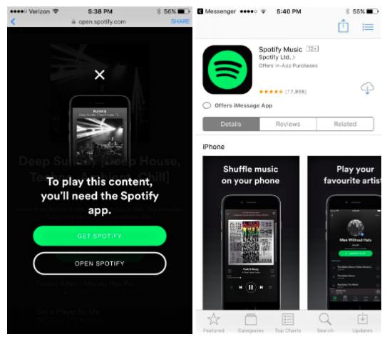
With deep links, you can send users directly into content inside your app. If they don’t have the app installed, they’ll be sent to download the app first. This is great because they’ve already indicated an interest in what you have inside, so you just need to show them where they can get it.
Spotify is one of the most prolific examples of this. If you click this link on your phone, you should see this:
If you have the app you can jump right in and follow my playlist. If not, you’ll be asked to download Spotify first or miss out on this great collection of music I just shared with you.
Now in this case, you might not care. But if a good friend or influencer you admire shared this content with you, it’ll be extra compelling to download a free app to check it out. If your experience is good, you may even become a lifelong customer.
Wrapping Up
Use these tips above in conjunction with your regular marketing channels to drive traffic and convert new users, as well as existing customers, to download, buy, and use your app.
What you do from there is up to you. These strategies work for just about all use cases, whether you’re building an app to generate revenue or simply as a lead magnet and marketing channel.
Either way, it starts by building a great app and then making sure that the right people find and download it!


