Kshitij PujariSep 05, 2019 20:18:30 IST
HMD Global-owned Nokia has just announced new additions to its mid-range lineup called the Nokia 6.2 and Nokia 7.2. These devices succeed the Nokia 6.1 and Nokia 7.1 respectively that had been launched last year. The company has been constantly expanding its portfolio of Android One smartphones for all price segments and this latest addition is a step in the right direction for the company. The Nokia 6.2 has been launched for a price of €199 while the Nokia 7.2 is priced at €249. Both phones will start selling from October.
I had a chance to try out both the phones and use them before they were officially unveiled and here are my first impressions.
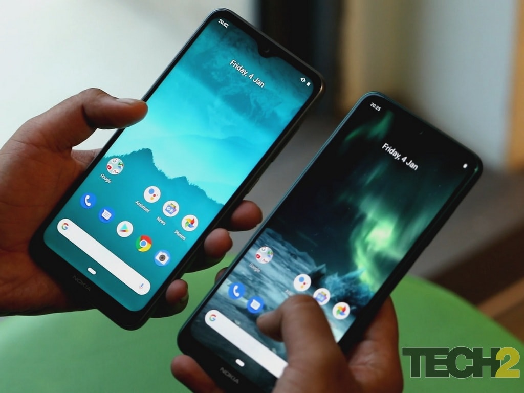
Nokia 7.2 (R) and Nokia 6.2 (L).
(Note: Both the devices we used for this first impression are pre-production units and do not reflect how the final device will look like)
Design and build
We had earlier praised the Nokia 6.1 Plus (Review) for its more than elegant finish and feel in the hand thanks to the glass back and polycarbonate frame. Nokia has gone with the same design aesthetics as both the Nokia 6.2 and Nokia 7.2. The devices have an extremely premium feel in the hand and while I’ve handled almost all the phones in the budget to the mid-range category in India, none of them have appealed to me more than the 6.2 and 7.2. Of course, the glass back makes the phone quite slippery to use and also a fingerprint magnet, although that has become the usual for nearly all smartphones today. The grey-ish white finish on the 6.2 and the navy blue colour on the 7.2 are really eye-catching, which makes it almost criminal in my opinion to put a case on them.
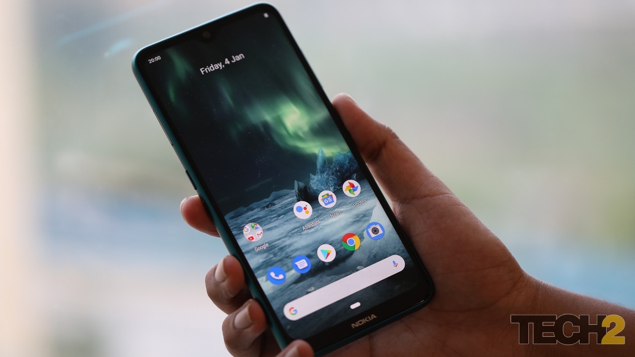
Nokia 7.2
The phones also have a circular camera housing with Zeiss branding, which appears to be a throwback to the days of the Nokia Lumia 1020, which had launched more than 6 years ago. Below the camera is the fingerprint sensor on both the devices. The phone has a type-C port at the bottom along with a headphone jack and speaker grills. Display-wise the devices look quite identical from the front with drop-notch at the top along with a small chin at the bottom where we can find the Nokia branding. All-in-all while I’m quite impressed by the design language on both the devices, I expected nothing less from Nokia which has a history of releasing stylish smartphones.
Chipset, memory and software
While many of the would-be competitors of the Nokia 6.2 and Nokia 7.2 are using high-end chipsets such as the Snapdragon 670 or the Snapdragon 712, Nokia has not put in a significant processing upgrade on its latest offerings. The 6.2 gets a Snapdragon 636 chipset which is more than a year old while the 7.2 has the Snapdragon 660 SoC that is also more than a year old. The company disclosed that it will be packing in 4 GB and 6 GB RAM variants on both the devices. In terms of storage, the phones have 64 GB of internal memory along with the option to expand it using a micro-SD card. We shall have to test the device for performance when we review it but as far my initial impressions go, the phone appeared to be quite smooth, while browsing apps and scrolling through the browser.
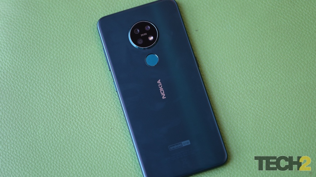
Nokia 7.2
On the software side of things, I had no complaints as Nokia has stuck to its Android One roots and giving the user a clean, bloatware-free, stock Android experience. Nokia also made a point of telling me that it has updated 96 percent of its portfolio of products to Android 9.0 Pie so we can be assured that the Nokia 6.2 and 7.2 will follow suit with Android 10. More on that in the full review.
Camera and battery
Unfortunately, the devices I handled were all pre-production units so I couldn’t fully get a measure of the camera quality. The Nokia 6.2 packs in a 16 MP primary camera supported by an 8 MP ultra-wide sensor and a 5 MP depth sensor. The Nokia 7.2 also has a triple-camera setup with the exception of the primary lens being a 48 MP Samsung ISOCELL sensor. On the front, the 6.2 has a 16 MP sensor while the 7.2 has a 20 MP sensor. I expect both the cameras to be good when the consumer versions of the phone hit the market because from what I could make out in the pre-production units, the details were lacking from the rear cameras while the 6.2’s front camera was a blurry mess.
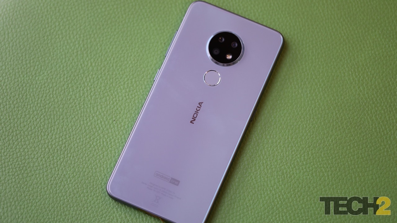
Nokia 6.2
In terms of battery, both the Nokia phones feature a 3,500 mAh battery with support for Qualcomm Quick Charge 3.0. We will put the battery of both these devices through the grind once we get our hands on them for the full review.
So what do we have here?
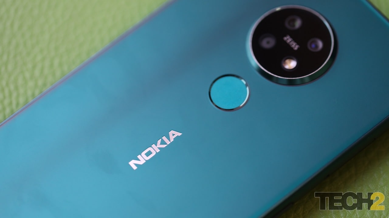
Nokia 7.2.
What we have are two very stylish and elegant devices with relatively low-powered chipsets as compared to the competition. The likes of Realme and Redmi are introducing quad-camera arrays on their respective smartphones along with good SoCs to make an enticing package. I’ve already reviewed the Realme 5 Pro, which is the most likely competitor for the Nokia 6.2, and have concluded that it is, in fact, a real value-for-money deal. I also have high hopes for the Redmi Note 8 Pro when it launches in India somewhere in November. The Nokia 6.2 and 7.2 are entering into a very cutthroat market and it remains to be seen whether their design, software and possibly also camera are merit enough to sell ahead of the competition. Stay tuned for our full review of the devices that should be out in the coming weeks.
Find our entire collection of stories, in-depth analysis, live updates, videos & more on Chandrayaan 2 Moon Mission on our dedicated #Chandrayaan2TheMoon domain.