Any website needs ongoing maintenance and optimisation as standard, but sometimes more drastic changes are needed. If your inbound marketing efforts are bringing in plenty of targeted, relevant traffic to your website but performance is slipping, chances are you need a website redesign.
In this article, we’ve got five warning signs that suggest your website is in need of some design improvements – and how you can determine specific problems that need fixing.
#1: Low conversion rates
Low conversion rates are the most obvious sign that you might need a website redesign. Before you start making any design changes though, you need to be sure the it’s actually the design of your site that is contributing to low conversion rates – because the problem could be elsewhere.
To rule out other causes, make sure the following things are already taken care of:
- Your website is generating enough traffic
- Your inbound marketing strategies are bringing in relevant visitors
- Your pages have relevant messages and compelling content
- Your pages have clear conversion goals
- Your pages have optimised CTAs
If your inbound marketing strategies aren’t bringing the right kind of visitors to your website then, of course, conversion rates will be low. Even if you’re generating the right kind of traffic, they’re not going to convert if they’re greeted by weak landing page messages.
If you’ve got all of the above covered though, a website redesign is probably the way forward.
#2: Your UX metrics are in the red
The most obvious warning signs are:
- High bounce rates: Bounces aren’t always a bad thing (e.g. when users visit, convert and leave) but high bounce rates are a strong indicator that people aren’t happy with the page they’ve landed on or the wider experience of your site.
- Low time on page: Again, unless users happen to be converting and leaving quickly, this is a red flag.
- Low page views: Suggests poor engagement, unless there’s a conversion of some sort.
- High page views: An unusually high number of page views could mean users are struggling to find the information they want on your website.
If your UX metrics are in the red and you’re confident that you’re bringing in the right kind of traffic to your website, maybe something is wrong with the content on your pages or the experience of using your site.
#3: Your loading times are too slow

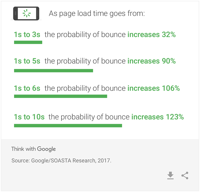
Google research repeatedly tells us that pages should be loading in under three seconds to have a minimal impact on conversion rates and other KPIs. Yet, separate research from Ubounce suggests marketers aren’t in as much of a hurry to improve loading times as they should be.
Recommended for You
Webcast, September 17th: 10X Growth & Relationships with Community Building

If your pages are taking longer than three seconds to load (on mobile with a 3G data connection), then loading times are hurting your marketing efforts. The good news is that you can take this opportunity to get your pages up to speed and get ahead of your competitors.
#4: Performance on mobile is weak
Mobile optimisation has been a ranking factor since Google’s “mobilegeddon” update in 2015, but even Google isn’t as demanding as real-world users when it comes to mobile user experience. So, even if your site is optimised well enough to please search algorithms, this doesn’t mean people visiting on mobile are going to be happy.

As things stand, mobile conversion rates are roughly half of what they are on desktop and tablet devices, despite generating the majority of traffic for most brands. So you need to segment your data for different devices types and compare how all of the warning signs we’re looking at in this article stack up.
Pay special attention to performance on tablets, if you’ve got a responsive site that delivers a very similar performance on mobile and tablets. Low conversion rates on tablets compared to desktop could suggest your responsive design needs revising.
#5: Users are dropping out of your sales funnels
If your UX metrics are looking fine and you’ve got loading times sorted out, but you’re still having problems, take a closer look at what people are getting up to on your website.
At this point, you want to check that users are following your sales funnels and engaging with your site in a way that keeps them moving towards the next conversion goal.
Here are some key steps to take:
- Use event measurement in Google Analytics and heatmaps to make sure users are clicking the right elements on your pages (heatmaps will also show you if users are clicking the wrong elements).
- Use URL tracking to make sure users are visiting the right pages after they click through to your site.
- Use event measurement and form analytics tools to see how many people aren’t filling out your forms, not completing them or getting submission errors.
- Use scroll heatmaps to check whether users are seeing your CTAs.
- Use event measurement and heatmaps to check whether users are clicking on your CTAs.
These steps will tell you whether significant design/testing work is required and where to focus your efforts.
