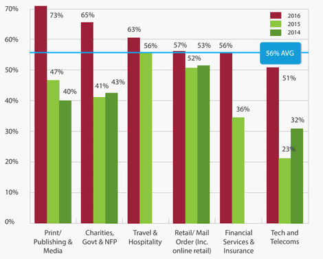
Chart of the Day: How verticals differ in their email campaign performance.
Out of the top six sectors, who would rate their company’s email campaigns performance as excellent?
The chart shows amazing growth from the print/publishing & media sector. To go from 40% effectiveness in 2014 to 73% in 2016 is astounding. This shows the importance of keeping up to date with current trends and getting the most out of your Email Service Provider (ESP).
At the other end of the spectrum are tech and telecoms. They are the only sector to be under the 56% average in 2016 for how it uses email. In fact, it has a 9% drop from 2014 to 2015.
It isn’t surprising to find that those who don’t have an email strategy or use email optimisation, end up having low-performance rates and poor Return on Investment (ROI) figures.

The king of the email hill is … ?
Print/publishers & media! They generally embrace all their ESP services and keep their messages and strategies optimised.
This chart emphasises how digital marketing is a competitive field, especially when there are so many different functions demanding attention. It is so easy to let one channel lapse, and for many that usually is email marketing. However having a digital marketing plan, where all your channels are working together instead of in silos and where you can remind yourself to include testing and experimentation in your campaigns. These changes may help put your vertical on top of the email hill.
