A decade ago, UX and SEO teams were always fighting one another, because their objectives weren’t aligned.
UX teams were really focusing on users – on providing them a great experience and helping them achieve their goals as effectively as possible.
Unfortunately, what was great from a UX point of view wasn’t cutting it back then from an SEO point of view.
SEO teams wanted to be able to place big blocks of content above the fold.
Why?
Because that’s what search engines valued.
That’s what made pages more relevant. SEO teams also wanted massive footer navigation and tag clouds because that helped the crawling and indexing process.
SEO teams would also riddle sites with content matching specific search queries that communicated the exact same message as the “money pages.”
But hey, you could optimize those pages for all the other related queries, so you needed to write extra content.
All that extra content bloated sites, made their content no longer manageable, and over time led to these pages becoming a form of duplicate content – which was subsequently pruned.
Slowly but surely, search engines have changed the way they make sense of content. That meant that these “SEO hacks” were no longer needed. And in fact, they were hurting SEO performance rather than helping it.
This is a good thing – it means that UX and SEO teams can now work together on an integrated approach that makes sense for both users and search engines. This is how you win at SEO today and beyond.
So how do you go about this?
What Do Users Really Want?
Every user has a question and is seeking a satisfying answer. They want it fast, on a site that’s easy to use.
You can break this down into:
- Creating satisfying answers and getting them to rank.
- Winning the click with your snippets.
- Satisfying the question with a fast and easy to use the site.
In this article, we’ll focus on the first step – creating those satisfying answers – because a lot of the updates that Google has rolled out over the last two years have refined what sort of content (and content types) makes for satisfying answers.
Creating a Satisfying Answer
If you don’t understand what users are looking to achieve, how will you be able to provide them a satisfying answer?
Understanding users’ search intent is step one.
Once you understand that, you can create a satisfying answer.
That satisfying answer breaks down into answering the query, and doing that with the right content type.
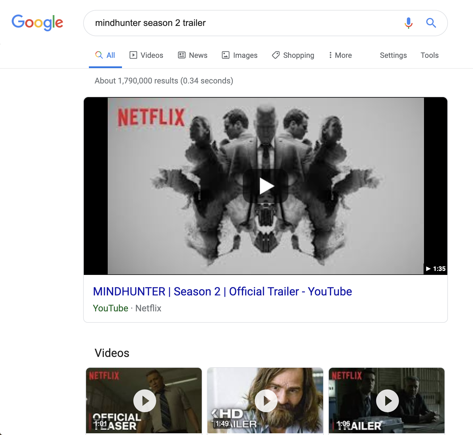
For instance, if someone’s searching for “mindhunters season 2 trailer”, they’re looking for the content type ‘video’ and the desired video content is the Mindhunters season 2 trailer.
Here’s what Google returns for this query:

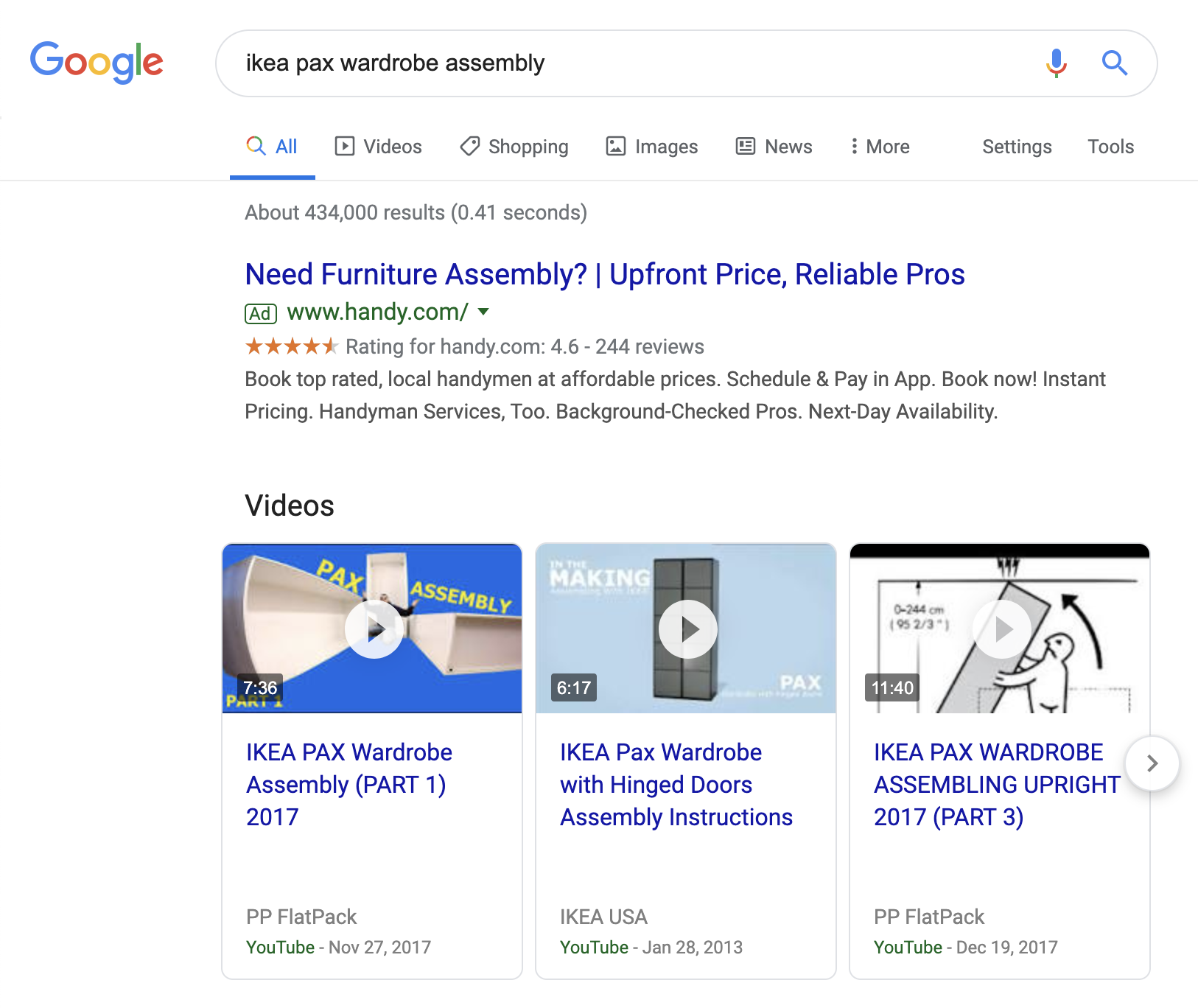
What if you’ve bought a second-hand world-famous IKEA Pax wardrobe closet and you’re typing in: “ikea pax wardrobe assembly”?
You’re in need of instructions on how to put it together again, because most likely the seller lost the manual. You don’t have time to read a 10-page manual, you want to have a quick answer.
Here’s what Google shows for the query “ikea pax wardrobe assembly”:

Google knows most people are just looking for a quick and easy instruction video, and not (yet) the downloadable Pax manual in PDF format.
When you scroll further down the page, that manual does surface. It’s likely to be the fall-back in case the videos don’t cut it. Speaking from experience, this makes total sense ;).
To satisfy both needs, ideally you provide both the instruction video and the downloadable PDF.
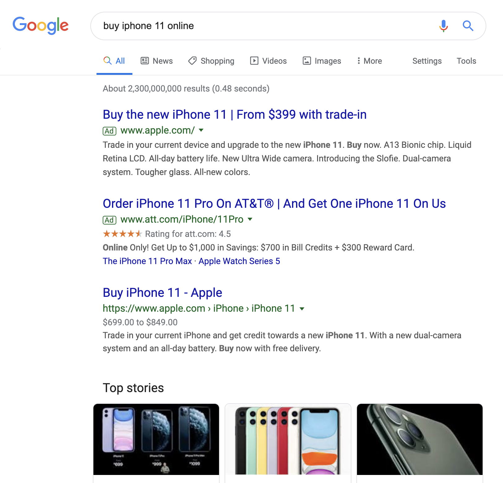
Let’s take another example, the query: “buy iphone 11 online”. You’ve got a clear intention: you’re looking to buy an iphone 11, online (not in a physical store — so local results don’t matter).
In this case, a satisfying answer is an ecommerce store that sells the iphone 11. And what’s THE place to do that?

So what’s interesting here is that Google knows that this search query also has a newsworthy component; it’s showing the “Top Stories” box too. That’s because as of the time of writing, the iPhone 11 has just been announced.
If an authoritative site that is often featured in the “Top Stories” box writes an article about the iPhone 11, they could very well rank for this term. That’s especially attractive if they also sell the iPhone 11 of course.
I expect the “Top Stories” box to disappear over time, so there would only be a small window of opportunity for this—but it’s there.
Creating satisfying answers is a two step process: first, you learn what a user is looking to achieve (their search intent), and then you create the answer using the right content type and the right content.
Winning the Click with Your Satisfying Answer
You’ve created satisfying answers for your potential users, but now you need to win their clicks.
You do this like you’ve been doing it all along – by crafting an appealing title and meta description, choosing a descriptive URL, and standing out.
Even though Google’s changing its review snippet game, it’s still possible to stand out in the search results.
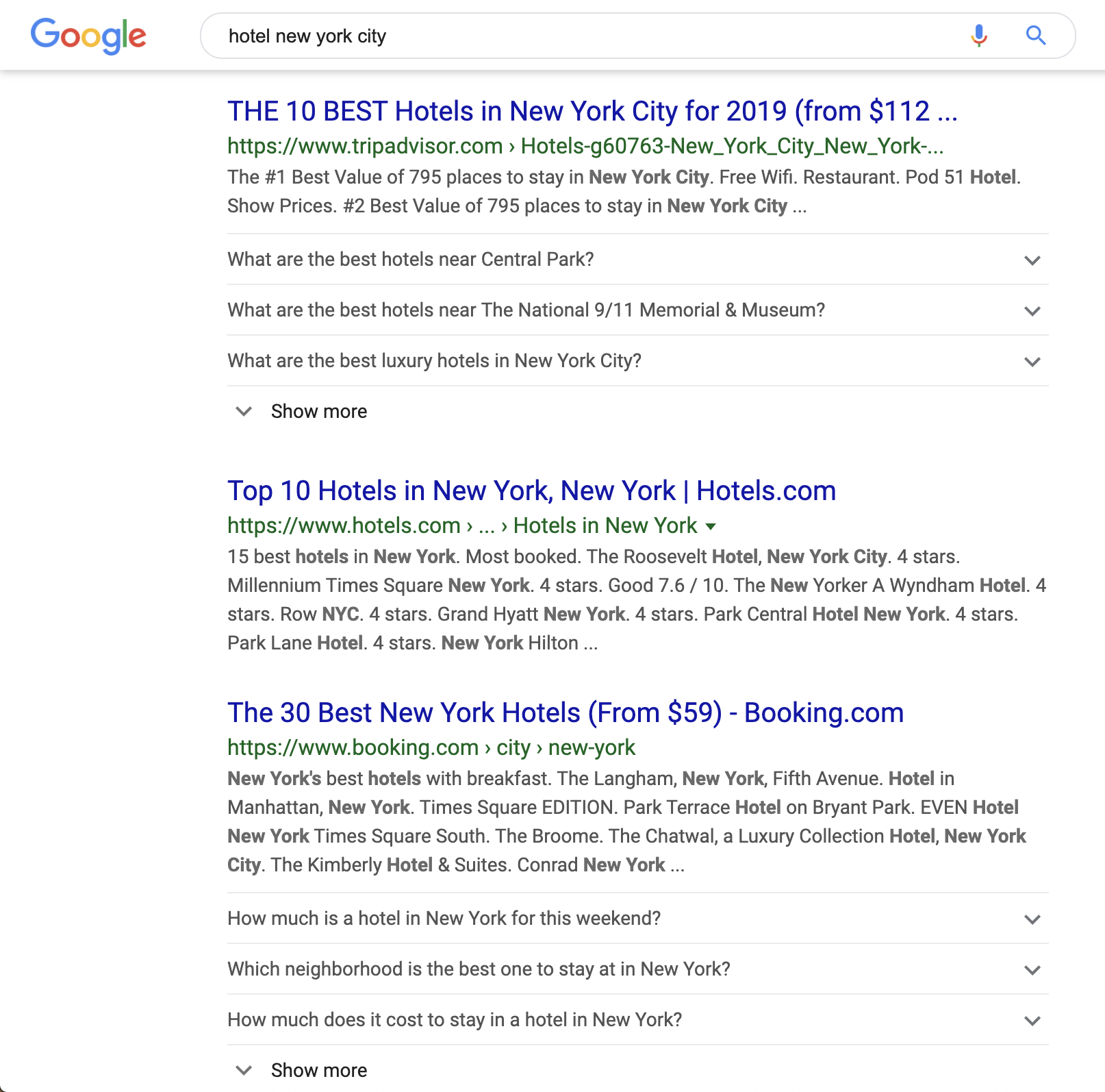
There are plenty of situation types where Google still shows your reviews, and there are new ways to gain visibility in the SERPs, such as using the FAQPage Schema type for the query “hotel new york city”:

Delivering Answers Fast
According to Google’s research, 53% of mobile visitors leave any page that takes longer than three seconds to load. That makes a lot of sense: everyone’s busy, and no one likes to wait, right?
So you need to make sure you’re delivering answers fast.
The faster the better – but your competition has already defined the competitive landscape and what users are used to, so when you’re already faster than the competition, it’ll pay off.
When we’re talking about speed and UX, I always focus on Time to Interactive (TTI): the time until a user can use a page.
Best practices to deliver answers fast are:
A useful resource to learn more: How to Take Your Website Beyond Fast.
Easy-to-Use Websites
In my book, an easy-to-use website is one that provides great usability and is mobile-friendly.
Great Usability
When we’re talking about providing great usability, among other things, it means it’s important to have:
- Clear navigation structure.
- Clear heading structure.
- Clear content structure: for instance using the inverted pyramid, where you’re making sure the most important content is at the top.
- Great content formatting using lists, bolding, and paragraphs.
- Useful resources to help readers learn more.
- Great accommodation for the user’s context. For example if you’ve got an international website targeting multiple audiences, then a language and currency switcher is important, as is using the right date and time format and number formatting.
- Great accessibility.
Here are some additional resources on usability:
Mobile-Friendliness
No matter what device a user is on, they need to be able to use your website effectively. In most cases, a responsive website is your best choice.
Design mobile-first, because that’s the real challenge. When you get that right, making it work for desktop is easy.
Because much has been written on this topic already, I’ll just refer to these resources:
Google’s mobile-friendliness tool comes in handy here as well. If you’re not familiar with it yet, be sure to take a look.
Conclusion
UX and SEO objectives are very much aligned these days. So focus on consistently delivering a great user experience, and you’ll win at SEO.
To deliver that user experience, provide satisfying answers fast, on a site that’s easy to use.
As long as you keep that in mind, and you go above and beyond to provide the best user experience, you’ll knock it out of the park in SEO.
More Resources:
Image Credits
All screenshots taken by author, September 2019
