On a Google Webmaster Hangout someone asked about the role of H1s on a web page. John Mueller responded that heading tags were good for several reasons but they’re not a critical element.
SEO and H1 Headings
One of the top rules for Search Engine Optimization has long been adding keywords to your H1 heading at the top of the page in order to signal what a page is about and rank well.
It used to be the case, in the early 2000’s. that adding the target keyword phrase in the H1 was mandatory. In the early 2000’s, if the keywords were not in the H1 heading then your site might not be so competitive.
However, Google’s ability to understand the nuances of what a page is about have come a long way since the early 2000’s.
As a consequence, it is important to listen to what Google’s John Mueller says about H1 headings.
Can Multiple H1s be Used?
The context of the question is whether a publisher is restricted to using one H1 or can multiple H1 heading tags be used.
This is the question:
“Is it mandatory to just have one H1 tag on a web page or can it be used multiple times?”
Google’s John Mueller answered that you can use as many H1s as you want. He also said you can omit using the H1 heading tag, too.
John Mueller’s answer about H1 heading tags:
“You can use H1 tags as often as you want on a page. There’s no limit, neither upper or lower bound.”
Then later on, at the end of his answer, he reaffirmed that publishers are free to choose how they want to use the H1 heading tag:
“Your site is going to rank perfectly fine with no H1 tags or with five H1 tags.”
H1 Headings Useful for Communicating Page Structure
John Mueller confirmed that H1 headings are good for outlining the page structure.
What he means is that the heading elements can work together to create a top level outline of what your page is about. That’s a macro overview of what the web page is about.
In my opinion, a properly deployed heading strategy can be useful for communicating what a page is about.
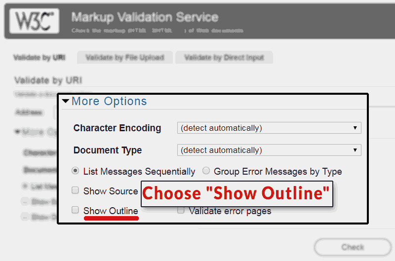
The W3c, the official body that administers HTML guidelines, offers an HTML validator that shows you the “outline” of a web page.
When validating a web page, select the “Show Outline” button. It’s a great way to see a page just by the outline that your heading elements create.
 Choosing the “Show Outline” option in the W3C HTML Validator will show you the overview of what your page looks like as communicated by your heading elements. It’s a great way to get a high level snapshot view of your page structure.
Here are Mueller’s comments about the H1 heading element:
“H1 elements are a great way to give more structure to a page so that users and search engines can understand which parts of a page are kind of under different headings.
So I would use them in the proper way on a page. And especially with HTML5 having multiple H1 elements on a page is completely normal and kind of expected.”
H1 Headings and SEO
John Mueller went on to reaffirm that the lack of a headings or using many H1s was not something to worry about. This is likely due to Google doesn’t need or require H1 headings to rank a web page.
This should be obvious to anyone who works in digital marketing. Google’s search results are full of web pages that do not feature H1 headings or that use them for styling purposes (a misuse of the heading tag!).
There are correlation studies that say that XX percentage of top ranked sites use headings. But those studies ignore that modern web pages, particularly those that use WordPress templates, routinely use Headings for styling navigational elements, which will skew those correlation studies.
Here’s what Mueller observed:
“So it’s not something you need to worry about.
Some SEO tools flag this as an issue and say like Oh you don’t have any H1 tag or you have two H1 tags… from our point of view that’s not a critical issue.”
H1 Headings Useful for Usability
Mueller’s on a roll in this answer when he begins talking about heading tags in the context of usability.
I have found that, particularly for mobile, heading tags help make a web page easier to read. Properly planned headings help communicate what a web page is about to a user and visually helps break up a daunting page of text, making it easier to read.
Here’s what Mueller said:
“From a usability point of view maybe it makes sense to improve that. So it’s not that I would completely ignore those suggestions but I wouldn’t see it as a critical issue.”
Takeaways about Heading Tags
1. Use as many H1 heading elements as you like
2. They are useful for communicating page structure to users and Google
3. Heading elements are useful for usability
I would add that the proper use of all the heading elements from at least H1 to H4 is useful. That means that nesting article sub-topics by using H2, H3 and sometimes H4 can be useful for making it clearer what a page is about.
If in doubt, run your site through the W3C HTML Validator to see how your outline looks!
Watch the Webmaster Hangout here:
https://youtu.be/rwpwq8Ynf7s?t=1427
