E-commerce is booming at a staggering pace: In 2017, it generated over $2.3 trillion in sales, which is expected to nearly double to $4.5 trillion by 2021. And by 2040, nearly 95% of all purchases are expected to be via e-commerce.
But tapping into this multi-trillion dollar industry isn’t easy.
As an emerging e-commerce entrepreneur, you are working your fingers to the bone. After a great deal of research, you pick a line of products and a business model. You go through the painstaking process of developing an attractive, functioning website that presents a sublime user experience. All this aside from the grind of getting a decent flow of traffic to your virtual store by numerous digital marketing strategies such as content marketing, SEO and paid advertising.
But in the end, the success of your e-commerce venture boils down to sales. If your hard-earned traffic doesn’t actually buy anything after landing on your product pages, then all your efforts are essentially for nothing. As you’d expect, your product pages play a pivotal role in converting visitors into paying customers. In other words, an incompetent product page will set you up for failure, and vice versa.
Realizing its importance, here are four core elements you need to focus on to build a high-converting product page.
1) Product Visuals
The biggest problem with selling any physical product online is the simple fact that your prospective customers can’t feel, taste or try out your products first-hand before making a decision.
This is why your product visuals are crucial to your success. If you upload different types of high-quality product images, you enable shoppers to get a more realistic sense of your products. Therefore, you should invest in professional product photography, illustrations and videos. In particular, include the following types of visuals on your product page:
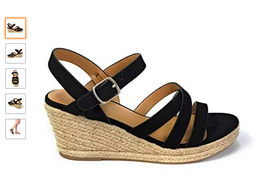
- Primary images: These are high-resolution photographs in which just the product is highlighted against a pure white backdrop. Such images allow your shoppers to focus only on the product without any distractions. Make sure to always upload at least one of these (preferably multiple, from different angles) to showcase your product as is; Amazon does an excellent job of this (see image below). Instead of purchasing and learning complicated and costly software like Photoshop, use an online tool like AutoClipping to easily remove the background of your image and make it pure white.
- Lifestyle images: Essentially, lifestyle photography involves showcasing your products as they’re being used in real-life, everyday situations by ordinary people. It helps shoppers visualize what it would be like to own your product.

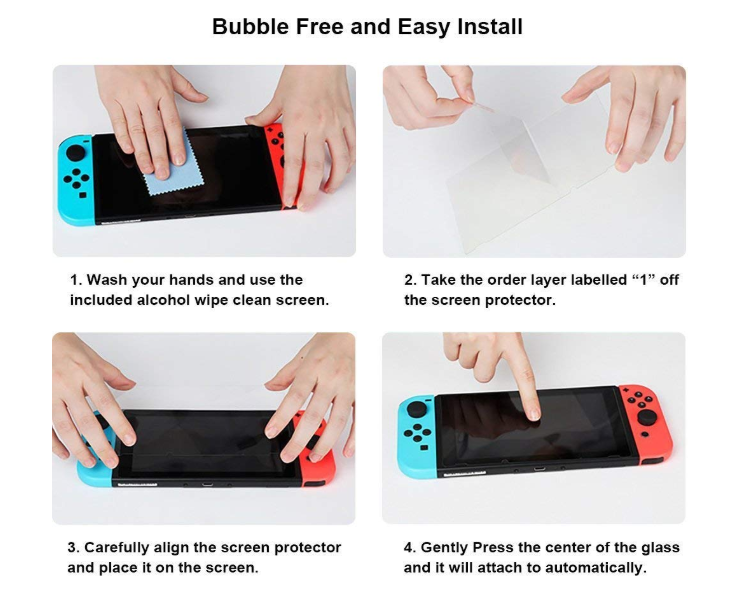
- Instructional images: Illustrations such as short infographics are a great way to swiftly underscore your product’s best features. Similarly, an instructional “how-to” illustration (such as assembly or usage instructions) can also be employed to demonstrate how easy your product is to use.
Furthermore, your shoppers want to closely inspect the product before they finalize a purchase. That’s where the zoom feature comes in. Adding a zoom feature to your online store is a straightforward task. On most major e-commerce platforms, such as WooCommerce and Shopify, it’s as simple as installing a plugin. It is definitely worth the cost, as it is a standard feature today and expected by shoppers.
Don’t cut corners when it comes to product visuals by uploading amateurish images taken on your smartphone. Find a local professional product photographer (and graphic designer) or hire an affordable one on Fiverr. Seriously, investing in high-quality product photography, professionally designed illustrations, and simple yet clear videos will bear fruit throughout the lifetime of your e-commerce storefront.
Dive Deeper:
2) Product Copy
The next most crucial element of your product page is the copy. Again, because online shoppers can’t examine a product in person, your product description must clearly describe the product with all necessary information.
Employ a clear structure and hierarchy in your product’s description. Intelligent use of headings, subheadings and keywords will make your content scannable and permit shoppers to quickly find the answers to any questions they may have. Not to mention, doing so will increase your odds of ranking on the first page of Google.
True, the success of selling anything is linked to how you leverage the art of storytelling, but this does not mean that you should write an extremely wordy product description. Your ability to weave your brand’s unique voice into the page is what will make your product pages stand out from your competition’s mediocrity.
Keep the following pointers in mind to write great copy:
- Explain your unique value proposition, or why shoppers should pick your product and not your competitors’.
- Succinctly describe all the features and benefits of your product using bullet points.
- Anticipate and address any potential questions that may arise in the shopper’s mind.
- Reduce buyer hesitation and boost confidence by clarifying any warranty/guarantee, free shipping or easy returns that you offer.
- Insert keywords but don’t just randomly stuff them in. Readability is all-important.
- As far as possible, shun jargon. Keep the language accessible for not-so-savvy shoppers.
Check out how Banana Republic does a fine job of writing to-the-point product copy:
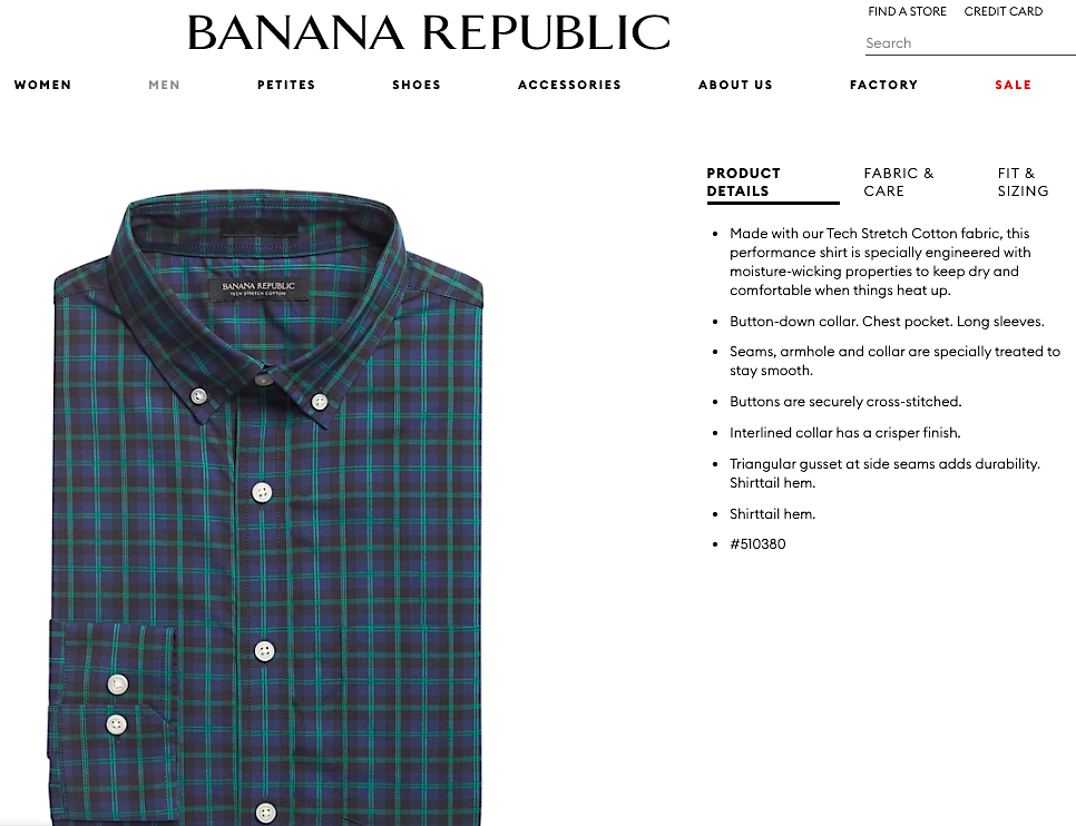
The copy is crisp and easy to scan through. This makes the shopper’s path to conversion a little bit quicker.
Dive Deeper:
3) Product CTAs
Ultimately, the purpose of your product page is to make your shoppers click on the “Add to Cart” button. That’s why Maria Bonello, former Director of Strategy at SMAKK Studios, recommends starting there when you’re optimizing your product page. She deftly explains:
“The ‘Add to Cart’ button is the most important component on the page, and should stand out from the surrounding content. The area around the button should be uncluttered so that there are no distractions or obstacles that block the user. It should also be immediately visible when you first land on the page – i.e. if your product description pushes the add to cart button below the bottom of the browser, it’s time for a redesign.”
So, how do you design a cogent call-to-action?
Firstly, use a contrasting color for the button. A striking color like red or orange is not a bad idea, as long as it matches your website’s theme or your brand’s logo. Next, make it big enough to easily spot within the first three seconds of landing on the product page. If that’s not the case, increase the size of the CTA.
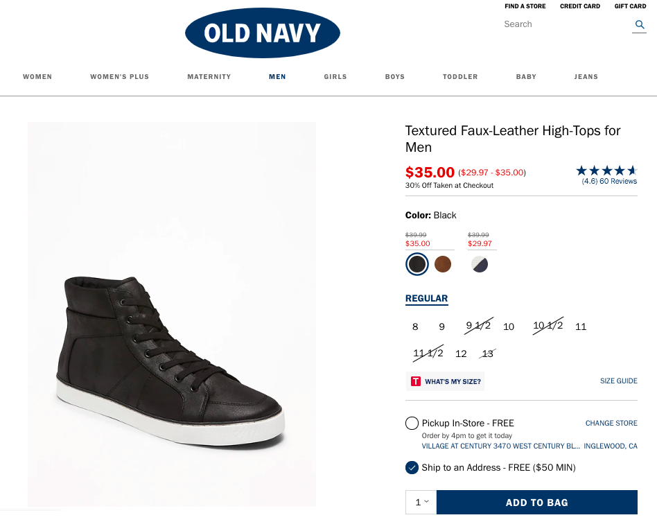
See how the “Add to Bag” CTA button matches the Old Navy logo and is immediately visible upon landing on the product page:
Finally, as most shoppers are going to be indecisive and hesitant, a “Save for Later” or “Add to Wishlist” button works well to keep them in the funnel and enables them to swiftly complete their purchase later. So, ensure this type of CTA is also evident.
Dive Deeper: How to Create CTAs that Actually Cause Action
4) Product Reviews
Get this: Customer feedback can make or break your business. In fact:
- 92% of consumers read reviews on the Internet
- 84% of people trust reviews they read online as much as personal recommendations
- 69% of online shoppers want more reviews from e-commerce sites
- 77% of customers read product reviews before making a purchase
Talk about the power of word of mouth! Those little star ratings you see on product pages are the most powerful determinant in your shoppers’ decision. The number of reviews also plays an equally crucial role. So, how do you earn more and better reviews?
One way is to reach out to your customers via good old-fashioned email and request that they take a moment to write an honest review. As there’s nothing in it for them, they might not comply easily, so send them friendly follow-ups a couple of times, letting them know that you highly appreciate their feedback.
Another great way is to incentivize feedback by offering them discounts and rewards on their next purchase. Doing so also boosts customer retention and brand loyalty.
For instance, check out how J.Crew showcases its product reviews (at the bottom of the product page):
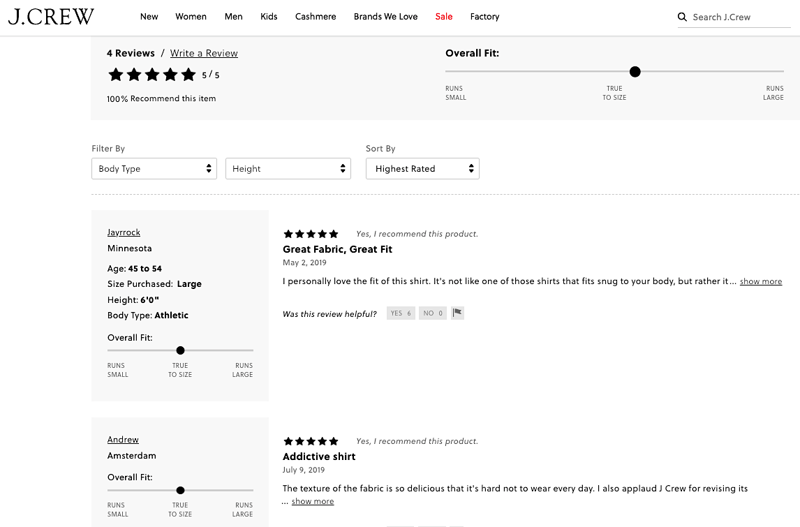
They manage to display a ton of useful information about their customers in a succinct and neat way.
Also, remember that if you get negative reviews, don’t ever get offended or respond harshly. Take the high road and always respond to each review in a timely and courteous way. It proves that you value your customers’ opinion.
Product reviews are the best form of social proof, so it’s sensible to invest time and effort in obtaining as many as you can.
Dive Deeper:
Summing Up E-commerce Product Page Optimization
Product pages are the gateway to conversions. While there are many elements that together constitute a good product page, concentrating on optimizing these four crucial ones – images, copy, CTAs, and reviews – will surely boost your sales.
To summarize, here are the key takeaways you must act upon:
- Invest in high-quality product photography, illustrations and, if feasible, videos. Hire a professional photographer and designer who know what they’re doing.
- Take the time to write stellar copy for each product. Try to have your brand’s distinctive voice rooted in the story you’re selling around the product, and make sure to keep the copy crisp and scannable. Use proper structure (H1, H2, and so on) and prioritize readability over keywords.
- Have prominent call-to-action buttons that are big enough to easily spot within the first three seconds of landing on the product page. Maintain color consistency with your brand’s colors. Also, allow “Save for Later” or “Add to Wishlist” using a button or icon for shoppers on the fence.
- Finally, strive to garner as many reviews as you can. Email your customers, follow up with them, incentivize it – do whatever it takes to get more product reviews to display on your product page. Got negative feedback? Be courteous and timely.
No matter what you’re selling, rest assured that e-commerce isn’t slowing down anytime soon. In fact, online shopping already accounts for 10% of retail sales and is expected to grow at a year-on-year rate of 15% in the U.S. alone. So, with that in mind, keep upgrading and optimizing your online store and, above all, be patient – the results will come.
Learn More:

