One might expect that big, successful brands would provide some of the best examples of user-centered design, but in reality, big brands are among the worst abusers of dark patterns — deceptive user interfaces and components that can trick users.
While it’s possible to improve user experiences and conversion rates without deception, the continued use of dark patterns reflects the fact that big, powerful brands are often willing to take the easy road, not the high road.
Here are three dark patterns being used by big brands and why they should be avoided.
Price comparison prevention and hidden costs
Making it difficult for customers to compare prices, including by hiding costs, is one of the most annoying and sometimes abusive dark patterns companies can employ. Rental giant Airbnb uses a subtle version of this dark pattern when displaying prices for listings on its service. When search results are displayed, it prominently features the daily rate for each accommodation. But the daily rate excludes additional amounts, including cleaning fees and Airbnb’s service fee. While the company does display a total price when a user selects dates for their stay, they have to click to see a breakdown of the additional fees charged.
What’s more, when a customer filters by price, Airbnb does not factor in additional fees. For instance, if a user specifies that she wants to spend up to $25 per night for a two-night stay, Airbnb’s search results can contain listings for which the total price exceeds $50 as a result of additional fees.

Why it’s a bad idea
Practices that intentionally make it more difficult for users to accomplish tasks or find what they are looking for are at odds with user-centered design principles.
Airbnb’s position in the market means that some if not many users complete bookings despite the use of these dark patterns, but it’s also likely that Airbnb has lost bookings when users were unable to efficiently find accommodations that met their criteria or abandoned a booking when they learned of fees that weren’t made apparent.
Instead of resorting to these dark patterns, Airbnb could give users the ability to search for listings with fees included or excluded, and/or to specify criteria for fees. Where appropriate, it could also alert users when changes to their criteria might improve their options. For instance, a user who is searching for listings that are $25 per night with fees included could be informed that for just $10 (or $5 per night) more, better listings are available.
Sneaky selections
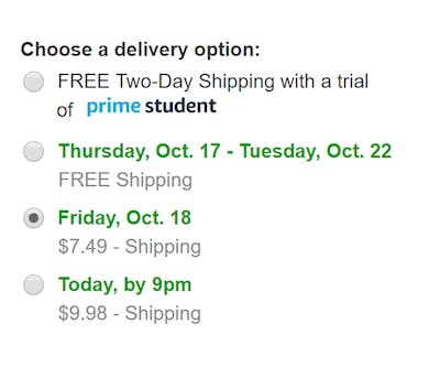
The availability of free shipping is one of the most important considerations for online shoppers and retail giant Amazon played a huge role in setting the free shipping standard. For non-Prime members, Amazon requires shoppers to purchase $35 worth of qualifying items in order to receive free shipping, something it prominently promotes when they’re browsing and adding items to cart.
But when shoppers go to check out with an order qualifying for free shipping, Amazon by default selects a paid shipping option. Oftentimes, this paid shipping option has estimated delivery dates that overlap with the free shipping option, and in some cases could even be faster. Needless to say, many if not most users would have little to no reason to prefer the paid option in these situations.

Why it’s a bad idea
Sneaky selections can generate incremental revenue but the potential long-term costs of customers who feel they have been tricked can be very high. While Amazon might feel its dominance leaves it impervious to customer disappointment, such hubris threatens Amazon’s standing with consumers at a time when it appears increasingly vulnerable.
Instead of tricking users into not taking advantage of the free shipping they have earned, Amazon should take the opportunity to remind customers of the benefit, which can breed loyalty, not resentment.
Fake notifications
Facebook makes use of multiple types of fake notifications to drive users to particular parts of its service, or back to its service altogether.
For instance, it shows notification dots next to links even when there is no legitimate new activity. In some cases, these dots don’t disappear even when users click on the links. Facebook also sends emails to users that suggest there is activity that they should log in to see.
Facebook’s #darkpatterns at work again. I don’t have any notifications, yet it keeps showing that I have when I am not logged in. @darkpatterns pic.twitter.com/U0RDUMXLO3
— Shubham Jain (@shubhamjainco) February 25, 2019
That red dot is an infuriating example of Facebook’s technomanipulation (I have unreads in every other category — they just want me to TRY to clear that dot (spoiler alert: you can’t)).
/cc @karaswisher pic.twitter.com/8YGJn48Vbr
— Chris Messina (@chrismessina) November 28, 2018
Why it’s a bad idea
Fake notifications can be effective in driving users to take action, but this is not likely to produce meaningful engagement. What’s more, over time, as users become conditioned to the notifications, a chicken little effect is likely to occur in which some users are likely to ignore notifications. This will make it more difficult to effectively use notifications in the future.
