Roughly 35 percent of U.S. adults desire some level of minimalism — ridding their lives of physical clutter. When it comes to ecommerce site design, minimalism can increase sales.
Minimalism can present products in a refreshing way and focus on key selling points. For example, the Bose site directs attention to its audio sunglasses with stellar imagery, a clear call to action, and lightweight text.
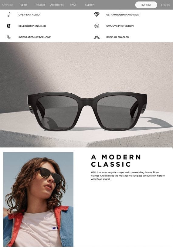
Simple navigation, a definitive call to action, and minimized text shine the spotlight on the product. Source: Bose.
—
Even the specifications area is clean and void of unnecessary content.
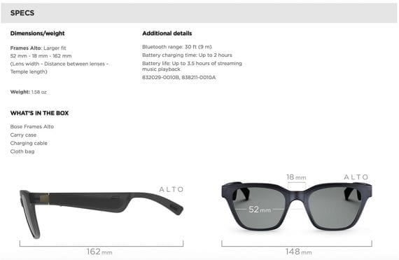
Bose simplifies the technical specs area using bold headings and oversize graphics.
By focusing on what matters most, you can encourage more engagement and conversions.
When considering a minimalist design, keep the following conversion pointers in mind.
Less is more. The idea is to minimize distractions, bringing the most favored content to the foreground. Review existing pages to determine which elements are crucial and which ones clutter the space. Examine ways to convey information in fewer words.
Use simple, logical navigation and robust search. With more websites being visited by users on smartphones, minimizing taps to locate products is essential. An advanced search tool helps shoppers find what they need on the first try.
Every picture tells a story. Ditch primary product photos that don’t evoke emotion, which is key to selling. Large, context-of-use images work well.
Typography matters. Words take on meanings by the way they appear on the screen. Apple recently revamped its iPad page to focus on users’ creative side. Apple designers swapped out the classic sans-serif font for something more fun. “Jot ‘til you drop” wouldn’t be as powerful in the site’s standard type.
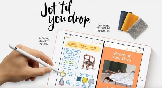
Apple uses typography that best describes both the product and who it’s designed for.
Dramatic typography emphasizes the core message. Consider using thick and bold fonts for short headlines.
Consistent alignment makes for easier comprehension. Use blocks — typically rectangles — to arrange content so sections are easy to follow. While a large graphic doesn’t have to run edge-to-edge on the page, it does need to fit within its assigned block.
Color contrast makes it fun and inspiring. Many minimalist websites use a white background because it produces a strong contrast. Other colors are suitable, too, however. Test them against various products and landing pages.
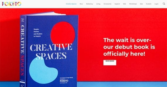
Poketo’s book pages use drastic contrast to call attention to each title.
Three definitive sections are best. For a product page, this could be the main image with product name, price, and call to action; supporting media with product details; and tech specs or special instructions.
Nix elements that don’t drive conversions. How many social share buttons get action on your product pages? Do products tagged with labels like “new” and “featured” get more conversions? Study your store’s analytics to see how many shoppers are utilizing all the extras.
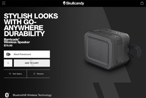
Skullcandy removes on-page distractions to focus on what sells its products: images.
No Clutter
A minimalist design isn’t for everyone. Some sites excel with detailed text and features. Regardless, rid pages of clutter and guide shoppers directly to the buy button. Make annotations in the site’s analytics tool to track the performance of changes.
