- By
Leadpages is an incredibly powerful tool for making landing pages. If you’re looking to convert visitors into something more – to push them through into sales and happy customers etc – an effective landing page can be near priceless: ideally paying for the amount of time, effort and money you’ve put into it many many times over!
But designing such a genuinely effective landing page is no easy task. Tools like Leadpages (or rivals such as Instapage and Unbounce) make the task infinitely easier of course by providing all kinds of helpful pre-made layouts, features and ideas, but ultimately the most important choices are still yours to make. A little dauntingly!
So what have others done? What kind of landing pages have some of the best designers and folk who really know what they’re doing already created using Leadpages? Just what ca be achieved with Leadpages?
Below, we’ve put together a showcase of over 30 top examples of Leadpages in action: a list created from filtering through several hundreds of examples to get down to just 30 that we think are about the best!
(note: images link to live examples – listed in no particular order)
Enjoy:
Plenty Vegan
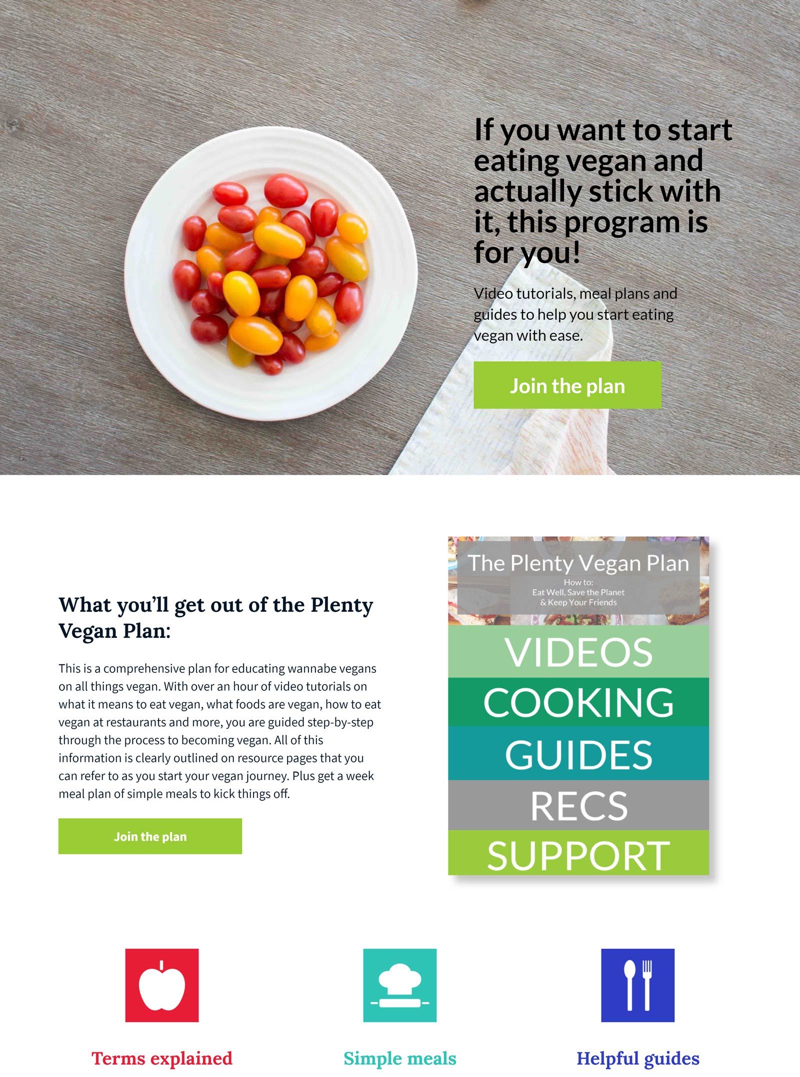
A good balance between icons and text is achieved here. The colour scheme of greens and white help to reinforce the plant-based nature of what Plenty Vegan is selling. And having the CTR buttons in each section help to keep conversion on track.
SeeSharp

The CTA is immediately identifiable here. SeeSharp have a total of six bold purple CTA buttons throughout the landing page, calling the visitor to secure a spot. The page also has a section for “private invite” (for those that cannot make the current date), giving the customer a feeling of importance. This is alongside a minimal form field for a quick and easy path to conversion.
Survival Life
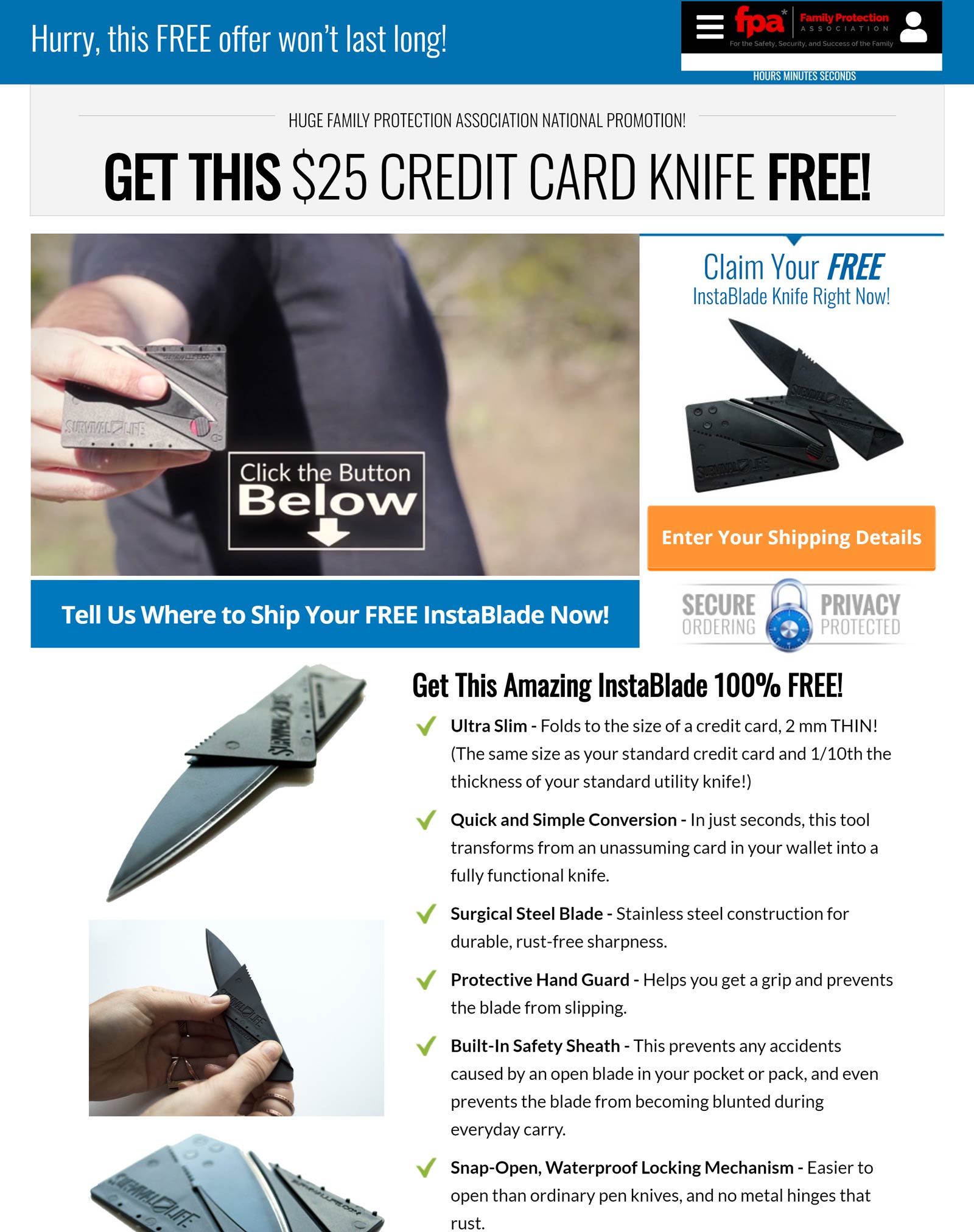
This LP is all about enticing the customer with its free product, the Instaknife (a foldable knife). The page begins with a short video explaining how and where the instaknife can be used. For a free gift, the instaknife is a premium product. Giving away a well made product like this sends the message you can expect a high level of quality with this company. This is backed up further by testimonials taken from their facebook page. And for those of you that might be wavering, before you reach the button, they offer another free product in the form of a book. People like free gifts, and they play on this idea well to maximise attention and action.
The Weekend Woodworker
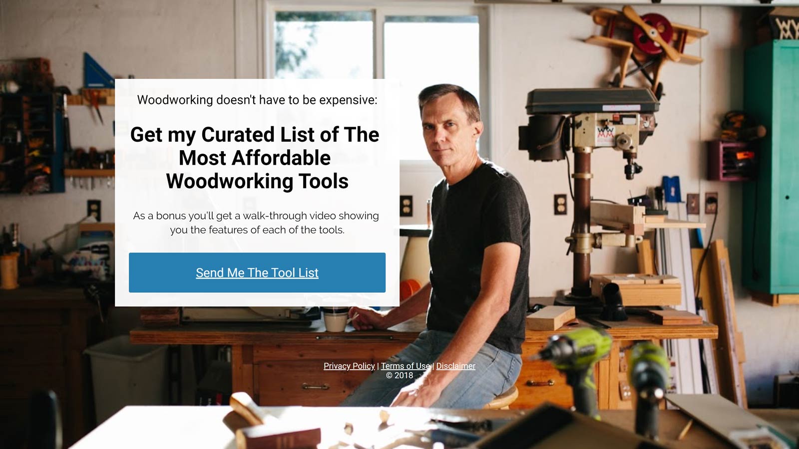
The majority of landing pages we have looked at so far have consisted of a few pages you can scroll through. The weekend Woodworker, however, is a one-pager. If what you are selling doesn’t require much explanation, then this style of landing page can be the perfect solution: it’s simple, clear and easy, with a picture of the weekend Woodworker in his workshop, giving an added sense of relatability to its audience.
Agrawal Leadership
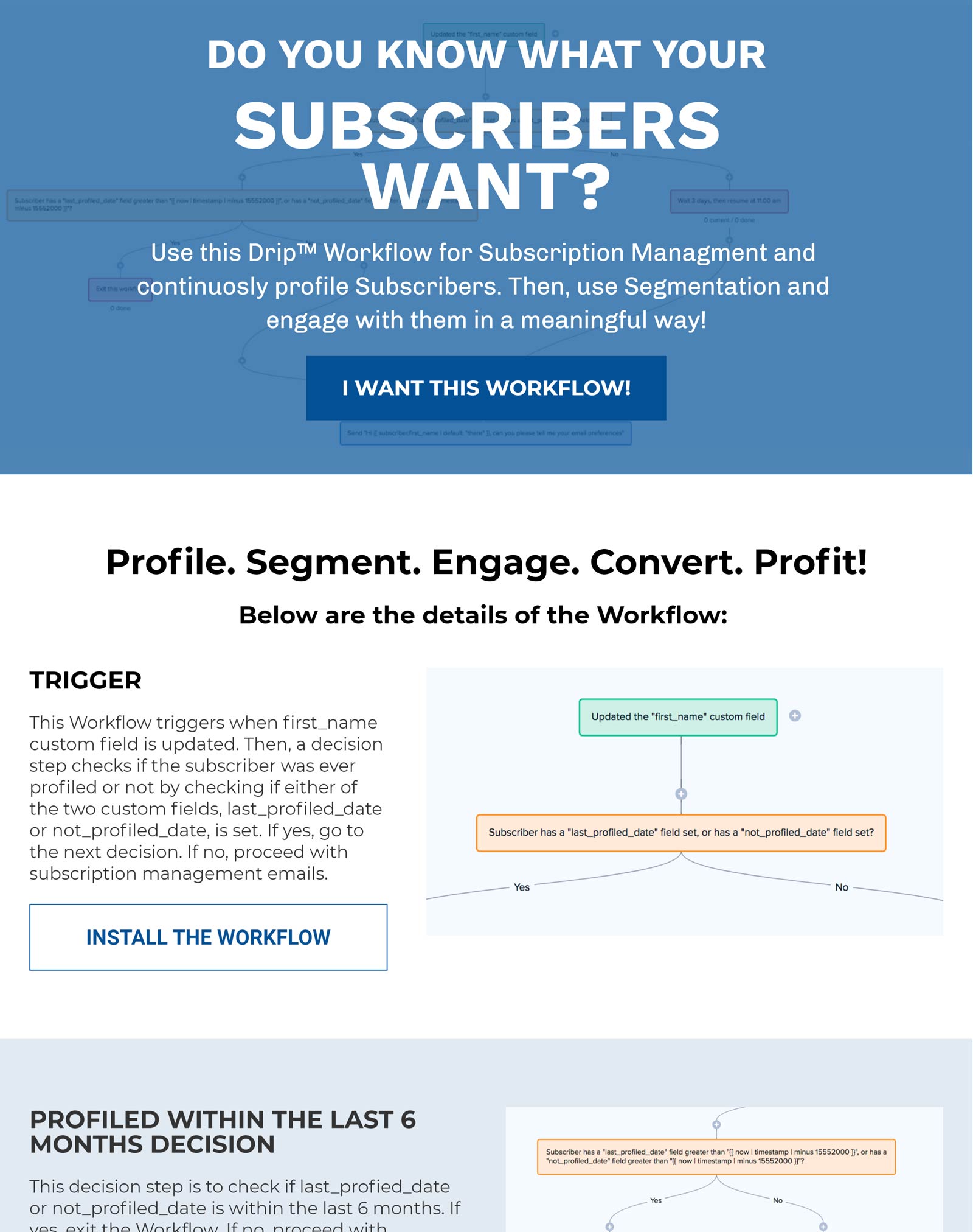
Agrawal Leadership pose a question and then offer a solution to it. This is a great way to engage your audience: it not only shows a way to improve their business, but it may also give them rise to think about a problem they have not yet realised.
Food ASC
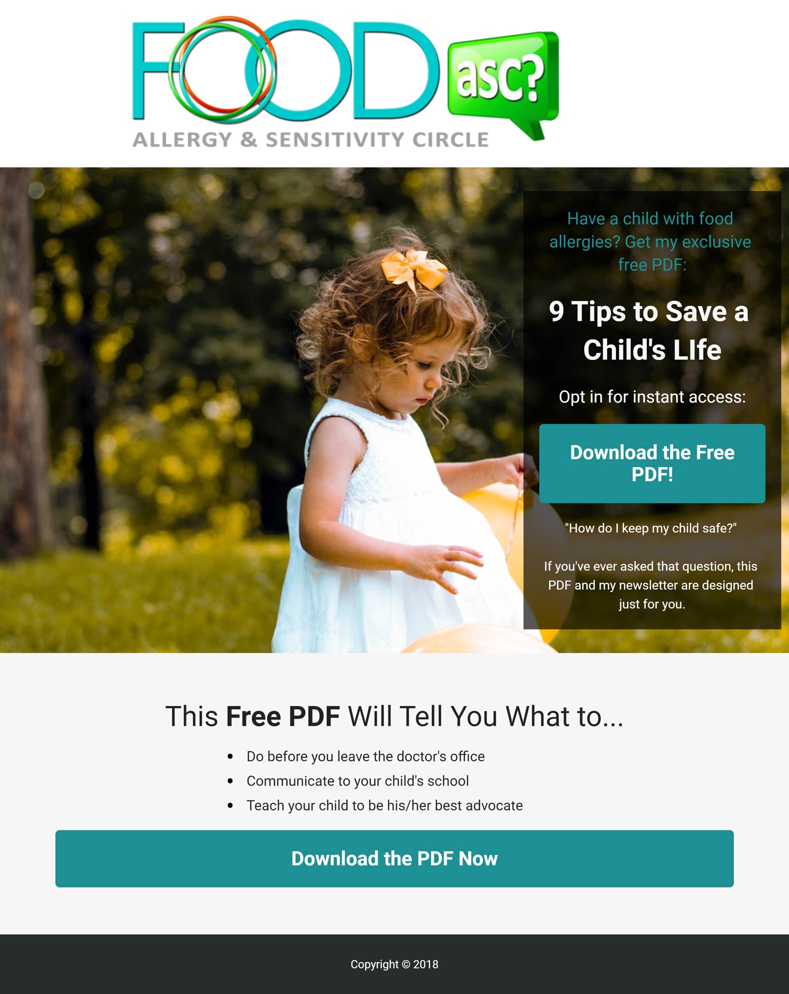
In similar vein to the Agrawal page, we have another problem-solution setup. It has a professional photo of a child as the background, which serves to humanise and remind its audience of the need for their product. It’s kept very simple, with everything on a single page which helps keep the conversion-rate process as quick and easy.
South Coast Inbound
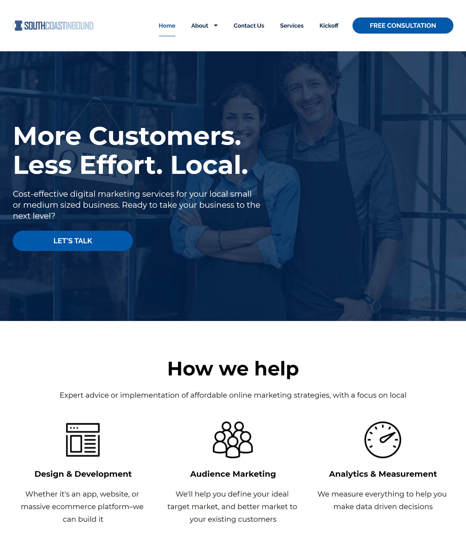
You are greeted with a picture of a couple, smiling in their matching aprons, outside a shopfront with an open sign in the window. We can infer these are the joint owners of a family run business. This gives the impression we [South Coast In Bound] have a personal interest in you, and you matter to us. And this is important to business owners; they want to feel their particular needs are listened to, rather than a one-size-fits-all approach. Adding to this, there is an instant messaging box for you to talk directly with someone from the company/South Coast Inbound. Along with the CTA buttons placed in each section of the page, this all leads to higher yield in conversion rates.
Goalie Coaches
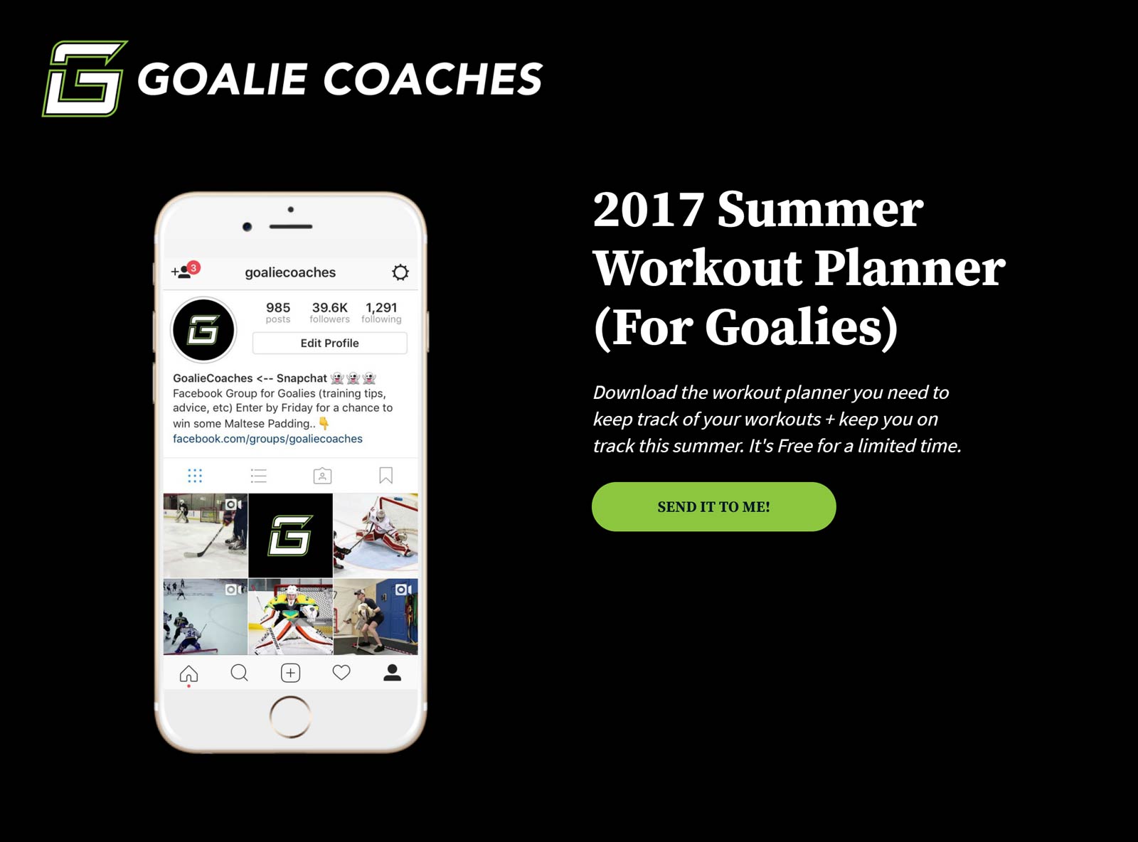
Back to simple does it best! This vibrant, straight-talking one-pager has everything you need to know and in one single spot, keeping conversion rate high. In fact, it has an “82.3% conversion rate on just over 1000 visits” — according to Tyler from Goalie Coaches.
Dr Jessica Higgins
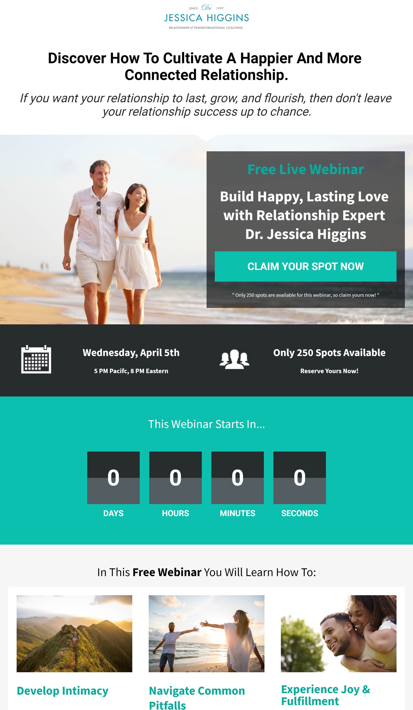
Exclusivity and urgency are great ways to increase your conversion rate. The CTA works on the idea of limited availability — “Only 250 spots available. Claim yours now!” Further enticement is added by the pictures of happy-looking couples, which illustrate the goals and expectations that can be achieved for you and your partner by clicking on the button to “claim your spot”.
Maze Digital
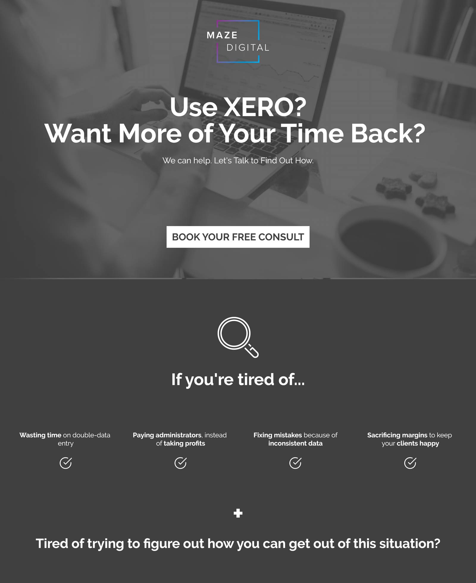
Maze Digital concentrate on specific real-world problems for Xero users in their LP. They put themselves in the position of having the magic bullet in solving these problems, so if you are a Xero user, you would be hard pressed not to want to click the CTA button and book a “free” consult with them. A particularly catchy segment, that follows on from a clients story, is the myth-busting section: five typical complaints from clients, ranging from needing to have a tech-savvy team to thinking nobody can know your business better than you, which are all highlighted as myths. This enables Xero users to identify with the purported myth and look to Maze Digital for the answers, all adding up to a higher probability of acting on its CTA.
Poppy Sports
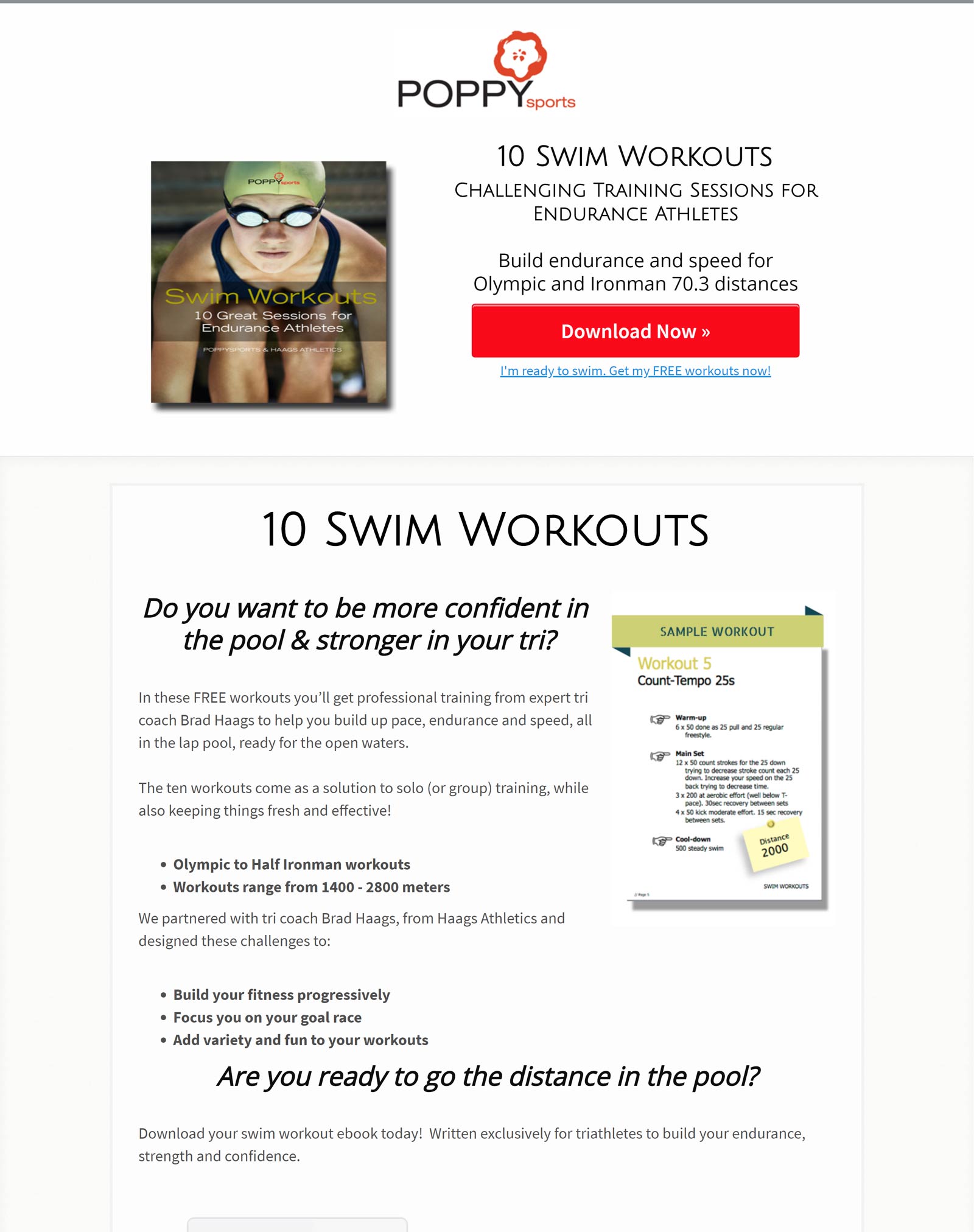
What stands out with this Lp is its immediate CTA at the very top of the page, and its simplicity. Some products require a lot more text, but this one doesn’t. And it’s always best to keep the text to a minimum to sustain engagement with LP. You want the conversion quick, simple and smooth.
Thought Lab
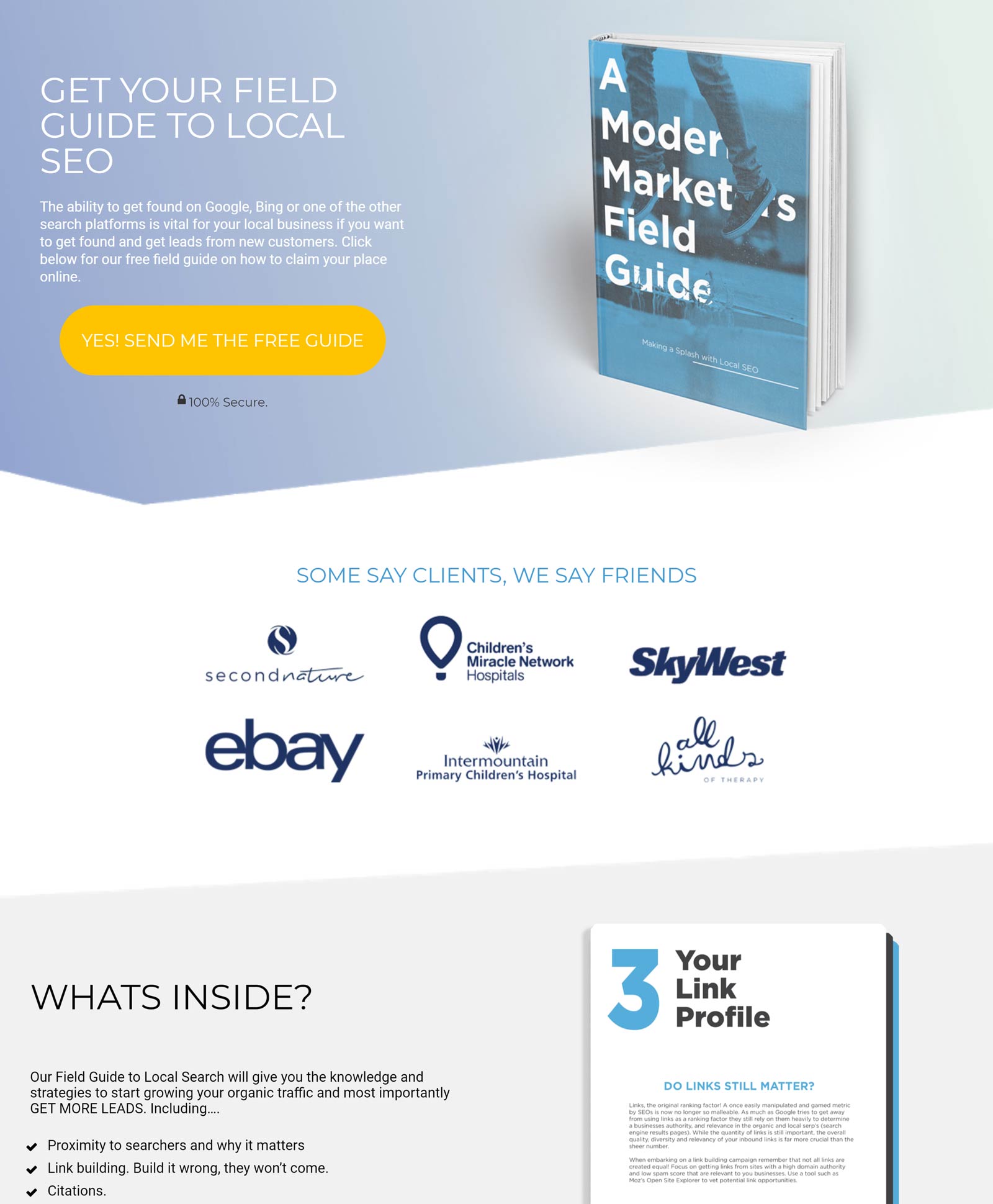
Thought Lab uses a muted pastel palette for their page, with their CTA button in standout yellow, giving it prominence on the page. We can see, further down, the logos of big named brands such as ebay and SkyWest — companies that Thought Lab have worked with. Further on, we see testimonials and photos from satisfied customers. This shows they have the experience and scale to work for big business, but also the personal touch for the individual.
Career Contessa
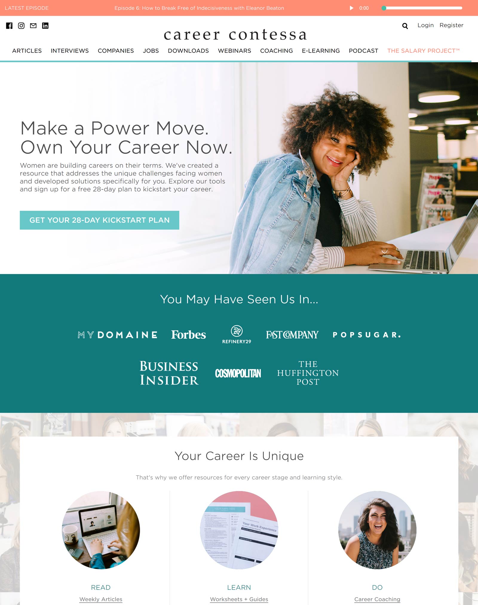
Like all good LP (landing pages) , Career Contessa’s has a smooth track to conversion. It has a single CTA (call to action), a simple pop-up box, and testimonaials in the form of quotes from satisfied customers for its social proof.
Moffat Girls
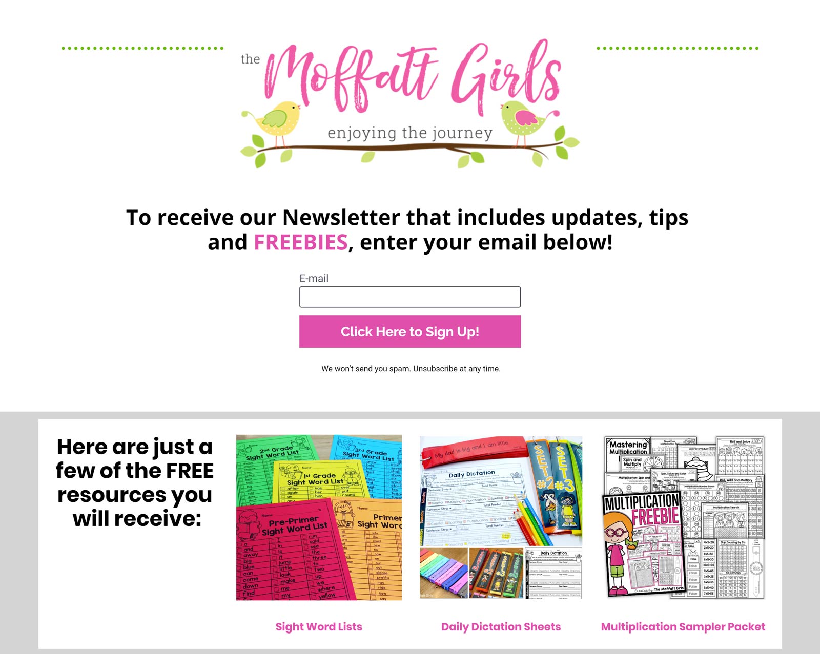
After viewing longer LP that require a small scroll of the mousewheel, it makes a nice break to get back to the one-pager, which Moffatt Girls does well. On top of its newsletter there are freebies that can be implemented into teachers classes. The simplicity and useful freebies all add up to a high conversion rate.
Amanda Arneill
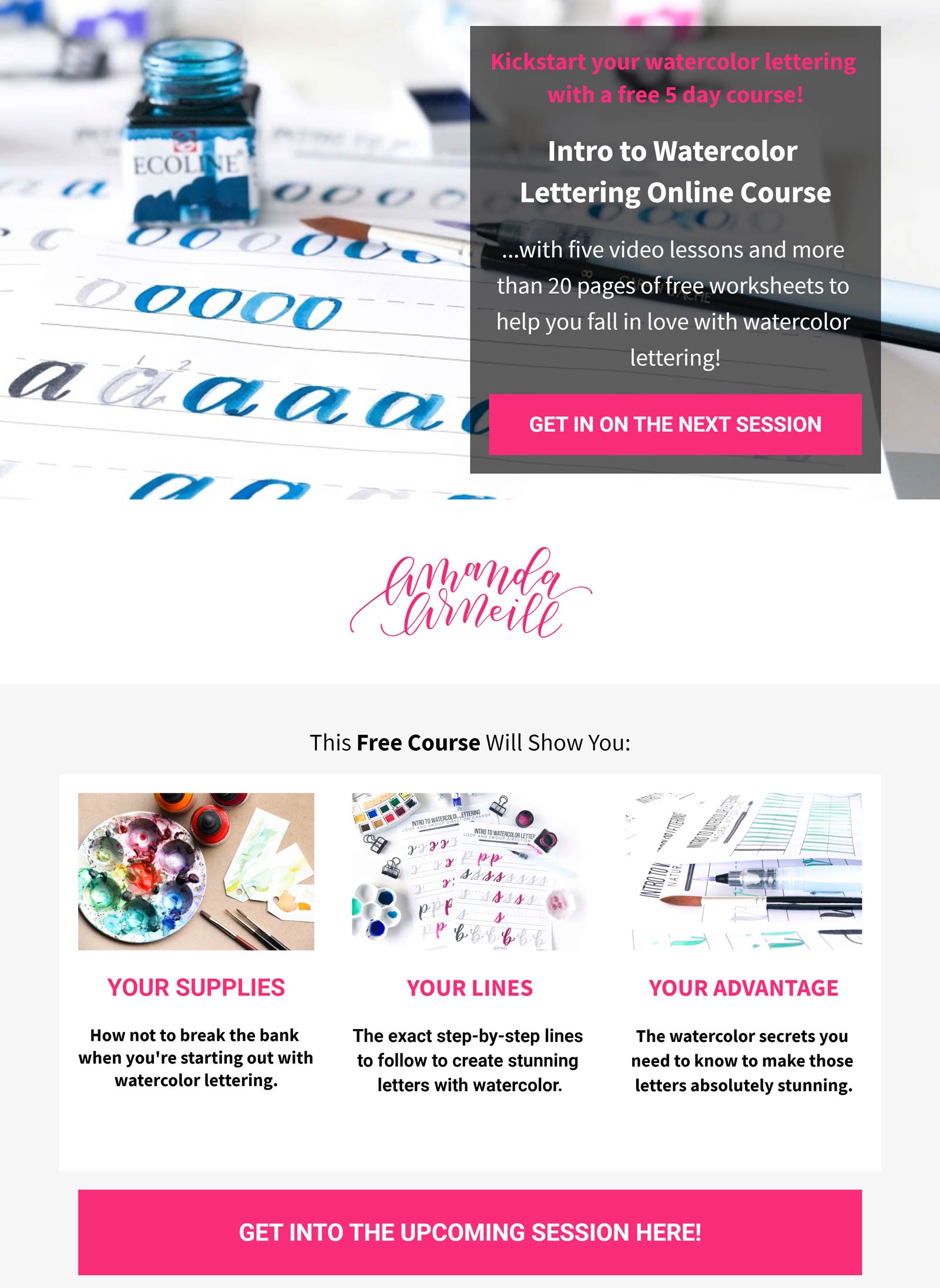
Similar to Moonology, Amanda Arneill offers a free course, has minimal text, and a simple form field upon clicking its CTA button — all designed to make conversion rates simple and fast. It also has a professional photo of one of its worksheets to make the act of signing up more attractive.
Fitness Balanced
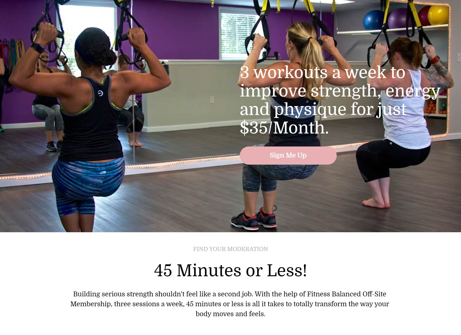
The page makes good use of real-world pictures taken from classes rather than a model-photographer set-up. This allows the audience to identify with those in the pictures and see themselves taking one of their classes. There are four CTAs throughout the page. And the testimonials are set adjacent to class photos, giving it more authenticity.
Phoenix Auditing
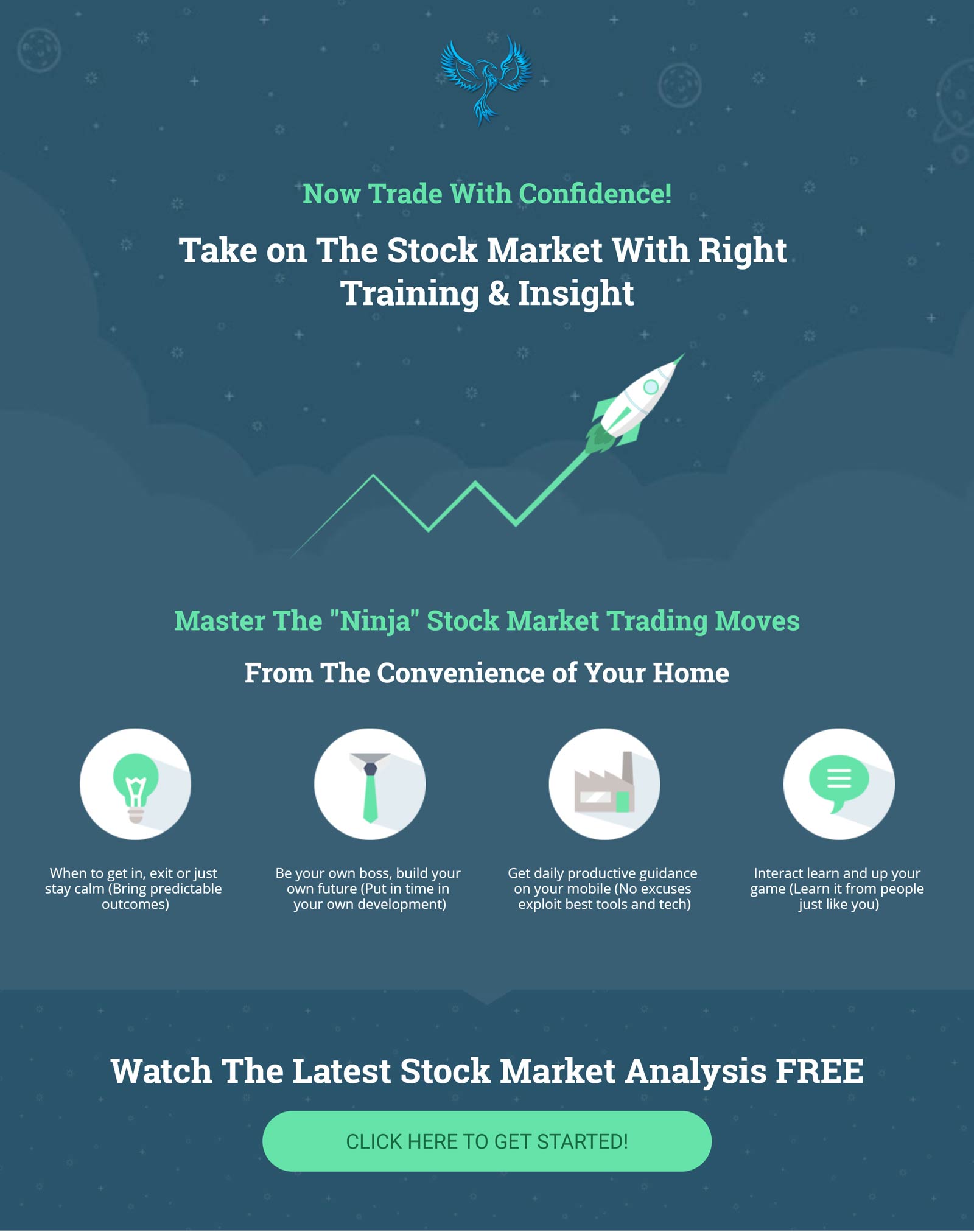
This landing page has three sections. The first section has four graphical bullet points informing you as to what you can expect to receive when working with Phoenix Auditing. This is done in no more than sentence for each point, keeping it light and brief and the audience engaged. In the next section this becomes fleshed out a little more. So instead of bombarding you with information, you are being lead gently down the page, making the experience less taxing and increasing retention rate. And in the last section we have testimonials in the form of screenshots from phone messages from satisfied customers, giving it a sense of realism that faceless quotes don’t always capture.
Bubu Research
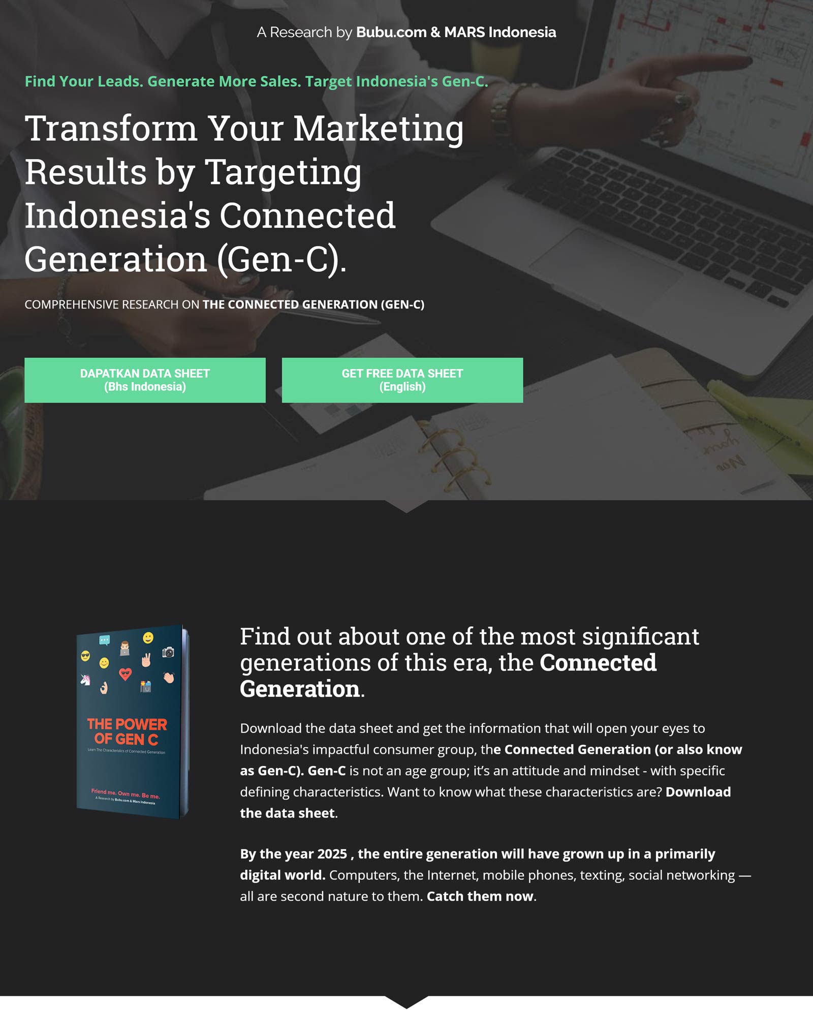
Colour taste can be subjective, but I think the vibrant greens on the CTR buttons over the muted grey tones of the photo work well here. And below the fold, at the bottom, the colour scheme is inverted. While stylistically a nice touch, it also keeps the visitor alert to what’s going on rather than drifting from seeing more of the same.
Clever Taxes
Each section has a CTA button with varying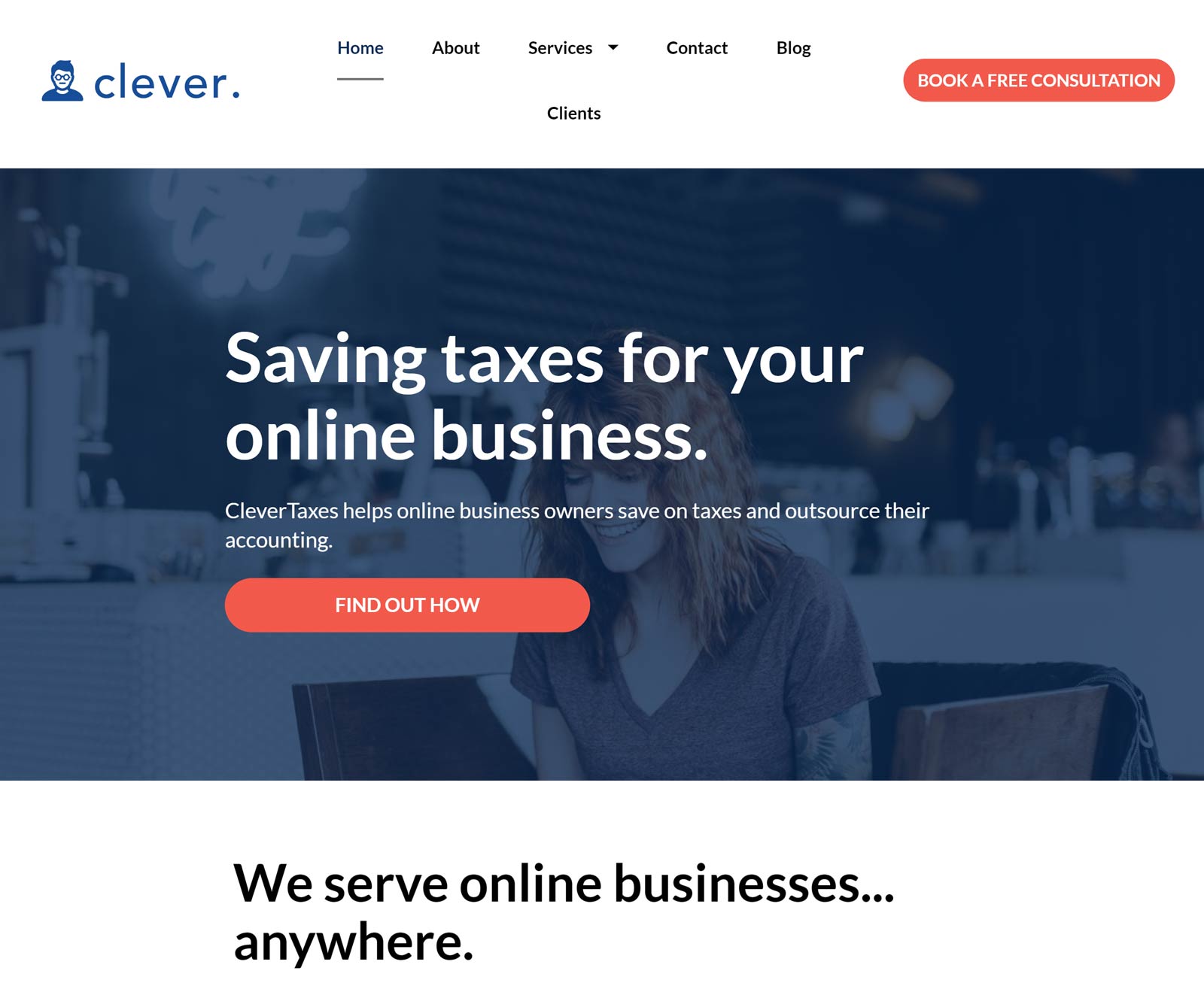
titles, like ”find out how” and “Let’s Talk” all resulting in the same pop-up — a picture of Bryan Nguyen and an interactive calendar for booking your Discovery Call With CleverTaxes. The use of different phrasing on the buttons helps to keep things fresh and increases the probability that one of them will connect with your audience. The calendar style pop-up makes a change from having to fill out field forms and gives a sense of control that you are making something happen on your terms in the moment, rather than waiting to schedule an appointment. The page has a professional polish to it and gives the impassion you are in capable hands.
Action Coach
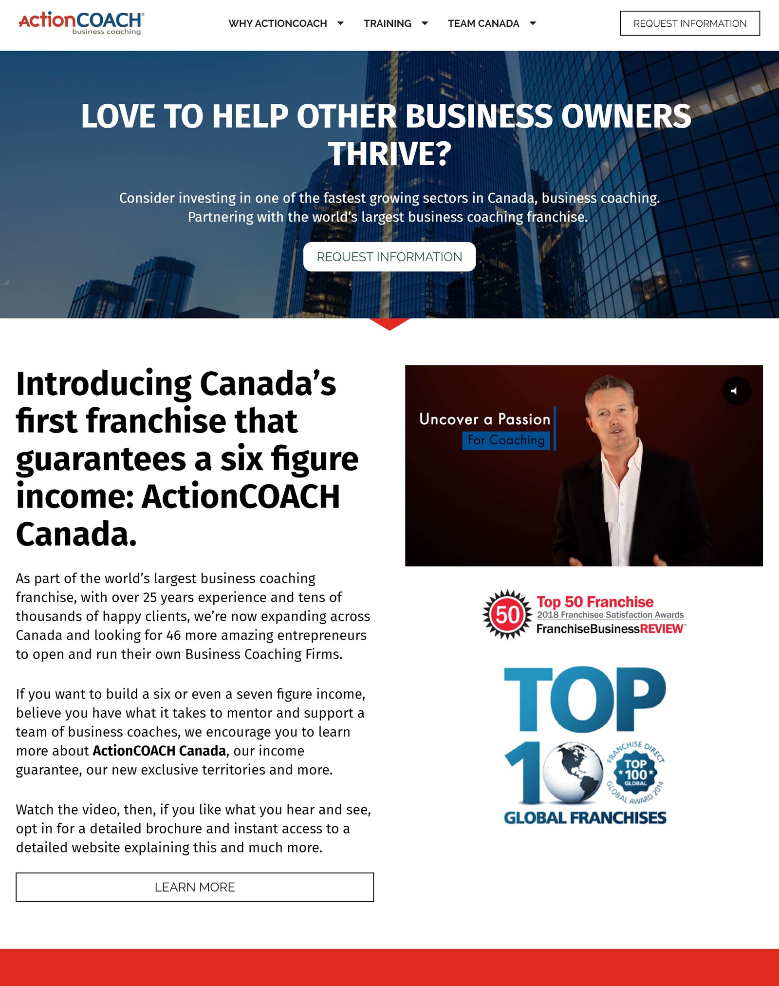
Action Coach is a little more complicated in what it has to offer, and therefore requires more text. However, Action Coach have opted for an embedded video, avoiding the audience being weighted down with information to read and keeping things interesting. The video is delivered by the owner of Action Coach, giving the experience a more personal touch. People connect with people, so if you are able to personalise your LP, visitors will be more inclined to connect with your product and answer your CTA.
Mingle Media Marketing
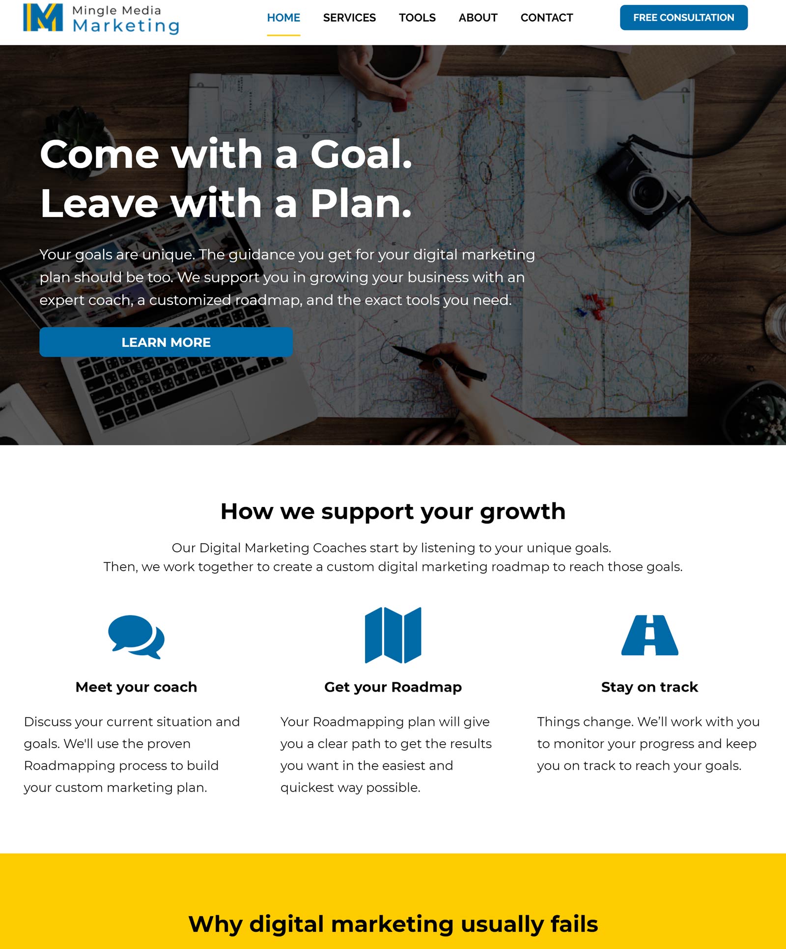
Mingle Media start their LP with a clean and simple layout, letting the visitor know what’s on offer. Between the top and bottom of the page, the midsection section is in a jarring yellow colour, which gives the viewer a sense of warning. It’s here it details the pitfalls you need to avoid in case of failure, and how they can help you avoid such pitfalls. This is a good way to alert your audience and galvanise them into action.
Nutrition by Nicole
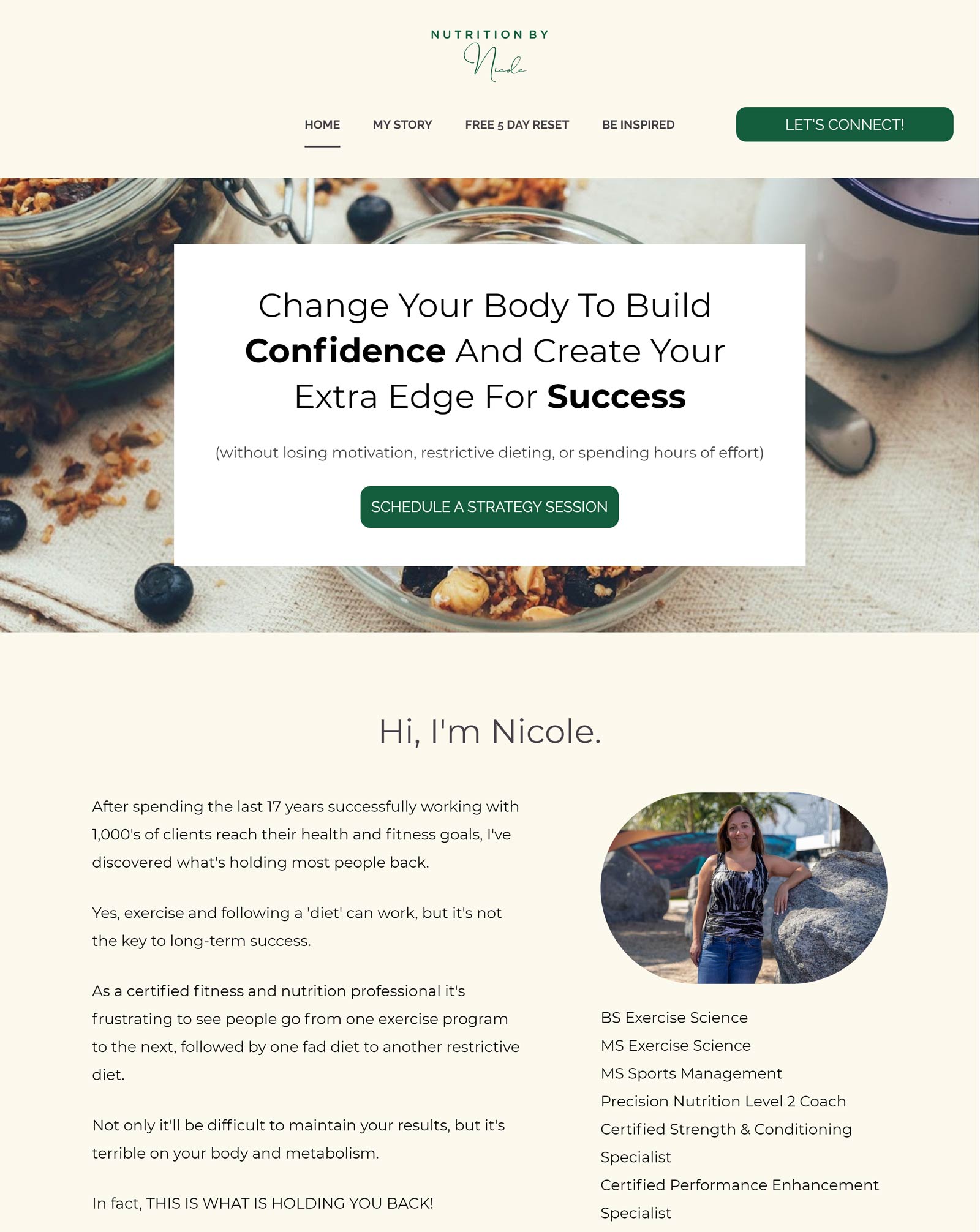
This page has two different CTAs: “Schedule a Strategy Session, and “Get The Free 5 Day Rest”. This gives those that are not quite ready to commit to a “strategy meeting” the opportunity for a less committed CTA, giving them something for free while also putting them on the mailing list for later down the line, when they might be in a better position to commit.
Clayton Poland
x
This page has two different CTAs: “Schedule a Strategy Session, and “Get The Free 5 Day Rest”. This gives those that are not quite ready to commit to a “strategy meeting” the opportunity for a less committed CTA, giving them something for free while also putting them on the mailing list for later down the line, when they might be in a better position to commit.
Affinescore IB Bootcamp
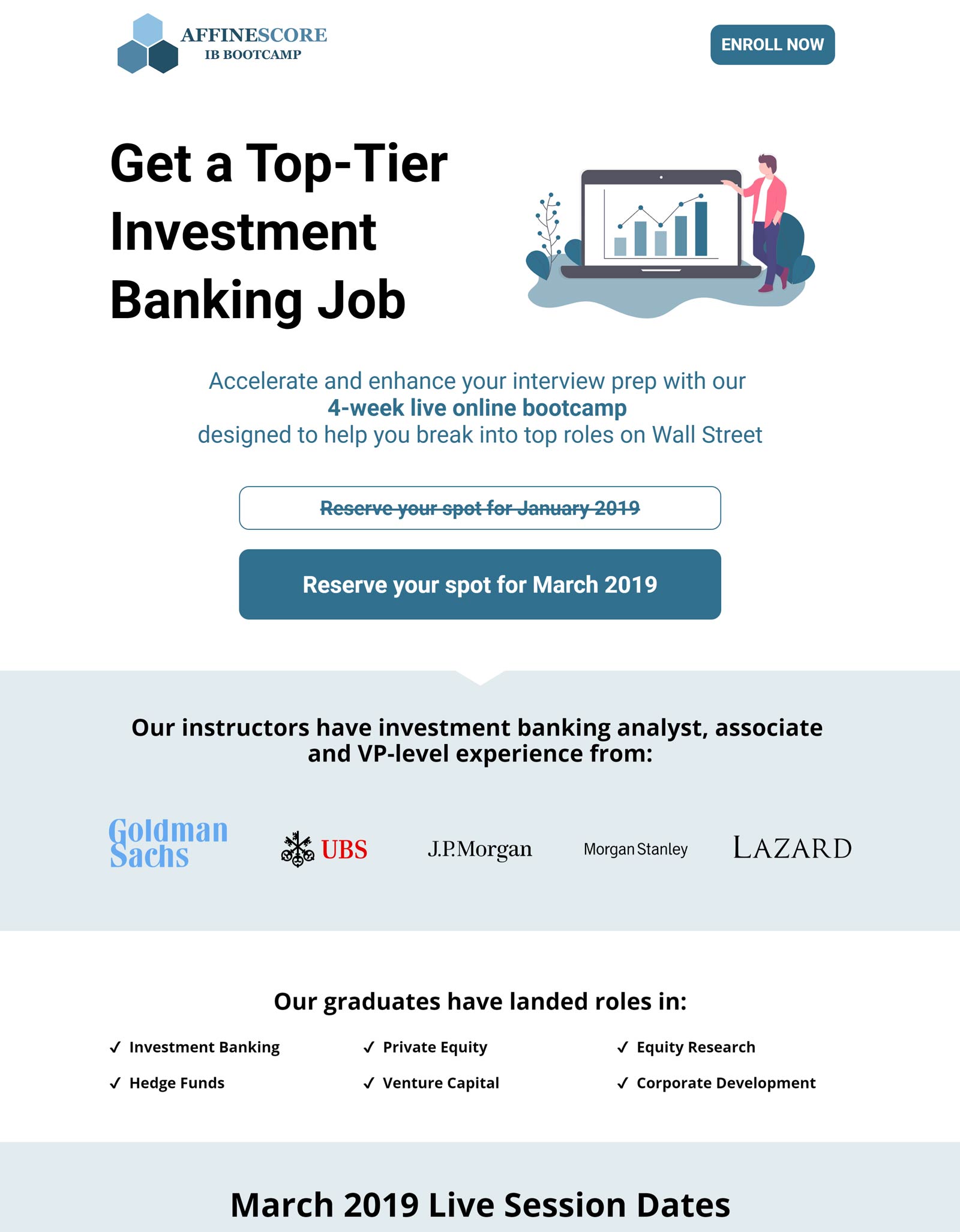
The branding is strong here, with an even distribution of text and imagery throughout the page. Digital products usually require more explanation than physical ones, which IB Bootcamp understand well by their use of illustrations and graphics to break it up and create a more user friendly experience.
I heart Umami Cookbook
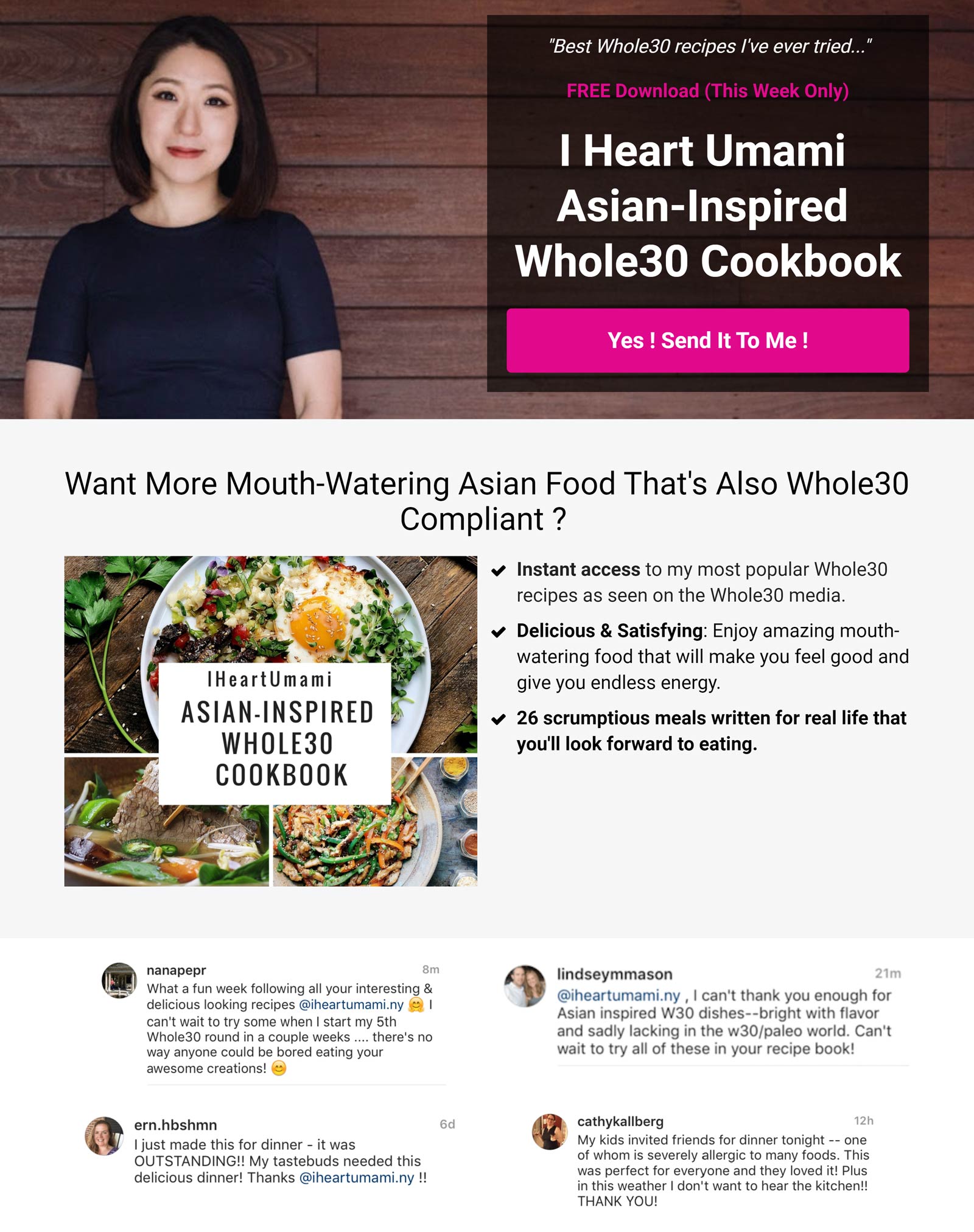
My favourite part about this page is the social proof section; it’s a grid of social media posts from people who have used her recipes, endorsing them and wanting to thank her. In particular those taken from Instagram have pictures of meals made from her recipes. This type of social proof works much better than quotes, which can be a little dry, because it gives a more tangible sense of real-world people.
Yasmin Boland
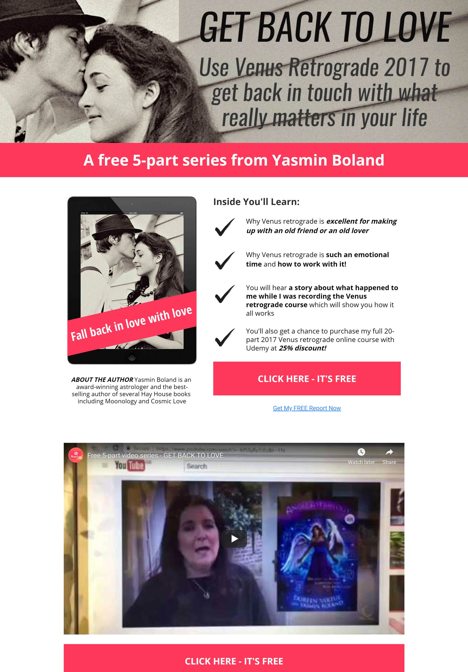
Working on the idea that people like free gifts, this LP centres around giving away a free five-part series. The form field after pressing the CTA button is as simple as it gets, email only required. This makes for a very quick and pleasant experience, resulting in a higher conversion rate.
Bills
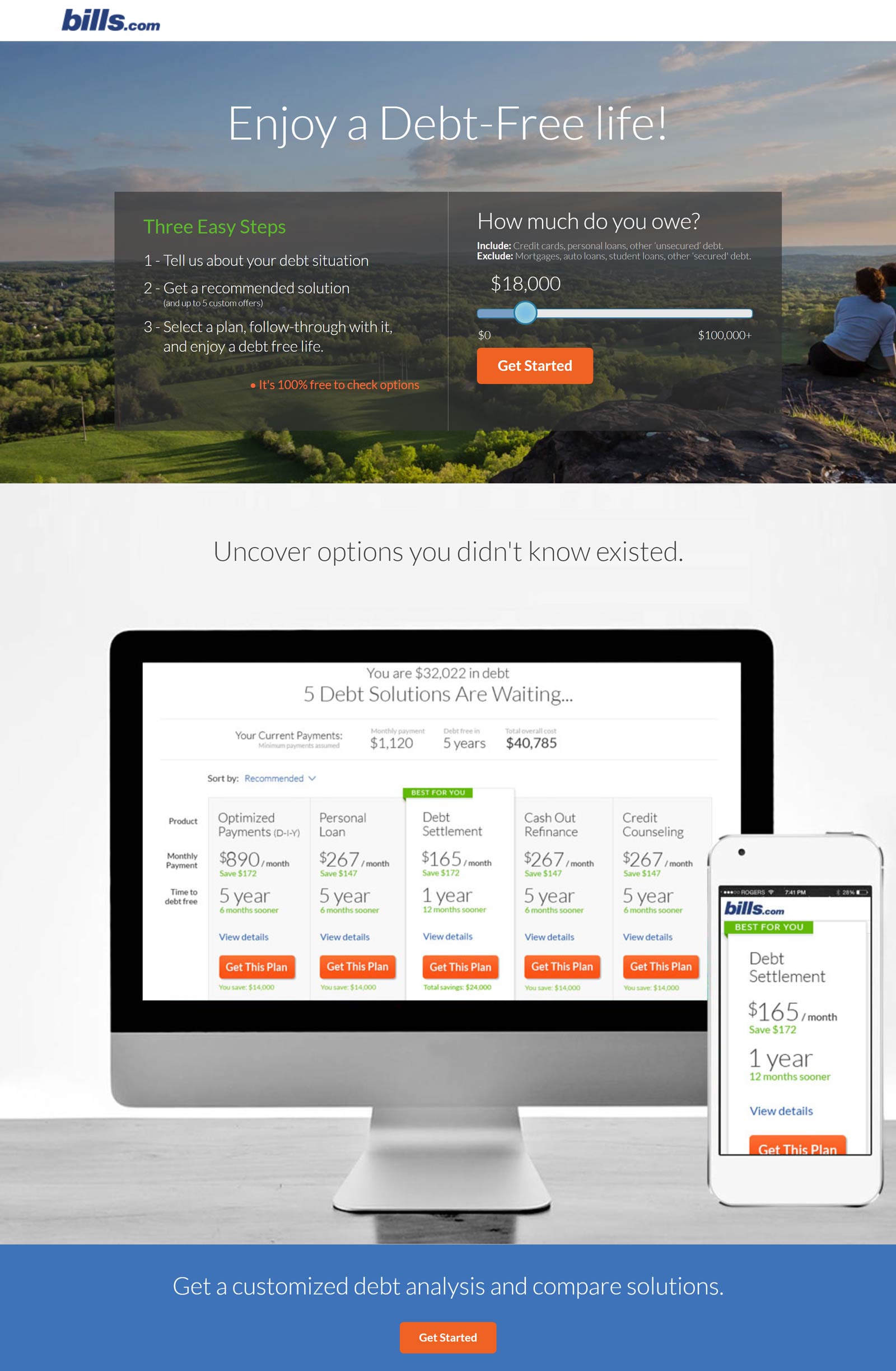
Two things that standout in this LP that work alongside each other: The strap line “Enjoy a Debt-Free Life” and the interactive slider. Visitors to the site are looking for a solution to money issues, and the strap line acts to illustrate the goal they are in pursuit of. To reinforce the possibility of this goal, there is a debt slider to interactive with, making the experience more personal and realisable which increases conversion rates.
Belt Social
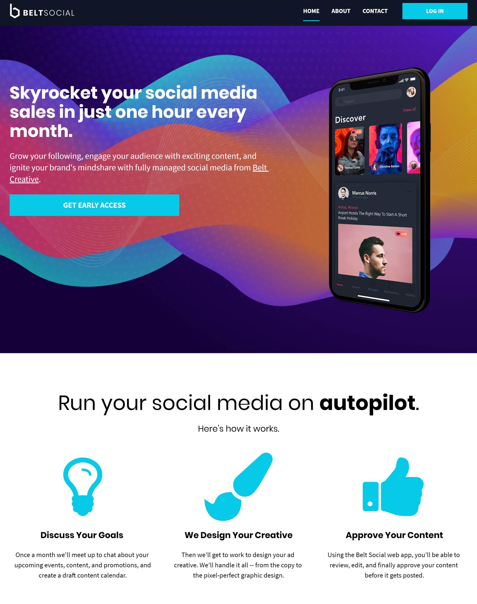
Belt Social make good use of vibrant graphics and a simple layout in this LP. The CTA takes the form of an “Early Access” button, enticing the visitor to be in on their service from the beginning, before it is rolled out to the public en mass. We know from the early-adopter phenomenon that people like the sense of knowing and being part of something before it is taken up by the masses, so this works well as a conversion strategy.
Yoga Branches
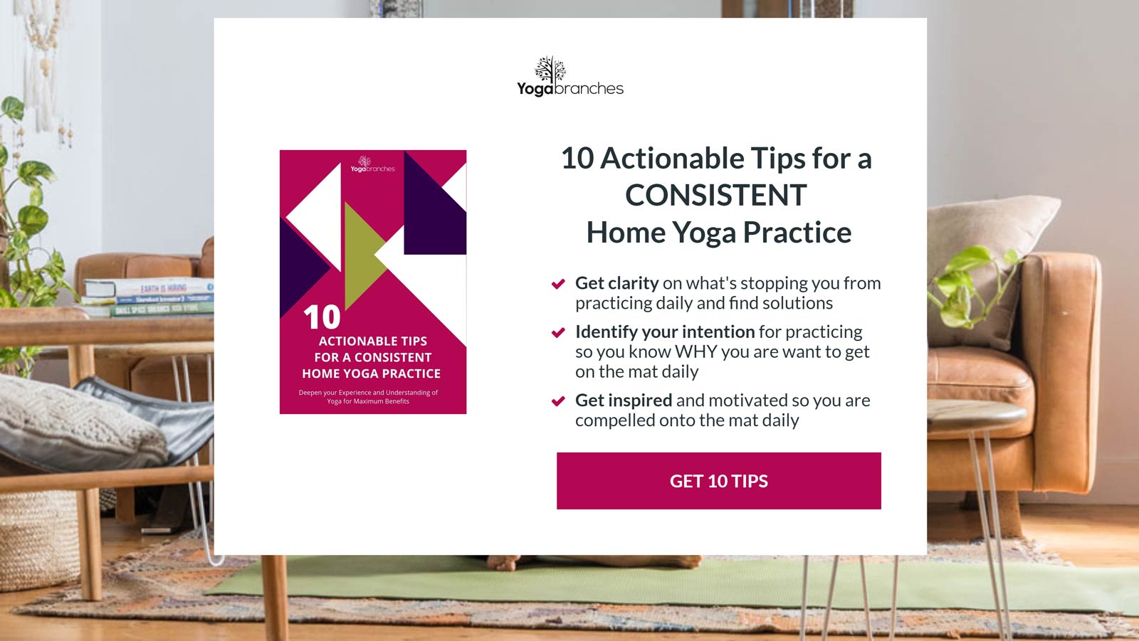
Upon opening this page you are met with a centralised, white square box containing its CTA and three bullet points explaining what you will be able to achieve with its “10 Actionable Tips For A Consistent Home Yoga Practice” — so no scrolling through pages or wasting time. This minimal style is great for fast conversion rates.
Young-writer’s workshop
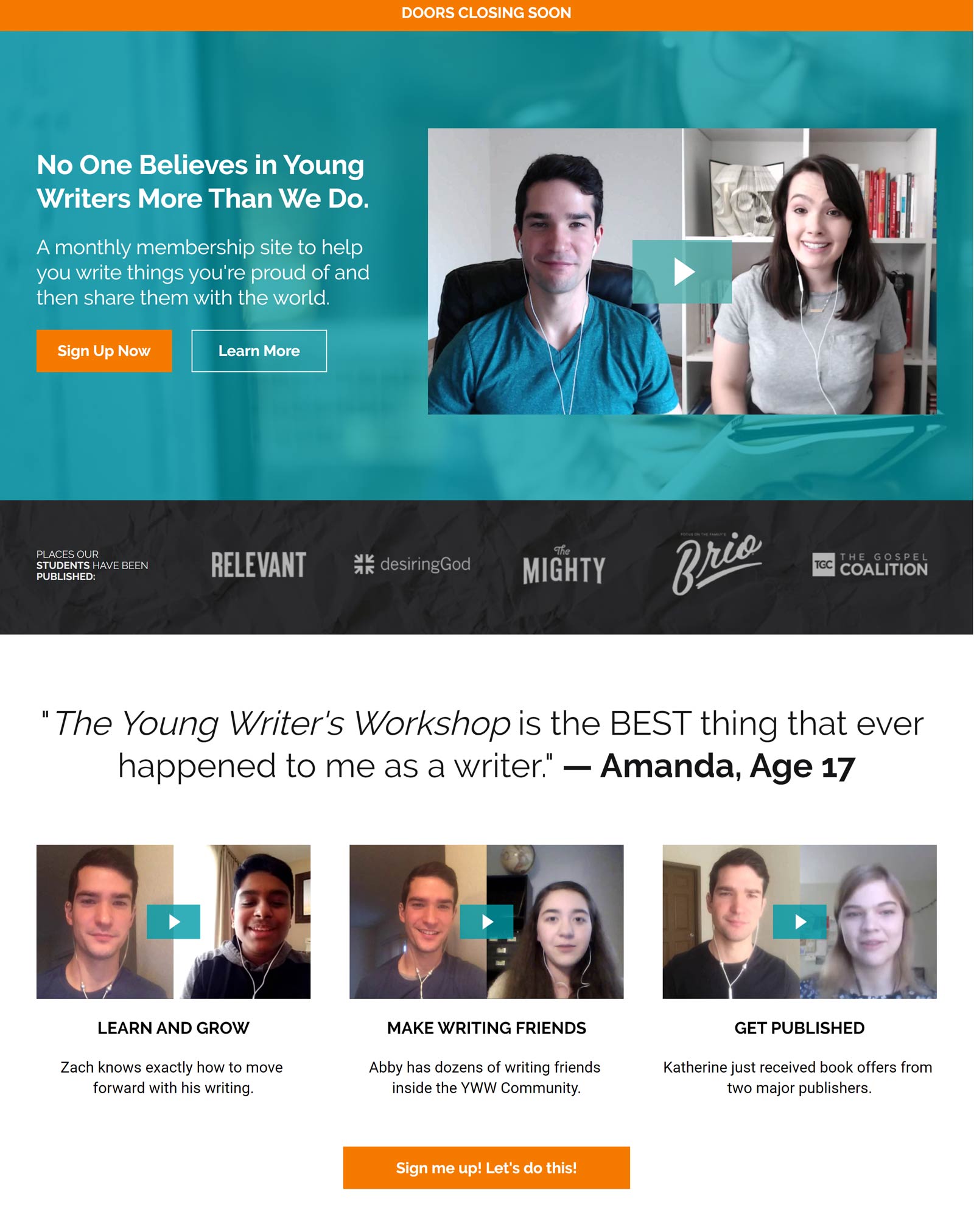
A sense of urgency is created here by having “doors closing soon”. And as we have mentioned before, this is a good strategy for conversion as people don’t want to miss out. There are testimonials peppered throughout the LP in the form of videos and text, inspiring confidence and social proof to its visitors. I particularly liked the large portrait photos of the instructors; it gives a personal touch and makes the act of signing up more welcoming.
Career Manifestations
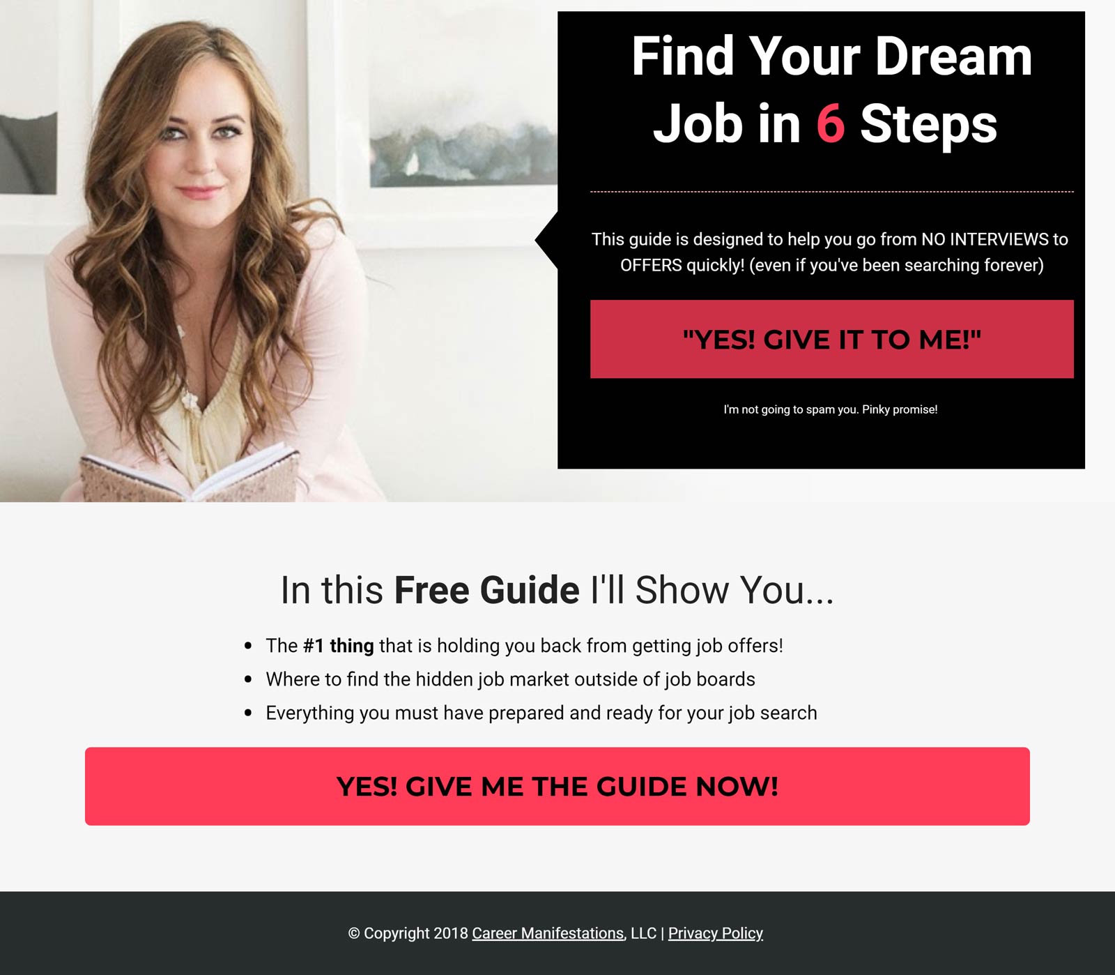
This is one of our favourite LP: it’s short, simple, vibrant and engaging. The colour scheme (pink on black) screams look this way, directing you straight to the CTA buttons. But in case you are wondering how you will benefit from from pressing the CTA button, with a single glance, you can read the three one-sentence bullet points in the lower-third of the page. This keeps all the essentials in one concentrated area.
Instant teleseminar
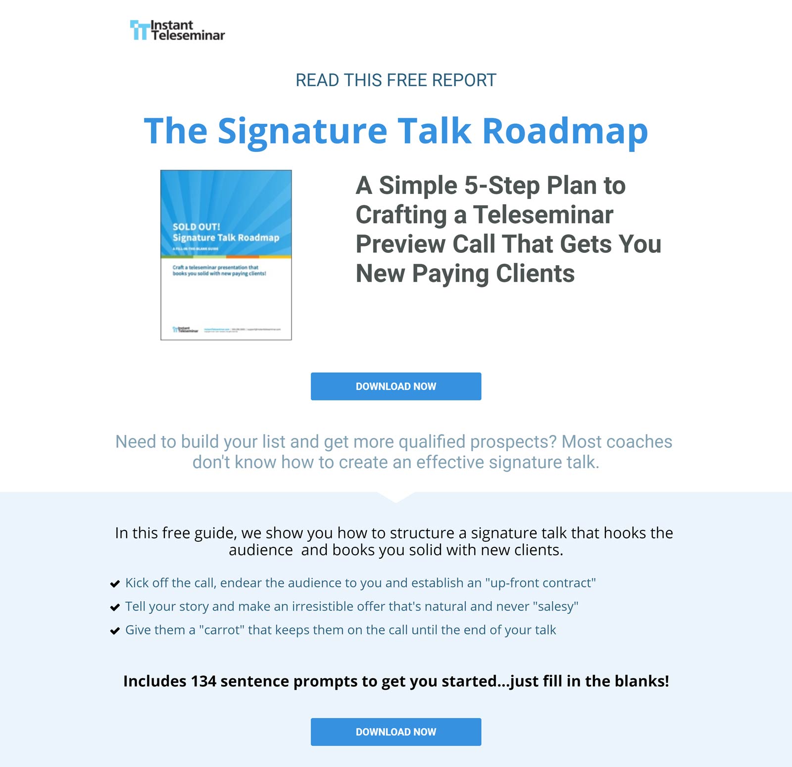
Nothing is wasted in this LP, from visuals to text. It offers a practical freebie in the form of a “5-step plan to crafting a teleseminar” that is the answer to creating an “effective signature talk” — to “build your list and get more qualified prospects.” As we have seen before, this setting up of a business-need-and-solution strategy works as an “ah-ha!” moment, giving reason for your audience to convert.
Jon Acuff
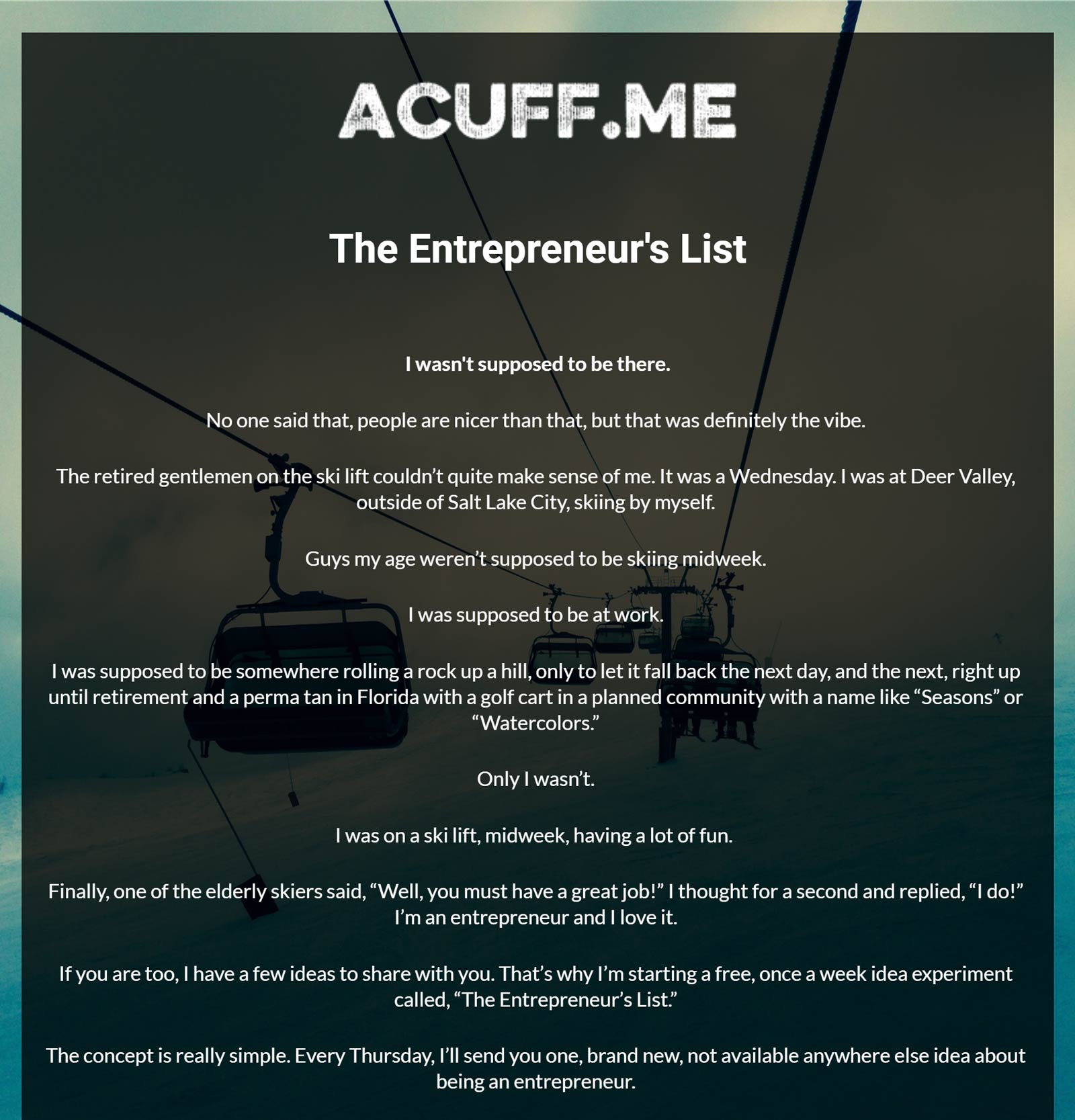
Jon Acuff’s LP takes a different approach, telling a story in the form of a blog post. There is a lot more text here when compared to other LP, but his story is concise and engaging, leaving no area for the reader to drift somewhere else. This technique works well as long as you keep a hight level of engagement with the text. This is set against a large artistic photo of a ski lift, helping the reader to resonate further with the story being told.
Know of any other nice examples of live sites using Leadpages? Any favorites? Made one yourself?

