Typically, when companies look to improve their conversion rates, they focus on their CTA buttons or value propositions.
Businesses also like to A/B test certain elements of their pages to see which versions convert the best.
Don’t get me wrong: these are all valid ways to improve conversions.
But something that’s sometimes overlooked is the simplicity of the website.
Far too often I see websites try to jam too much information into a very small space.
The navigation is confusing, and it’s overwhelming for anyone viewing the site.
If this is starting to sound like the layout of your website, it could be the reason why your conversion rates are unsatisfactory.
Even if you don’t think your design is too cluttered, there’s always room for improvement.
A slight rise in conversions could mean a significant increase in your annual revenue.
Below, I outline some reasons why simplicity can optimize your conversion rates.
You’ll learn some proven strategies that focus website visitors on your CTA and any other element of your site you want to emphasize.
It’s time to clean up the clutter and simplify the layout of your pages.
Here’s why modest designs have the highest performing conversions.
They have faster loading times
If you have too much going on all over your website, it will take longer to load.
Don’t think it’s a big deal?
Think again.
When a web page takes longer than 4 seconds to load, the bounce rate increases by 100%.
Once your site hits the 8 second mark for loading time, the bounce rate jumps to 150%.
If you can speed up the load time, your bounce rate will improve as well.
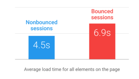
Think about how much potential you’re missing out on over a couple of seconds.
Getting your page to load in less than 4 seconds should be your goal.
To accomplish this, you have to get rid of unnecessary elements on each page.
This is especially true for ecommerce websites.
Why?
Take a look at how speed effects shopping cart abandonment:
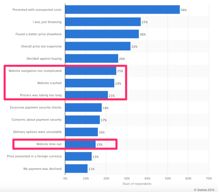
According to survey respondents, four of the top reasons for shopping cart abandonment were related to the speed of the website.
What elements can you remove to get your page to load faster?
- Complex images
- Extra features
- Added options
- Unnecessary text
Those are just a few places to start.
Visuals are definitely an important feature to have on your website. Just don’t go overboard with them.
Simplify the photos so the images are smaller and can load faster.
The CTA is clear and obvious
When your pages have simple layouts, you have more control over what visitors see.
If the site is too cluttered, your CTA button may be obscured.
You don’t want people to be confused about whatever action you want them to take.
Some examples of CTAs:
- join an email subscription list
- download an ebook
- sign up for a service
- make a purchase
- enter personal information
Basically, whatever your CTA is, it needs to be the clearest item on the page.
Here’s a great example from Unbounce:
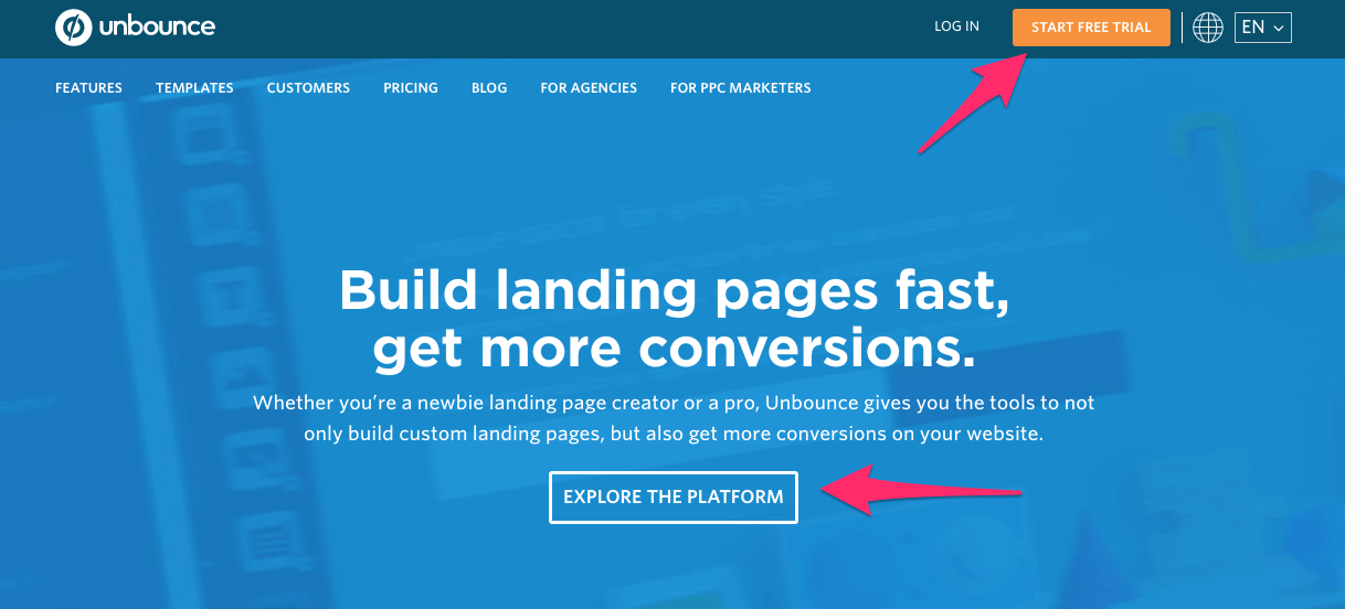
Notice how open and free of clutter the page is.
There are no complicated images or visuals to distract the user.
The text is minimal, and it explains exactly what their company does.
Now the user can focus on the CTA because the options are so limited.
The site visitor can:
- start a free trial
- explore the platform
Sure, there is a menu that visitors can navigate through as well. But based on the design, it’s clearly not made to be the primary focus.
Their menu at the top of the screen has the smallest text on the page.
If Unbounce tried to jam a detailed description of each section of their menu, the page would be too overwhelming.
So they did the right thing here by keeping it simple.
I use this same strategy on my own website as well.
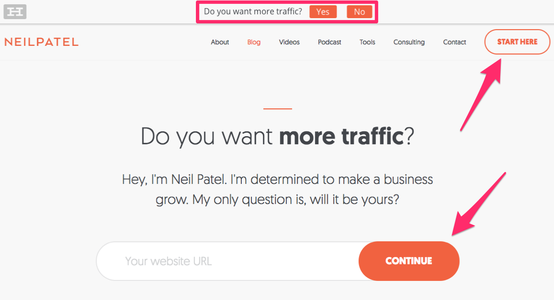
When someone visits my page, their eyes are immediately drawn to my different CTA buttons.
There’s nothing else to distract them.
If you’re looking for help to find out what users see when they’re looking at your page, try using a service such as Crazy Egg.
You can analyze a heat map that shows what visitors’ eyes get drawn to when they’re viewing your website.
This is really helpful in terms of CTA placement when you’re simplifying your design.
It’s easier for visitors to skim through your page
People aren’t going to read all the content on your page.
It can be disappointing because I know what it’s like to put much hard work, time, and effort into every word on a website.
But that’s the reality.
Break up the content on your page to make it easier for visitors to scan it.
If you’re writing in long paragraphs without any breaks, it’s going to be difficult to get your message across to the audience.
Here are some tips to break up content and make it easier for visitors to scan through your page:
- use short sentences
- keep paragraphs between 1-3 lines
- insert visuals
- include numbered lists
- use bullet points
Take a look at how visuals are used to accomplish this goal:
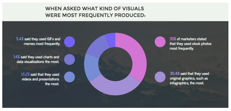
The most common types of visuals to break up content are:
- infographics
- stock photos
- videos
- charts and data visualizations
- GIFs and memes
Take this into consideration when you’re deciding what to include on your page.
Stick to the suggestions at the top of this list.
When you get down to GIFs, complex images like that can slow down your loading time.
Keep it simple with some relevant infographics and photos.
Navigation is simple
Simple navigation piggybacks on my last point.
Let’s go through an example to illustrate what I mean.
Here’s the homepage for Square:
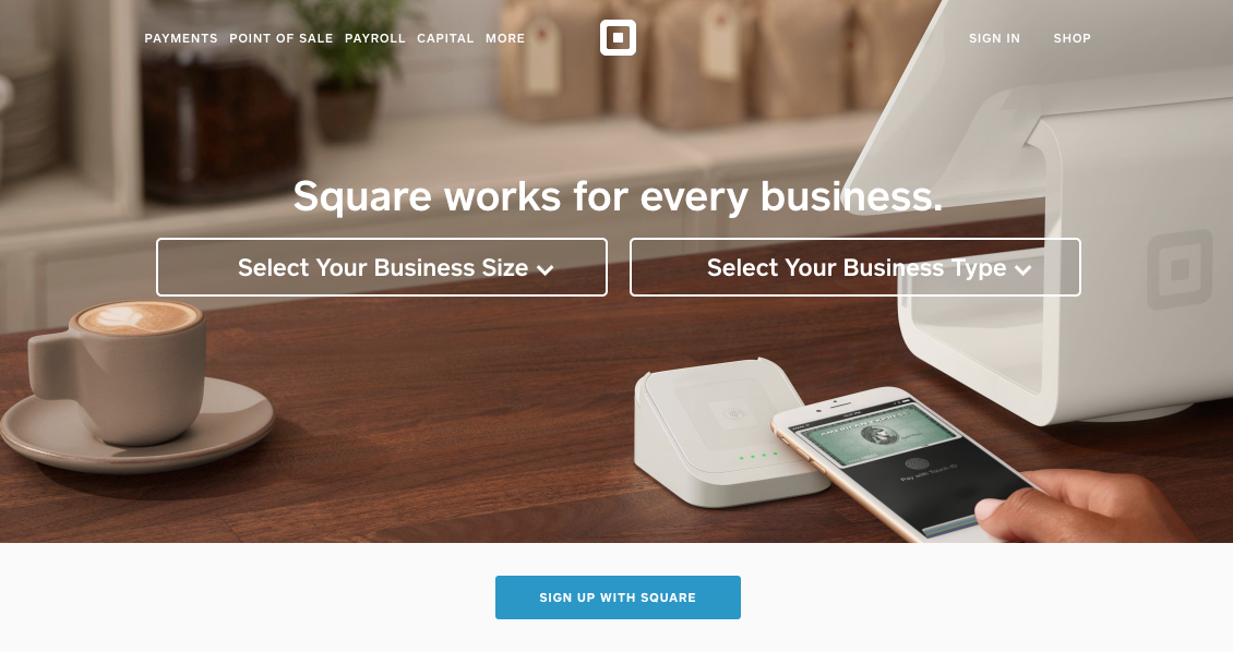
It’s super clean and easy to read.
If a visitor wants to get started, they can simply select the size and type of their business.
There’s nothing confusing about this navigation because the options are narrow.
The CTA is clear: “Sign Up With Square.”
When someone visiting the website wants to learn more, their options are limited, so they are forced to scroll.
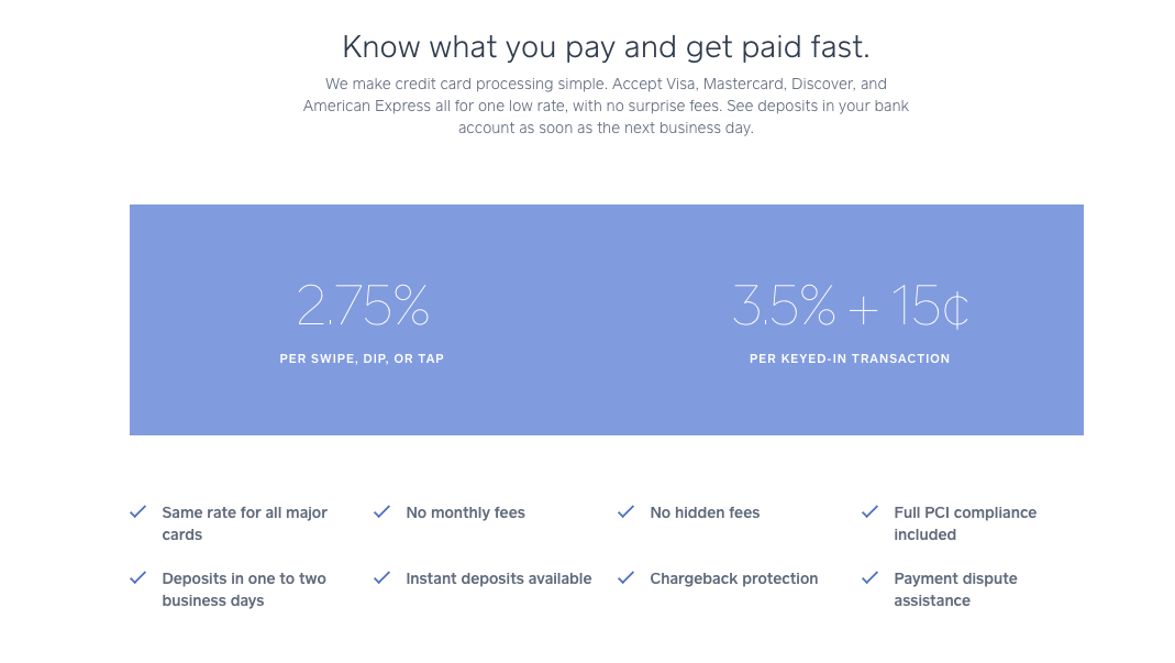
As you continue to navigate down the homepage, you learn more information about the product.
Look at how the screenshot above reflects the points I talked about earlier.
- No complex images
- Minimal text
- Short paragraphs
- Bullet points
From here, the user has no other option but to continue scrolling.
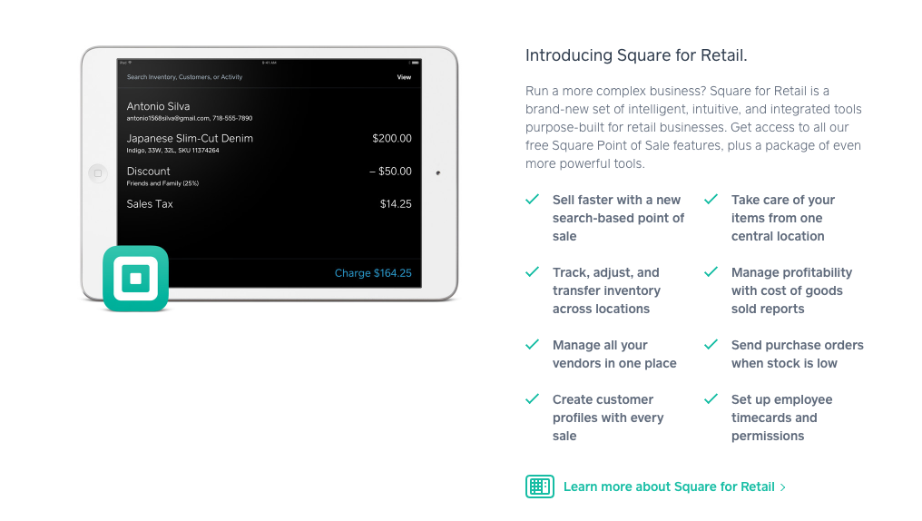
Now they have even more information about the product, and there’s a CTA button in this section as well.
There’s no messy sidebar or confusing menu.
It’s so easy for the visitor to navigate that it’s impossible for them to get lost.
This also impacts the page loading time.
Each time a user has to click on a new page to find more information, you risk having an issue with loading, which, as we saw earlier, will negatively impact your bounce rate.
But Square eliminates that problem but putting all the information on the homepage.
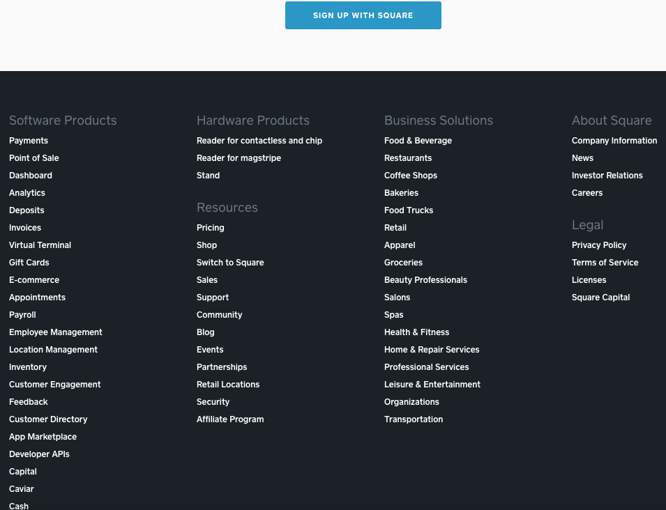
Once you get to the bottom of the screen, you’ll see a much larger menu on the footer.
Can you imagine if this was the first thing you saw at the very top of the page?
You’d be so overwhelmed that you’d have no idea where to get started.
There are nearly 40 options to choose from.
It’s fine at the footer because at this point the user already has an idea of what they’re looking for.
But I know you’ve been to websites that have menus like this at the top of their pages.
Bad idea.
If your website looks like this right now, you need to simplify it right away if you want to improve your conversion rates.
You’ll have fewer problems designing the website and fixing bugs
If you’ve been running a website for any length of time now, you know that bugs and minor issues are bound to happen.
It’s inevitable.
The key is being able to identify those problems and get them fixed right away.
Here are some of the most common types of problems with a website:
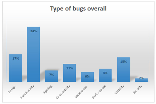
All of these can negatively impact your conversion rates.
If your site is too cluttered, it’s hard to keep the page code organized.
Anytime you need to make an update, it becomes a complicated process.
There’s just too much room for error.
Having a simple design will make it easier for you to code, build, update, and edit the site.
It’s less expensive for your web hosting services
How much does it cost you to host your website?
If your site is complex, you’ll need extra storage space.
Prices vary from platform to platform, but here’s an example from SiteGround’s web hosting plans:
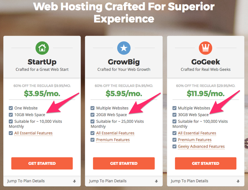
There’s a 300% price increase between 10 GB of web space and 30 GB of storage space.
I realize the price points also come with other upgrade features, but from a storage standpoint, it’s going to be cheaper for you if the page design is simple.
You can put the money you’re saving towards another aspect of your business.
That money can help you from a marketing perspective to generate new leads and eventually increase conversions.
Visitors will think your site is more trustworthy
Have you ever been on a website and thought it didn’t seem legitimate?
I have.
It’s a weird feeling getting instantly worried about cyber security.
You don’t want your website visitors to get this feeling when they’re navigating your site.
Having too much clutter can make it seem like you’re trying to hide something, even if that’s not the case.
Having images and advertisements everywhere feels too salesy.
Even if you’re selling something, you don’t want to come off like you’re trying to force it down the user’s throat.
Earlier we discussed some reasons for shopping cart abandonment as it relates to the speed of your site.
This graph explains that trust also impacts conversions on your page:
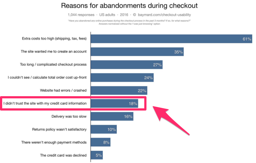
For an ecommerce store, this could be a deadly mistake.
The customer wants your product or services, but they are hesitant to complete the purchase because they don’t think their credit card information is secure.
They’ll just go to another website where they feel safe and make the purchase from your competition instead.
Conclusion
If you’re looking to improve the conversion rates on your website, take a look at the design of your pages.
Those of you who have too much clutter overwhelm your visitors.
Go back to the drawing board.
Simplicity needs to be your goal.
Simple designs help your pages load faster, reducing your bounce rates.
Without distractions on the page, your CTA button will be clear and obvious.
Users won’t have to search for it to take the action you want them to take.
Modest designs also make it easier for people to skim through your content.
This is beneficial for you because you’ll have complete control over what their eyes see on the screen.
Limit their options, and make your points stand out.
A simple website design is also less expensive for you to host.
You can put that extra money towards another marketing campaign that improves conversions.
Simple websites also help you establish more trust with the visitors.
If your design is too complex or sketchy, you’ll have trouble getting conversions.
What elements of your website do you plan on eliminating to cut down the clutter?
