My mom has this amazing collection of beaded sweaters that, some years back, we attempted to sell on Etsy. I say “attempted” because there were absolutely no sales and barely any traffic, and it was mainly all our fault. You see, I was twelve-years-old at the time and thought I could do wonders with a camera, but all I managed to do was take low-quality pictures of wrinkled sweaters with bad lighting and shadows. Mom, if you’re reading this, I’m sorry. Will you still give me Hanukkah money?
Like our failed Etsy endeavor, I’ve seen so many retailers in the online world with great products but horrible execution with their presentation. For a lot of online merchants with great ideas, the design aspect of selling their product seems to fall through the cracks, and it can be the do or die of their online business. So just what exactly is the value of your store’s design, and more importantly—how can you make your store look great without breaking the bank?
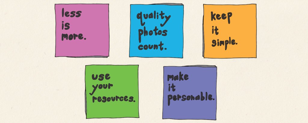
Keep It Simple
With online shopping, you want your product to do all the talking, but that doesn’t mean design can’t pitch in every now and then. If you’re at a loss for just what do with the look of your store, think simple. Everyone loves a little bit of minimalistic charm. Big online marketplaces like Amazon and eBay have basically maintained the same web layout for years, but what keeps them from appearing boring is their ease of use. Most likely your own store won’t be as complicated, so I’d recommend only doing a minimalistic design if you can really make it good and unique.
If you’re using Shopify for your store, they offer up hundreds of different themes available for free, and you can always try them on for size. Whatever route you take, you’re going to want something that uplifts your brand and complements it. That’s what matters the most!
Dress to Impress
Recently I’ve been assigned a very important task: finding action figures that represent SumAll’s values and purchasing them to put on display in the office. Perusing eBay (as we want collectibles—not toys because we’re adults, dammit!) I have noticed that far too many folks on eBay take horrible pictures of the things they’re selling. Cue war flashbacks to my experience on Etsy.
I Googled “really bad eBay picture” and this was the worst one I could find.
I’m going to be real with you and say that if the photos of your product suck, people are going to think so and not buy it. Shoppers expect their online purchases to be quality, and if the photo doesn’t match the part (and hey, while we’re at it, the website design too) they’re going to think that product isn’t worth their money. They may even think your store is a scam or fake, which would probably just hurt your feelings.
It Ain’t Rocket Science
We live in a time where there’s so many options for setting up a store online, you barely have to struggle with making your business’s design look good. Know your strengths and weaknesses! Because it’s so easy to get free help, don’t push yourself to do something you can’t actually do.
Want to know a secret if you’re ever concerned whether your store’s design looks good or not? Pretend you’re a customer! Ask yourself, would I want to shop at this store? Does this store look professional? Your design doesn’t have to necessarily knock anyone’s socks off, but it has to more importantly not conjure up any negative opinions. People visit so many websites on a daily basis, web design isn’t particularly a major concern, but the moment they notice anything off it will affect them. Shut down any chance of that happen by knowing the value of your store’s design, and more importantly, yourself and your store!


