January 25th, 2018

Remember that one time you were tempted to post all 20 images from your friend’s bachelorette party, all at one time, within the 30-minute window it took to filter each and create ~the best~ captions?
Yeah. Don’t do that. (Kim Kardashian, I’m looking at you.)

When should you use Instagram’s slideshow? When the answer to the following question is “yes,” resort to a slideshow: “If my friend posted all these photos individually as single images, would I consider him annoying, self-indulgent, or out-of-touch?”
Even a solid “maybe” in this case elicits a slideshow.
Yes, this goes for brands, too.
Instagram is not a full representation of your life or your brand. We all understand this. With that understanding comes the expectation that you will carefully curate your own photos, selecting only highlights intended for the enjoyment of your audience.
In social media, the enjoyment of your audience always comes first, at least for brands. Here are some tips to help marketers (and everyone else) use Instagram slideshows to benefit both the brand and their audience.
Avoid Insta-Faux Pas
While your audience enjoys your photos, they don’t want to know how much you enjoy your photos. Posting gratuitous photos gives your audience the impression that you, or your brand, is self-obsessed (and not in a trendy way). Oops.
Your audience likes you bunches and wants to know about all the awesome things you do. They love seeing snapshots from your trip or your brand’s philanthropic event. However, they don’t want to see three in a row. (Still looking at you, Kimmy K.)

Think about it this way: It’s cute when you have one missed call from your boyfriend. It’s not cute when you have eight missed calls in the span of five minutes. That’s just overwhelming.
In short, posting too often is a major Instagram faux pas. When you have more than two pictures to share at a time, use a slideshow; avoid appearing insta-rude.
Reduce Clutter
You’ve got to understand a brilliant purpose behind these slideshows: They reduce clutter. It’s the same purpose of the algorithm—the constant challenge social media platforms are facing. With more users comes more content, and not all of it’s valuable. How can we best deliver the content our audience cares about most? How can we reduce the clutter?
Slideshows allow you to share more than one aspect of a story without contributing to the clutter, as @the12ishstyle‘s Katie Sturino has done. Choose up to ten images of your trip, your brand’s philanthropic event, or in Katie’s case, a lookalike Barbie. Publish all images in one post to let your audience explore your slideshow at their leisure, not against their will.

Additionally, if your brand has a healthy social media advertising budget, slideshows allow you to send your target audience the full story, all at one time. Rather than boosting each post under multiple budgets, you can combine the budget for a larger spend, allowing you to reach a larger audience.
Instagram slideshows let your audience explore your images at their leisure, not against their will. Click To Tweet
Creative Storytelling
Slideshows also give brands new, creative ways by which to intrigue audiences or tell their brand story. Comic accounts, for example, use slideshows to tell longer stories than can be told in one photo. The audience can swipe through the slideshow as if turning the pages of a book.
To the delight of their audience, brands can also sneak surprises into slideshows, as I once did for Indiana University, shown below. These little surprises engage your audience, giving them a good laugh while increasing brand affinity. Everyone loves someone, or some brand, who can laugh at herself.

The caption to the slideshow above reads, “Please enjoy these five images of what one might consider g.o.a.t.” At the time, g.o.a.t. stood for greatest of all time. I crack myself up.
User-Generated Content
One caveat with slideshows is that they still aren’t great when it comes to mass user-generated content (UGC) shares. Therefore, if your brand has an overabundance of quality UGC (lucky you), slideshows may not be your clutter-reduction solution.
Currently, the standard is to post credit to the photographer by tagging her in the caption. As all photos in a slideshow share the same caption, there’s really no graceful way to credit all photographers when sharing more than two pieces of UGC in a slideshow. Yes, you can tag each photographer in their image within the slideshow, but, it might not be considered enough for your generous UGC providers.
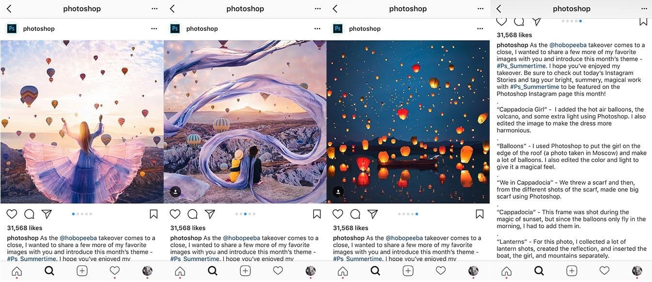
On the other hand, Photoshop found a nice way to tell an extraordinary visual story from one photo-editing influencer, @hobopeeba‘s Kristina Makeeva. All photos of the slideshow are examples of Kristina’s work. In the caption, Photoshop provided an explanation of each photo.

If you want to post all 20 of those pictures from your friend’s bachelorette party, first wait until you are 100 percent sober. (You’re welcome for that advice.) Then, choose the two most amazing photos. Post twice, ten photos each. Make sure you lead each slideshow with one of the amazing top two photos.
And there you have it! A faux pas-free, engaging, still self-obsessed (but in a polite, charming way) solution to your over-sharing problems. Your audience will love, adore, and thank you.
