Abandoned shopping carts are a hurdle for online merchants.
Abandonment rates range from 60 to 80 percent, depending on the study. Some of this is “window shopping” on the part of visitors. Some of it is due to the complexity of your checkout process.
Thus optimizing your checkout will likely increase sales. In this post, I’ll review methods to streamline and simplify a checkout process. I’ll cite examples from the WooCommerce platform. But the broader points apply to all merchants, on all platforms.
Checkout Rules
A fundamental rule is to only require the fields you must have to complete the transaction. If you’re selling digital products, don’t ask for someone’s physical address (unless you need it for tax reasons). If you need only a zip or postal code, don’t ask for a street address.
Second, make sure your fields are in the correct order. For example, I often encounter checkout forms that have the country choice as the last item in the form. Since I live in Canada, when I get to the state field (for U.S. shoppers) no options apply to me. I must scroll down and change the country to Canada. I then return to the province field and make my selection.
If your checkout form auto-fills the states and provinces, make sure you provide the country choice before then.
Third, realize that shoppers make mistakes. Many carts don’t provide useful error messages. If someone missed entering his last name, make sure that field is highlighted and obvious. Even better is having your checkout form scroll to the error, so the shopper doesn’t have to hunt for it.
Importantly, save the information as the user completes the form. This prevents the user from having to re-enter it all if there is an error, which could lead to abandonment.
Fourth, offer customer accounts, so that repeat buyers do not have to complete the checkout fields each time. An account system will save customer information and automatically fill it in during checkout.
Also, choose a payment gateway that saves a customer’s payment information so that she doesn’t have to re-enter it. For example, using Stripe and WooCommerce, a merchant can check a box to allow saved cards. This will store a token that Stripe can use to charge the same card again.
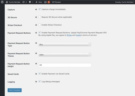
Merchants that use Stripe and WooCommerce can check a box to allow saved card information.
Streamlining with Plugins
There are plugins that streamline and edit the WooCommerce checkout process, without writing code. These can optimize your checkout and increase conversions.
One way to optimize is to eliminate the cart page. The default checkout process in WooCommerce sends users to their cart, where they can review their selections, apply a coupon code, and receive a shipping quote. Many shoppers don’t need this step and removing it will improve conversions.
WooCommerce Direct Checkout allows shoppers to go directly to the full checkout form. With the plugin installed, go to WooCommerce > Direct Checkout and check the box marked “Enable.” Now when shoppers view their cart, they’ll be taken directly to the checkout page, skipping a step in the default process.
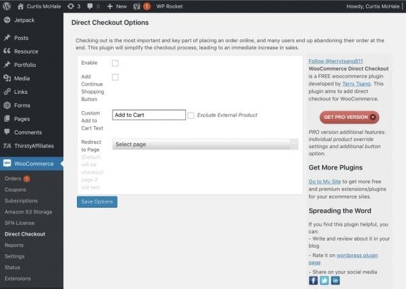
With WooCommerce Direct Checkout installed, merchants can check the box marked “Enable” so that shoppers can go directly to the checkout page.
Checkout Field Editor, another plugin, was written and supported by the team at WooCommerce. It provides an easy interface to change the labels on fields, change which fields are required, and reorder fields.
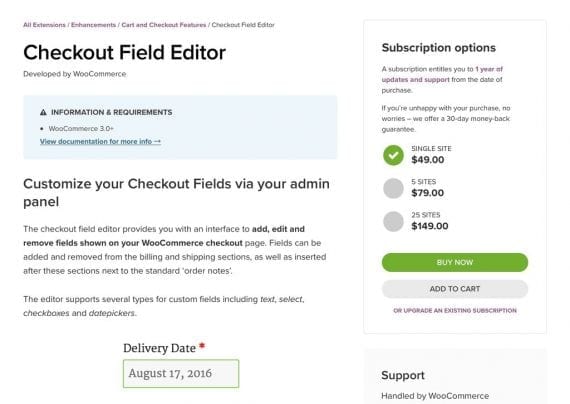
With Checkout Field Editor, WooCommerce merchants can change the labels on fields, change which fields are required, and reorder fields.
Another helpful plugin is WooCommerce Checkout Field Editor (Manager) Pro. The free version enables merchants to add new fields, edit existing fields, and change many other aspects of the core checkout function. The paid version offers more advanced field types, such as a date picker, and additional options involving where you display the fields.
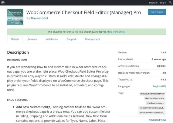
WooCommerce Checkout Field Editor (Manager) Pro allows you to add new fields, edit existing fields, and change many other default aspects.
Eliminate Steps
This article focused on WooCommerce merchants. But the checkout guidelines apply to all merchants, regardless of platform. To increase sales, reduce cart abandonment rates. Examine your checkout process and remove all unnecessary steps.
