February 27, 2018
Just one click.
That’s what separates an ad from its corresponding landing page elements, and yet most ads and the landing pages connected to them seem to have nothing in common.
Most marketers often overlook a crucial piece of information when it comes to optimization, and this is what results in the 70-90% bounce rate for landing pages.
What many marketers overlook is the fact that the pre-ad click is just as important as what happens after it, i.e., the pre-click experience is just as important as post-click experience.
It’s true that a compelling ad image, persuasive copy, and contrasting CTA button have the power to motivate visitors to click. But what convinces them to stay long enough to learn about the offer (and fulfill the conversion goal by clicking the CTA button), depends on the landing page elements they see after the ad click.
Don’t want to pay for ad clicks that fail to convert while running PPC campaigns? Optimize the post-click experience for conversions.
What is post-click optimization?
Post-click optimization is the process of ensuring that the ad click results in a conversion by directing visitors to a landing page that matches the ad’s message.
When you optimize the post-click experience, you motivate the user who already clicked the ad to also click the landing page CTA button.
But before we explain how to optimize the landing page elements for a better post-click experience, let’s compare an optimized post-click experience with an un-optimized post-click experience.
Suppose you’re looking to invest in a task management platform. You do a quick Google search:
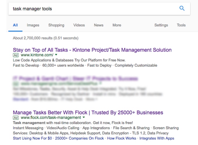
Kintone’s ad talks about project and task management, a free trial, and that the platform is fast to deploy. This is the landing page the ad takes you to post-click:

- The navigation bar is cluttered with a lot of elements that the visitor wasn’t necessarily looking for.
- The headline ‘project/task management’ connects with the ad headline but isn’t persuasive enough to keep visitors on the page.
- The CTA button ‘Get a Free Trial’ that should have been the focal point of the page is hiding in the top-right corner.
- The pop-up offering visitors to ‘Learn More’ about integrated business ecosystem distracts them from locating the free trial.
Now, let’s look at Flock’s ad. It talks about managing tasks better, instant messaging, and the fact that ‘flock is free’. This is the landing page where you arrive after the ad click:
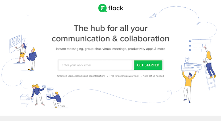
- The landing page headline ties in well with the ad message, the fact that Flock is a hub for collaboration and communication.
- The sub-headline showcases the platform’s various services, also mentioned in the ad such as instant messaging, group chat, virtual meetings, etc.
- The images showcase team communication and collaboration.
- The CTA button is the star of the page, up front and center in a contrasting color.
- No distractions exist on the page, no extra elements, and no navigation links allowing visitors to exit without first converting.
- The text under the form and CTA reminds visitors that Flock is free for as long as they want, which is something that the ad highlighted.
So, which landing page CTA button are you more likely to click?
Landing page elements that lead to an optimized post-click experience
Writing a compelling ad is only half the conversion battle. To ensure that prospects, whose ad click you just paid for, will follow through with the conversion you should optimize the following landing page elements for the perfect post-click experience.
Message matching
Message matching refers to the process of matching the ad’s primary message with that of the corresponding landing page. It is not restricted to the ad and landing page headline, but also includes imagery (for display ads), and primary branding colors.
Most importantly, in a message matched post-click experience, the offer that’s promoted in the ad should be the offer that’s highlighted on the landing page.
Constellation’s display ad and landing page maintain message match, motivating visitors to click. Here’s the ad:

Here’s the corresponding landing page:
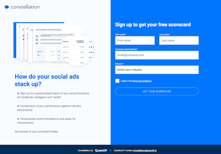
- Both the ad headline and landing page headline talk about social ad benchmarks.
- The free ‘constellation score card’ offer is highlighted in the ad and featured on the landing page.
- The CTA button copy is personalized (“your”).
- The image in the ad and the landing page are similar ensuring visitors that they’ll get what the ad promised.
Message matching is especially necessary for retargeting campaigns. About 97% of your website traffic leaves without converting, by targeting past visitors with message matched ads and landing pages you increase the chances of them finally committing on your page.
When your ad and landing page maintain message match, you satisfy user expectations that initiated with the ad click, making getting conversions much easier.
1:1 Conversion ratio
A landing page is a standalone page from your website created to promote one offer and, hence, fulfill one conversion goal. Conversion ratio refers to the number of clickable elements on a page compared to the number of conversion goals.
With that landing page definition in mind, all landing pages must maintain a conversion ratio of 1:1, i.e., one clickable element for one conversion goal. This clickable element is usually the CTA button.
Landing pages with more than one clickable element distract the visitor from the conversion goal by allowing them to click away from the page before converting. Ultimately, this re-routes the customer journey unfavorably, and wasting the money spent on the ad click.
To keep visitors’ focus on the conversion goal, there should be zero distractions present on the landing page. This only happens when the CTA button is the only clickable element.
Let’s look at WalkMe’s landing page as an example:
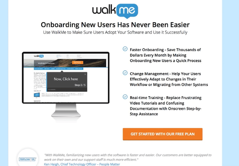
- The ‘free plan’ is the only thing promoted throughout the page.
- Both the red and orange CTA buttons open up the lead capture form.
- There are no off-page navigation links present on the page that could take visitors away from the page before converting.
Keep your visitors focused on just the offer you’re promoting on the landing page by maintaining a conversion of 1:1 and excluding all off-page navigation links.
A contrasting CTA button
The CTA button’s primary job is to capture the visitors’ attention and persuade them to click. How you design the landing page call-to-action button determines if they will do just that.
There is no magic CTA button color you can blindly use on all your pages. Instead what’s most important, is that the CTA button contrasts with the page background. Since each page background is different, every CTA button should be designed accordingly.
Pay attention to the visual hierarchy when designing the button color, which color will stand out the most? The answer to that question is the color you should choose for the button. A quick look at the color wheel can help you design a contrasting-color button (e.g. blue background with orange button).
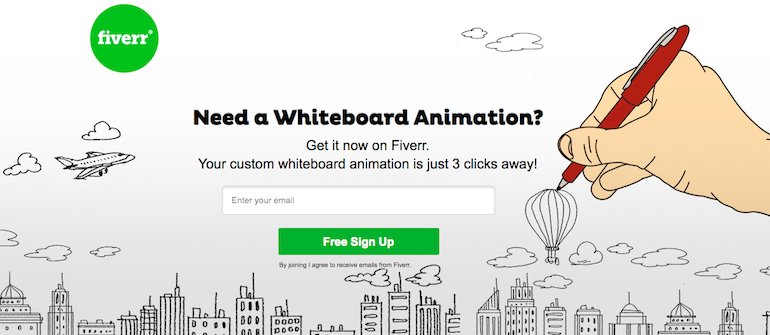
Fiverr’s green CTA button contrasts nicely with the page helping draw visitors’ attention:
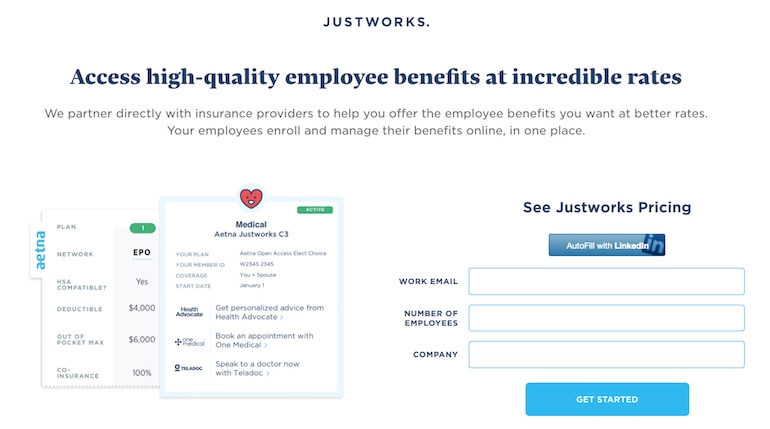
Justwork’s blue CTA button also contrasts with the page background, and ties in with the page’s visual hierarchy:
Persuade visitors to click by designing the CTA button in a color that looks aesthetically pleasing and stands out on the page.
White space
White space, also called negative space or blank space, is the empty area between and around landing page elements. The space helps draw attention to specific landing page elements, such as the CTA button.
Contrary to what its name suggests, white space does not have to be white. It’s just negative space designed for a higher-quality user experience by reducing clutter and creating more room for page elements to breathe.
Using ample white space offers the following advantages:
- Increases comprehension: This is especially true for copy because when you give it enough room to breathe, visitors can read and comprehend it easier.
- Separates elements: This leads to a better, visual experience.
- Focuses attention: By spreading elements out from one another, you attract more visitor attention to each one.
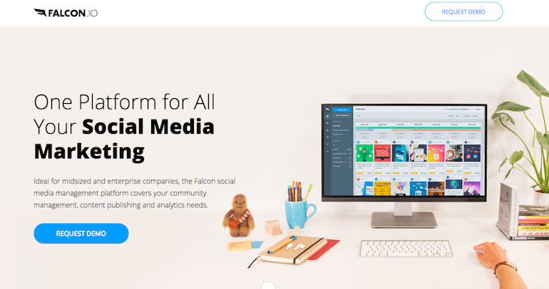
To demonstrate, Falcon’s landing page features ample white space helping increase page comprehension and focusing attention on the CTA button:
An optimized post-click experience improves conversion rates
Converting visitors into leads, and ultimately customers doesn’t solely rely on how you create your ads. Where you direct visitors post-click is just as important as the pre-click stage.
Optimize the post-click experience for visitors by designing landing page elements that match the message of the ad, don’t derail their attention from the page, and make them notice the elements that matter most in fulfilling the conversion goal.