I launched ‘Red Lemon Club’ in late 2009. I had written an ebook about what I’d learned promoting myself as a self-taught illustrator, called (deep breath):
‘10 Steps to Powerful Online Self-Promotion for Creatives.’
The blog was to be my main method for promoting the book, but I’ve kept it running for all these years, covering topics from self-promotion as a ‘creative person,’ to running a freelance business, to self-development and building confidence.
The branding, slogan and angle of the site have changed too many times to count. At times, I thought I was going crazy with an obsession with getting the look and feel just right.
Here was one of many earlier versions of the logo, which I put together using Adobe Illustrator:
Since then, the logo has gone through a few changes, and the slogan now reads as: ‘In search of creative genius,’ to reflect a more personal-development-focused approach to the content.
To go with a recent refresh of the website design, I decided to invest in a more professional feel for the logo. So, after some searching on Dribbble, I hired logotype and lettering pro Claire Coullon for the job.
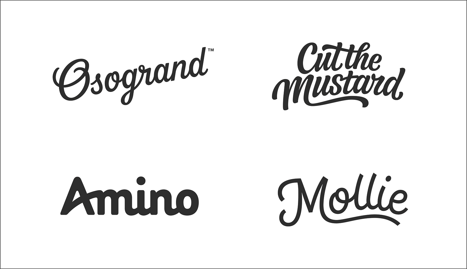
I felt her fresh, organic-text style, was closest to how I envisioned the RLC brand.
As I discovered later, with very few revisions, I was very happy with the final result, reflecting the values, vibe and intent of the blog perfectly.
Here were some of the points I sent to Claire for the brief right at the start:
- I want the Red Lemon Club brand to be synonymous with creativity, becoming more creative, self-confident, sharp, happier, motivated, and successful as an independent creative, or entrepreneur.
- I’m looking for a logo that is just text. No symbols or pictogram for now.
- The logo should transmit these concepts: warm, authentic, intelligent, friendly, empathetic, human, a bit creative but not whacky, quite classic.
- Not too much extravagance and swirling in the letters, quite restrained, yet friendly and leaning more to masculine (I’d always wanted to avoid Red Lemon Club feeling too ‘cutesy’ if you know what I mean — so a touch more masculine could counteract this).
- I referenced several logos that I’d seen on Pinterest and shared with her the board for those examples.
I’m now handing over to Claire for some extra insight about the process, and more about her life as a designer…
What were some key points in the logo-creation process for Red Lemon Club?
First of all, the initial conceptual planning was really important, as tends to be the case with branding/logo design work in general.
We talked in depth about the background behind Red Lemon Club and worked on defining the essence of the brand in terms of values, key characteristics and goals.
This along with other more literal points like usage requirements helped to inform a discussion on how we could represent these ideas through the lettering. So before doing any drawing at all, we already had a good idea of the direction: the combination of two styles, the stacked composition, the overall weight, etc.
When a project is really well-defined and has clear objectives, it can be more beneficial to have tight planning so that when you’re sketching, you can focus on variations within an overall established direction rather than going through lots of wildly different styles.
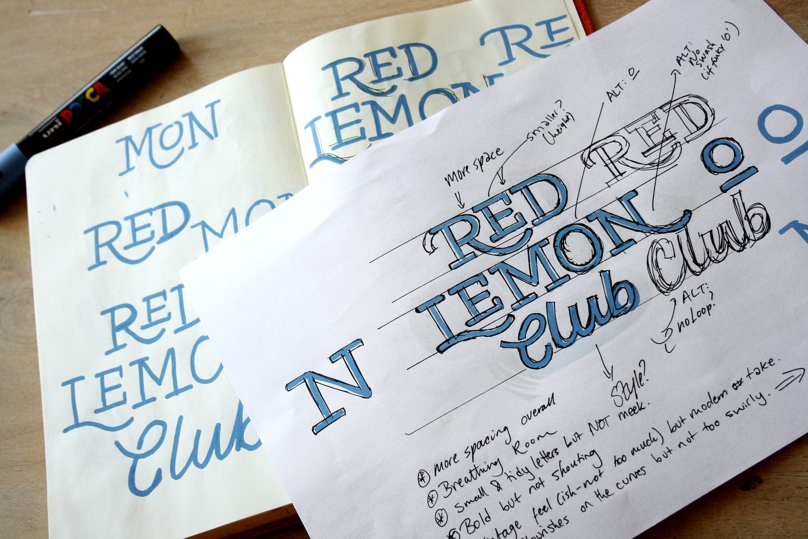
The early development stage was also important in that it brought all these ideas together on paper and gave us something solid to look at.
Since our planning was in depth, the following sketch to vector step went smoothly and allowed us to focus on specific, smaller level details like the interlocking letters and swash features on individual letters.
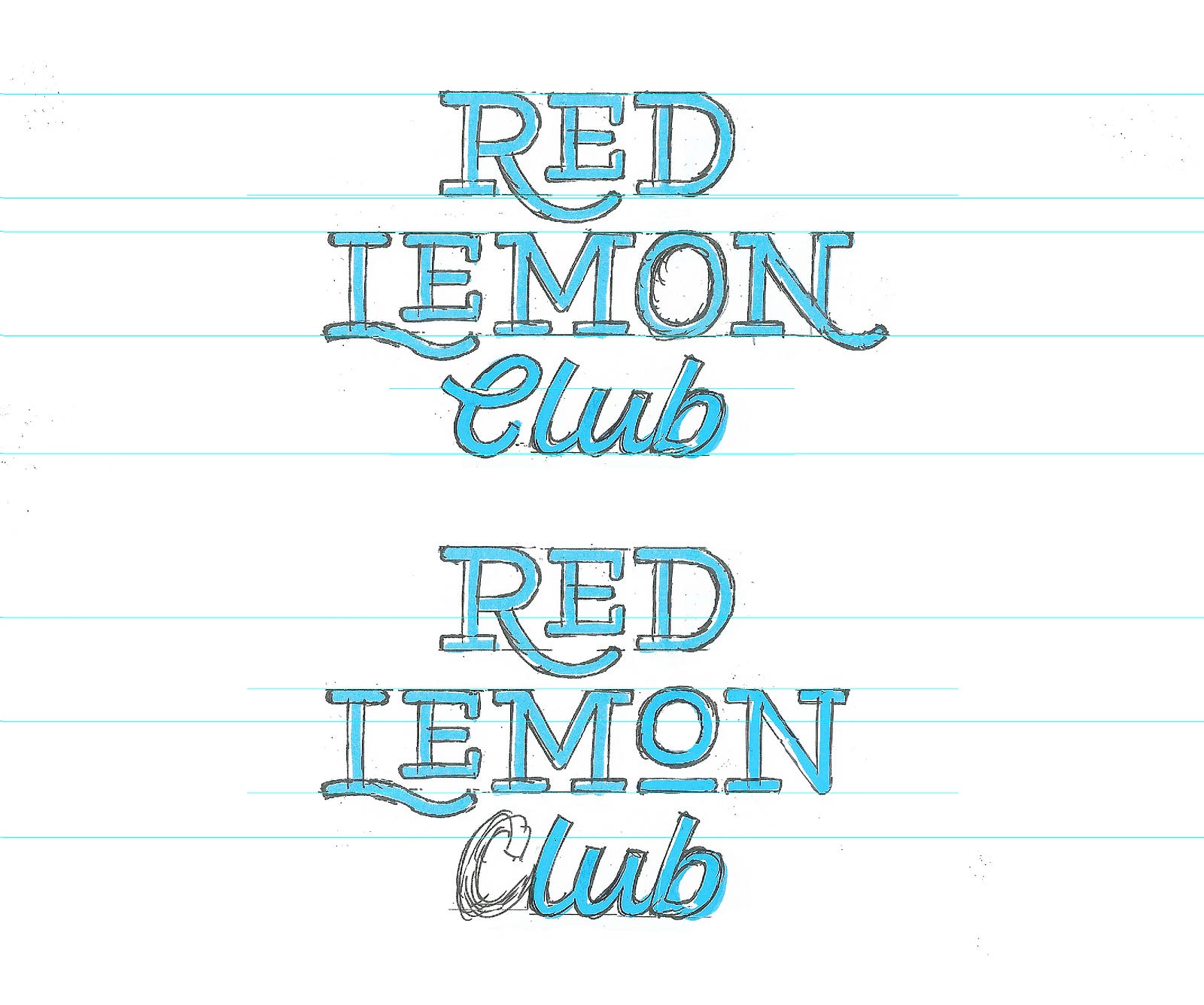
As with any logo project, testing is also a key stage and it can really make the difference between a nice visual concept and a strong, effective logotype: print and on-screen testing, finding the minimum safe size, testing on dark backgrounds, etc. This is also surprisingly fun as it’s all about tweaking tiny meticulous details!
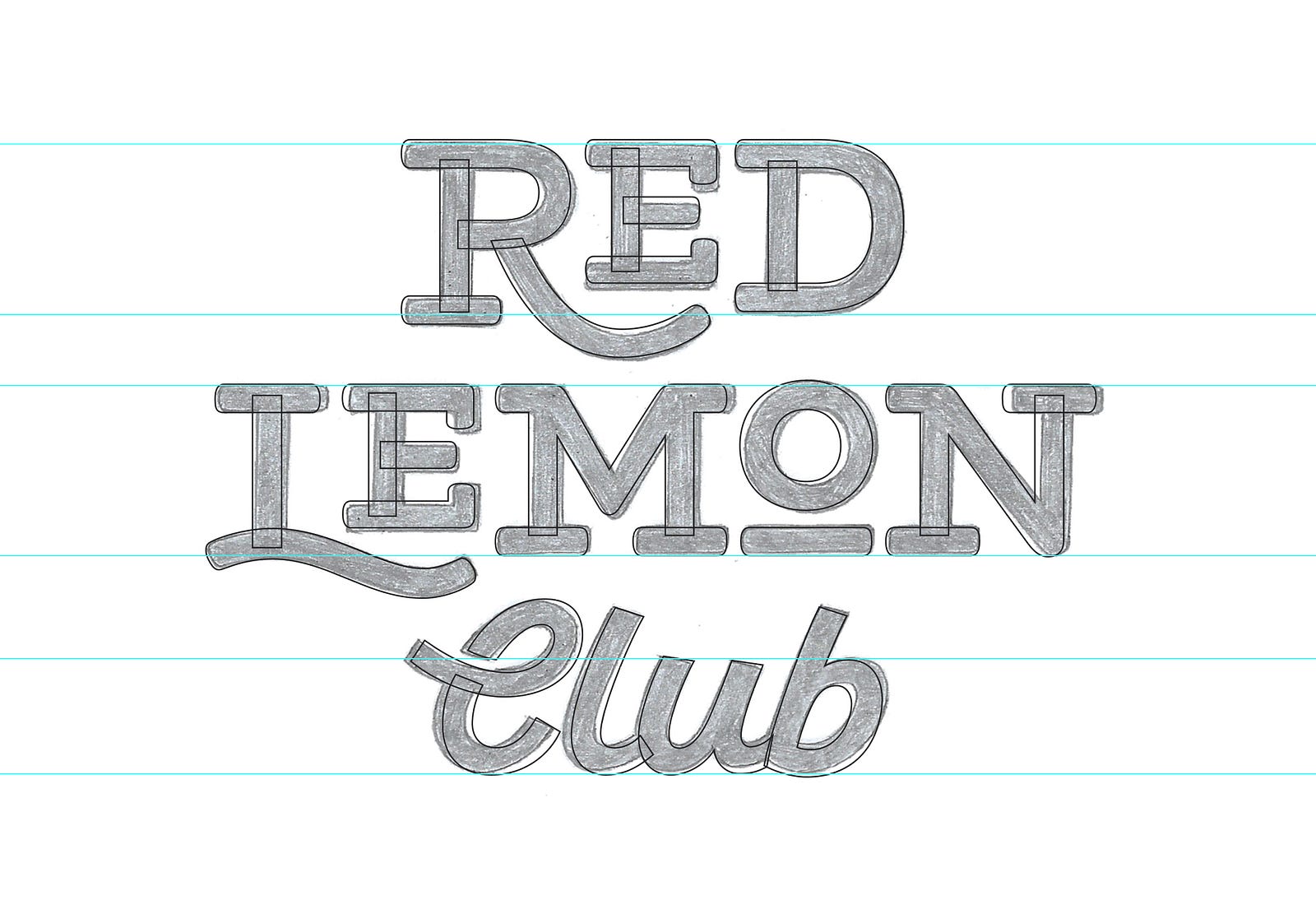

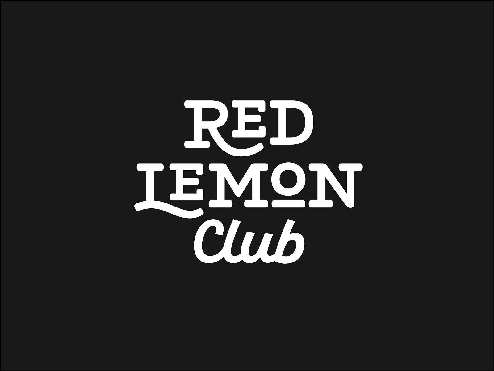
We noticed that the raised ‘o’ in the word ‘lemon’ could work really well as a standalone symbol of a red lemon (sort of like how I designed the lemon as a picture in the original piece). This was more like a lucky surprise that came out of the process.
I’m planning to use it on future products, merchandise and shorthand versions of the logo, such as the website favicon.


What drew you to your profession?
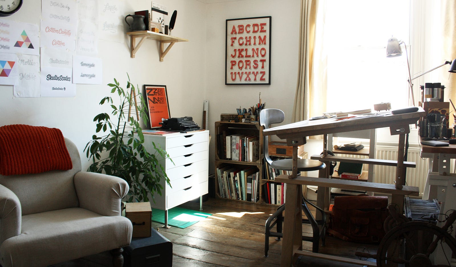
The realisation that you could draw letters like you would do any illustration was a big moment for me. It seems obvious, but until I started drawing hand-rendered versions of existing fonts early on at university, it hadn’t really struck me.
I loved spending time with all the intricate details and seeing how different styles would create a different perception. I also liked that using letters and words provided a loose structure that allowed you to be creative within that, rather than just being able to do just anything.
I felt like it gave me a natural starting point rather than the sometimes overwhelming blank page.
What do you find challenging about the work and what do you love about it?
I find it challenging to avoid falling into the same styles sometimes, particularly when working with similar design briefs.
While obviously a letter always needs to look like ‘itself,’ you need to come up with pretty different solutions every time, which can be tricky, particularly when one idea tends to work really well.
Of course, it’s also about seeing a typographic piece as a whole, rather than just small details — so for instance, with legibility issues, it’s important not to fixate on the shape of the one letterform but look at the word in context.
This can be a tricky point to address when working with clients as we spend so much time closely studying the letters, but usually, a collaborative-based process helps to promote a good understanding on both sides.
I love when both the client and I are really excited about a project in its early stages, usually when we’re really on the same page with the design brief and project objectives.
The early exploration stage is also something I enjoy as there are lots of possibilities, but there’s also something great about the digital step as it’s where the design really starts coming to life.
What is next for you?
I’m excited to continue developing logotype-centric projects into wider branding ones, as well as broadening the scope of the work I’m taking on.
I’ve also always found it difficult to let myself focus on personal projects properly, so I’m planning to work more on that as well.
Typeface design is always in the back of my mind, but it’s quite a long-term project so it’s something that I need to dedicate time to properly!
See more of Claire’s work on her site, and follow her on Dribbble.
—