Standing out online is not a question of quick fixes. It’s a question of mindset
Web design sits at the core of a site’s success. It communicates the substance of what you do and why anyone should care. Peel back the veneer of a lot of sites and you’ll be surprised by how many fail to do either. More people are online than ever. Standing out online is not a question of quick fixes. It’s a question of mindset.
There are now nearly 200 million active websites, and over 3.5 billion internet users. Yet the average user visits less than 100 sites each month. That all adds up to a lot of competition. The internet is busy on a level we can barely conceive, and only so many sites can rise above the bustle and have their voices heard.
Modern resources mean just about anyone can make a website, which is great. However, modern trends often create approaches that, although stylish, are not always in the best long-term interests of a site. Be wary of shortcuts. It can seem daunting, but improving your site is a modest investment of effort when measured against the potential benefits.
Templates are a beginning, not an end
Website builders are getting more sophisticated by the day, with millions of sites built using their tools. You might be surprised which of your favourite sites were put together on something like Wix or Squarespace. Widespread access is terrific, but with it comes a risk of being indistinct.
Templates are one of the biggest strengths website builders have, but they’re also one of the most misused. The temptation is to pick a template, fill in your details, and get on with your day and it’s easy to see why. You have a business to grow, other priorities to consider. Getting online is the hard part and it’s not even terribly hard anymore, so why not take that extra step to really personalize your presence?
For some, a template is enough, but for others, it tells visitors you’re no different from anyone else. Once you clock certain types of templates, you’ll start noticing how similar many websites look. When enough people buy into the dream of having their own website without taking the time to personalize it, the result is a kind of digital levittown.
Starting something is the hardest part of a project, and that’s why templates are so useful. They are a start, providing tried and true foundations of form and function. Once you’ve filled in those blanks, start asking what you should be changing. When looking at your competitors, what do you want the first impression to be and how does it differ to what’s already out there? Oftentimes, it’s the most basic elements of web design that get overlooked but they’re often the most important, including the color scheme. The colors you choose for your website can evoke different emotions and attract very specific audiences so it’s important to choose wisely. If you’re not sure where to start, Smart Insights have an excellent article highlighting basic design elements.
Try it. Go to your site — or any site for that matter — and identify a change that would suit the unique qualities of the brand. Once you get into that mindset, improvements to the site will become a natural extension of business development.
Websites are not photo feeds
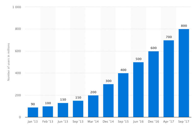
It’s easy to fall in love with the idea of a beautiful website. Appearances are important, but they’re not everything. Industry reports show that Instagram passed 800 million users in December. Over a trillion photos are taken each year. We live in a visual age, which naturally means image has seeped into places where it won’t age well, like web design.

A lot of modern sites are heavily reliant on image. This is ideal for visual spheres like fashion or art, while for others it can border on indulgent. When I land on a website homepage with a huge oversaturated photo and a vague tagline, I’m not as impressed as I’m expected to be. Style without substance only gets you so far.
As much as anything else, the upkeep demands are high. People obsess enough about their Instagram account. Can you imagine the demands of an entire website? Treat a website like a photo feed and that’s what it will become. Content will become secondary to appearances, which is always a bad deal.
If image is integral to your site, you don’t need to worry about this. If it’s not, channel some of those energies into appropriate social media channels. Beautiful visuals are the lifeblood of sites like Instagram and Pinterest, so lay out your stall. Users who like your content will find their way back to your site to learn more about you.
Social media exists in orbit
Your site is the only thing you can really rely on. Having a social media presence is excellent, essential even, but those channels need to exist in a kind of orbit around your site. The internet is a fickle world. Lords of all creation can be crowned and felled in days; all it takes is one unfavourable algorithm update for a brand’s exposure to plummet.

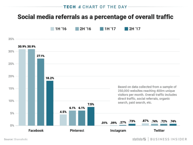
Above, Statista shows that in the second half of 2017 social media referrals from facebook plummeted by 9% after their newsfeed algorithm change.
For all the talk of fake news and user gullibility online, users are learning to be scrupulous which has culminated in a steep decline in the number of social shares over the last three years.
Shallow, cynical, manipulative content is on the way out, and good riddance. Shares are earned by having something worth sharing, like an interesting website with awesome content.
View social media as a way of sharing the substance of your business or brand. What are you doing? Why are you doing it? Why does it matter? If you don’t know the answers to those questions, it’s unlikely that it will stand the test of time.
Build design around content
As web design guru Jeffrey Zeldman said way back in 2008,
“Design in the absence of content is not design, it’s decoration.”
This is as true today as it was then, and carries renewed relevance now most people are making their sites themselves.
As Steven Bradley has written about brilliantly, ‘form follows function’ is not a binding law in web design. Purpose and aesthetic need to be developed together for either to work properly. It’s a balancing act. The Roman architect Vitruvius highlighted three essential qualities in a building, saying any structure worth its salt must be:
- Structurally sound (firmitas)
- Useful (utilitas)
- Beautiful (venustas)
This is just as applicable to websites.. Its core requirements are actually incredibly simple, but we muddy them with fads and shortcuts. Wedding the three isn’t always easy, but it’s worth it.
For you to tick all three boxes, you have to build your site around its content, and to do that you need to work from the answer to one question: Why does your site exist? A default template and a pretty picture is fine to start with, but long-term there’s (hopefully) more to you and your business than that. Show it.
Content is more than copy; it’s imagery, page layout, branding, tone of voice; the sum total of who you are online. Take a site like Eggradients, a cool online resource for choosing colour gradients. It’s a simple idea, but they’ve thought about what they wanted to achieve and built the site around that purpose. Pretty trim, no?
You don’t need to get it right first time. In fact, it often takes time for your content strategy to develop into something solid enough to build a site around. As that happens, step back and consider different elements in unison. A holistic approach is good enough for Google; it’s good enough for you.
A great website is never finished
Cliches like ‘be your best self’ are not necessarily a problem; the problem is not translating them to actions. A site built with its best self in mind — which is to say it develops itself around its purpose — is much more likely to succeed. That approach creates a natural resistance to short-term gratification and ill-fitting fashions.
Success begins with having your house in order, being stable and cheerfully occupied. Online, this just means having your site in order. Web design at its best is a kind of self-discovery, an opportunity to develop key skills and apply them to something you care about. As Google says, ‘design is never done,’ so the process only truly ends when the site ceases to exist.
Remember how I opened with fact there are nearly 200 million active websites? Well, there are over a billion that are inactive. Some were useful, some beautiful, some structurally immaculate. Few will have been all three.
